Research
The research I did for this project was to learn about different and unique packaging on the internet. A lot of the different packaging I found utilized the product nicely. I found lots of ideas and inspiration by making Pinterest boards and finding uniquely different packaging. Other research I did was to learn more about my mentor, so I asked him questions like his favorite foods, drinks, designers, and things he likes to do outside of class.
On the left are notes about my mentor, and on the right is my Pinterest board.
Exercises/Activities
Some exercises and activities I did for this project were creating packaging for the item I chose which was a flashlight. My partner and I created a pop-open box, and on top is supposed to be a light beam, and on the sides are slits so when the flashlight turns on the light will shine through the little slits on each side. When the box opens there’s the flashlight right in the middle and on each side of the box are quotes that have to do with light and a flashlight.
This is the pop-up box we created for the exercise and our gift was the flashlight.This is another box I created during the exercise for the flashlight
Iterations
I had ideas for the final project of doing drawers or containers for coffee items since my mentor likes coffee. My first iteration was doing a hidden shelf, when it’s closed it’s a cylinder with a lid but when you open it, it’s four square containers going up. A couple more iterations were figuring out how to create a container out of paper and using different sizes and types of paper to see which is best and sturdier. My last iterations were creating Chester drawers out of paper and making a milk carton coffee bag out of paper to get an idea for my final project.
These are iterations of my milk carton and some containers I was planning on makingThis is an iteration I made in a sketchbook app of how the containers would be stacked on top of each other when opened and closedThese are some different containers I made to see what I liked for the final project, there are drawers, milk cartons, and other different containers.
Concept Statement
My concept for this project was to create a gift that would be special to my mentor using information about what he likes and also utilize some of his favorite quotes throughout the gift. I wanted to go with the coffee theme because it is one of his favorite drinks. I wanted a variety of browns to be the color of the gifts themselves so the theme of gifts can have the same aesthetic. I wanted to create something that could be useful for coffee grounds or beans and also create something he could use to store things he not just uses for his coffee or anything he wants. The idea was to make something that is sturdy and useful, and something that would be long-lasting and special to my mentor.
Production
In my final production, I chose to not do the drawers but to make something else that I thought would have a cleaner look and something more things my mentor likes. I decided to create a wardrobe out of brown cardstock and inside is a brown leather crescent moon with his last name carved in it. On the inside of each door, I did quotes, two that are his favorite quotes, and the other quote I thought went nicely with the whole moon theme. I chose for the handles to be a crescent moon out of brown leather because he really likes the phases of moons. There is a drawer at the bottom and when you open it inside are two macrame keychains, when you take out the drawer there is another one of his favorite quotes behind it. The last thing I made was a milk carton-shaped brown coffee bag that closes by the string when tied together.
Research
The research I did for this project was to learn about chess and learn more about the pieces in chess. I researched the meaning behind each piece and also how pieces can move on the board. I also had to learn along with my group how to play chess. Since my group had the three-way board I researched some three-way boards and also researched groups of three objects and groups of people in threes that go together.
On the left is my 3-way chess board and on the right is the list of rules I wrote down in my sketchbook for each chess piece.
Exercises/Activities
Some exercises and activities I did to lead up to the final were first learning how to play chess by playing online called chess.com, you’re able to play against the computer at different levels. At first, I played at the beginner level where they show you steps on which piece is the best move at the time. We did an exercise in class where we practiced platforms from basic shapes like a circle, square, and triangle, for a challenge we did a toy car. I also did an activity in class where we played jeopardy. In the jeopardy game, it would ask questions about what piece in chess was the best to use in certain scenarios and other questions were terms and the meanings in playing the game of chess. I did an exercise where my partners and I pick an object and create a slice form, so we first chose to do glasses and did I did the front view and my partner did the side view, then we decided to pick a challenge and do a trophy which was very complicated because there were a lot of circles and some were too big or small and measuring the slits to match the size of circles was complicated.
Online chessBasic shapes using slice formsSide and front view of slice form glasses and trophy
Iterations
Some iterations I did for this project were first coming up with what pieces represent the nerds best but all the pieces still correlate with the original pieces in chess. At first, the knight was going to be an old Pacman game controller which also has that L shape when playing it or it could’ve been the queen because you can move everywhere when playing with the controller. The rook I was thinking to be a school building but I decided that a science beaker would be a better fit because it also fits in with how the rook moves on the chessboard. I hand cut some pieces just to get an idea of what my pieces would like and also to test out how bristol would look which was not very good because it was very flimsy and kept ripping when I hand cut them. I decided to use my Cricut machine to get cleaner cuts and see what it would look like before using our final material. At first, we tested the chipboard with the Cricut but when it cut made the chipboard look rough and made it fragile and didn’t cut all the way through and we also knew it wouldn’t look good for our final. We then tested the white plastic material which was a lot cleaner cut even though it took two-three passes on the Cricut to cut all the way through it looked much better, but on some pieces, I still had to take an Exacto knife and cut out some pieces.
Sketchbook app iterations for each chess piece
On the right is the final material we used for our chess pieces which is white plastic and on the right is chipboard which we tested and did not work well.
These are my pieces in the Cricut design space before printing them out.
Concept Statement
Our concept for this project was to create an 80’s disco school cliques theme, where each of us has different cliques such as jocks, nerds, and skaters. When the chess pieces are on the board they are supposed to be having a “dance battle” just like in the movies. The idea was that the item that is represented for the king piece in each clique is something the other groups want and are jealous of. The nerd’s king is represented with an A which shows they get good grades and something hard for the other cliques to get. We wanted to create these pieces out of sturdy material which is made of white plastic, and to represent each different clique we painted little details on our pieces to separate each clique. All the cliques have a different color based on what we thought colors represented each clique the best, so nerds are blue, jocks are red and skaters are green.
My concept for my pieces was to create pieces that have to do with my clique, the nerds. I wanted to make pieces that you could tell what they are just by looking at them. The idea was to make nerd chess pieces based on stereotypes from 80’s movies, like nerds are in science classes and use beakers or nerds are in debates so they are behind podiums, and they wear glasses and they break when they get beat up. Stereotypes like that were the idea behind most of my pieces, and also remembering the original pieces and having the pieces I created still have something to do with the original pieces. Using the laptop as the knight because the knight moves in an L on the chessboard and when making the pieces I wanted to make sure all my pieces still correlate with the original chess pieces.
Production
I used the Cricut machine process and used white plastic material for my final pieces. My clique was the nerds with the color blue, my King is the letter A to represent the good grades that the nerds get all the time and something the other cliques are after. The Queen is a pen that represents how the queen moves on the board and can move anywhere and can also be used as a weapon by the nerds by using the pointy end to stab or poke people in the other cliques. The Bishop is a podium because nerds do debates in school and it also represents how the bishop goes forward and speaks in the game of chess. The Knight is a laptop because it has an L shape which also represents how a knight moves on the chessboard. The Rook is represented with a science beaker and also represents how the rook moves on the board which is different ways up, down, and diagonally and is also how you could shake a beaker. Finally, the Pawns are represented with broken glasses because there are multiple nerds and in the 80’s movies and skits, the jocks would punch nerds breaking their glasses.
My chess pieces on 3-way chess board
Final chessboard with everyone’s pieces while playing a game of chess, and what they look like set up on each side of the board.
Research
The research I did for this project was to learn about different paper mechanisms and find exactly different ways they are made or where there seen the most. While doing research I found paper mechanisms are not just turning a handle and wheels start turning, but also can be a pull tab, or turning a wheel that is revealing or hiding something. I went to the library and looked at different books with popup mechanisms, or some even opened up and revealed something. It was interesting to see all the different mechanisms made by different people but all have the same concept. I also researched different instrumental music and found what type of music my partner and I wanted to choose for this project whether it was jazz or classical music.
List of song ideasActivity at the library where we explored many pop-up mechanisms
Exercises/Activities
I created a mechanism and practiced how different types of paper mechanisms. I decided to create a pull tab mechanism and when you pull the tab it looks like the little boy’s mouth is opening and closing. I also made a second one, but in a circular mechanism where you turn the wheel.
Iterations I had an idea of doing a circular mechanism because my part in the song I choose to do sounds like a repeating line. I sketched mechanisms on the Sketchbook app after consistently listening to my part of the song. I wanted my mechanism to reveal and hide something but also show a disruption. The first one I made is a circle mechanism with a section cut out so when you turn it behind each spot is something different. Another one I made was a rectangular mechanism but when you turn the wheel each half has a different picture on it and the border around it hides the pictures. The final mechanism I made is a circle hiding within a circle, when you turn the tab it’s revealing or hiding depending on the way you turn it.
Revealing circle mechanismWheel turning mechanism
Iterations on the sketchbook appSketch of circle hiding within a circle
Concept Statement
My concept for this project was to create a circular rotating mechanism out of paper using two different colors. The elements and principles that are being used are contrast and movement. The contrast is shown through color and the size of the shapes that are being shown when using the mechanism. Movement is being shown when using the mechanism and the use of shapeand size are showing movement also. Using the song I chose the beginning part of the song that conveys a continuous motion and sounds like a repeating part of the song, which is what I wanted my mechanism connects to when rotating it. Disruption is something I wanted to show abstractly using shapes and one shape being different from the rest. The idea is to have a mechanism that reveals and hides using shape, size, and color.
Production
In my final production, we chose to do the theme song Pink Panther, and my part of the song is the beginning where it repeats the same beat or tone. I chose to do the circular mechanism where the circle is hiding within another circle. I decided to use that mechanism because it’s easy to see my concept and what I was trying to do. I decided to use black and pink for the colors because when the mechanism reveals that hiding circle I want it to be a surprise color that is a big contrast of color between the bigger circle. When the circle is revealed it is also revealing circles going small to big and a square at the end showing that disruption at the end. I used a string so it can easily be pulled to reveal and hide that pink circle.
Research
The research I did for this project was to learn what a mask is, and find different purposes of masks throughout history. I researched different pandemics that required people to wear masks during that time. I also found many masks that are not nesscarliy masks that just cover your nose and mouth. More of the mask I found were poetic masks that don’t have anything to do with keeping away germs but more for the look of it, and use of color. Our masks were based on the bubonic plague, and I researched the masks people, the reasons they wore those specific types of masks, and how they developed and were manipulated over time.
Inspiration for final mask
Exercises/Activities
I created a mask for a person based on safety, fluidity, and power. In this exercise I decided to take a literal approach rather than manipulating the regular full face mask, I decided the important part of the mask is what’s actually on it rather than how it fits your face. On the mask I put a green section with money signs to represent power, the next section is a yellow section with the word caution on it to represent safety defense and to warn people to stay away. The smaller section of the mask is supposed to be water dripping to represent fluidity and the next section that is orange and has grey lines is supposed to be a safety jacket that most construction workers wear. The shape of the mask is a regular full face mask with a string attached to both sides, and the eyes I wanted to be different from the regular mask, I made them smaller than normal, and behind the eyeholes would be clear acrylic to protect the eyes.
Iterations Based on the present version of the bubonic plague mask, which is now called a mardi gras mask. Mardi Mask can have three colors, purple, green, and gold or can be many colors in the rainbow with feathers and glitter. Many of my iterations are different versions of mardi gras masks that have different shapes for the eyes, but all of them have beaks so its still ties in with the original bubonic plague mask. I wanted my mask to be colorful and have a completely different contrast in color compared to the original bubonic plague mask. I created my iterations with different color palettes, and I also created them with different designs around the eyes. I made an original mini bubonic plague mask to try out the bubonic plagues mask template that was found. I made the mini version out of paper and then started to figure out ways to attach the beak to my version of my mask.
1st Sketched out iteration of mask
Variety of masks created in the sketchbook appOrginal mask template made out of printer paperA bigger version of the mask made of bristol paper
Concept Statement
My concept for this project was to create a mask based on the bubonic plague that happened in the mid-1300s. Instead of doing a mask that would fit in with the pandemic and how they would look, I wanted my mask to be a present-day representation of how it is presented today. The idea is to take a more poetic approach to the bubonic plague mask, and turn it into a Mardi Gras mask but still have the beak from the original mask attached. Mardi Gras masks have the prominent colors of purple, green, and gold which have the meaning of justice, faith, and power. I wanted the color to be dominant in my mask and make it stand out and create that separation from the original mask. In my mask, the colors would be all types of bright and bold colors that come from the inspiration of the holiday Day of the Dead which celebrates life and death with skull masks filled with bright and vibrant colors and decorations.
Production
In my final production, I chose to do bright-colored masks and have different colored layered masks with a beak attached in a variety of colors. I used the Cricut machine to cut each layer of the mask, each color that is seen in the mask is a separate layer that was cut by the machine. In the Cricut design space on the computer, I separated each part of the mask into layers and sized the mask to make sure the beak would fit correctly. I added different colors glitter and feathers because that is what is mostly seen on Mardi gras masks, and I also added a wooden dull to the side of the masks so people could hold the mask up to their faces. On the wooden dull I added a spiral macrame to each of the wooden dulls so it would tie in with my partner’s mask, but also it gave the wooden dull a nice touch instead of it being plain.
Research
The research I did for this project was to learn what the Gestalt Principles were. I learned what was figure/ground, closure, similarity, proximity, continuity, and symmetry. I also did research on the internet and found examples of layering and got some ideas about what I could do for my final project. I looked at different ways to layer the paper using different methods such as stacking them or accordion fold layering. I learned how to use the laser cutter and Cricut machine, to help get straight lines, and clean cuts for my project.
Ideas from the internet to help me with the final production
Exercises/Activities
I created a vector image using my initial using a specific font and image in the negative space that represents me. In this exercise, I explored different positive and negatives versions using fonts and pictures. I created a negative version and a positive version in black and white on Adobe illustrator. I chose the letter T for my last name, and I chose a bull which is the animal that represents the zodiac sign, Taurus.
Negative and Positive Vector images
Iterations I created my ideas on the app Sketchbook. My first idea was to do a spring-themed layering space project. At first, the idea was to make the entire thing in a butterfly silhouette, and have trees, grass, and little animals that you see in the springtime, like birds and bunnies. I felt it represented me because my birthday is in the springtime, and I wanted to show that through my project. I created my first iteration with the Cricut and tested out how it would look with my first idea. I tried showing the branches and having a ring of butterflies in a circle, but I decided to change it because you couldn’t see the circles. I went into the Cricut design space on my computer and made the circle thicker to show the layers, and also made another circle with only two butterflies.
First iterations created in the sketchbook app
Concept Statement
My concept for this project was to create a layering space project that would create a story only using the images that are in the project. I wanted to show the life cycle of a butterfly using vector images and color. I wanted to use the Cricut machine and design space so my vector images have clean lines and cuts. My concept was to use color to give depth, using the darkest colors in the back, and the top layer being the lightest color. I used balance in my project, using only the butterflies which tell a better story. I also created movement in my project, you can look at the cycle of a butterfly and the butterflies that take your eye in a circular motion giving it a sense of movement. I think the best way to capture spring and still keep movement in mind is by showing a butterflies life cycle through different layers and silhouettes that can tell the story of the butterfly. I also used the different color layering to give depth and used the colors to show past to present with the past being the darkest and the future being the lightest color.
Production
In my final production, I chose to do the life cycle of a butterfly, the bottom layer is black to create depth, and the next layer is the darkest grey, and it is cut out to represent the eggs on the leaf. The next layer is a dark grey but lighter than the last layer, and that is cut out as a caterpillar on a branch showing the next stage of life. The second to last layer is a lighter grey showing the chrysalis hanging from the tree before it turns into a butterfly. The very top layer is a white circle that is showing butterflies flying away showing the last cycle of a butterfly as an adult.
Full composition and two detailed images of the final project
The research I did was find videos and tutorials on how to make a sketchbook from scratch. I found different methods of making sketchbooks, and many ways to bind my sketchbook together. I found Japanese binding to be interesting with the different designs you can create on the outside with the different color strings. I also searched on the internet for unique sketchbooks, and one I found interesting was books with a little lock on them or a magnetic button to keep it close but not to lock it. I also learned what mind mapping was and different methods of mind mapping and ways we could show it in our sketchbooks.
Exercises/Activities
I created different mini sketchbooks and tried folding them in different ways just to get an idea of how I wanted my sketchbook to open whether it opens up and down or opens like a book. I created my mini sketchbooks out of lined notebook paper and the other one out of bristol paper to create a sturdier notebook with thicker paper. I also created a mind map in my mini sketchbook. My main topic was my favorites, and I took that and branched off each of my ideas with things like favorite drinks, favorite songs, and favorite food. Creating a mind map in my sketchbook was a little difficult because I wanted to create mini pictures to go with some of the words in my mind map but because of how mini my sketchbook was there was so little room to fit anything.
Iterations The way I explored to get to my final product, is by creating a list of things I don’t like about sketchbooks which was how they don’t lay flat or the spiral gets in the way when sketching. I created another list of things I want or wish my sketchbook has like the ability to lay flat, different kinds of paper, and also a bookmaker to know where I left off in my sketchbook. I created a prototype of my sketchbook. I took the cardboard-like brown paper to represent the front and back cover as leather. I created a bookmaker out of rope string, and also took the same string and made it to where if you tie it together it closes the book and holds everything together. On the inside of the book, I created a pocket on the back cover to hold scrap paper. Lastly, for my prototype sketchbook, I tried the Japanese binding method using a sewing needle and thread to see how flat the pages would lay and to see how the design would come out.
Sketchbook prototype
List of my dislikes of a sketchbook and a wish and want list for my sketchbook
Production In my final production, I used Cricut leather on the inside and outside of the front and back cover. I created my front cover design in the Cricut design space and used iron-on glitter vinyl to make the design. In the bottom corner of the front cover, I used the laser cutter to etch my last name and first initial, and I also used the laser cutter for the wording on the back cover. I bought a magnetic button and attached one side to a leather strap and the other side to the front cover to close the book. I used the laser cutter and Cricut machine to cut out my different kinds of paper. The different kinds of paper I used were Cricut acetate paper, drawing paper, bristol paper, and colored cardstock paper. I made a bookmark from leather string and attached a butterfly charm at the end to match the front cover of my sketchbook. Lastly, for the binding method, I wanted to use leather string to go with the whole leather aesthetic, so the Japanese binding didn’t work well because of how thick the leather string was. I came up with an alternative of doing the binder rings method so the book can lay flat.
The research I did was listen to the podcast called Mashups, Remixes, and Frankenfiction, it was a 25-minute recording that discusses similar items that are not always clear. I found different tutorials on how to use illustrator which kind of guided me through using the program I also found different ideas from the internet to help me with my final design.
Exercises/Activities
For the exercise, I used my initials to start practicing how to draw in an isometric gird. I tried drawing my letters from the top view, and some side views. During this exercise, I had trouble doing curved letters such as the first letter of my name B. I tested line weight, and color to figure out how I’m going to use that for my final design. While testing out different ways to show letters in isometric view I found it was hard to get the lines to snap to the grid in illustrator than it was drawing the lines in the sketchbook app. Sketchbook App
Iterations The way I explored to get to my final product, is by getting and mashing up a bunch of words that are one adjective and a verb, or a verb and a noun, or adjective and a noun. I also used a website called word scrambler to help me mash-up words and put the two words together in a different way than what I was thinking. I had many different ideas, such as cralor, which is color and crayon together, and it was one of my favorite designs I did and it was also in the middle of me getting the hang of using illustrator. I also did other designs I thought were nice but when I started playing with different ideas such as how to create fur, I thought my word doute would go best with the fur because the fur can represent the dog. I used Youtube videos to help show me how to create different things that I used in my final design like the dog bowl and the fur.
Color and crayon together
Fur Heart
List of Mash-Up words
Production When designing my final design I wanted the letter D to be all fur put I decided to put it on top of the E because it was hard to get the furry letter in an isometric view. At first, I wanted my U to be laying in what it looks like a puddle of pee but instead, I stood it so it looks like it was sitting in pee instead of laying down. For the dog bowl which represents my letter O, I decided to put my dog’s name on the bowl to make it feel more realistic and I also decided to put dog kibble in the bowl. My letter T is made out of bones, and my letter D has a collar around it. Every letter in my final design represents a dog in some way with the collar, dog bowl, a puddle of pee, dog bones, and the fur to give a feel or an idea of what the dog would look like. My two words for my final design were Dog and Cute to create doute.
Research
The first part of my research I did was looking up what is a mandala and finding the meaning and what it represents. I found various types of mandalas and the symbolism in mandalas and learned that mandalas are not always circular. For this project, I researched ten pictures that are man-made like a shoe, umbrella, or hat, and also researched ten nature-made things like a flower, fish, or fruit. Using those twenty images I created a chart separating the ten images into two different charts and created abstractions using proportion, scale with shape, direction, components, and value and color.
Manmade itemsNature made Items
Exercises/Activities*
Exercises and activities I did to lead up to my project are going through my chart with man-made items and my other chart with nature-made items. I picked one nature-made item and one man-made item and I took those and created a couple of different patterns in three-inch squares and created a nine-by-nine pattern grid for the two items I chose a fish and a key.
Fish and Key pattern
Iterations I had many ideas for the final project, I searched for many different mandalas templates and created different ideas I had for my final production. First I chose my 5 different abstractions which were a hat, a fish fin, the outside lines of a basketball, a snail shell, an umbrella, and the circular part of a key. Then I took a simple template of the mandala which was the basic circular pattern and divided it into parts which made it easier to create a pattern and use the same patterns in each part of the mandala. I decided to start creating my templates and I wanted to make a different kind of mandala instead of circular ones. The first one I created was a flower mandala. I created a mandala with half circles that spiral and get smaller and smaller as you look at it. After I chose to use my half circle spiral template I decided to start playing around with different abstractions from my man-made and nature-made chart, and I started adding value to the mandala, using black, white, and grays. After reviewing my mandala I went back and took notes of what I wanted to change and focused on the focal point of my mandala and how directional movement is used. After finishing the black, white, and grey version of my mandala I used the color wheel/chart to help me figure out which colors would look best based on the colors that were already used in the black and white mandala.
Multiple iterations using the color chartThe first iteration of mandalaAbstractions used in mandala
Production
For my final production, I felt monochromatic was the best way to use color because I chose to use directional movement and I wanted it to have movement not only within the abstractions but also with the color. As you look at the mandala the abstractions get smaller and the color gets lighter on my value mandala and also the color mandalas. I tried using many colors and different compositions to try for my final production. I chose to use the pink and red monochromatic and the split complimentary greens and blues for my two final mandalas. I felt using monochromatic and split complimentary gave the most effective directional movement and the colors went well together.
The research I did for this project was trying to figure out my destination coming from Hayes Hall. I chose my location to be the RPAC which is the gym because I like to go there and exercise and play basketball and just hang with friends. My path is the most direct path because when going to the gym you want to conserve your energy, then use that energy at the gym, people don’t really go to the gym tired and out of breath already. I feel you should want to leave the gym tired than arriving at the gym tired.
Exercises/Activities*
Some of the exercises/activities that I did in class were slow looking and observing the space around me and writing down what I saw at the location. After gathering notes about the location I wrote a creative and descriptive haiku and shared it with the class. I went outside and took pictures around the oval and then took those pictures and placed them where I thought they would be in the oval. Some pictures were placed near Hayes Hall and some pictures like the statue in front of Thompson Library were placed more by the library. The last exercise I did was create different methods of showing a path and directions on where to go. My group did the life cycle of a frog in which the egg mass would represent the starting point and the adult frog would represent the ending point.
These are everyone’s pictures from the oval, and here we tried placing them where we think they were exactly in the oval
Iterations My first idea was to do 3D buildings and then have a red line pass by each building. I did a collage of some things you might see along my path, like University Hall, and the Thompson library statue. In the collage, I used magenta color paint and used my thumb to create a path from University Hall to the RPAC. I decided to use magenta because it was the closest color to red which is the color I used for my final production. My next thought was to draw the buildings how they were on google earth, I really like the structure of the top of the buildings. I chose to show my starting point by using a push pin and to show my finishing point and chose the race car finish flags, I also tried using bird feet to represent the path from my starting point to the destination.
1st iteration shows a direct pathThis iteration I tried a bird pathThis is the collage exercise where I use my thumb and paint for the path
Production For my final production, I decided to do changes to my map so that it has a theme which is sports, exercise, and the gym. I used stuff that you would see at a gym, like weights, basketballs, someone on a bicycle, a person running and etc. I made a path with the different items, then I chose to add color to the starting point and my destination. Also for my final production, I decided to outline my buildings in black, and darken the trees that are surrounding some of the buildings. I have also decided to add color to most of my items in the path.
Final production
Concept Statement
My concept for this project was to create a map that has a clear starting point and a clear destination. I wanted my path to be something that had to do with my destination, so using those little icons I think the readers of my map should be able to tell what the destination is and the theme of the map.
Start at the front door of Hayes Hall then walk down the stairs
Turn right onto the sidewalk
Walk straight going past Hopkins Hall
Walk past Derby Hall
Continue walking past Bricker Hall
Go past University Hall
Go across the street by Townsend Hall, then stop and turn right,
Go straight to the corner of Neil Ave and Annie and John Glenn Ave
Turn left by Independence Hall
Continue Straight.
Cross the street and enter the Physical Activity and Education Services building
Continue Straight
Enter the doors to walk across the red skyline into the RPAC
Creative/Descriptive Directions
I walk down the stone stairs and turn onto the mile-long sidewalk passing the tall trees as they talk to me on windy days while giving me leaves as gifts. I pass by the hard-working students in Derby, Hopkins, and Bricker Hall. I then go past the huge clock that tells me the time every day. I look both ways and cross the street by the building across from the library, then I turn right passing cars and bikes, and squirrels of all sizes. I walk to the corner and turn by Independence Hall and continue walking while people on scooters pass me. I go past more trees, busy students and slow-moving cars, and little white robots that pass trying to get to their destination. I carefully cross the street and enter the big building with the big shiny red windows, as I continue walking and go through the doors with those shiny red windows. I continue walking and walk on top of everyone while looking down at the people who look like ants. I then exit the doors and find a spot to start my workout.
Research
The research I did for this project was to learn about orthographic drawing, and I learned how to draw the 2D orthographic projection. Since I picked illusion as my option, I went on the internet to find pictures of different illusions I could draw in my 3D form for research.
Exercises/Activities
The first exercise I did was to draw out a template to create a 3D cube. In the exercise, I created at least three templates to try and create the perfect cube. The next exercise is orthographic drawing and creation. In this exercise, we were given a template to redraw and try to create the 3D shape which was the letter F, before actually creating the shape we learned how to draw the different perspectives when looking at a 3D shape or form.
“Perfect cube”Orthographic F
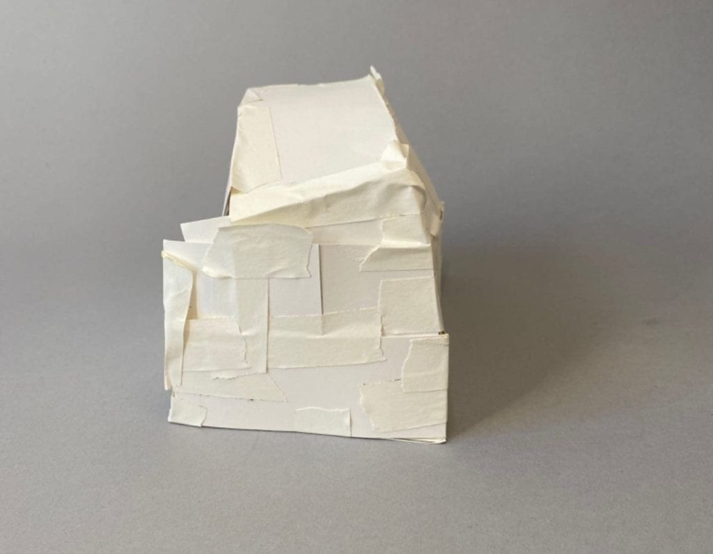
Iterations I explored different forms by using one of the shapes I found to be interesting in assignment 2, 2D composition explorations. I started by taking my shape while in 2D form and started trying to draw the net to create it in a 3D shape, but it didn’t work because you were able to see through the shape. I started taking construction paper and started to build off of my shape and create 3D forms. I made three forms in different ways to can create one whole form. After deciding which form to create a template for I started taking it apart while the pieces were taped together to try and find the net of the form I created. I started drawing out the net digitally and tried to figure out measurements, then I drew it by hand, and cut it out, to figure out what needed to adjust. After a lot of adjustments to measurements and changing the placement of shapes created my final template.
2D form1st 3D iteration2nd 3D iteration3rd 3D iteration
Concept Statement My concept for this project was to take a 2D form and create a 3D form using the same shape. I wanted to take this unordinary shape and use basic shapes like triangles and rectangles and create a new form using the same 2D shape on the bottom.
A net of my 3D form
Production The final part of this assignment for the original form I built off my 2D shape with construction paper. After choosing between three forms, I chose my first form and created a template from that shape. After finding the right measurements I started to create more and more forms until I found the two forms I felt were the best. I made one form be the original 3D shape (all white) then I took the other one and create an illusion onto the form.
Comparing
When comparing my two forms they are both the same shape but have something different to them. I choose to change my form by creating an illusion on the entire front of my form. I made the illusion by making it seem as if there was a ball coming out using straight and curved lines also with the colors black and white.