Posts

Brand Yourself

For my final project, I chose to create a personal resume, business card, Facebook banner, and letterhead. My career area is fashion (more specifically, corporate retail) so I wanted a theme that was very simple, consistent, and business professional while still conveying my creative side. I also do some fashion design on the side, so I chose to create a Facebook banner that could serve not only for myself but as the title page for a digital portfolio-style page. The “snap to guides” feature was my best friend for this project. See images of my work as well as my workspace below!

Resume

Business Card

Letterhead

Facebook Banner


Dream Journal

My dream journal sequence narrates an island with lots of warped size objects and out of place items. My dream was of a paper boat floating on the actual sea towards an island. The island is very green and has an abnormally proportioned house on it that the boat is traveling to. I dreamt of abstract items in places that they shouldn’t be, such as the paper boat in the sea and a sunflower sun in the sky. There is also a bridge that travels to an unknown location.

To describe this dream, I found a stock photo of an island that was close to the one I had imagined and edited it to become the space I had in mind. I did lots of placement of other stock photos, clipping them from their backgrounds (largely using the select and mask tools, then cleaning with an eraser) to place them on the image. I used the transform and warp tools extensively to help them fit the spaces they were to occupy more naturally. I used tools such as sharpen edges, outer glow, exposure, contrast, saturation, and dodge to make each object appear more natural. I also created shadows with 30% opacity for the objects in the direction that the sun would hit them to pull the image together.

I added this image of a house as a new layer, using the select and mask tool to remove the majority of its original background. I used the eraser tool to further clean up the edges. I then used the free transform to achieve its desired size, and the warp tool to achieve the shape I wanted for it. I used some filters to give it the appropriate feel in terms of lighting and color.

Next, this image of a bridge was added, again select and masking to remove the original background. There was some greenery in the original photo, so I used the clone stamp tool to make the entire bridge stone. I used free transform to make it the size and location that I wanted, and used the eraser to make it seem like it went behind the mountain. I also used the eraser on varying opacities as well as the dodge tool to blend the bridge more naturally with the water below it.

One of the main features of my dream is this paper boat floating on the sea. The best photo I found was actually orange, so I removed the background and then sharpened the edges. I then adjusted the settings on the exposure, brightness, shadows, contrast, and saturation to turn the boat into the white paper one I’d envisioned. I warped and transformed it to fit, and used the eraser to blend its bottom edge with the water.

To make the objects I’d added look more normal in their new backgrounds, I added shadows to them. I did this by duplicating each layer, turning the exposure to zero, and decreasing the opacity to 20-30%. I was then able to warp and transform the shadows underneath the object in the direction opposite the sunlight.

I added two more separate layers, a sunflower and a sun, to create the sun I imagined. After removing their backgrounds and placing them in a corner that felt balanced, I added outer glow to both and increased the spread of this glow to create a sunny effect.

A lot of these layers had to be ordered a certain way and added with the appropriate blend mode in order for the final image to look cohesive, which I played with throughout my process. Here is a screenshot of my final layers and workspace!

Andy Warhol Inspired Art

For my Andy Warhol inspired project, I chose a pair of boots from Thursday Boot Company to represent me. I am an ambassador for Thursday Boot Company and as a Retail major, fashion is something I’ve always loved. I also care a lot about investing in high-quality goods from companies with transparent supply chains. Sustainability in the retail industry is something I’m very passionate about and would like to impact throughout my career, especially in a world driven by fast fashion. Fast fashion is a huge part of popular culture today; it is one driven by consumption where clothing and other apparel items are viewed as disposable. This is closely related to many of the ideas Warhol explored in his consumer-influenced work. I believe that fashion and art are equally reflective of the zeitgeist of a time period. Today, there is a pushback against overconsumption as many young people are beginning to care more about ethical sourcing and corporate social responsibility. The growing popularity of brands such as L.L. Bean, Patagonia, Girlfriend Collective, and Thursdays reflects this shift. I believe that other young people searching for more sustainable and responsible items that are still fashion-forward will connect to the item I have chosen to feature in my work.

Andy Warhol frequently used common items in his artwork to portray larger ideas about American consumption culture. He understood that while art is a part of modern culture, so is advertising, consumer goods, and celebrity. His art stood at the intersection of all of these topics. He took advantage of commercialism and built an identity around it. I believe that his ideas have merit; it is both clever and creative to simultaneously critique a system and take advantage of it. His unique subject matter and production automation paved the way for future art movements such as street art, which have been built around many of the same criticisms and ideas. Being able to create art in nontraditional formats such as Photoshop means that the definition of art is becoming more broad and that more people have access to art creation. I love applied art; I am not skilled at painting or other more traditional mediums. The ability to find creative outlets in areas such as digital art and fashion design has positively impacted my life.

Elements of Art & Principles of Design

Elements of Art

Line: Lines are narrow separators that extend in a certain direction. They can serve to separate areas of an image or draw the viewer’s eye towards something. In this photo, the angle of the street lines on the wet pavement push the viewer’s eye forward towards the end of the street.

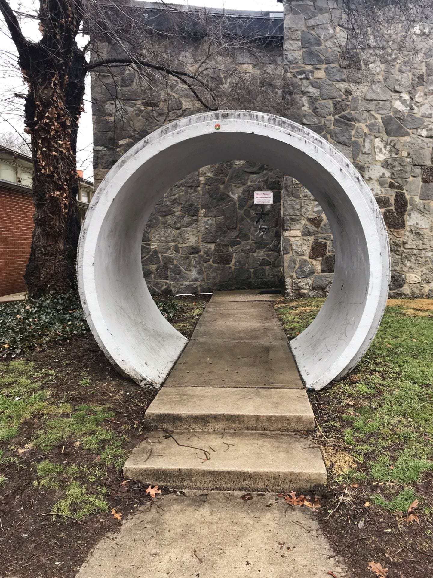
Shape: Shape is the form an object takes in an image. Below, the concrete arch forms a circle from the perspective of the viewer.


Color: The pigmentation of the image or objects in the image portrays color. Here, the bright green and yellow of the eggs and avocado against the more dull background draw the viewer’s eye in and emphasize the object of the photo.

Value: The level of light present in different areas of an image can create value. In this example, the bright reflection of the sun on the river water against the darker shadows of the building creates a visually interesting effect.

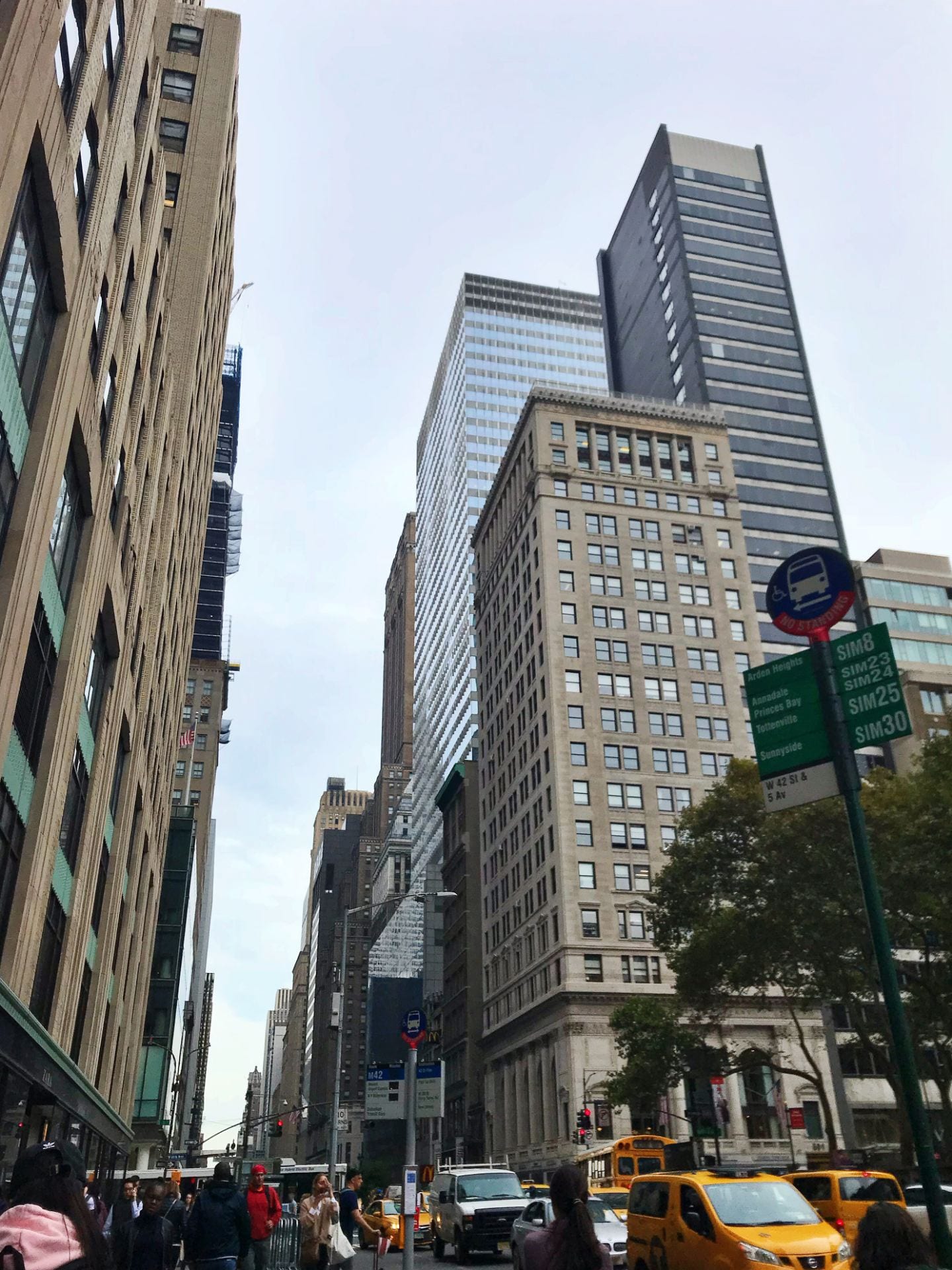
Form: Form is the sense of dimension in an image. The buildings in the photo below can be seen from multiple sides so that the viewer can tell that they are three dimensional.

Texture: Texture is the ability to tell from an image how an object feels. The fluffy-looking fur in this photo of a dog gives a soft, tangible feeling to the photo.

Space: Different proportions of empty and full areas of a photo can alter the amount of space that is perceived. The wide open space of the blue sky takes up most of the image below, which creates a natural and bright landscape while emphasizing the bridge, which is the main object.


Principles of Design

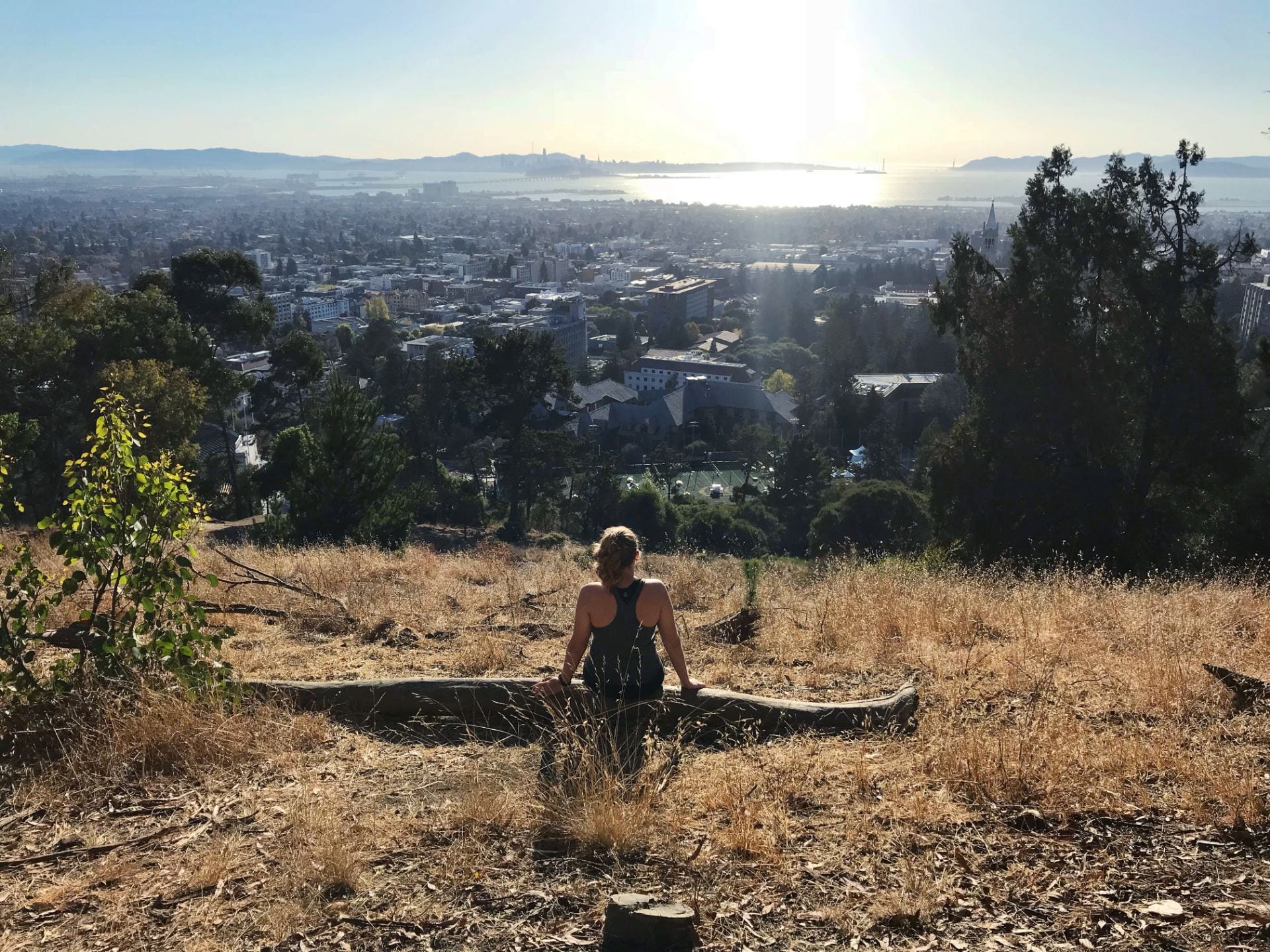
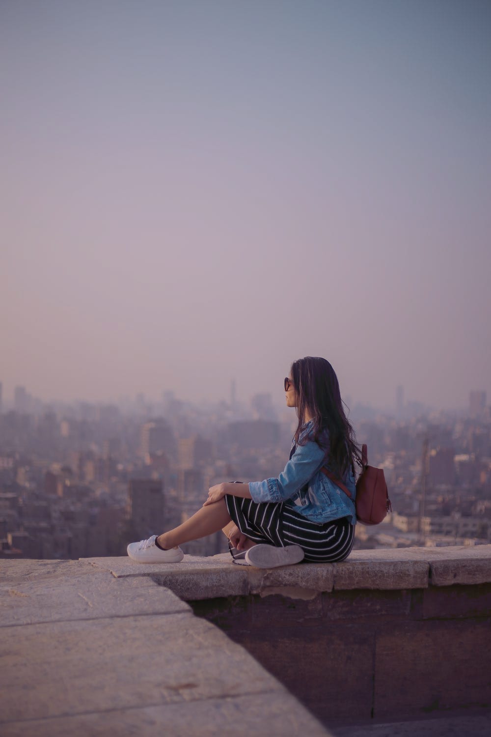
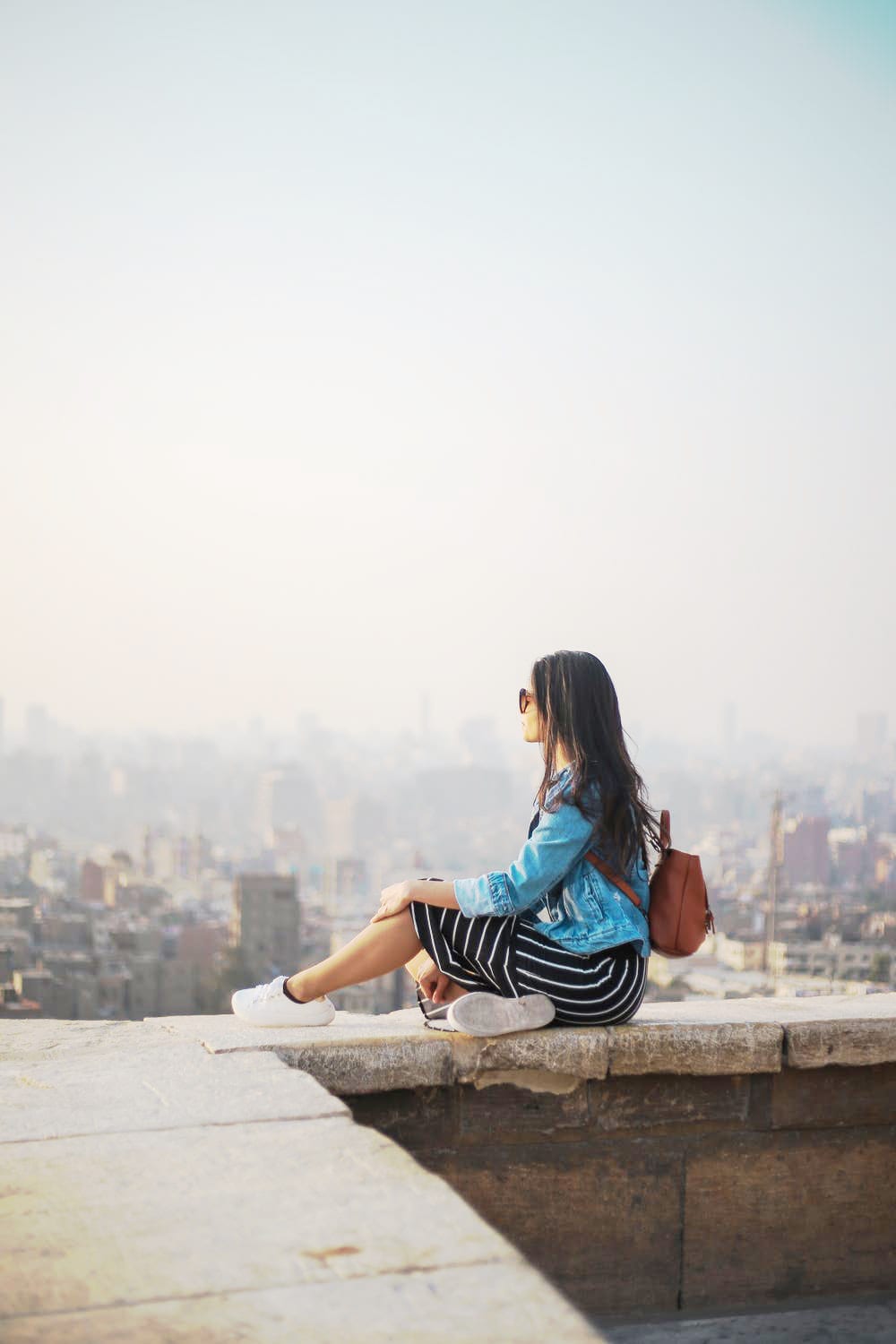
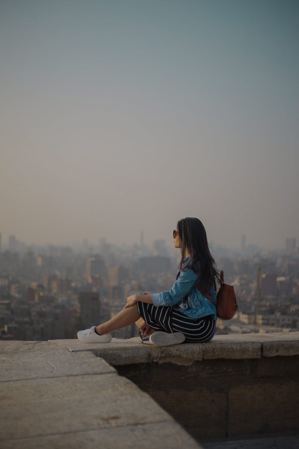
Balance: The inclusion of different components in a visually equal way creates balance. In the photo below, the city and the sky take up about the same percentage of the overall image. Despite the fact that they are very different elements, this allows for a feeling of balance.

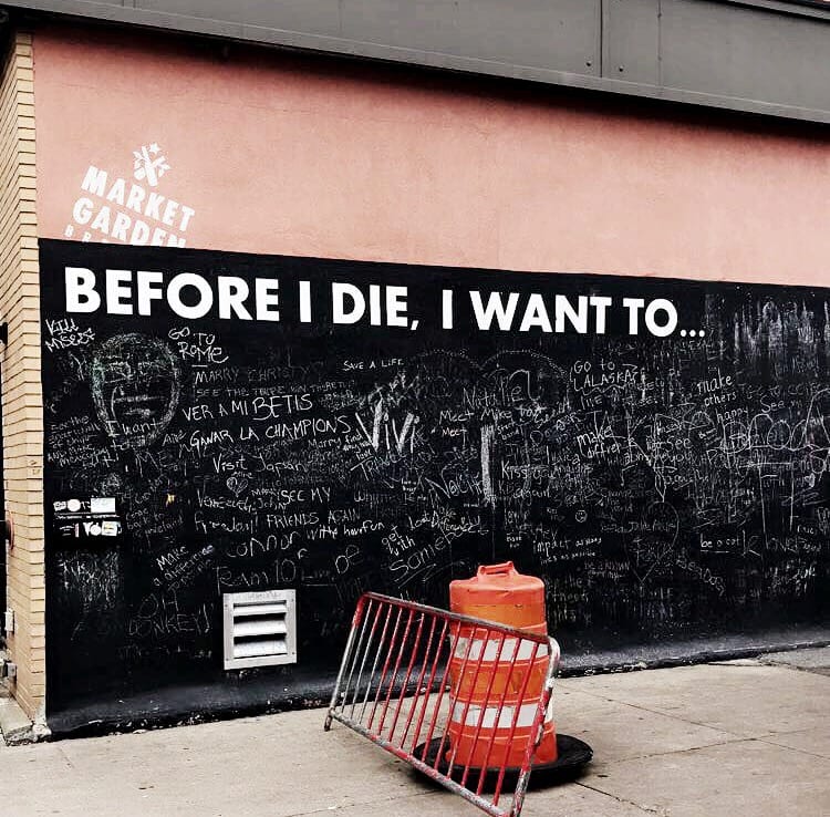
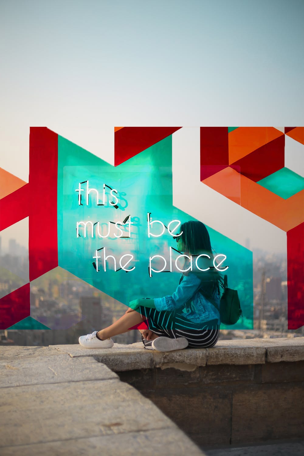
Contrast: Contrast is the use of opposing elements (color, shape, ideas, and more) to make a statement in an image. The white text on the black wall in this picture make the message stand out and become the most important part of the scene depicted. This contrast is created by using opposite colors.

Emphasis: Emphasis draws the viewer’s attention to an especially important object or area of a photo. In this example, the background is dull and includes few details. In contrast, the foreground is bright and much more saturated. This makes it obvious that the boots are the focal point.

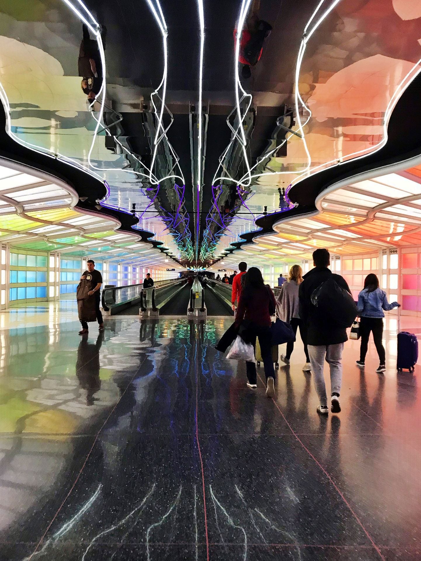
Movement: A variety of elements can give the perception of motion within a photo, which is movement. The snapshot below contains people mid-stride, so it can be inferred that they are walking through the space. The linear direction of the lights on the ceiling adds to the sense of forward motion here.

Pattern: Patterns are recurring designs throughout an image. The image below contains fabrics with repeating plaid designs in them.

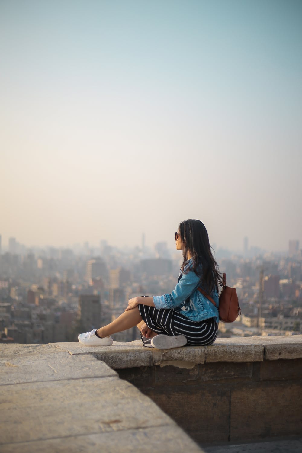
Proportion: Proportion refers to the size that one element appears compared to another. In this example, the person in the foreground is the largest object in the image and many details are visible. The buildings and landscape behind appear much smaller in comparison as a result of the distance portrayed.

Alignment (repetition): The organization of different objects in a linear or repeated manner is known as alignment. The LED hexagon art piece in the photo below create a visually satisfying effect using this principle.

Unity: Combining many elements in a balanced and aesthetically pleasing way creates unity in an image. In the photo below, there are many different details present in the room shown. The colors, shapes, and lighting all balance out these details in a way that feels even and together.

Exploring Blend Modes

This week, I used different blend modes from six different blend mode families to explore how different effects could be created both with additional layers and duplicate layers of an image.

Normal Blend Modes

Normal (original image)

The above image utilized the Dissolve blend mode. I actually used an image of confetti stars and adjusted the colors so that the dissolve blend would create the look of the stars being stamped on top. The dissolve mode clears certain pixels where an edge is detected, making it great for chalky or starry effects.

Darken Blend Modes

For this image, I used the Darken blend mode family to create a vignette around the photo. I created a duplicate layer of the original image and applied the Linear Burn blend mode. Linear Burn will darken the base color of the image, which can help make a photo such as this one appear as if it was taken at a different time of day. Other darken blend mode edits are below.

Darken

Multiply

Darker Color

Color Burn

Lighten Blend Modes

As seen here, Lighten blending modes can do the opposite. I wanted to contrast the work I did with the Darken family, so I again used a duplicate layer of the original image and ended up using the Screen blending mode to increase the exposure of the photo. This makes the photo look lighter and brings more attention to the subject because lighter areas will be screened lighter without a significant effect on the darker areas. This can also make the photo appear as if it was taken at the brightest time of day. Other lighten blend mode edits are below.

Color Dodge

Linear Dodge

Lighten

Lighter Color

Contrast Blend Modes

I also wanted to experiment with typography and superimposing additional images for this project. I used the Pin Light blend mode from the Contrast family on the top layer to create this image. This blend mode makes all areas that are 50% grey transparent, so I was able to combine the images in a way that played off of the geometry of the second photo. See below for other edits of this image using the different contrast blend modes.

Overlay

Hard Light

Linear Light

Soft Light

Vivid Light

Hard Mix

Comparative Blend Modes

The Subtract Blend mode of the Comparative family on the above image. I wanted to experiment with a number of very different aesthetics on the original image, and I added a layer of a light leak photo to create this dark, burned effect. The Subtract blend mode will examine and compare the colors in both layers, making the photo much darker as it subtracts pixel values. Other comparative blend mode edits are below.

Difference

Exclusion

Divide

Color Blend Modes

I used the Saturation blend mode from the Color family to combine an image of a fence with the original image. This mode will blend elements of the base layer (luminosity and hue) and elements of the new layer (saturation). By adjusting the opacity and selecting an appropriate photo for the new layer, I was able to create a subtle geometric effect and the appearance of a colorful filter on the image. Other saturation blend mode edits, including many with colored gradients, are below.

Hue

Color

Luminosity

Tiny World

I believe space has a personality. The aesthetics of a particular space heavily affect my immediate impression of the space. Spaces that I have particular emotional connections to have the ability to evoke a variety of feelings. For my “tiny world” image project, the space I chose to photograph was the Oval area of Ohio State’s campus on a snowy morning. I have a strong emotional connection to Ohio State because of the growth and memories I have experienced here and this space is representative of that to me. I work part-time as a tour guide while in school and I walk across this space through all types of weather talking about how much I love it, so it has a special meaning to me. I believe this is an example of how space can reflect something larger about ourselves. As a college student and proud Buckeye, it is easy to relate to this space because it feels like home to me. I feel very personally connected to this space because it is a symbol for so much more that has happened in my life and a constant throughout my time in college.

I knew immediately that I wanted to photograph the Oval for this project because I love the area and how it looks during this time of year. I followed the instructions from Spoon Graphics’s YouTube tutorial closely because I am still working on becoming more familiar with Photoshop. I found that using my own photos was much more difficult than the “tiny worlds” that I created in class. It was difficult to edit a photo with lots of people walking to class in it, and I had trouble adjusting the sky around the trees. I ended up using the clone stamp tool for the majority of this. Other tools I used frequently in this process include the eraser, opacity adjustments, free transform, and spot healing tools. Using my own photos was a new challenge for me but ultimately allowed me to use new techniques to achieve my desired results.

Tattoos and Freckles

I used a number of tools to remove the tattoos and freckles in this photo, which was a very experimental process for me. I began with the freckles, mainly using the spot healing brush on the content aware setting to do so. I adjusted the brush softness based on the area, and used the create texture setting on the larger areas of her cheeks. The tattoos were a bit more difficult, and I alternated between using the spot healing brush and the clone stamp tools. I had the most difficulty with the lighter colored tattoos that covered large areas of her arm. I ended up using the content aware healing tool, then going over it with the “create texture” setting to even out certain areas.

I then placed her on a new interior background by uploading a new photo and anchoring it as the background layer. I used the quick selection tool to outline the general background around the person, then used the de-select option of the quick selection tool to make sure I had all of the areas of her hair that I wanted to include before deleting the original background. This was much more difficult to do than the last photo I worked with (which was a nature landscape and required less exactness than a person). I used the eraser tool to work on the layer of the person, adjusting the opacity and softness as I went. This helped the hair and other softer areas of the photo look more natural against a new background.

This was a learning experience for me not only in terms of figuring out how to make the desired edits effectively, but also in becoming familiar with the platform and workspace as a whole. I understand the difference between destructive and non-destructive editing now, a new concept for me. I became much more comfortable with some tools, particularly spot healing and quick selection. I would like to become more familiar with ways to make people look more natural on new backgrounds as well as how to smooth out skin. I also had some trouble learning the patch tool, which I would like to be able to use more effectively. I feel much better about trying new things in regards to editing and being willing to go back and redo things differently when something does not produce my desired result.

Lava Field

I chose to replace the grass and the sky in the lava field image, adding a mountain background and trees instead. I used the selection tool to select the areas that I wanted to delete and moved the layers so that the original lava field was highest. I mostly used the quick selection tool for this. I struggled with using the magic wand tool on areas like the rocks that contained lots of similar colors, so I switched to the quick selection tool for that reason. On the following images, I used the desaturate feature on the mountain layer, the posterize adjustment on the rocks layer, and the flip vertical transformation on the tree layer. I wanted to experiment with the ways I could alter certain layers in respect to the whole photo.