Blending are done between layers in Adobe Photoshop. There are six families of blending modes: normal, darken, lighten, contrast, inversion and component.
Normal Blending Modes
Normal family only allows adjustments of the opacity of the images. The above image shows (from left to right) the normal mode and dissolve mode in 50% opacity.
-
Normal mode

The image above shows the normal blend mode with 50% opacity. This mode only allows the typical adjustment of opacity. 100% opacity will result in completely opaque top layer, while 0% opacity will result in completely transparent top layer.
-
Dissolve mode
 The above image shows dissolve mode with 50% opacity. The only difference with normal mode is the sharper resulting layer, revealing some pixels/noise of the top layer.

Darken Blending Modes
Darken blending modes will turn the resulting image darker. White will be invisible while others are darkened. There are five types of darken blending modes (left to right): darken, multiply, color burn, linear burn and darker color.
-
Darken
 Darken blending mode choose to retain the darker color between the two layers, so the resulting image shows all the darker colors.
 -
Multiply

Multiply blending mode blends both layers’ colors and the resulting color will always be darker than both colors.
-
Color burn

Color burn blending mode gives similar result to burn tool, which increasing the contrast and decreasing the brightness based on both layers.
-
Linear burn

Linear burn is similar to color burn, but the brightness decrease is based on the lower layer. In this image, the red part was originally the brightest part. However, since this blending mode depends on the lower layer, the resulting image is darker than color burn.
-
Darker color
 Darker color bending mode is similar to darken mode, but it determines the darker color based on the combination of all channels instead of just one channel at a time.


Lighten
 Lighten blending modes will turn the image lighter. Black will be invisible and white will retain. Other colors will be lightened. There are five types of lighten blending modes (left to right): lighten, scree, color dodge, linear dodge (add) and lighter color.
-
Lighten
 Lighten blend mode, similar to darken blending mode, compares both layers in each channel and retains the lighter color.
 -
Screen

Screen mode blends the color and lighten the image based on the top layer.
-
Color dodge

Color dodge mode is similar to dodge tool. This mode reduce the brightness of the image by reducing the contrast between the two layers.
-
Linear dodge (add)

Linear dodge (add) is similar to color dodge, but it increases the brightness of the lower layer based on each channel.
-
Lighter color

Lighter color mode is similar to lighten, but it observes the composite of all channels instead of each channel.


Contrast

The contrast blending modes increase the contrast between two layers by brightening the bright colors and darkening the dark colors. There are seven types of blending modes in this family (left to right in the above image): overlay, soft light, hard light, vivid light, linear light, pin light and hard mix.
-
Overlay
 Overlay blend mode always shows the background image. If the blend layer is dark, it darkens the mid-tone color in the background layer. If the blend layer is bright, it lightens the mid-tone color in the background layer.
 - Soft light
Soft light is like overlay, but with softer contrast. As seen in the image, the contrast in the above image is lower than the contrast in the previous image.
- Hard light
 Hard light is also close to overlay, but with more intense color from the blend layer because it does calculation of the brightness values based on the blend layer, not base layer like in overlay.
 - Vivid light
 Vivid light is like overlay, but with higher contrast. Since the calculation is based on the base layer, more colors from the base layer can be seen in contrast to hard light.
 - Linear light
 Linear light is the combination of linear burn and linear dodge, which are stronger than multiply and screen that are used in previously mentioned contrast modes. It looks similar to hard light but with more extreme colors.
 - Pin light
 Pin light combines darken and lighten blend modes, which are stronger than linear burn and linear dodge. Thus, the color appears more solid than in linear light. However, the mid-tones are removed from the blend layer, as seen at the center of the image above, that the color of the trees in base layer looks green like in the original image.
 - Hard mix
 Hard mix only shows basic colors based on the original values. As seen in the image above, only white, yellow, black, magenta and red are present. No shades of colors are present.


Inversion

Inversion determines the differences in the base layer and the blend layer and produces a new appearance of the blend layer as explained below for each blend modes. From left, the image above shows blend modes of difference, exclusion, subtract and divide.
- Difference
 Difference calculates the differences of the values between the base and blend layer and shows the result in the appearance of the blend layer. The black color in the blend layer is removed in this blend mode as shown at the bottom of the image above. The white color will invert the color of the base layer negatively.
 - Exclusion
 Exclusion is similar to difference, but the mid-tones are converted to gray as shown in the middle of the image above.
 - Subtract
 Subtract uses the base layer color values and subtract them with the blend layer values. The resulting image looks similar to difference, but the mid-tone values are darker instead of negative, as seen in the middle of the image above. Black color on the blend layer appears transparent.
 - Divide
 Divide is the opposite of Subtract, where dark colors in blend layer produce brighter color (at the bottom of the image above) and bright colors in blend layer is more transparent, showing the base layer (in the middle of the image above).


Component Blending Modes

Component blend modes use primary color components, which are hue, saturation and brightness, to change the blend layer. Hue can be described as the color with respect to blue, red and yellow (not black and white) such as in rainbow. Saturation can be described as the intensity of the color, which the primary colors have the highest intensity while gray has the lowest intensity. Brightness can be described as bright or dark, with white as the brightest and black as the darkest. From left, the above image shows hue, saturation, color and luminosity.
- Hue
 Hue changes the hue to the blend layer while preserving other color components (luminosity and saturation) from the base layer. Black and white has no hue, so the image appears grayscale at that part as seen at the bottom of the image above. The color seen other than grayscale is from the blend layer such as the magenta color in the above image.
 - Saturation
 Saturation takes the saturation from the blend layer while preserving the brightness and hue from the base layer. The black part of the blend layer is also transparent and produces grayscale image like in Hue blend mode since there is no saturation associated with black or white. The part of the blend layer with higher intensity shows a more vivid color of the base layer.
 - Color
 Color takes the luminosity from the base layer while taking the hue and saturation from the blend layer. The black part of the blend layer also makes the image looks grayscale. The resulting image looks like Hue blend mode but with different saturation because they take it from different layers.
 - Luminosity
 Luminosity takes hue and saturation from the base layer and luminosity from the blend layer. The black part of the blend layer appears opaque in 100% opacity since black has a high luminosity because it is the darkest. The color looks similar like in Saturation blend mode because they take hue from the base layer. However, they have different luminosity and saturation because they take it from the opposite layer, making the image looks negative as compared to applying Saturation blend mode.


 This image shows multiple lines used in a hallway. The different lengths of lines add depth to the image by using perspective technique.
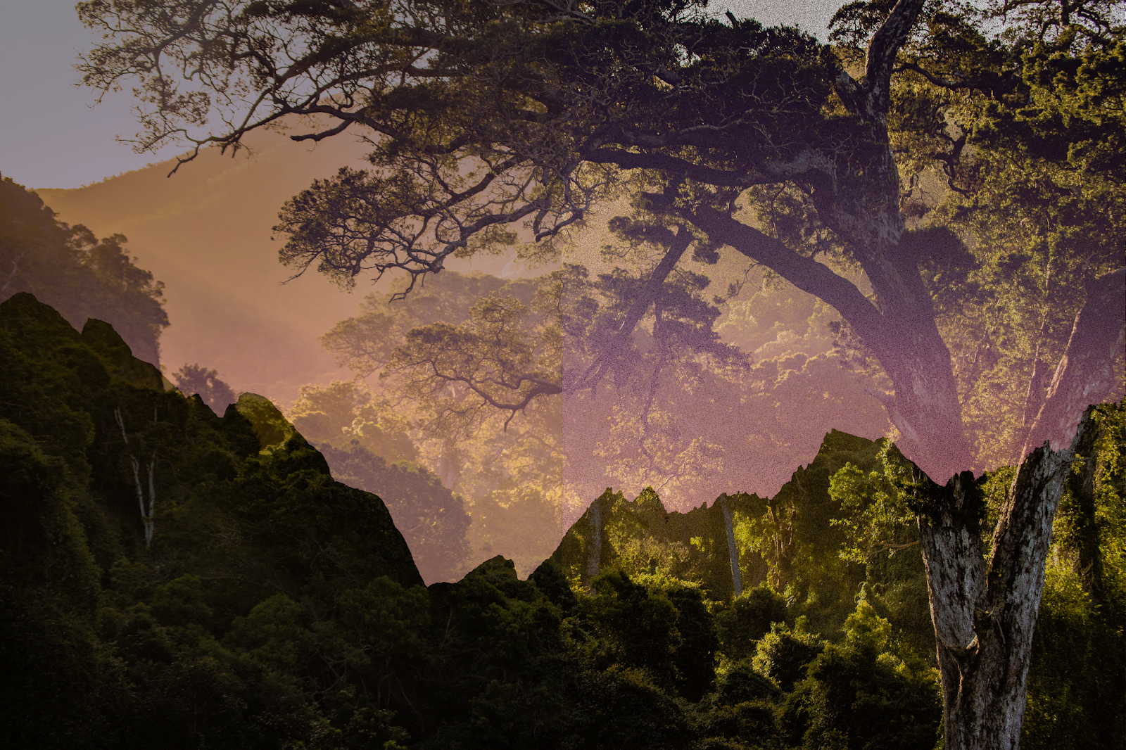
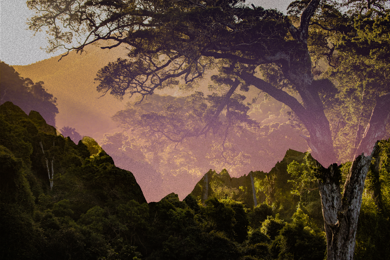
 The above image shows multiple colors, especially shown by the middle tree. The transition of red to green as demonstrated by the tree from top to bottom shows that colors can be continuous although they have different properties. The variant colors also gives the mood of happiness in the image, especially on a sunny day.
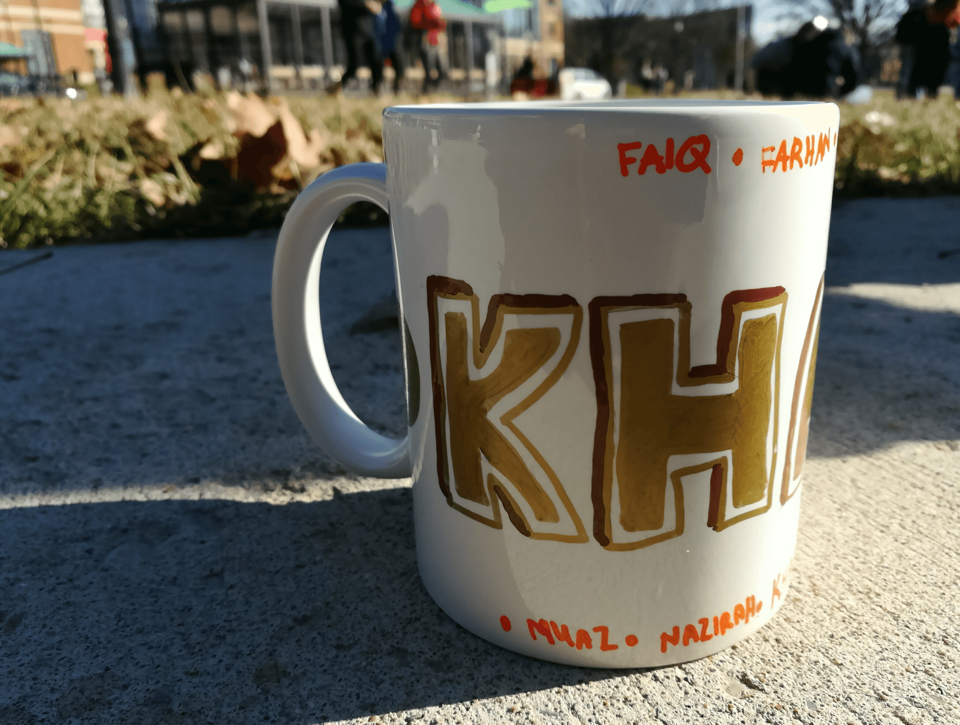 Value is the different shades of color, demonstrated by the shadows on the mug in the above image. The brightness on the right of the mug and darker color at the left show the direction of the light, in this case the sunlight. This also gives the hint to the viewers of the time the picture was taken. Since the light seems to be from a lower source, the picture might be taken in the evening or in the morning.
 Form demonstrates the depth of 3-dimensional objects. In the above image, the objects are clearly 3-dimensional based on the different values they have at certain parts. The shadows at the bottom also prove that the objects are 3-dimensional.
 Space is important to draw the attention of the viewers to a specific object. In the above image, the sky acts as an empty space to draw the viewer’s attention towards Statue of Liberty.
 Balance is the existence of a symmetry line in an image. The above image has a vertical symmetry line at the center, which the right and the left part are almost exactly the same. Thus, there is balance between the right and left parts of the image.
 Contrast can be identified from any criteria of an image. The image shown above demonstrates the contrast in brightness, which the trees on the left are bright while the trees on the right are dark. Contrast may also be identified through numbers, color and other properties, but there is usually an imaginary line that clearly separates between the two opposite criteria.
 Emphasis may be shown through its distinct properties apart from other part of an image. In the above image, the group of flowers is emphasized by focusing on it and blurring the background. This principle will draw viewer’s attention to the flowers.
 Movement in an image is usually shown through a continuous line demonstrating the movement path of an object. The above image shows that the water is flowing down the rocks, demonstrated by the continuous line of the water. This principle increases the sense of viewer in imagining the situation of the place.
 Pattern is a principle in which something is repeated multiple times. In the above image, the hexagon-shaped lights are repeated several times to be like a bee-hive pattern.
 Proportion shows the different size of an object with respect to another object. In the above image, the sign looks obviously larger than the building on the right. Since the building should be larger in the real world, viewers can conclude that the sign is nearer than the building based on the proportion.
 Alignment is similar to pattern, but arranged in a line. The image shown above shows some flowers grown in a line instead of spread throughout the field. Viewers may also extend their views outside of the image, which there are more flowers in the line.
 Unity is the principle that is used in most real images since the objects are arranged in a unified way. The above image shows the unity in nature. Although the bamboo hut is manmade, it unifies with the river and the trees since it is made of bamboo, which is natural. The color reflected by the water in the river is also green, which unifies with the green trees along the side of the river.
 This whole image was created using two separate images: a panoramic image and a full body image. The tiny world was created by first changing the size of the long panoramic image to a square. Then, the image was rotated upside down. After that, polar coordinates filter (in distort category) was used to create the tiny world. On another layer, clone stamp and spot healing brush tool were used to remove any unwanted effects from the filter, such as the meeting point of edges and the stretching effect of the sky.


 A new layer (Layer 1) was created and spot healing brush tool was mainly used to remove the freckles. This tool uses samples from all layers to take the color of the skin while not directly applying the changes to the original layer. It was my first time using the healing brush and it seems easy for simple images. However, removing freckles are quite hard because there are so many freckle spots and it needs to be clicked one spot at a time to make it look good. Moreover, the spot healing brush produces more pinkish color than the skin should be, resulting in a patchy skin.


