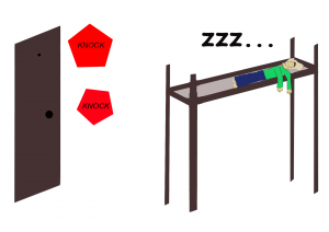
This top quality comic is left somewhat ambiguous. The true story is that our card reader was out of battery and I needed my roommate to let me into the room. However, anything could be knocking at the door making this a spooky Halloween comic. The comic was primarily composed using the line and pencil tools. While the original image was very poor and jagged, I focused on editing the image to be more clean. Additionally, the image is designed in 3D which helps the viewer to see the room in perspective. The color is meant to bring out contrast between my roommate and his surroundings. Additionally, a bright red was given to the text bubbles so that one feels the imminent importance of the matter.
Posts
Poop Wine
This limited edition poop wine bottle is exactly what you expect from a limited edition wine. The classic taste of poop is exactly what customers around the world have been waiting to drink. The bottle and ingredients are completely recycled to have protect the environment. Additionally, the wine s very cheap, only around $1000 total after 99 payments of $9.99. The alcohol content is not listed because the wine is actually virgin. The wine is even endorsed by someone who is not Barrack Obama. This product is sure to revolutionize the wine industry and will likely lead to numerous copy cats from other brands. Make sure to pick up my wine of choice: Poop Wine.
Uncommon Knowledge
The above image is the first edition cover of the soon-to-be #1 selling magazine among martian colonists. The cover features a background layer featuring an eye catching rocket launch. Additionally, the planet makes the cover seem more adventurous. The mask tool is used for some text while other text is colored to fit the background it is sitting upon. Most of the text features content that draws the readers’ attention. Another background image of Pluto is visible the bottom left corner of the magazine. This fits well with the space theme and adds context for the amazing Pluto article which may surprise you.
360
The above picture was taken at the intersection of 3 hallways in my dorm. I chose this spot because there are many different paths and orientations in the shot. The panoramic photo gives a VR perspective that seems warped or distorted without 360 viewing. The point of view is in many directions at once which makes the photo more broad and unfocused. In this particular picture, one can see down each hallway. This effect makes it seem has though there are many layers to the photo. Additionally, the field of view is extremely massive. The photo could be improved by making sure that it is aligned in a more straight horizontal fashion.
Filters
The car on the left is a picture I took from a car meet. The filter was chosen to make the area seem snowy although there was no snow that day. The picture on the left is from my backyard in Cincinnati. The trees and lake are meant to look like a painting, so the sponge filter was used to achieve this effect. The picture to the right is my cousin and super fashionable dog.
Long Shot
#AllNatural #NoMakeup
I edited these from my friend Kat who I usually use to make memes. The right picture was edited to make her look good though she does look pretty crazy in this picture and Photoshop can only do so much! The left image is my attempt to make her Johnny in the here’s Johnny meme. The image on the right i overlayed onto the image o the left (just in case you are blind). The eraser tool was used to try to make the overlay look a bit better but ultimately the blending did not look very natural so I certainly need more practice.
Ants to Falcons
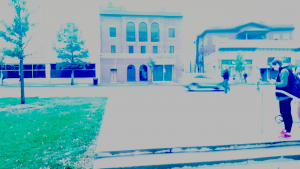
The purpose of these photos are to show a ground, standard, and bird’s eye view. The left-hand ground photo was edited to make the lamppost more red with an evil appearance. The middle standard photo was made brighter and more vivid except for a small sign which was emphasized by making it was darker and surreal. This is designed to draw attention to the sign and make the rest of the photo seem more lively. Finally, the right bird eye view photo was edited by changing the color of a large part of the floor. This is to make the floor appear to be covered in a strange green gas.
The Doges
Many temperature, Wow!
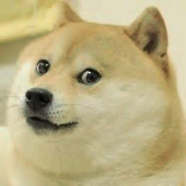
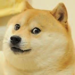
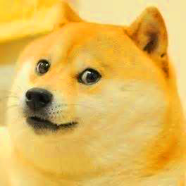
The middle image is the default from the Doge meme. The default doge is caption-less and plain which was chosen because it is a good place to start editing. I choose to make the right Doge warm to make it seem like it was warming up by a fireplace. This is suiting because many dogs enjoy doing this during cold days. The left Doge is cold Doge. I decided to make him only moderately cold because Doge is generally a warm and playful character who would reasonably try to stay warm. Most of this editing was accomplished by using selective colors.
Phases of Dat Boi
IT’S YA BOIS
The above images are from a meme known as “Dat Boi”. I decided to make the base boi cyan because cyan is a much more vivid color than the standard green boi. This was done using selective colors. The underexposed middle Boi is meant to seem as though he is fading. The effect I was trying to achieve was a pause in the fade animation on Powerpoint. The final right Boi is overexposed to look like he is being abducted by aliens. I thought this was suiting because Dat Boi is clearly not from this planet and needs to go back to his people occasionally. These edits were obtained by using the exposure tool. Together they are your Bois.
