In January 2023, the STEMcoding Data Science team had the opportunity to try out some of our new activities with 9th and 10th grade students at Metro Early College High School in a two-week course we called “The Art of Data”. College of Education grad student Jessica Kulp and OSU actuarial science student Gowrav Mannem worked with Prof. Chris Orban and a teacher from Metro to deliver the course.
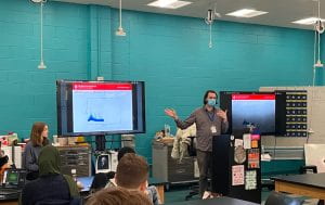
Prof. Chris Orban and grad student Jessica Kulp discuss good figures vs bad figures as part of a short course on “The Art of Data” at Metro Early College High School. Image Credit: Gowrav Mannem
To introduce the course, we spent a couple days discussing what makes figures ‘good’ or ‘bad’, how to represent data effectively, and the purpose of visualization. The ideas distilled from this discussion then guided students in creating their own visualizations throughout the course. Below is an example of a bad figure:

Example of bad figure. Students pointed out the confusing bin labels, lack of title, and questioned the appropriateness of a bar graph.
Students pointed out the confusing bin labels, lack of title, and questioned the appropriateness of a bar graph. This is ‘bad’ because the purpose of the visualization is unclear.
Students then completed our updated Air Pressure Activity, and a new Solar Panel Activity

Sample data from Air Pressure activity (using Excel). Pressure measurements are taken using the Arduino Science Journal app, which reads from the sensors built into most smartphones and tablets. We took pressure measurements at regular increments while walking up a flight of stairs.
The students’ data did not turn out as clearly linear as our sample data, as they had a limited height range to work with (one flight of stairs). However, this led to a discussion about how to assess the fit of a trendline and how to treat outliers, which were not originally planned topics for this activity.
The Solar Panel activity asks students to investigate whether the efficiency of a solar panel has declined over time. The dataset used contains daily measurements of energy produced over the course of five years. This activity gives students experience working with a large, messy dataset to build essential spreadsheet skills, such as sorting data into columns and using functions to sum and average.

Scatter plot of the solar panel data. There are clear seasonal variations within each year, but also a subtle downward trend from year-to-year. Students must take a closer look at each year in terms of summed or average energy produced.
Students also briefly explored probability through two activities: Free throw probabilities, and weighted dice.
We borrowed the free throw activity from Tap Into Teen Minds. Students worked collaboratively to determine the likelihood of three different outcomes of a real basketball game: Win, tie (overtime), or lose. Students had to think critically about what the probability is for making a given shot. Is it a 50/50 change of making the shot? Should they consider the player’s free-throw percentage from this game, or from the whole season?
A weighted or loaded dice is one which is unfairly weighted to land more often on some sides than others. We asked students to formulate a plan for how they would investigate a suspicious die. Groups of students came up with a variety of ways to collect and analyze data from dice rolls using spreadsheet software. In reality, none of the dice students tested were intentionally unfairly weighted, but all groups found an average roll value of 3.7. This was surprising, as we expect an average of 3.5 for a fair die. This led to a valuable discussion about sample size and sources of error.
We couldn’t fit all the STEMcoding Data Science activities into this short course, but some of our other activities (Earth Day and Night Sky activities) are demonstrated here in the data science playlist on the STEMcoding YouTube channel.