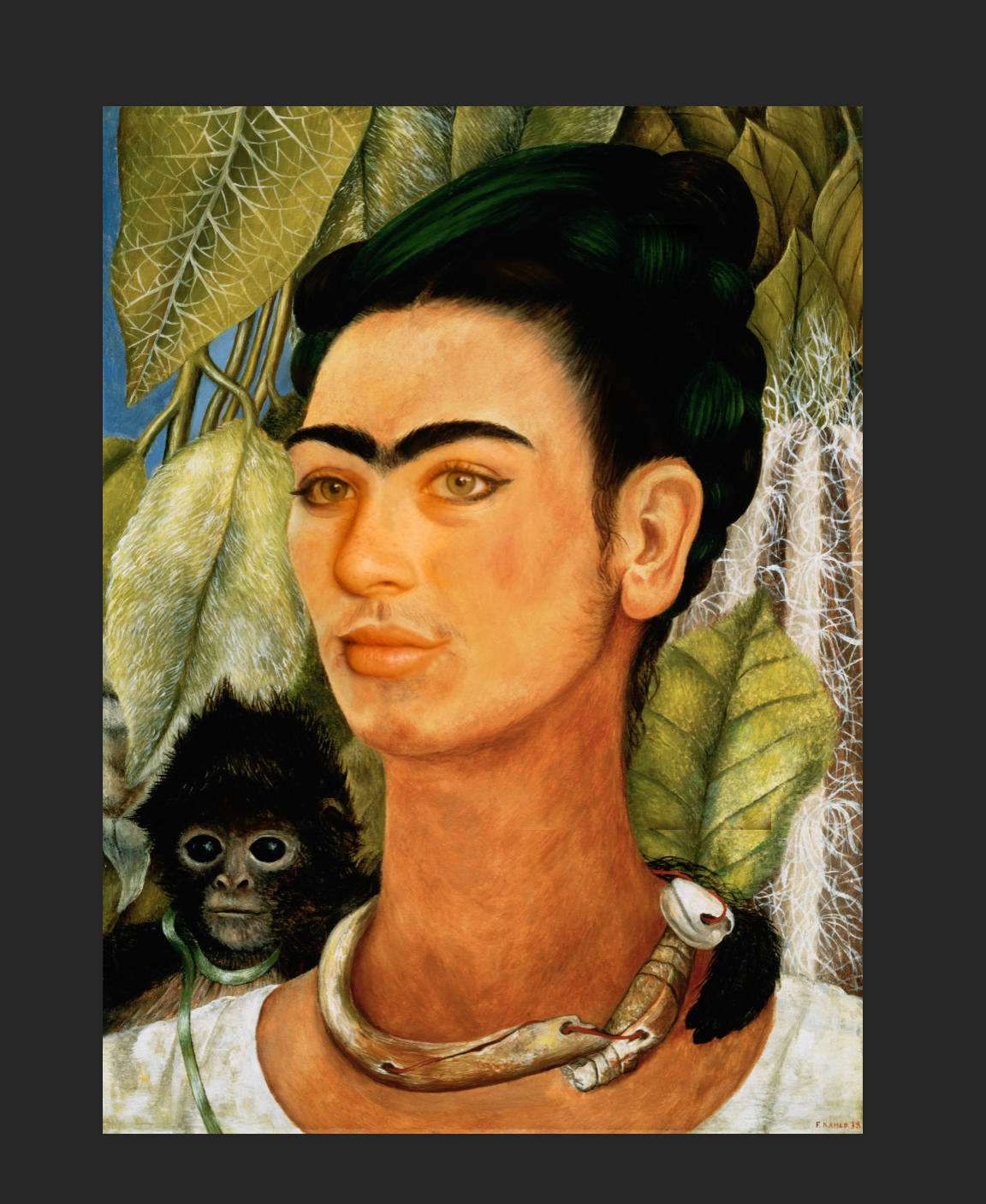
Postcard

To create this postcard, I first worked in illustrator. First, the words Sedona, Arizona were typed out. To make the letters pop, I went up to the effect tab, dropped down to 3D and chose extrude and bevel. From here, the photos of red rock were imported into the piece. A picture for each letter was needed. To get the letter to be masked by the image, the letter was dragged over the image and the object tab, clipping mask was used. A background was added, then the entire piece was exported to photoshop where a paper effect was added and some extra text.

I chose Sedona because this is a place that I have loved to travel to ever since I was a kid. My family used to go there every year. The crystals in the background were chosen because I also love the side of Sedona that surrounds the superstition of magic and the vortex.

final

 The Timeless Woman

The topic and idea behind my piece of art is Feminism. The three different layers of women are meant to represent a passing of time. The achromatic women signify the past, the colored, abstract women represent the present, and the woman in the alternate universe symbolizes the future. A future which is female! This idea is important to discuss because even in today’s society there is not gender equality. It is still a persistent issue that plagues our world. I tried my best to avoid cliché images like peace signs and the female gender insignia, but I wanted to incorporate women in the piece, because after all, they are the muse and the subject. Just like women deserve to be herd, they deserve to be seen. I hope the viewer sees the time lapse I tried to incorporate into the piece and realizes that even though equality is closer, we are not nearly there. The background displays road signs to symbolize these roadblocks women face when trying to gain their power.

One of the most important elements I incorporated in my piece is the use of color. To start, the background is muted, portraying the idea that the world is still moving without always thinking about this issue. Pink was used throughput the piece to give hints of femininity. And ultimately, the neon colors of the future were used to create an idealistic view of what is to come, a sense of bright hope. Shape is another element that is emphasized. The mountains symbolize the climb and hardship women face to earn their rights. Again, the shape of these mountains is recreated with the women of the past, and the present women, giving the idea that since the beginning, women have stood strong. The principle of emphasis is used in the silhouette of the woman that encompasses the piece. Within her mind is the main idea, a colorful future and a dark past. The contrast from the background gives a sense of idealism.

When designing this piece, I decided to use the opacity tool to mute out the background layer. This allowed for a brighter emphasis on the mind going on in the silhouette. I saturated all of the colors within the mind to show the stark contrast of the ideas in her head to her surroundings. The magic wand tool and magnetic lasso were both heavily used when cutting out the shapes of the women. The eraser tool was used to cut out the space around the woman of the cuter and the spaceship. Image rotation, scale, and distortion were used to fit the pieces within the silhouette. Color channels were played with as well as brightness and contrast.

I was not present for the peer critique. But I was here for the class critique. The comments were all positive explaining that the color choices all were very pleasing. It was also noticed that the shape of the mountain was repeated throughout the shapes of the women. I was pleased that people understood and could see my ideas coming to life. One student said that he liked that the flowers and past started at the bottom and it all culminated in the futuristic, more in depth imaginary scene. Although I didn’t get much feedback on how to change or improve the piece, I liked being able to hear the feedback of what other people saw within my piece. Ultimately, I left my submission the same as it was before the critique.


Citations


http://charlestontileremodeling.com/testimonials-3/


http://www.safetysign.com/products/2643/caution-sign


http://www.champion-america.com/traffic-parking-signs/traffic-signs/caution-signs/traffic-caution-sign-caution-22304.html


http://rebloggy.com/post/art-trippy-moon-psychedelic/41027425514


https://pitchfork.com/thepitch/when-feminism-meets-music-great-songs-that-sample-radical-speech/


https://www.kcet.org/shows/lost-la/the-womans-building-las-feminist-mecca


https://mic.com/articles/87809/23-ways-feminists-have-made-the-world-better-for-women#.EubqjR9ri


http://www.wewomen.com/key-debates/10-feminist-icons-that-didn-t-stand-for-sexist-bullsh-t-s428999.html


https://www.pinterest.com/pin/371547037980803036/?lp=true


https://www.irishtimes.com/culture/film/feminism-has-been-a-dirty-word-for-a-long-time-the-untold-story-of-women-s-liberation-in-the-us-1.2409006


https://www.tumblr.com/search/flower%20png


Portrait Edits

To create frequency separation, a copy of the background was made. The gaussian blur was applied to the copy to the point where no details were visible. The result will be gray. Linear light is then applied. you use the lasso tool to select certain parts of the face and feather the details to create a softer look. along with the frequency separation, the dodge tool is used to add highlight to the face and the burn tool is used to create shadows. The color of the eyes in both photos were enhanced and changed.


Final Project Brainstorming

Topic being explored:  Equality & Feminism

  • Why does this topic interest me?
    • I have always been interested in the topic of feminism. Equality has always been an issue I have taken an interested in and both topics together are issues I strongly stand for.
  • What do I already know about this topic?
    • Both equality and the rise of feminism are controversial topics. Many disregard them altogether or refuse to acknowledge their reality.
  • What do I want to learn about this topic?
    • How much of an impact their recent movements have made and the transitions that have been made from the beginning of the origins of equality and feminism til now.
  • What are cliché images and ideas relating to this project that I want to avoid?
    • equal sign, gender symbol, peace signs
  • Why should other people care about this topic?
    • Because it is an issue that our country has been facing for decades. Not only is it a very real topic, but it degrades people we all know and ultimately affects us all.
  • How can I discuss this object visually without falling back on overused imagery?
    • By looking at a broader, more abstract picture I have some ideas involving the “shattering of stereotypes” and the rise of female dominance
  • How do I get people interested in this topic with my work
    • Make the piece intriguing and something that triggers people to think. When art is interesting, people want to talk about the subject matter intertwined within it

Group Joiner Project

Our Composite With Paper

Photoshop Automated Creation

Our Photoshop Composite

For me the most frustrating part of this project was using photoshop. It is not always easy to manipulate the pictures how you would like them to look. Also, for some reason, more abstract pieces of art are harder for me to develop. Maybe this time it was due to the fact that it was a group effort and we all had to decide on the piece together as a whole. If I am being honest, my favorite part of the assignment was putting the composite together on paper using the old methods of scissors and glue. I think that this also was the most successful medium we used.

Using a computer to manipulate images the way you want to is more difficult. You can never truly get the organic shapes you may desire. Even though the computer continues to become more advanced, it is not as creative as the human mind. Photoshop was not able to make the same decisions as us because it a predetermined automated piece. It cannot manipulate the work the way we desire.

Hockney views photoshop as a sort of stale representation of art. Making every pictures without flaw and extremely edited takes away from its creativity. The photo just isn’t the same. He thinks that there is a loss of personal connection when using the computer to generate the work and ultimately lose some of its human experience. I agree. All these computer applications can be helpful to an extent, but allowing them to create the art themselves takes away the connection and meaning. It makes the work more lifeless and flat. When the computer is added it can be a co-creator, but in my opinion art requires human interaction and creativity so it should not be the sole creator. Humans are the creators of art, the computer is just a tool for us to enhance art.

Composites

To create these composites, multiple pictures were layered like a collage. I started with the ocean scene as the background layer in the piece above. From here, I added the city scape and used the gradient tool to blend its features into the background. Finally, I used the magnetic lasso tool to crop from its original background and placed it into my piece, editing it final features to get the desired effect.


In-class composite:

In Progress Screen Shot

The painting I used to crop my face into is called Time Flies by Frida Kahlo. I chose this painting because I have always loved Kahlo’s work and the idea she has of purity of herself. She doesn’t try to alter her facial hair and often embodies strength in her paintings. To edit my face onto the painting, I first had to take a color swatch of the painting’s face and a color swatch from mine. From here you use the color curve to obtain the color numbers. Changing the output of the numbers allowed for my face to have a mask layer that matches the color of Kahlo’s. After this, parts on my face were deleted and the obscurity was played with to get a proportional picture. From here, the polygon tool was used to add texture and color back into the picture.

Color

Photoshop Color Manipulation

Greyscale:

To convert an image to greyscale, you go to the tab at the top of the page named image, scroll down to mode, then click greyscale.

Monotone:

To convert an image to monotone you must first follow the steps to convert it to greyscale, then go back to the image tab, scroll down to mode, then choose duotone.

Desaturate:

To desaturate an image you must go to the image tab at the top of the page, scroll down to adjustments tab, and choose desaturate.

Channel Mixer:

To use channel mixer on an image you must go to the bottom right corner of the screen and click the circle that is half shaded. From here you will get a red, blue, and green scale which you can alter the color of the picture with.

Elements of Art & Principles of Design

Elements of Art

Line: Path of a moving point


Color: objects’s chromatic quality


Value: Lightness or darkness of an object’s color


Form: Three-dimensional aspect of an object


Texture: Tactile quality of a surface


Space: Positive & negative areas defined by sense of depth


Shape: Two-dimensional quality of an object


Principles of Design

Balance: Distribution of visual weight


emphasis- putting stress on a particular subject


Contrast: Arrangement of opposite elements


Movement: Object created to guide viewer’s eye


Repetition: Repeated object or shape


Proportion: Relationship of objects to each other


Unity: Combining similar elements to make piece come together as a whole


Pattern: Repetition of visual element