Posts

Gifting Design Process

Statement of Intent 

Concept Statement:

The gift I made for my mentor was a record player spice rack. I combined her love for music and cooking into a cohesive and functional product. I wanted this record player to evoke many of the senses including touch, sound, and taste. Using a dowel rod and cut rings, I constructed a mechanism to make the disc spin. I used laser etching techniques to help enhance the style and look of the record player. To make it more realistic, I etched the QR code of the Ratatouille soundtrack (which is one of my mentor’s favorite Disney movies). This was the sound component I wanted to achieve with the record player. The vinyl holds five containers that can be used to store the different spices.

Using the laser-cutting machine, I made the box and the vinyl. The main materials I used to make this container were MDF, acrylic, and ribbon. The elements/ principles that were activated are movement, space, and shapes. The quote I used was, “Good food is like music you can taste, color you can smell. There is excellence all around you. You need only to be aware to stop and savor it.” – Gusteau, Ratatouille. I used this quote because it reflected the senses I was trying to achieve with this product.

Iteration

Exercise #1 

For our first exercise, our challenge was to make a container/ packaging for any found object of our choice. The object I chose was a tape measure.

Tape Measure Container  

First I rolled a piece of paper into a thick rod and cut a small slit in the middle. This is where the tip of the tape measure will be inserted and the tape measure will be wrapped around the rod. Then I made a small open top box with and drew a picture of the head of a small anteater. I cut the bottom the box so that the tape measure can be pulled out. The goal was to have the tape measure be the “tongue” of the anteater and you can pull the tongue down. The back would have a trivia question- “how long is an anteaters tongue?” – then you would pull the tape measure and it would stop at the length of which the length of an anteaters tongue would be.

Meeting With My Mentor:

I met up with my mentor Hattie. It was nice that we got the chance to meet in person so we could get to know one another. I wanted to know about her hobbies, interest, and her personality. She told me how she loved to cook, she plays multiple instruments, she makes music, and she loves her dogs. Meeting up with my mentor was really fun and she gave me lots of advice about the industrial design program which was the field that I was interested in. This also gave me many ideas about what gift I could potentially make for my mentor.

Brainstorming:

First I made a list of all the things my mentor likes

  • music/ going to concerts
  • sports: soccer/ track
  • plays percussion in band
  • plays piano
  • makes music
  • cooking/ baking
  • Loves her dog
  • was in theatre in high school

First I sketched a few ideas on potential gifts I could make for my mentor.

  • Idea #1 Pepper shaker recipe display: A wooded pepper shaker that has a spinnable rod in the middle that can hold printed recipes. I though of this idea because my mentor mentioned having cooking competitions with her family so I thought it would be nice for her to be able to keep all her favorite recipes in one place.
  • Idea #2 Record Player Spice Rack: this ideas combines both her love music and cooking.
  • Idea #3 Her dog playing Spice Rack Drum Set: This idea combines her love for music, cooking, and her dog. I thought it would be a very funny and memorable gift.
  • Idea #4 Piano/ Drums Spice Rack: the drums hold the spice rack and when you hit the piano keys, the tops of the drums would pop up, opening the lid of the container.

Testing Idea #2

I liked my second idea the best because it was the most developed and aesthetic, so I began to test it and prototype it out of cardstock/ Bristol.

First I made a container by making a net. Then I made a spice rack using with a small hole in the middle. I put the straw through the small hole in the spice rack then glued it to the base of the box. This way it would be able to spin around the straw.

Testing Idea #4

I decided to try my fourth idea but it was really hard to figure out the mechanism to have the piano keys open the spice rack containers. My instructor Deb showed how the mechanism would work.

The elastic is attached to one side of the straw while the other side loops through the bottom and attaches to the lid of the container. The straw structure is attached to the container itself. So when the piano key is pressed down the whole straw structure comes down and the elastic also gets pulled down opening the lid.

I really liked this idea but due to the time constraints there wasn’t enough to time get everything printed/ tested on time so I decided to go with my other idea.

I started to put everything into Adobe Illustrator.

To make the box I went to the Box Generator to make me a box. This box form was a lot more stable because it had teeth to hold everything together.

Box Generator

Inspiration Photos:

Crosley Cruiser Plus Vinyl Record Player

Top View of Record Player 

ByronStatics Vinyl Record Player

Illustrator Files:

First I tried to lay everything out and started designing the top of the box. I tested many fonts for the “The Sounds Of Spices”. I ended up going with Harlow Solid Italic. It matched the aesthetic I was going for which was a 80’s dinner logo. I wanted to laser cut everything on MDF.

I went to the store to buy the spice containers, and measured them. The bottom part of the container was about 3 inches and the cap was about 0.5 inches. For the box I made the bottom 3.5 inches in height and the top box 1 inch tall. I took a piece of string to measure the part between the lid and glass and made that as the holes of my vinyl. I wanted the lids to stick up above the vinyl so I made sure that the circumference was big enough to fit the bottom portion but small enough that it would stop at the lid. I made the width of 0.74 inches.

Record Player

After measuring, I took the dimensions and put them into the box generator. I made 2 open boxes: one for the bottom and one for the top. Then I started working on the vinyl. I made a circle with a 0.74 inch width and height. I duplicated that into 5 using the pattern/ radial function on Illustrator. Then I made a larger circle surrounding all the small circles. I have 3 cut lines: the inner 5 circles, the outer rim, and the tiny circle in the middle for the dowel rod. The material that I am using for the vinyl is black acrylic. I plan to etch the rings to the acrylic. Lastly I made a Moveable Tonearm and Headshell of the Record Player and placed it on the side.

I began to design the tonearm and headshell. I wanted some the details to be etched so I placed the cut and etch details on different layers. Since the tonearm is on the side, I had to make a floating piece attached the the side of the box so the tonearm is able to sit there. I used the slip from methods to make this attachment. I have holes on the bottom, side of the box and a a tab with small projections that wall fit perfectly into the holes.

Vinyl with Fork and Knife

I wanted to put a quote at the bottom of the box so I came up with one that fit the concept of the product: “A balance of flavors that sing together in a harmonious tune. The perfect dish with the perfect pitch.”. I really liked the record player dish with the fork and knife for the logo. I went to illustrate and made a fork, spoon and record player. I wanted everything be 3D so that the words/ vinyl dish pops out. To do this I rastered everything first then cut it out. This way the raster makes all the letters/ logo look darker and it creates a contrast.

Vinyl with Fork and Spoon

Then I made the rings that would make the spinning mechanism of the spice rack.

I wanted to add a musical component to the record player so I made a QR code that scans to the Ratatouille Movie soundtrack, (my mentor really likes this movie and it fits the theme of the product) I wanted the QR code to be located on the top inside of the record player box. I rastered the QR code and found a Ratatouille quote to put at the bottom of the QR code.

The Quote: “Good food is like music you can taste. color you can smell. There is excellence all around you. You need only to be aware to stop and savor it.

Ratatouille QR Code

Iteration and Production:

The set of 3 rings would be stacked and glued together. I take this set of rings and glue them to the bottom of the box. The dowel rod glued at the bottom of the box through the rings. The dowel rode would be around 3.5 inches tall. Another set of 3 rings would be stacked and glued together. After they are glued I would place/ glue them onto the dowel rod about 2/3 away from the bottom. Then I would put the vinyl on top of the rings through the dowel. Then I have another set of rings on top to sandwich it all together/ to keep the disc in place/ spinning. The top set of rings are not glued so that the vinyl is able to be removed and cleaned when needed.

Spinning Spice Rack Construction

Vinyl, Fork, and Knife Raster and Cut

The Letters Rastered/ Printed

Box Made + Design Logo

I glued ribbon to the back of the box to hold the lid and the bottom part together. I chose green because that was my mentor’s favorite color. I decided to leave out the quote and just have the logo. I felt it was more concise and made more sense spatially.

Moveable Tonearm and Headshell of the Record Player:

The Tone arm is also able to move like a real record player would.

The Containers Inside the Vinyl

Quote and QR Code

 Reflection:

Through this project I learned a lot about materiality and how to make a structurally sound and functional product. In the beginning I was going to glue the pieces of the box together but my instructor advised my to use the box generator which created the teeth on the edges so that the pieces would fit together better and the box would last longer. I also had the challenge of making the spinning mechanism more sturdy so stacking the rings and gluing them really helped with that. I have become more efficient and organized when working on illustrator and I am becoming more familiar with using the laser cutter. I’m glad that my mentor likes this gift and it’s something that she can use. I think that it turned out great and I was happy with the results.

Final Product: 

Vinyl With Spice Containers

The Box With Logo Design

Moveable Tonearm and Headshell of the Record Player:

Record Player Spinning

Gifting Gift To Mentor


Checkmate Process

Statement of Intent 

Concept Statement:

For our group project, the theme we chess set is nautical/ Fisherman VS Seamonsters. We wanted the pieces to have a rustic style so we kept the wooden look of the MDF. To fit the aesthetic we wanted the pieces to be very detailed and realistic. I had the mermaid and prawns as the pawns, the lighthouse as the rook, the Loch Ness monster as the knight, and lastly, the shark and spearfisher as the bishop. We used the laser cutting machine to etch and cut all of our chess pieces. We constructed the pieces using slip-form methods. The other pieces of the chess set are made by my partner Anthony Gil. More information on his pieces can be found here.

Ideation

Exercise #1

For our First Exercise, we practiced making 3D Images from paper slip form mechanisms.


Then we started to brainstorm some ideas for our chess pieces.

  • Music
  • Food
  • Picnic
  • Fishing
  • Movies
  • Pizza Toppings
  • NYC

We discussed and thought that Fisherman V.S. Seamonsters would be a good idea to explore. We began to brainstorm what each piece could be on the chessboard.

Then I began to make all the pieces in Adobe Illustrator. I took images found online and used them as a reference to make the pieces in my chess set. I made sure to make the etch and cut lines on separate layers so it would be easier to cut in the lasering process.

First I made my prawns and lighthouse. I traced the Prawn and made the shells that lined the back of the shrimp using slip-form methods. I also made the lighthouse 3D using slip-form methods. I also started to work on the boat for the spearfisher.

Prawn and Lighthouse

Then I made the Shark Bishop, I wanted to make waves at the bottom and a fin coming out of the water.

Shark Fin Coming out of the Water

The MDF we used was approximately 1/8th of an inch. At first, when I made it a 1/8 gap, it turned out to be too loose. For the next print, I made them 1/11 in thick so they ended up fitting together perfectly. We decided to make the bases round and have the creatures stick up vertically connected to the holes of the base.

The Base Pieces

Then I made the Lock Ness Monster and the Mermaid. I wanted the Lock Ness Monster to be partially coming out of the water. For the mermaid I wanted her to be laying on top of a big boulder/ rock so I laser cut different-sized rocks to glue on top of one another to create a solid 3D boulder.

Lock Ness Monster Reference Picture

Lock Ness Monster Chess Piece

Mermaid Cut and Boulder

After I put everything into Illustrator I sent it into the laser machine. I began to cut out all my pieces and assemble them.

Iteration and Production


Some of the pieces were a little loose so we used wood glue to hold everything together.


Assembling the Pieces

Reflection

Through this project, I learned a lot about working together as a team. The best part of the collaboration was brainstorming and coming up with creative conceptsI liked how we got to bounce ideas off of each other. There was a lot of trial and error to get the slip forms to fit but we figured it out together. I learned a lot about making 3d forms through slip-form methods.

Final Product

Anthony’s Pieces


My Pieces

The Board 

Carnival Process

Statement of Intent 

CONCEPT STATEMENT:

For our project, we constructed “hologram” virtual reality glasses. Our concept is an imagined dystopian carnival of the future. After catastrophic events such as war, the terrible results of prolonged climate change, etc., the world is destroyed and nothing is left. The only way humans can escape this tragedy and sadness is through these virtual reality glasses. A chip is placed through the temples and into the brain. This allows the holographic glasses to project in front of the eyes and can be activated at any time. This specific user wants to experience the nostalgic carnival he once loved but is no longer in existence. Once the glasses are activated this user can enjoy what it’s like to be back at the carnival. The user can customize the glasses using filters. In this case, a holographic butterfly floats/flutters its wings in front of the glasses. This is meant to resemble a butterfly face painting one would see at a carnival. The user can take old scavenged things left on earth, and looking through the lenses, transform them into something beautiful. This shows that technology may seem like it is fixing the problem, giving the users a glimpse of utopia, but in actuality, it distracts its participants from the real world. 

The glasses are made out of acrylic and are etched/ cut using a laser cutter. There is iridescent wrapping paper and a printed carnival picture layered on the inside. The butterfly is made out of iridescent and Bristol paper. For the presentation, an edited video is played. This video is a “sales pitch”, promoting our new product. It is an advertisement that shows the users the VR glasses: what it is and how it works. In the beginning, it introduces our brand (POV) and mission statement. It all seems so perfect as it opens the viewer’s eyes to a whole new world of exciting advanced technology. Eventually, the video starts to glitch, revealing reality. A demo of the product is performed: A video plays in the background. The user is seen participating in various games and activities at the carnival but in reality, is holding normal/ “scavenged” things. I designed and made the glasses, and my partner Phil edited the advertisement/ demo video that accompanied the presentations. My other partner Olivia worked on the props and the interactive component of the presentation. 

Our Brand name is POV which is the initials of our first names put together (Phil, Olivia, Vivian) and it also stands for Point of View which perfectly encapsulates what we are trying to present with these VR Glasses.

Ideation:
First I made a web diagram listing everything that a carnival entails.
                                    Carnival Web Diagram
I brainstormed some ideas and made a list of potential concepts to work with. I was thinking of themes relating to a futuristic carnival that reflects a societal problem.
I started sketching out some of the ideas I had on my list and I went on Pinterest to find inspiration.
               
  Carousel Dress            Carnival Cage Dress               Carnival Dress           Carnival Inspired Dress                  Accessories 
I was inspired by this style of dress and I liked the idea of having something inside the bottom of the dress like a carousel.
Idea #1: An underwater carnival. All the land on Earth has sunk underwater. Humans have evolved into mermaids. It is a carnival for mermaids and it reflects the environmental problem of water pollution.
Pictures:
           
          Mermaid Scales                              Mermaid Skeleton                       Ocean Pollution                                Ocean Pollution
           
         Plastic Bags in the Ocean                               Fish Wearing a Mask                    Soda Can Jellyfish                      Breathing Mask
    
                 Skeleton Dress                               Fish Made out of Forks
Sketch #1: The Mermaid Carnival 
This is a mermaid wearing an opened soda can that resembles a jellyfish inspired by the picture I found on Pinterest. Attached to the bottom of the dress is a carousel made up of trash and seahorses. The bottom of the carousel is a plastic plate. The ruffles on the neck are made up of plastic soda can holders and string. The mermaid is holding an animal (jellyfish) balloon but in reality, is holding a used plastic bag that is tied to look like a jellyfish. The mermaid is wearing a mask that helps it breathe in the murky polluted waters. You can see the mermaid’s skeleton and its bottom fin is broken.
Idea #2: The world is destroyed, and humans have reached full capacity, The only thing left is to build up. A carnival in the sky only for the rich and elite. The poor live below and do not get to see the sunlight. Differing social economic classes are seen on a larger scale. Inspired by the film parasite.
       
                               Cage                                                                     Cage Design                                                                   Cloud House 
            
                   Gold Feather Accessory                                             Gold Feather Top                                                    Gold Feather Dress
     
                               Gold Wings                                                                  Gloves
Sketch #2: Carnival in the Sky 
This would be the dress that the rich/ elite would wear to the carnival in the sky. The dress is made out of “real” bird feathers/ wings. There is a bird carousel on the inside with doves as the horses. The dress floats on a giant cloud. This concept depicts a world in the sky; the main article of clothing that would be used is bird wings/ feathers.

Idea #3: A carnival hosted by Animals. Animals are the spectators. Humans now perform shows, races, etc. Animals rule the world and have gotten revenge on humans.

Idea Sketch #3: The Carnival for Animals
I again went with the dress with the base opened style. A lion/ human is wearing a dress- on the inside of the bottom is a cage with humans on the inside. The lion yells “tickets to see the human show!!”
We discussed as a group and we all had similar ideas of having a futuristic dystopian setting. We were leaning towards the idea of technology taking over the world (robots/ AI running the world.) We collectively agreed on the idea of virtual reality. The concept we went with was the idea that life on earth is destroyed and the only way to experience a carnival again is through virtual reality.
Idea #3: Virtual Reality Carnival. The world is destroyed. The only escape is through VR. No more social interactions. A perfect world/ society can only be achieved through a screen.
            
     Metal Eye Piece                       Glass Butterfly Glass Accessory                      Dystopian World                                     Dystopian World
           
     Face Mask Accessory                          Disneyland Dystopia                            Eye Piece                                          Light-Up Glasses
           
            Butterfly Chairs                           Face Painting                                    Face Painting                               Face Painting Templates
       
                         Air Purifier Mask                                                       Glowing Glasses                                                 Glowing Red Visor
Idea Sketch #3:
For this design. I wanted to make virtual reality glasses shaped like a butterfly across the eyes. I wanted the butterfly to resemble a face painting that would be seen at a carnival. I drew a wing-shaped earpiece attached to the glasses. I put ribbons on the arms and these sensory finger pads/strings on the hands. Those are the pads that send electrical impulses so that you can feel things. I thought it would be interesting to try and replicate a VR experience, so I thought of making a box that a person can step into and then project a 360 picture/ video on all four walls.
Exercise #1:
For our first exercise, we were randomly given a body part, a carnival game, and a theme. The goal is to create a body augmentation with these three things combined. Our group got an ear, a ring toss game, and got lost. We came up with a bunny earring toss game. We designed a headpiece with bunny ears attached to each side. The ring to toss onto the ear is a large hollow carrot.
Rabbit Ears:
       
       
Carrot Ring:
    
Final Product:
The bunny ears are made out of thick cardboard and pink felt. The two ears are attached to a headband made out of thick metal wire. The hollow carrot is made out of thick cardboard and it is covered in green and orange cardstock. We presented the game as a lost bunny trying to find its way home as the player tries to successfully toss the carrot ring onto the bunny ears.
Exercise 2: 
For this exercise we used DALL-E Open AI to generate pictures that would help give us inspiration for our project.


I also wanted to explore virtual reality and 3D Spaces. I downloaded Unreal Engine 5 and experimented with 3D spaces. I learned how to import objects into space and manipulate the objects around them. To make the Ferris Wheel I took a regular small wheel and made it large and placed it on top of a pillar. Then I imported house balconies and put them on the wheel.  For the carousel, I again took a wheel enlarged it and made it the base. I put fences underneath, lining the bottom of the wheel. For the top of the carousel, I placed house roofs together floating above the base. Finally, for the entrance, I put arches and pillars together.
                                                    
                                                                                                      Unreal Engine 5

Then I begin to work on the VR glass design.

First I roughly sketched out the shape and some of the designs on top of the glasses.
I wanted the shape of the glasses to be very sleek and minimalistic so I eliminated the side ear pieces. I took inspiration from Pinterest to make a futuristic design on the surface of the glasses.
VR Glass Sketch:
I wanted the glasses to look like its floating in front of the head/ eyes so I came up with a design to have the earpiece hooked onto the ear and then have a block attached to the earpiece extended outwards. The VR glasses are attached to the blocks making it look like it’s floating in front of the eyes and the sides of the head. I made space for changeable lenses so that different pictures can easily be inserted into the glasses. For the butterfly wings, I wanted to be attached to the front of the glasses. The butterfly wings resemble a butterfly face painting you would see at a carnival.
I took this design and put everything into Adobe Illustrator. I used these dimensions to make the glasses.
VR Glasses and Butterfly Design Test #1:
Glass Illustrator Construction Test #1:
The initial plan was to have the rim of the glasses to be made out of Bristol paper. Both the back and the front of the glasses are connected. The dotted red lines are worn the paper would be folded which leaves a little space (the black dashed lines) for the changeable lens. I took this design and put it into the laser cutter.
Initial Design Laser Cut:
Clear PVC Sheet and Metallic Basket Gift Bag:
I traced the shape of the lenses onto the clear PVC sheet and on the clear holographic paper and taped it on the inside of the glasses. I wanted the glasses to look like it was a hologram floating in front of the face. Using this metallic paper material gave it a reflective rainbow glow and helped achieve the look I was going for.
Test #1 Glasses:
       
The Bristol was folded leaving a little space/ gap for changeable lenses. There are also flaps on the top to hold the lenses in place. The clear and holographic paper was glued onto the inside.
Final Outcome of Test #1: 
In the beginning when I made the rough sketch of the glasses on regular paper; the paper was much thinner so it was bendable. It was able to bend without making any definite creases in the paper. With the double layering of the Bristol paper in addition to the space I left in between for the changeable lenses, it made it a lot harder to bend the same way as the regular paper did. The Bristol was making crease lines and it was hard to fold. I had to come up with a different format.
Then I tried to make a prototype of the floating glasses.
Glasses Outside View:
   
Glasses Inside View:
   
Glasses Inside/Top View:
     
Glasses Top View:
   
Glasses Top View:
   
Iteration and Production:
When I tried on the glasses I realized that there was no support to hold the glasses up so that it floats in front of the face. The glasses kept falling in front of the face because it was too heavy and off-balanced. Because of time constraints, I decided not to do the floating glasses and have the normal-shaped glasses with curves for the ears.
I got a real pair of glasses and I traced the ends (curved ear parts) and put it into Illustrator. I still kept the same design but added the ear curves to the ends. Instead of making space for the changeable lenses, I changed them to tabs to make them thinner and bendable. This time I decided to make it one layer instead of two layers.
I began to put in the design for the front frame and the front butterfly wings.
I wanted to print out a panoramic of a carnival and glue the two pictures back to back so you can see the carnival in the front and on the inside of the glasses.
      

Panoramic Picture MN State Fair

I tried using a different material, something similar to matboard, to cut out the glasses. This material was much thicker and was able to fit on the face better. But using a mat board I was not able to have it bend the same way that paper did. The creases were inevitable, I could not get it to bend smoothly like in the shape of a half circle the way I did with the regular paper.


Matboard Material


As I was laser cutting the Bristol I realized that the designs on the lenses were way too small and they fell apart. Some of the pieces weren’t attached to the rim so some of the designs flew away in the cutting process. The Bristol was a very flimsy and not very stable material to work with.

      Bristol Material
The Designs on the Front Lenses
                                                             
Front Butterfly Design
My instructor Deb suggested that I use an acrylic material to make the glasses. First I lasered the design on the acrylic
      
Design Etched onto Acrylic
I re-lasered the glasses which includes both the design and the rim of the glasses. We then used a heat gun to melt the acrylic and slowly molded it into the shape of the glasses. Using this material helped solve a lot of problems I was running into. Using the Bristol paper, I could not etch anything because the lens of the glasses had to be clear/see-through. When I tried to cut out the designs; they were way too small and could not stay in place. The acrylic had much more stability than Bristol paper. With the acrylic, I was able to both etch and have see-through quality.
         
After I had the glasses made; I put the finishing touches on to make it look more like a hologram. I first taped the clear Metallic wrapping paper on the inside of the glasses. Then I printed out the panoramic pictures of the carnival and taped them on top of the metallic paper and also on the inside of the glasses.
   
    
Front View of the Glasses
Previous Butterfly Design
New Butterfly Design
The original butterfly design I had did not match the look of the glasses so I decided to change it. I took out the colored cardstock and replaced it with clear iridescent paper.
      
Final Butterfly Design
Inside the Glasses
Phil’s Video Presentation
For Phil’s section of the project; using Davinci Resolve, he edited the advertisement/ demo video that accompanied the presentation. 
Olivia’s Section:
Olivia worked on the interactive portion of the project; making the props for the presentation and also coming up with ideas for the project.
                                                           
Cotton Candy Prop
                                               
Glasses Prototype
Reflection
Through this project, I learned a lot of materials. Each material I experimented with had very different qualities and fit on the face. It took a lot of trial and error to determine what material would provide the most stability for the glasses while also achieving the look/ aesthetics I was going for. I learned a new technique of melting down acrylic and molding it into my desired shape. I liked how it turned out that in the end, I was able to etch onto the acrylic and still have that see-through effect. What I found most frustrating was my idea of the floating glasses on the face didnt work and due to time constraints, I went back to the regular fitting glass design for our final product.
This was our first group project, so I learned a lot about working together as a team. The best part of the collaboration was brainstorming and coming up with creative concepts. I liked how we got to bounce ideas off of each other. All my group members had great ideas and our ideas were building off of each other. The most valuable tool in this collaboration was that each person had different strengths so it was easy to divide up the work and determine what each person would focus on in the project.  I think that each person’s strengths were well showcased in the outcome. There weren’t many challenging parts during this collaboration. We were on the same page most of the whole time. Maybe little disagreements on ideas here and there but we compromised and worked through them together.
Final Product:
       
       
VR Glasses Without the Butterfly
       
       
VR Glasses With the Butterfly
Final Presentation:
POV Commercial
POV Tech Demo
POV Demo With Footage

Dynamic Page Process

Statement of Intent 

Concept Statement:

This stop-motion animation visually illustrates a prince and princess’s waltz. The music starts slow as the two lovers descend the stairs, making their grand entrance. They join together at the foot of the stairs. As the music begins to pick up, the two lovers dance in a warm, close embrace across the large ballroom floor.

Paper folding techniques are implemented to create the structure of the staircase. The Cricut machine cuts the cardstock of the final images of the prince and the princess. Movement and space are the main principles activated in this composition. We used a waltzing song, Johann Strauss II – Blue Danube Waltz (Andre Rieu’s version), as the background music. This was a group project and Shana was my Partner. I worked on the video editing portion and Shana worked on the stop-motion animation. We both made the characters that were seen in the video. 

Ideation:

Exercise #1: Audio-Visual Score

For our first exercise we “visualized a score” that represents 10-15 seconds of a piece of music. We were able to manipulate shapes including squares. circles, and triangles. We must use principles such as scale, repetition, and positioning will influence our visual score. We could use a range of Hues, Color Values, and varying Opacities.

The song I picked for this exercise was West Coast by Lana Del Rey: the first 17 seconds of the song. I picked this song because the introduction has multiple components like drums and guitars that sounded like an interesting piece to put together visually.

West Coast by Lana Del Rey [0:00-0:17 secs]

First I made a 17” x 11” Illustrator document in landscape orientation. I put a horizontal line across the middle of the page. This horizontal line is used as a reference e when considering the dynamic placement of shapes.

Horizontal Line

First I did the drums for the song. I decided to make the drums a mix of ovals/ circles. The drums are a consistent component of the song, so I placed them in the middle of the page, overlapping the line. The circles/ ovals are a mix of black and yellow. The lower bass drum is placed lower on the line and the higher/cymbal-like sounds are placed higher above the line.

Drum Line

In the song, there is this background noise/ sound effect that is played. There is a set of two and it repeats multiple times in each set. It sounds like it’s growing ascending upwards. To represent this, I took a triangle and manipulated/ stretched the points. I used repetition and made them ascend the page. They start small and then slowly increase in size as you move across the page. I made them different shades of blue starting with light and going to dark blue.

Background Sound Effects


Then I made the guitar sounds out of a peach horizontal squiggly line. The higher notes are placed higher, the lower notes are placed lower on the page. Every time the guitar slides down the fret (neck) I made a vertical squiggly line to connect the top note as it slides to the bottom note. These are bar chords, so I made the squiggles placed over one another like a 2 step staircase for each chord.

Lastly, I put these waves at the start of the line to represent the static that can be heard in the beginning of the song.

Final Outcome


Exercise #2:

For the next exercise practiced cutting and folding templates for paper mechanisms. I chose to do the Flexagon Repeating 4-frame Rectangular Animation Contraption.

Flexagon Repeating 4-frame Rectangular Animation Contraption

Exercise #3: 

Using paper mechanisms we made a pop up card that revealed a hidden layer. First I folded a piece of paper in half so it looks like a card. Then in the front cover of the card I made a small horizontal cut in the middle of the page. On one bottom of the slit I drew one half of a flower. I took a separate piece of paper and drew the other half of the flower. Below the half flower I then drew a small bee. I cut this out and stuck the bee into the slit in the front cover. The final result was a flower that the top half is able to be lifted to  reveal a Bee “hiding” inside of the flower.


Then we began to brainstorm potential songs we might use for the video:

  • Tyrants Catfish and the Bottleman
  • Do I Wanna Know Arctic Monkeys
  • West Coast Lana Del Rel
  • Take Me Out Franz Ferdinand
  • Softcore the neighborhood
  • She Harry Styles
  • Cry Baby The neighborhood
  • The Perfect Girl Maurex
  • New person same old mistakes
  • Hey You Pink Floyd
  • Music to watch boys to Lana Del Rey
  • I Know The End, Phoebe Bridgers
  • Glue Song beabadoobee
  • Die For You Joji
  • Good News Mac Miller
  • Gilded Lily Cults
  • For Lovers Lamp
  • Once Upon A Dream Sleeping Beauty (Instrumental Version)
  • Johann Strauss II  Blue Danube Waltz (Andre Rieu’s Version)

Then we search for interesting mechanisms/ designs we could use for our video.

Origami Dome

Origami Dome

Paper Folding Stairs


3D Staircase

3D Waves

Yoshimura Polyhedral Pattern

We decided to do a stop motion animation of a waltzing/ dancing scene. First we brainstormed what we wanted the setting to be. We wanted to do a large ballroom with a grand staircase in the background. We decided to use the 3D mountain wall video tutorial to make the staircase. We downloaded and printed out the template.

Stairs Template

Cutting out the Template

Final Staircase

We went on Pinterest to find some inspiration and pictures we could use as a reference make the characters.


Waltzing Picture #1                                Waltzing Picture #2                                   Aurora                                   Cinderella and Prince

I took all these images and put them into illustrator and made the waltzing characters.


Putting Pictures into Illustrator


Making the Characters


Adjusting so that all the Characters are the Same Style


I made one version with just the outline of the character and the other with the details. This way we can print out the outline in Bristol as the base. Then print the individual details on different colored cardstock.


Details in the Suit and Dress

All the Pieces Together


Then we started to cut all the pieces out using the Cricut.


Detailed Cuts


Base Cuts for the Characters

At first we wanted to take the detail pieces and trace them onto the colored cardstock. Then we realized that that the pieces were too small and hard to cut by hand so we decided to use the Cricut to cut the detail pieces as well. After cutting out the pieces we layered them on top of the base pieces.


Iteration and Production:
Then we started to make the stop motion animation. In the beginning of the video, we wanted the to make the characters move down the grand stair case and meet together at the bottom. we couldn’t get the characters to stand up by themselves on the stair case so I decided to video edit them going down the stairs.
First I took pictures of the characters and turned them into png images [outlining them so they have a transparent background.] I used the Bazaart app on my iPad.
Then I imported these pictures to Cute Cut a video editing app on my ipad. First I put the background with the stairs in the background and placed the png pictures of the 2 characters on the top.
Then in each frame I moved the characters slightly down the stairs with a total of 36 frames
Video Edited Stop Motion Animation
                   
                   
Then for the second part of the video we set up the dancing scene and this time we moved all the pieces by hand. Shan took a video on the phone and took pictures every time she moved the pieces.
Hand Moved Stop Motion Animation


After we finished both sections, I combined the 2 videos and placed the song in the background.

Reflection

Through this project I learned how to do stop motion animation using both physical movements and editing tools. We used a combination of apps to achieve the final video. I learned a lot about good craft, especially when making the staircase. It was challenging to get all the folds to stand up and we found out that if we scored the paper too deep then each stair would break off, so we were very careful when making our final staircase. This was our first group project, so I learned a lot about working together as a team. The best part of the collaboration was brainstorming and coming up with creative concepts. I liked how we got to bounce ideas off of each other.


Final Product

IMG_4457 (3)

Layers Process

CONCEPT STATEMENT:

This constructed composition visually illustrates the idea of time and how it evokes a sense of deep space. The concept of this design showcases the different ways we tell time. The front side shows how we can use the sun, moon, and stars to tell time while the back side shows the gears that can be found inside a clock. It represents how the intricate inner workings seen in the universe can be mimicked on a smaller scale mechanism. Both convey a sense of deep space as our universe feels like it has infinite depth with no beginning or end and the complex workings within the gears (to make a clock run) present themselves as a world of their own.

The use of layering emphasizes the depth component within this composition. Light is implemented to reveal the hidden element of the numbers on the clock and the stars in the background. Movement, space, and shapes are the main elements/ principles that are activated. There are working gears in the clock as well as a swinging moon to resemble a pendulum on a grandfather clock. The Cricut machine is used to cut out details while the laser cutter cuts the larger pieces. The final deliverables will have all the layered paper placed in a framed shadow box.

Ideation

Exercise #1: 

For our first exercise, we pick a specific font for our initials. The challenge is to incorporate a hidden element within the negative space.  The hidden element must communicate something about oneself. The illustrations must be in Adobe Illustrator and lasered/Cricut cut.

First I went on illustrator to explore the potential  fonts I could use: Franklin Gothic Heavy, Bauhaus 93, Eras Bold ITC, Britannic Bold, Berlin Sans FB Demi Bold, Forte, Franklin Gothic Demi

Testing out Different Fonts 

Bernard MT Condensed 

The font I chose for the final cut was Bernard MT Condensed

I began sketching ideas on what I could potentially include in the negative space. I wanted to include some of my favorite hobbies such as traveling (the plane), doing puzzles, art, and playing guitar.


Sketch Ideas

Then I took all of these designs and put them into Illustrator. Using the pen tool I drew each object and placed them into the negative space.

Illustrator Designs

I choose the fish and guitar for my final design. The two fish swimming in opposite directions is the symbol for Pisces which is my zodiac sign. I created 2 different layers: one for etching and one for cutting. All the lines were cut except for the etched dots of the fish’s eyes. I made sure that each letter had no more than 3 puzzle pieces. I used recycled MDF I found in the laser cutting room.

Initials Cut Using Negative Space

Exercise #2

For this exercise, we turned off the lights and chose an object of our choice to shine a light onto it. Our challenge was to draw an image we saw in the shadow created by the object. I chose my phone charger as the object to shine the light on. On one side of the charger, I saw a frog and on the other side, I saw the top view of a hotel building.


Shadows are seen on each side of the charger 

The Frog and the Hotel 

Then I started brainstorming things that have a sense of deep space.

List of Things that could be considered Deep Space

I begin to sketch out my ideas. The first idea I had was music/ sounds. I was inspired by the circular and “layered” seating arrangement in an orchestra. Music arrangements can be complex with multiple different instruments that play at the same time. Each instrument plays something a little different; whether it’s harmony, melody, or rhythm. All the intricate components weave themselves together to create a composed piece of music.

Idea #1 Music 

For my second idea, I wanted to do a cave/ forest/ body of water with the hidden element of a monster or giant creature that can only be seen when light is shined into the composition. The first image is a boat drifting into a cave but in reality, it is going into a shark’s mouth. The second image is another bout floating into the water, but a large octopus lurks at the boat’s bottom. The last image is a deep and dense forest and with the light shined on it we will see the glowing eyes of a creature/ monster in between the branches.

Idea #2

The third idea I had was “House v.s Home”. The construction of a house can be considered deep. There is a lot of engineering when it comes to building a large stable structure: hundred of wooden panels and structural supports. But a house is only 4 walls. What makes a house a home? The things that happen inside, the memories made, and the moments shared. Without the light there only the house would be seen: the structure, wooded panels, roof, doors, windows, etc. The light on it will reveal a family inside the home, pictures on the walls, the pets, the couch, etc.

Idea #3

For my fourth idea, I wanted to do the human body. Our feelings a very complex and deep and experience many different emotions. I also wanted to include body structure metaphors.

List:

  • heart beating (out of my chest): nervous, anxious, excited, broken-hearted
  • Eyes: windows to the soul,  crying tears
  • stomach: butterflies, pit in the stomach
  • heavy shoulders
  • Head: head in the clouds, confusion,
  • Light on my feet

My fifth idea was time: visually illustrating the idea of time and how it evokes a sense of deep space. I sketch/ list all things that reminded me of time.

I came up with many different ideas so I decided to move forward with this concept. I thought it would be an interesting topic to explore further.

List of Ideas for Time Concept

I wanted to include movement in my composition to illustrate that time is in motion. I came up with some potential mechanisms and concepts for this idea.

Idea #1: Mechanism I came up with a spinning clock design that can pull apart into an hourglass. I wanted to make the sand in the hourglass spin so that it looks like it was falling into the bottom of the glass. The numbers on the clock would be the negative space so the lights shine through.

Spinning Clock and Hour Glass

Idea #2: Mechanism One side of the circle shows a clock while the other side is a picture of the earth. The whole structure would flip and the clock would spin using a handle. This represents time moving and the earth spinning.

Spinning Clock

Testing the Mechanism: Spinning Clock With Handle Using Brass Fastener 


Earth and Clock Movement 

Idea #3: Calendar A calendar but when the light shines through it you can see that the days are crossed off.

Light Up Calendar 

Idea #4: Aging I wanted to show that aging is a part of the time so for this design, I have a young girl but when the light is shined through reveals an old lady with the light showing wrinkles.

Aging Person

Idea #5: Season changing/ Trees Growing. Each layer would be a different season so winter would have snowflakes layered, autumn with layered leaves, summer with sun rays, and spring with fields of flowers.

Idea #6: The Inside of a Clock. With this design, I wanted to show all the gears working inside the clock. It gives a good sense of deep space in a literal and metaphorical way. It shows that the concept of time is deep and also the intricate workings within the gears; the engineering to make a clockwork is complex and presents itself as a world of its own. I added doors and stairs to emphasize the depth and the human-made aspect of the idea.


Gears Working Inside a Clock 

Idea #7: Time is an Illusion. For this concept, I wanted the design to be very distorted and with optical illusions. Portals to different dimensions and question what time is. (inspired by the twilight zone intro: Twilight Zone)

Since I had so many ideas, I tried to combine some of my favorites into one harmonious concept. I wanted to have some type of movement in my piece so I decided to move forward with the gear design. I wanted a clock inside but I also wanted to show how we use the sun to tell time. I came up with another design that tries to incorporate both of these things.

Idea #8: Using Celestial Bodies to Tell Time.

Clock With Sun, Stars, Moon, and Earth 

Since the framed shadow box can be seen from both sides, I have the Earth, moon, and stars in the front and the clock gears in the back.

Gathering Pictures for Inspiration:


Gears                                                      Spiral Clock                             Optical Illusion


Clock With Gears                               Clock Galaxy                         Using Stars to Tell Time


Gears                                       Layered Paper Illusion

I begin making small scaled prototypes to physically visualize all my ideas.


Celestial Bodies and Gears

I start putting everything into Adobe Illustrator


Clock + Stars, Sun, Moon, Earth 

For the Gears, I traced one tooth (of a gear) then went to object< repeat<radial to make the repeated tooth structures on the gear. Then I made a circle and united both of the shapes. I did the same steps again making the design inside the gears ( the repeating lines) then made a hexagon shape in the middle and joined the shapes together. Finally, I made a small hole in the middle. I wanted a set of three gears to spin so I took the one gear that I made, duplicated it, and made 2 smaller ones.


Making the Gears

All the Layers 

After making all the layers I printed a couple of them on the Cricut (small-scaled) to test out how the cuts look.

Test Cricket Small Scale

The Cricket wasn’t good at cutting the details in the numbers and gears so I decided that I would use the laser cutter instead for more precision. Before going to to the laser cutter I finalized all my images on Adobe.

I changed the clock so that all the numbers are lined with stars. First I made one star and turned it into a grid. Using the repeat function I made a radial pattern and then lined it up with the numbers.

Clock With Stars 

Using reference pictures, I made the craters on the moon. Then with the gradient tool, the moon fades from dark grey to light grey. I did this so that I could raster the details later.


Moon Reference Picture Moon Reference Picture

Making the Details of the Moon

I started making the Earth and then positioning all the planets in the orientation I wanted them to be cut.

 The Moon

Planets Layered Together 

Layers on Top of One Another

Iteration and Production:

First I realized that the gears wouldn’t work because they aren’t the right size to fit with each other so I found a picture of working gears and use the same method I did before to make them.

Gears Reference Picture

I wanted to make the gears 3D so I wanted to attach 2 gears and make a hollow inside. I wanted to do something similar to a YouTube video I found where the gears are made with 2 pieces of paper and a paper tab that connects each tooth.

Clock Gear Out Of Paper  YouTube Video

For each gear, I extended the length of each tooth so that later it can be folded and glued to the other gear.

Extended Tooth Gears 


Gears Folded 


Each Tooth Tab Put Together with the Other Gear’s Tooth Tab


Each Gear Tooth Glued Together 


All Layers are Ready To Print.


Printed Layers 

The moon, earth, and sun were supposed to be in alignment but this made it look like the planets were stationary while in reality are in motion. I changed the position so the moon and earth are off-centered to appear like they are moving in space.

Earth Moon Sun in New position

I thought that the front side with the sun, moon, etc. did not look interesting enough so decided to add the movement of the moon. I turned the mood into a pendulum to resemble one found in a grandfather clock.

I begin to work on all the mechanisms in this composition such as the swinging moon and the moving gear. I planned to glue multiple circles together to make a small stack that can fit through the circle of the gear. I glued the stack onto the clock layer and centered the middle hole on the gear onto the stacked circles. Then I use a larger circle to lock everything in place, gluing the larger circle on top of the stack.

Circles Cut


Spinning Gears IMG_237 Moving Gears Video


Swinging Moon:IMG_2436 (2)

After the moving pieces, I glue all the moon/ earth structures in the back of the layer so that they could be revealed with the light shined through.


Earth


Reflection

Through this project, I have learned many new Illustrator tricks/ techniques. There was a lot of trial/ error and experimenting in the process of making this composition. Because I had a limited amount of materials and laser cutting time, I had to carefully plan out how I was going to construct everything. In the beginning, I had so many different ideas for this project that it was hard to narrow down and combine my ideas to make one harmonious/ cohesive concept. I got to practice how to use different cutting machines such as the laser cutter and the Cricut.

Final Product


Lights Off/On Back Side


Lights Off/ On Front Side

SketchBook Process

Statement of Intent 

In this project, a personal sketchbook is designed and constructed. A variety of visual (and non-visual) strategies, methods, and styles are used to show how ideas are communicated and supported. Different materials are experimented with along with an effective and creative application of construction techniques to create a durable and usable product.  The concept of my sketchbook is “house themed” A little home for new ideas and designs. A place to raise and grow one’s creative thoughts.

A 5.5″ x 8.25″ sketchbook is created using Matboard and MDF (recycled materials found in the laser cutting room). Laser-cutting methods such as cutting, etching, and rastering are used to create the designs/cover of the book. The sketchbook is bounded by binder rings so it is easy to take out and put in more pages for future use. The pages consist of many media, including notebook paper, cardstock, printer paper, and construction paper. The hidden element of the sketchbook is a phone stand/ post-it note display.

Ideation 

Exercise #1 

For our first-in-class exercise, we learned how to make a mini booklet out of a piece of drawing paper using folding/ cutting methods.

Booklet Folding Tutorial

Then we were given multiple prompts from which we choose one to fill our mini sketchbook with. I picked the prompt ” What do you find at the end of a rainbow?”. Using Notability, I begin to make a list of all things rainbow related.

List of rainbow-related things

Then I start sketching out some of the things on my list. I wanted to include St Patrick-themed things like the field of four-leafed clovers, a leprechaun, and the pot of gold. I also wanted to have some other fun images like the pool of colors and a painter’s canvas. I have The Dark Side Of The Moon Pink Floyd album cover because they are one of my favorite bands and this album cover has a triangular light prism with a rainbow shining through.

Idea Sketches

After that, I map out the potential pages in my mini sketchbook.

Mapping out Pages

I wanted to include moving elements and flap openings to make the sketchbook fun and interactive. I planned on making the record spin and the paintbrush “paint” on the canvas.

I decided to make a “rainbow waterfall” by manipulating the way the pages fold to get it to stand up in a 3D orientation.

For the record, I plan to use a brass fastener to make the disc spin. I first poke a hole through the page with the brass fastener then expand the 2 brass flaps flat onto the page. Then I draw and cut out a circular disc and tape it on top.

I start to put everything together, drawing out the final sketchbook pages.

Page #1


Page #2/#3 With Opening Flap

For this page, I folded the pages together into a triangle shape so that it can hold the coins in the “pot of gold”.


Page #4


Page #5: 3D Waterfall


IMG_2332  Spinning Record Video


Page #6/#7 with the spinning record

For this page, the paintbrush is pulled to reveal a rainbow.


Page #8: Painted Canvas

Then I started brainstorming ideas for my final sketchbook.

For the cover of my sketchbook, I designed a “Sketchbook Anatomy”. I wanted it to show the anatomy of my sketchbook: how it was made and what it consist of. I wanted it to resemble an annotated anatomy textbook with labels and notes written on the sides. I used some anatomy terminology to describe the materials I used to construct the sketchbook.

Then I came up with ideas for the hidden element.

The first idea I had was a pencil holder/case hidden on the inside of the spiral bound or just a pencil holder on the side of the sketchbook.

The second idea I had was to make a window phone stand/ Post-It note display. With this design, the window can open and expand into a phone stand. The window itself can hold Post-it notes, pictures, To-Do lists, etc. It is customizable so that you can have any image you prefer in the window. This is the hidden element I chose to move forward within the final design.

I had to figure out how to connect the phone stand to the back cover. At first, I planned to attach it with the spiral coil but then realized that the phone would not be able to sit flat on to the board because the coil would be in the way. Then I thought about folding the window to have it stand up, but this would make the matboard bend and wrinkle. Then I decided that it was best to use something flat and small like string. I ended up using ribbon. Using ribbon, not only easily connect both pieces but also adds an aesthetic element. I realize I can weave it together so that it looks like a shoelace.

Then I worked on designing my name. I was inspired by the @ sign so I wanted my initials to be connected in one line stroke into a shape of a circle.

Materials Used in the Project

I took all my hand-drawn designs and put them into Adobe Illustrator. At this point, I liked my window idea. I felt that the cover of the Anatomy Sketchbook didn’t match the window, so I changed it into a simple door design. I wanted to make the sketchbook “house” themed. The details of the door are etched into the mat board using the laser cutter.

Front Cover

ReliaBilt Sunburst 36-in x 80-in Steel 1/4 Lite Left-Hand Inswing Primed Prehung Single Front Door with Brickmould Insulating Core ENERGY STAR Northern Zone ENERGY STAR North/Central Zone ENERGY STAR South/Central Zone ENERGY

Door Reference Photo

Then I made my initials with the class/ term below. I thought it would be fitting to add a welcome mat since this is the back of the front door cover. Using the laser cutter, I made the letters rostered and the welcome mat is etched into the mat board. In this part, while I was etching the initials on the back of the front cover I realized that I had put it upside down. To fix this I had to re-etch the front cover and glue it onto the correct position.

Back of Front Cover

This is the design of the window phone stand on the back cover of the sketchbook. Going from left to right, the first cut is the back cover of the sketchbook.

The window consists of three layers. The top layer is the window design cut out of the matboard, and the layer underneath is an MDF border, which is used to give the window room to place things inside (it gives it a slight height raised above the surface.) Then the last bottom layer is the matboard needed to close the back part of the window so the things placed inside the window can be held in place. The window is connected to the back cover using a ribbon. [All of these lines are cut using the laser cutter]

On the left side is a border layer of MDF and on the right side is a mat board. This will be glued to the back side of the back cover so that it can hold the window in place. [This is slightly bigger than the window so that it can hold everything.]

This is the kickstand made out of a matboard that will be attached to the back of the window phone stand. I made the width of the kickstand the same width as the bottom widow and glued it so that it fit inside the area of the window. I did this so that it can be tucked and folded in when it’s not being used. Making the kickstand the same width as the bottom window width was important so that when it is expanded it stops at the curve of the window, giving the phone support.

Using the paper cutter I made the pages for my sketchbook which are slightly smaller (about 0.25 in smaller) than the cover. I then used the laser cutter to cut the holes.

Using the etch tool I etched window post-it notes on drawing paper

Illustrator Post-It Notes

Etched Post-It Notes on Drawing Paper

Iteration and Production:

I begin to assemble all the pieces of the sketchbook

Preparing the ribbon for the window and rings for the sketchbook

Front Cover

Back side of the Front Cover

Pages of the SketchBook

Assembling the Back Cover 

Step #1: Lay Down Large Matboard Back Base 

Step #2: Glue the Large MDF Border onto the matboard 

Step #3: Glue the Back Cover on top [this creates a dip down where the window will be placed in]

Making the Window:

Step #1: Put down the smaller Matboard Back base at the bottom then glue the MDF border onto the matboard

Step 2: Glue the window piece on the top [you can see with the MDF board it gives it room to slide the Post-It notes into the window.


Step 3: The Back Cover and Window and weaved together using a Ribbon.

Step 4: Gluing the kickstand to the back of the window

After putting the phone stand together I realized that the structure was stable so the window was adjustable. It can be pushed down further or have a more vertical orientation. As I push it down further, it still was able to stop when it hits the curved part of the bottom.

Reflection

Through this project, I have learned many new Illustrator skills and drawing techniques. I got to practice mapping out my ideas and was able to create something effective and durable. I learned how to use different cutting methods on the laser-cutting machine such as etching, rastering, and cutting. These methods helped make the process a lot faster and easier. There was a lot of trial/ error and experimenting in the process of making this sketchbook. Because I had a limited amount of materials to work with, I had to carefully plan out how I was going to construct everything so that it would work. I for the window, I was luckily able to get everything to work on the first cut. I had just enough matboard to have a single mess up which I used when I printed my initials backward.

Final Product 


Front Cover/ Back of Front Cover


Back Of The Sketch Book/ Front View of Phone Stand 


Side View Of Phone Stand 


Phone Stand Demo


Post-It Note Demo

MashUp Process

Statement of Intent 

In this project, the communication of text and imagery is explored using isometric drawing methods. Demonstrating intentional crafting techniques in analog and digital drawing applications and tools, various shapes are manipulated and transformed from 2D to 3D. A range of elements/ principles combined with typography is creatively applied to this design project. Outcomes illustrate the definition of an invented word: a mashup of 2 existing words to make a new one.

The word design and definition (in dictionary format) are put on an 11″ x 17″ poster. Color can be used: A maximum of 3 hues and greyscale. The orientation of the poster can be either vertical or horizontal.

The materials used in this project are Illustrator, Adobe Fresco, and Notability.

Ideation 

Exercise #1 

In our first exercise, we practiced drawing on an isometric grid. We made some of our essential shapes like cubes and rectangles. I learned how to make floating letters in different views; laying down, and looking from the left and right perspective.

Practicing on Isometric Grid

Then we practice putting words in isometric in illustrator. Using the text tool I picked my font and size. Then I went into Effects< 3D and Materials< 3D classic < extrude + bevel. It brings up a control panel where I click on no shading, chooses my isometric option which was isometric top, and then made it 25 pt. thickness. Then I click on object< expand appearance and make the fill white and stroke black. Then I right-click <ungroup. After that, I shift-clicked the extra unwanted lines, go to pathfinder, and united them. Lastly, I go to stroke and click on the round corner.

My Name In Isometric

I made 2 versions of my name. In the first one, I made it blue and transparent and in the second one, I made the top black and the sides a brown swirl pattern. For the blue one, I pulled the letters apart to make it look like it was flying off the name and scattered in multiple directions.

Exercise #2 

For the second exercise, I use this chart to make word mashups. The first column is a noun and the second column is either an adjective or verb to describe the noun. The last column is the 2 words combined.

I begin coming up with possible mashup words for my final composition. I sketched out multiple ideas and noted some of the fonts that go with the mashup word.


Potential Mashup Words

I took these ideas and made them in illustrator

My favorite word was palominos so I decided to use it for my final composition. I wanted the letters to be dominos falling in a chain reaction.


Idea Sketch

I noted some of the fonts I think fit this word. I wanted it to be a sort of uniform font and not stylized.

Font Options: Berlin Sans, FB Demi, Bauhaus 93, Britannic Bold, Century Gothic Bold

I chose Centric Gothic Bold for my final composition

I imported the isometric grid to illustrator and practiced making letters on there. I tested how to make the dominos fall on and how I wanted the word to look.

First I tried making it by hand. I realized that it took too long because each Domino is at a different angle.

I tried making 2 L’s in the text, tilting them, then turning it into isometric.

This method worked a lot better and was faster.

I practiced multiple times with a different number of dominos and tried out different angles and placements of the dominos.

Iteration and Production:

I begin making the components of my poster and assembling them.

I first make the word. I used the pen tool to make the lines on the Dominos and the ellipse tool to make the circles. I stretch and angled some of them to fit the perspective.

The Word with the Falling Dominos

Table

I wanted to make the wood grain on the table so I made a brown rectangle, then I made a very thin slightly darker rectangle and repeated this until it covered the entirety of the brown rectangle. Once I had that I used multiple tools such as the bloat, pucker, and warp tool over the rectangle to make the grain effect.  I used a tutorial on YouTube to help me.

Illustrator Wood Texture Tutorial

Wood Texture

Table with Orange Background

Then I made the Dominos Box


Domino Box

Foam Finger

I made the foam finger that pushes the Dominos by hand and use the same techniques to turn it into isometric

Table Leg

After that, I made the table legs and used different shades of grey to represent the shadows and light.

I wanted there to be a Domino game in the process so I made some extra Dominos laying down on the table.

Isometric Dominos


Multiple Dominos put Together

I wanted to make a Family Game Night Card so I used the Tool and Text to make the card. For the font, I used Britannic Bold.

Lastly, I put the definition in a box on the top left of the page. For this, I used Calisto MT Font.

Reflection

Through this project, I have learned many new Illustrator skills and drawing techniques. Since I not really familiar with illustrator there was a lot of trial and error especially when making the dominoes angled and look like they were falling over. I learned how to draw in isometric which I’ve never done prior to this project. I have gained I good understanding on how different fonts possess different emotions and style.

Final Work 


Patterning and Abstraction Process

Statement of Intent

In this project, the development of dynamic shapes is explored through the observation and analysis of nature. Various methods are used to create a pattern design such as sketching, implementing elements/ principles, and digital techniques. This pattern is then applied to a card and envelope design. Using abstracted shapes and patterned designs, a theme (about an element of nature) will be illustrated in the final card/ envelope composition. Digital application, prototype making, dynamic testing, and intentional applications are practiced through this assignment.

The card is required to be a standard size that can be sent through the US Postal Service. Functionality, cost effects, and size must be taken into account. Color can be used, but a black, white, and greyscale digital version is provided in the submission. A minimum of 2 cards are created if they are handmade and a minimum of 5 if printed from digital images. If a combined method is used, then a minimum of 2 cards are made. Advancements are optional and go beyond the essential project requirements.

The materials used in this project are cardstock, glue, a cutting knife, scissors, a computer, Adobe Illustrator, Ipad, and the Cricut machine.

The final deliverable of this assignment is an uploaded single PDF file which consists of 3 images of the final composition with labels and notes if needed. 

Ideation 

Our first-in-class activity was to go outside and collect a minimum of 10 images of natural forms.

Exercise #1: Tessellation Making  

On a square piece of paper, we sketch out some of the natural forms we took pictures of prior.

Natural forms Sketches

Then we cut a line vertically down the middle of the page and flip both sides.

Picture Flipped

Then the same process was repeated but horizontally this time.


Horizontal cut and switch of both sides.

This a now a tessellation each side of the paper will always match the other (parallel) side. We took a picture of this and imported it into the Illustrator app on the IPad. We repeated this pattern to see the tessellation form.

Tessellation on Illustrator

Then we did more practice with tessellations of more complex shapes. For this tessellation, we labeled each side 1, 2, 3, and 4 cut a shape out of the 1/2 side, and taped them on the opposite sides.

Tessellation of more complex shapes

Then I practiced making another tessellation with Illustrator using the same methods above.

Illustrator Tessellation

We were introduced to how to use the Cricut and learned how to import things made on illustrator into the Cricket to cut.

Cricut Cutter

Exercise #2: Abstractions using a Grid:

We then start working on our abstractions of natural forms using the images we took in the beginning. We start by making a grid with 4 rows:

Row 1 consists of the photographs we took of nature

Row 2 explores principle elements: using proportion, scale, balance, size, etc., and basic shape relationships seen in these natural forms

Row 3 depicts the direction and movement

Row 4 illustrates different components that make it unique

Row 5 shows the value and color

Research:

I began researching some more pattern ideas and finding inspiration for my card design.

Koi Fish   Fish scales   Fish Scales #2  Fish Scales #3  Mountain  Spider Web  Flower

Patterns found in nature

I sketch some ideas I could use for my card design.

Fish Idea                                                                                                 Water Idea

Spider Web Idea

I liked both the fish and the water idea because there are a lot of great patterns seen in both forms and they pair well together.

I go on Pinterest to find more inspiration on fish/ water illustrations and compositions.

I liked the idea of the layering of the water, having a gradient effect. It creates a sort of depth as the water gets darker in the middle.

 Water Layering Effect                                Coffee Water Layering Effect

I also want to incorporate the pattern of scales seen on a fish.

Fish Scale Pattern

After that, I begin testing some different ideas and making prototypes.


Prototype #1

I wanted to make it 3D so I wedged tape between the water layers. I also tried having the fish in the back jump over the pond using a folded piece of paper connected to the top of the card. I thought the 3D elements in this design weren’t very stable so I wanted to try something different.


Prototype #2

I wanted to focus more on the scale/ pattern of the fish. Using a circled stencil I found in our classroom, I picked a circle that was a good size for the card and began making multiple circles. I begin to arrange them in a circular layered pattern. This represents both the water and the scales of the fish. I liked this idea much more and decided to move forward with this design.

I wanted to add movement to the design. I wanted to come up with a way to make the fish move or spin. I made a little T-shaped device out of paper. The vertical part of the T sticks through a small hole while the horizontal part of the T sits on top of the paper so that you could spin it from underneath. And anything attached to the horizontal part of the T can spin

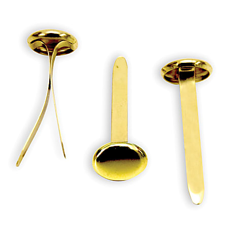
I research items that resemble my T-shaped device and I find something called brass fasteners which were exactly what I needed.

Office Depot® Brand Round-Head Fasteners, 1", Brass, Pack Of 100

Brass Fasteners

Iteration and Production:

I decided to use different colors in my final design. I wanted to use blue to represent the water and orange. Orange and blue are directly opposite on the color wheel so they go well with each other.

First measured the circles from the stencil and then made them in illustrator. I picked 3 different size circles: a large medium and a small from the stencil.

I send it to the cricket and cut out the circles. I wanted the larger circles to be on the outside and the circles to become smaller as you move into the circle. The large circles are light and the smaller circles are dark to create a gradient effect. I tested the colors in black and white and you can see the difference between all the colors.

Color Circles                                                                  Black and white circles

Then I started assembling the circle

Assembling the Circle

I poked a hole in the center and placed the bass fastener on the inside.

Back of the Card                                                 Front of the Card

The Stencil of a Fish Colored and Attached to The Brass Fasteners

I glued a white rectangle on the top of the inside so that any notes written could be legible

For the envelope, I took a sheet of cardstock and folded both sides and the bottom. I made sure to make the envelope slightly larger than the card itself so that it would fit.   The flaps are about 1 inch thick and will be glued to the other side of the envelope.

I decided to make a layered water design in the front so I took the different shades of blue I had and cut out the waves and putting on top of one another.

Layer 1

Layer 2

Layer 3

Layer 4


Layers Combined

This is then glued to the flaps/ bottom of the envelope.

I wanted to also make a fish pattern on the front of the envelope. I made a fish scale shape in illustrator and duplicated it to fill the entire page. I sent it to the Cricut to cut my design out. Instead of using the cutouts, I decided to use the outline of the design. I glue this to the white part of the envelope and cut out the top of the envelope to match the shape of the scales.


I printed it out in 2 shades of orange. The dark orange color against the white paper creates contrast and makes the scales stand out.

Front of the envelope

Reflection

Through this assignment, I have learned how to create patterns in techniques such as Illustrator and Cricut. The Cricut was such a useful tool to use for this assignment. I also got to make multiple prototypes and test out some of my ideas which is a really important part of the design process. I was able to learn more about color theory methods to see if the colors I chose had enough contrast so that they can be viewable to all audiences. I was able to practice and stren

Final Work


Observation & Communication Process

Statement of Intent

For this project, the concept of slow looking will be practiced to help actively observe and record/ map an excursion starting from Hayes Hall to a specific (accessible) location on campus and must include a representation of a non-visual sense ( smell, taste, touch, or hearing) that is part of the journey. This map will initially be comprised of 10 steps that will be documented in 3 different methods: sketches, written words, and digital images. The goal of this assignment is to make a composition that possesses intention, and creativity through interpretation and representation. In the final composition, the map has at least 5 “steps” and must include a title, legend, and multiple points of interest or landmarks.  

Through this assignment, many craft materials will be explored and different drawing techniques will be showcased such as contour, layering, perspective value, shape manipulation, and line weight.

The materials that will be used in this project a 14” X17” Bristol paper, pencils, tech pens, drawing paper, trace paper, a precision knife, and tacky glue.

The final deliverables are comprised of a single pdf with a single image of the entire drawing, 1-2 details images, and a concise assignment statement/ summary.

Ideation

For our first-in-class activity, we were asked to draw a map from our house to Hayes Hall. For my path, I drew a road and also some footsteps. I drew a car because that is my main mode of transportation. After that, I included points of interest such as notable buildings I pass on my way to school. I made my map read from left to right; having my starting location at the top left and my destination ending in the bottom right corner. 

The journey from my house to Hayes Hall 

Then we had to draw the map again, but this time highlighting a sense we experience on our journey. The sense I picked was sound. Instead of focusing on drawing the notable buildings, I mostly tried to portray the main sounds I usually hear on my way to Hayes Hall. I again drew my map reading from left to right, having my starting location at the top left and my destination ending in the bottom right corner. Instead of drawing a road for my path, I drew a music staff with notes to represent the music I listen to while I drive. I used squiggles around my car to represent the shaking/ engine sound. The target-looking circles are the ambulance sound I sometimes hear. I included leaves, footprints, and little swirls to describe the leaves crunching beneath my feet, the light footsteps, and the wind blowing. I also scribbled some words to portray the conversations and light background chatter I hear when I walk through campus.

The journey from my house to Hayes Hall sounds

For our next exercise, we were given the challenge to draw any object of choice. We then wrote very detailed directions on how to draw this object. We give the directions to another classmate and they have to replicate the object without knowing what the object is.

The object I chose to do was a guitar

Guitar drawing.

I then wrote the directions on how to draw this guitar. I tried to be as thorough/ clear as possible so that the person drawing my object can understand. I included rough measurements of each component of the guitar, relative to one another. I split the guitar into 

Guitar Drawing Directions

I got another student’s directions and attempted to draw their object. 

Another student’s directions of their object  

My Drawing of the Student’s Object 

The student’s object was supposed to be a witches hat with a little buckle in the middle. The only thing I was missing was the curve of the hat. 

The student that had to draw my guitar also did not successfully get the right object. This exercise helped me learn how important explicit directions are when trying to describe something. I kept this in mind as I continued with this project making maps.

Shading/ Texture Practice 

We then practice shading techniques. First I made a value scale going from dark to light. Then made 3 more value scales using lines, cross-hatching, and little squiggles. 

Various Value Scales 

Then we learned how to use value to show where the light source is. First, we practiced blending from light to dark. Then we drew 3D shapes and blended in the shadows and added the highlights considering the light source. 

Blending from light to dark 

Blending 3D Shapes 

Then we practiced drawing textures using our micron pens. I went to the internet to find different types of textures. The first picture is rock-like pebbles stacked on top of one another. The second picture is a rope pattern the last picture is eroded and layered rocks.


Circular Stacked Rocks                   Rope Texture                            Layered Rock Texture

In the first column, I drew the texture of each picture. In the second column, I described the qualities I observed. For the last column drew the texture of the rocks/ropes going from light to dark using thin micron pens to increasingly thicker sized micron pens to create a value scale. Using this method can help translate where the light source is coming from and in this case, I drew it coming from the left side.

Texture Drawings 

Exercise #1: Instructions 

The location I picked as the destination for my map was Mirror Lake. I started from Hayes Hall and walked through the oval towards Mirror Lake. On my walk, I practiced slow looking and paid attention to my surroundings. I noticed the crunchy leaves beneath my feet, leaves in various shades of green, brown, and red as they fall off the tree branches. I heard the footsteps of students hurrying to get to their classes, bikes and scooters zoom past me, and squirrels rustling in leaves as they make their way across the lawn. I heard the whistling of the wind and as I approached the lake, I listened to the sounds of a waterfall coming from the fountain. The more looked and listened the more I became aware of my surroundings.

I took note of all my observations and wrote the instructions for my journey to Mirror Lake. 

Step 1: At the bottom of the steps of Hayes Hall, my body facing forward, I walk about 20 steps to the middle of the oval 

  • Sight: I see the beautiful trees and students walking to class. The leaves come in a variety of colors such as Red, Green, Orange, and Brown. Birds flying swiftly into a tree and squirrels running around the oval. There are dried-up leaves near my feet. There is a bright blue sky with light clouds.
  • Sound: The crunch of the leaves beneath my feet. The low whistle of the wind blowing. The light chatter of conversation between 2 people and louder are come closer fading away as they pass. The ruffling noises of branches and leaves as an unknown creature scurry around inside a nearby bush. Scooter noises and light footsteps. I listen to The Perfect Girl by Mareux on the left side of my ear  
  • Touch: I feel the leaves crunch beneath my feet. Wind through my hair. The warmth of the sun
  • Smell: Grass 

Step 2: I keep walking until I get to the middle path of the oval 

  • Sight: Autumn Trees, Hopkins hall flower bed students walking trees
  • Sound: Birds chirping, footsteps 

Step 3: I turn right and begin to walk straight down the red path 

  • Sight: a Student is on the phone waking in the opposite direction. Someone zooms past on their scooter. A squirrel running onto a tree. Leaves falling from branches like snow 
  • Sound: zipping of the scooter, talking, footsteps 
  • Touch: I begin to feel the heaviness of my backpack and the weight of my art supplies pulling my arm closer to the ground

Step 4: I continue to walk straight toward Thompson Library 

  • Sight: A large copper statue stands in front of me. I see students sitting and studying on small tables in front of the library students entering in and out the library doors

Step 5: I take a slight left turn 

  • Sight:  I see a cute dog being walked, students laying on the grass/studying underneath a large tree,  a hammock between 2 trees 
  • Sounds:  talking, wind, dog barks tree ruffle, and wind whistles 

Step 6: I cross a small parking lot 

  • Sight: There is a street. A black car slows down. Thick white lines beneath my feet. 
  • Sound: The car engine, the wheels running and slowly coming to a stop on the pavement.

Step 7: I walk straight toward a small balcony overlooking the lake

  • Sight: There are several large bushes to my left and a row of bikes to my right. There was a blue, black, and red bike. One of them had a basket attached near the handles. The bushes were very large for my height. There are many thick clumps of spider webbing in these bushes. A couple of people are sitting on the black bench nearby
  • Clicking sounds of a cicada and crickets chirping, footsteps 

Step 8: I walk down the long concrete staircase

  • Sight: many trees and bushes around me 
  • Sounds: light chatter, footsteps, sounds of water fountain  of the water fountain

Step 9: I reach the bottom of the staircase and turn right 

  • Sight: I see more bushes, people sitting in large chairs 
  • Sound: sounds of the fountain becomes louder 

Step 10: I arrive at my destination: Mirror Lake 


Then we went to the Map Room located at Thompson Library to explore different types of maps and to get inspiration for our maps. I saw many visually detailed maps, colored maps, and maps with graphic representations.

Pictures of Maps 

Then we walked to our selected location, photo documenting our journey. I documented the explicit path as well as the nature aspects such as the leaves, plants, trees, squirrels, etc.

After documenting my journey, I gathered all the pictures and made a  photo collage of my excursion. I wanted to experiment with how I wanted my map to be read either from left to right/ top to bottom 

Map Layout

Then I made a physical collage of my excursion using construction paper. The main sense I wanted to highlight was sounded. I made a list of sounds I heard on my way to Mirror Lake:

Sounds: Wind blowing, scratching, and little footsteps of squirrels running across the oval, birds chirping, trees swaying with leaves rustling, the music through my headphones, the leaves crunching beneath my feet, the cars, scooters, bikes, skateboards.

With this in mind, I began crafting my collage. I used construction paper and recreated the oval and its path. I made various wheel shapes to present the cars, scooters, and bikes I heard about on my journey. For the path to Mirror lake, I made a trail of leaves and music notes to represent the leaves crunching beneath my feet and the songs I listen to through my headphones. I printed out the photos I took of each location and made them 3D so they pop out of the page.

Oval Reference Picture

        wheel

Scooter Wheel                                                       Car Wheel


Wheels

Pictures of Collage 

Then I begin finding inspiration for my map. I wanted to make a tree map with the branches being the path. The main points of interest on my map are Hayes Hall, Thompson Library, Orton Hall, and Mirror Lake.


Thompson Statue                                         Thompson Statue                                      Tree #1


Tree #2                                                         Tree #3                                      Tree #4

OSU sign

I brainstormed some ideas and  sketched out some potential elements for my map

I sketched the layout of my map. I wanted the map to be read from bottom to top.

I practiced sketching the buildings in 3D perspective and decided to make the light source come from the top left of the page.

Buildings 3D perspective

I put all my ideas together and did a final draft of all the things I would potentially include in my map. Starting from Hayes, footprints lead up the tree to mirror lake. There are leaves with a song lyric on them, water droplets representing the sounds of the lake, bikes/ scooters, and a squirrel stretched across the tree. The swirling lines represent the sounds of wind blowing.

Iteration and Production

I start working toward my final composition of the map. I started testing different methods I could potentially use to shade and add texture to my buildings. I experimented with lines, cross-hatching, and multiple pen thicknesses. I decided to put my light source at the left top of the page.

Sketching

I drew the base of my map which is the tree trunk.

Tree Trunk Sketch

I wanted to make the title of the map on a scroll/paper design.

Map Title Inspiration

Title of Map

I used tracing paper and as I come up with more ideas, I continue to layering more tracing paper. I wanted to integrate the tree into the map/ the buildings so I drew the roots growing on top of Hayes Hall. I also drew a giant squirrel stretched across the tree to represent all the squirrels I see every day on the Oval. I made a stoned pathway that leads up to mirror lake.

Hayes Hall

OSU Symbol Carved on the Tree

I place Orton Hall on the left of my map. I wanted the branches to surround the building as if it were in a cage. I added birds to represent the chirping sounds I hear on my journey.

Orton Hall

To the right, I have Thompson Library with the statue in front.

I placed Mirror Lake at the very top of the map, slightly to the right. I wanted to put the pond on the tree, but I needed to figure out a way to make it look more realistic. I drew it as a slightly tilted forwards hole in the tree filled with water with the fountain coming out of the hole. I liked the font used on the real-life Hayes Hall building, so I decided to label all of my locations on my map using that font.

I wanted to make the map interactive so I made it so that the OSU sign opened up to a nest of acorns,

I glued on leaves and made them pop out of the page as if they have just fallen off of the tree. I wanted to represent the autumn, crunchy leaves I step on my excursion.

Leaves

To make my path clear I added bridges and ladders

Ladders and Bridges

Using another piece of tracing paper, I scaled down the Library and made a little pop-up book

Thompson Library

Map

For the Instructions, I decided to make make it inside an envelope, which you can open up and read the inside. I wanted to turn the map into a game/ quest.  The final destination Mirror Lake is a magical lake that can grant the player 3 wishes. The player must retrieve different objects and complete a task at each location to activate the lake.

Map Instructions Envelope Draft

Then I made the key for my map

Map Key

Using Bristol paper I made the final map instructions.

Map instructions :

Mirror Lake: Located at the top of the Oval tree lies a magic lake that can grant you 3 wishes.

Mission: Retrieve a gold feather, a squirrel’s acorn, and Thompson’s scholarly scroll which contains the spell to activate the Lake. Say the spell then place all the objects into the lake. Magic stepping stones will appear to guide you to your destination.

Tasks: 

1.) Enter Hayes Hall-> Get to the roof and climb up the tree. Retrieve one acorn hidden in the Oval Tree. [Be careful, The Giant Squirrels of Oval guard their acorns with their life.

2.) Continue your journey to Thompson Library where you will be greeted by Mr. Thompson. Solve his riddle with the help of the books in his library and he will gift you his scholarly scroll.

3.) Cross the bridge to Orton Tower and climb to the top. This is where the golden dove lives. A flute will be found in the middle of the room. Play the right tune and the dove will give you one of its feathers. [Caution watch for strong winds]

4.) Finally, climb up the ladder to Mirror Lake. [Watch out for a swarm of blackbirds that guard Mirror Lake on your way up.]

I used a lightbox to trace all the things I’ve drawn and transferred it to the Bristol paper.

I wanted to draw a bird flying on top of Orton Hall

Inspiration and Hope in Coronavirus

Golden Bird Reference Photo

Golden Bird/ Dove

Bird Feather Hidden Behind Orton Tower

For the Key, I decided to also make it an envelope/ card that can open up.


Map Key


Map Instructions

I added arrows to make the path clear and also made the scroll on Thompson’s statue out of rolled-up construction paper.

Thompson Library

I begin shading the tree and the buildings. I placed the light source at the top left of the map so the right side of my tree is slightly darker than the left side of the tree.

The carved oval sign opens up to a pile of acorns inside.


Acorns/ OSU sign

Key/ Orton Tower                                                                    The Grand Thompson Library/ Map Instructions


Reflection 

Through this assignment, I have learned how to create a map using multiple elements such as sketching, written words, and digital images. I was able to explore many different craft materials and new drawing techniques such as contour, layering, perspective value, shape manipulation, and line weight. I have strengthened my observation skills and was to portray a non-visual element in my map. There was a lot to tackle in this project and the main problem I struggled with was time management. As the deadline was coming closer, I kept coming up with more ideas to add/ enhance my map, which took additional time to complete/ longer than expected. I think what I can do next time to fix this problem is to finish all the elements I am certain to include in the final composition and leave time for any additional ideas that would come up later on. Another challenge was trying to integrate the buildings/ lake into the tree as naturally and realistically as possible.


Final Work

Summary:

For this assignment, I created a map that resembles a tree. The branches represent the Oval pathways and there are stepping stones that lead up to Mirror Lake. The sense I wanted to highlight on my journey is sound: the crunchy leaves, the wind blowing, the squirrels, the fountain in the lake, and the birds. 

The map starts at Hayes Hall, climbing up the tree to The Grand Thompson Library, crossing the bridge to Orton Tower, then up the ladder to reach the final destination, Mirror Lake.

I wanted to make the map a magical game/ quest. The player must do tasks and retrieve a specific object from each location. Successfully completing all the tasks and the lake will activate and grant the player 3 wishes. I wanted to make the map interactive and three-dimensional, so the tree has a flap and can open up, the feather is hidden behind the castle, the map instructions/key are in an “envelope” and can open, Thompson’s scroll can unroll, and the leaves are glued on to add texture.


2D to 3D Translation Process

Statement of Intent

In this project, the relationship between 2D and 3D shapes is explored and the transformation between the two is practiced through template making. Exercising the use of good craft and ideation, a 3D polyhedron will be made using a single sheet of Bristol paper (14”x 17” inch). The same polyhedron will be created again, but this time it is made with the modification option of negative space: cutting into the form creating negative shapes/ space inside the 3D polyhedron. 

The materials used in this project are Bristol, glue, rulers, pencils, and a knife. 

The final deliverables are comprised of a single pdf with photographs ( a minimum of 3 views), the templates/ net of, and instructions on how to build both polyhedrons.

Ideation 

We first learned how to make a net for the cube. 

I drew the layout of the net first knowing that a cube has a total of 6 sides.

I first drew 4 of the same dimension squares and stacked them vertically on top of one another. Then on the second square from the top, I added one square to each side creating a t-shaped net out of squares.

I knew that every 2 sides of the cube needs a tab to connect them, so I began to number/ color coded each side that would be put together. The hatch marks are the lines to score/ fold at.

Net of a Cube with Labeled Sides


Exercise 1A: Building the Perfect Cube 

In this exercise, we were given the challenge to make the perfect.

The final cube must have a measurement of 3″x 3″ inches on a white piece of Bristol paper.

I first took a white sheet of Bristol and measured a 3″ x 3″ inch square. I then used the model template of a cube I made earlier to construct this one. 

Template of a 3″x 3″ inch cube

I used scissors and an Exacto knife to cut out my net. Using the Exacto knife I scored the sides that needed to be folded. [I didn’t want to have the pencil lines show so I flipped to template over and marked each end of a score line with a light dot. Using an Exacto knife I scored and connected the dot marks] 


I began folding the template into a cube shape. I apply tacky glue onto the tabs using a small piece of leftover Bristol paper as an applicator. This method helped me to smoothly/ thinly/ and evenly spread the glue onto the tabs. I connected each tab to its matching side (gluing on the inside of the cube) and held the 2 pieces together for about thirty seconds until the glue dried. 

I found that it was hard to put some of the pieces together at the corners because the flaps were too big so I had to trim some of them down. 

Perfect Cube

We brought the cubes into class for evaluation and my cube was put into the middle category: not perfect and had some flaws.

I noted down some things I could have done to improve my craft for next time:

  • Remembering to make the flaps smaller at the corners so they will fit together better 
  • And surface pencil markings need to be erased 
  • Needed to find another strategy to make straighter more accurate score lines so that the bristol folds properly 


Then in class, together we worked on making a Trapezoidal Prism.

We were given a PDF template of the net and figured out some of the missing measurements using estimation and calculation.

Net for Trapezoidal Prism


Using the template, I drew a grid similar to the one on the PDF onto a piece of Bristol and made the template. Again, I cut out the template and scored on the sides that would need to be folded. This time I scored on top of my pencil markings and erased it after to create straighter score marks. I applied tacky glue onto the tabs using a small piece of leftover Bristol paper as an applicator. I connected each tab to its matching side and held the 2 pieces together for about thirty seconds until the glue dried.


Trapezoidal Prism


Exercise 1b: Building the Icosahedron 

I first searched for an icosahedron template.

File:Foldable icosahedron (blank).jpg - Wikimedia Commons

Icosahedron Template.


Once I found the template I estimated each of the triangles to be equilaterals so I decided to make each side a length of 2 inches. I cut out one 2-inch equilateral triangle on a sheet of Bristol and used it to trace the rest of the triangles. 

I cut the template out using scissors and an Xacto knife and glued the sides together.

Icosahedron


Composition #1: Normal Cube 

For the final project, I chose to do a cube shape and use the negative space option as my modification.

First I drew the template of my cube. I used the same outline as the first cube made in exercise 1A but instead of having it 3″x 3″ inches, I scaled it so that it could be 4″x 4″ inches so that it could be larger.

4″ x 4″ Cube Template

I used an Exacto knife to cut the corners/ tabs and using scissors to cut the larger straight-edged sides of the cube.

I remembered to make the tabs curved at the corners so that the sides can easily fit together.

This time I scored on top of a light table so I could see my template and not have to worry about the pencil markings showing up on the surface of the cube. 

I apply tacky glue onto the tabs using a small piece of leftover Bristol paper as an applicator. I connected each tab to its matching side and held the 2 pieces together for about thirty seconds until the glue dried. 


Final Cube Composition


Composition #2: Modified Cube Using Negative Space 

Idea #1: Cube with Pyramid Cut Out 

First I brainstormed some ideas I could do for the negative space element. 

I sketched out some ideas.

Cube Sketches

I wanted to do 6 pyramids cut out of the cube.

First I needed to figure out the measurements of the pyramid. I made the square base of the pyramid 2″x 2″ inches. I knew that the height of the pyramid had to be 1 inch because 2 pyramids must add up to 2 inches since it’s a 2″ x 2″x 2″ cubic inch. 

I needed to find the length of the other 2 sides of the triangle. I used the Pythagorean theorem to find the diagonal length of the square and got 2.83 inches. I divided it by 2 to get the length of where the height intersects                  (1.415 inches). I used the Pythagorean theorem again to find the length of the pyramid and got 1.73269 inches. 

Since I got the dimensions of one pyramid, the other 5 pyramids are the same so they just need to be repeated when built.

After that, I drew out the net of the cube. 

Designing the Cube with the Pyramids Cut Out

Ideas #2: The Cube Staircase 

The other idea I came up with was the cube staircase. I made a 4″x4″ inch cube making a grid on the cube so that each 1″x 1″ inch cube was visible. I colored in the staircase on each side. 

I first sketched out a couple of options for where the staircase could be located. After drawing I realized that these designs will not work because the base of each staircase needs to be present. The base of the staircase was positioned at the opening of another staircase which does not make sense.

Cube Sketches that Don’t Work

I fixed this problem and made another design where all the staircases have a base. 


I tried making a single net; thinking about what the stairs would look like opened up. I successfully sketched out one side of the cube with one of the staircases. 

Net Sketches: Single Net vs Separate Nets

Another option was to make 3 nets of the stairs and attach them to an inside cube. There must be a cube in the center of all the staircases, so I broke down the cube to find out where exactly it would be placed. I made a net for the inside cube and then made a separate net for the small cube in the middle.

I realized that I couldn’t make separate nets of the staircase because the cutouts of the staircase will be seen on the backside of the cube. It should be seamless on the back. I could only make separate nets where the 2 edges connect. 

Net of the Inside Cube

Making Cube Composition #2: The Cube Staircase

Part 1:

I decided to go with the staircase design because I thought it was challenging and visually interesting. 

First I started sketching out the net of the cube and practiced making the cube on grid paper. I made every 4 grid paper squares as 1 unit. I imagined what the cube would look like opened up and used that to guide my template. 

Net on Grid Paper

I decided that it was best to make 3 separate templates.

In the first template, I had the back, bottom, and front side stairs of the cube all attached

For the second template, I had the right-side staircase

And for the last template, I had the top staircase and the left face of the cube together.

Cut them out and began to fold them into the cube.

I taped them down and anything that was missing from the net I added more using separate pieces of grid paper and tape. Using a red marker, I marked where the sides would be connected/ where the tabs would be in the final composition. 

Right Side of the Cube

Top and Left side of the Cube

Back, Bottom, and Front of the Cube

After I was able to successfully build the cube. I took it apart and laid it flat to see the finalized net. 

On a piece of Bristol, I made a grid with 1″ x 1″ units. I copied the net I made on the grid paper and put it onto my Bristol. I labeled each side. 

I decided to make the bottom its separate net so it would be a total of 4 separate nets.

Net of the Cube staircase on Bristol


I cut out all the separate nets using an Exacto knife and scissors making sure to trim the flaps. I used the light table to make my score marks. I used tacky glue and a small piece of Bristol paper as an applicator to spread the glue out evenly and thinly.

I forgot one of the tabs so I made a separate one and glued it in.

I folded at the score lines and began to glue everything together and placing the tiny cube in the middle hole where all the staircases met.


Problems with the Cube

  • As I was gluing I ran into problems with the glue mixing with the pencil markings and it would smudge around the edges. Erasing it made it worse spreading the darkened glue. 
  • I trimmed the tabs a little too much and I started seeing holes and tiny gaps at the corners as I put them together. 
  • Even though I carefully cut all the lines as straight as I could, I still saw some unevenness and they weren’t lining up properly. 
  • Since the small cube in the middle was a separate net, I wasn’t able to glue it without making the glue visible and just placing it in, you could see it wasn’t connected to anything. [All of these problems can be visibly seen in the above pictures]


With all these flaws, I couldn’t use it in my final composition because of the poor craft. The staircase cube takes a very long time to make and it was hard to get all the stairs to line up with one another so I last minute changed to my first cube idea. I thought that even though it was an easy design and not as visually interesting as the staircase, the craft might be better at the end.

Iteration and Production:

Making Cube Composition #2: The Cube with the Cut-out Pyramids 

First I used the measurements from my first cube idea to make the net. I drew a triangle with the dimensions with calculated dimensions. I cut out the triangle and used it as a template to make the net. I changed the net so that at least one side of the triangle was connected to another side of the triangle. I made a total of 4 nets.

Net of the Pyramids

With this design, I was able to score directly onto the template because the scored side will not be seen. The scored side will be glued to the other pyramids. 

I thought it would be interesting to create a pattern on the inside of two of the pyramids. I used a compass to make rings on the inside of the pyramid. I thought it would make it more visually interesting having it be the shape of a cube, with pyramids cut out of them, with a circular pattern on the inside. So I would be using 3 different types of shapes in one composition.

Creating circle pattern in Pyramid

After scoring everything I folded at the score marks and glued the flap to the (outside) side of my pyramid. Once I had my 4 pyramids I began to glue the pyramids together. I remembered to erase all pencil markings before gluing to avoid darkening the glue and accidentally smudging it. I traced the circles with sharpie.

Cube with Cut out Pyramids Built


Problems with the Cube: 

  • Everything was working until I had to glue the last pyramid. As I was gluing the last pyramid in place and the other sides that were already glued down started popping open and ripping apart.
  • The width of the last pyramid could not fit into the last spot even though I measured it properly. Every time I held one side of the cube another side would eventually pop open.
  • I realized that I didn’t account for the measurement of the thickness of the glue and the overlapping tabs of Bristol. All of those minor details contributed to the last pyramid not fitting properly. This would have worked with thinner paper but I did not think about how to thick the Bristol was.


Gaps in-between the Pyramids

I decided to start over trying another way to solve this problem.

I made the same net again and cut it out as I did before.

I first glued the first 3 pyramids. I decided to make one extra pyramid to place on one of the sides for more stability. Instead of connecting the last pyramid in I measured out 1 triangle and glued it where the missing pyramid side was.

Reflection

Through this assignment, I have learned to how to translate 2D shapes into 3D shapes. I got to practice making nets/ templates for various polyhedrons. I ran into many different problems in this project through it I have learned to think from different perspectives and I have practiced strengthening my problem-solving skills. I have also learned how to improve my craft for future projects (For example: how to apply glue/ how to cut in straight lines using the knife, using the light table for tracing/ scoring, etc)

Final Product

Composition #1: Original Cube

Composition #2: Negative Space