

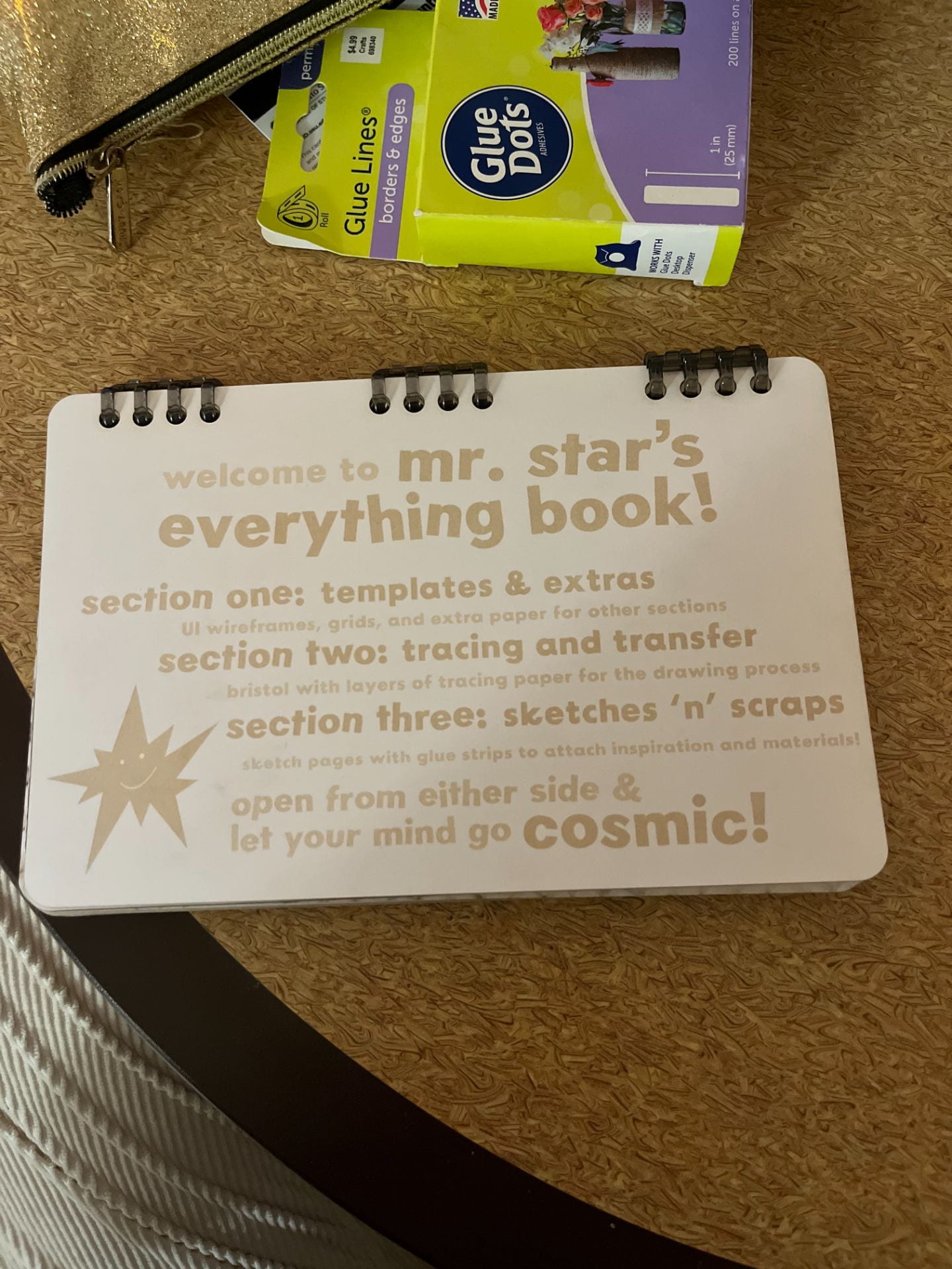
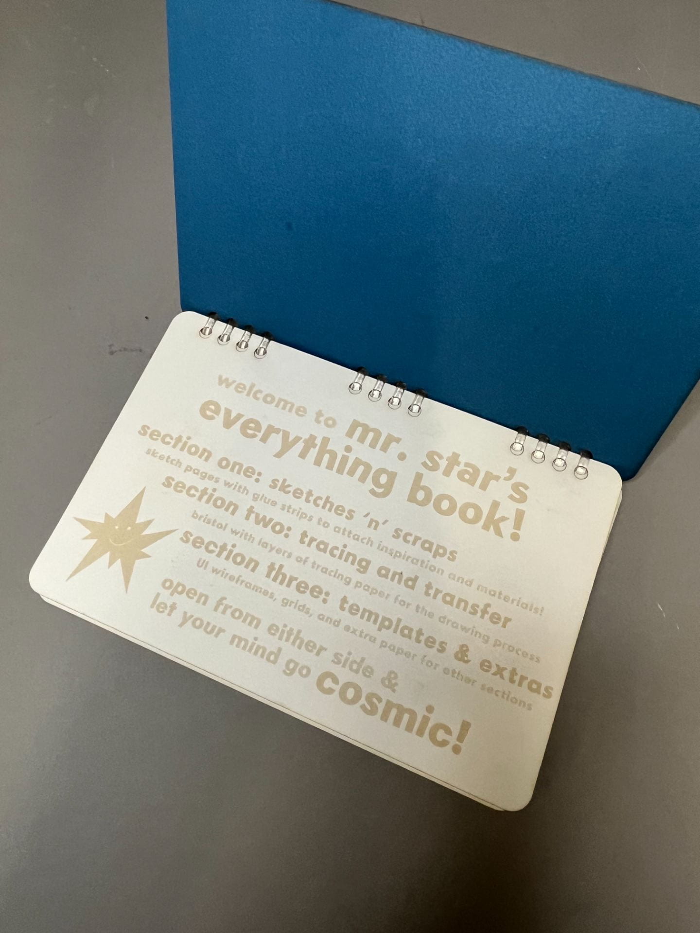
Statement of Intent
I was particularly excited about this project because of how personal it felt. Similarly to the studio space rendering project from Visualizations last semester, I was able to give it that extra sense of personality that I hope is present in all my design work. I wanted to experiment with a new medium/discipline of art through the creation of linoleum printed stamps, as well as create a definitive branding for the book itself. Thus, Mr. Star was born, the mascot of my sketchbook, who you’ll see on most of the pages!
Ideation
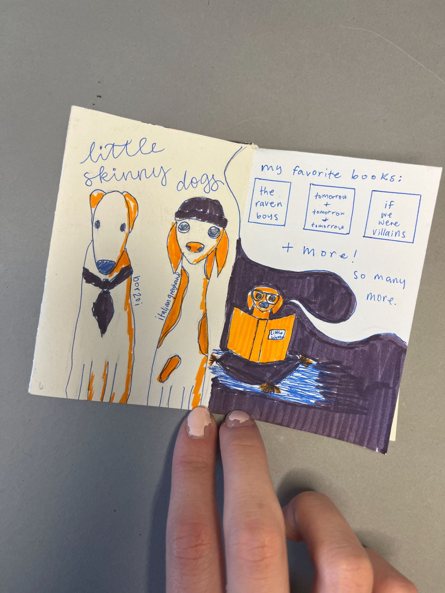
Exercise One: Mini sketchbook / zine
For the zine, I chose the prompt about my favorite things. It was really fun to make, and I got to incorporate a fun color scheme into the design of it!


Sketchbook Ideation
As someone who enjoys creating and designing digitally, my initial question had to do with what would assist me best when working on my laptop. I knew I wanted some UI wireframes in the book for sketching, as well as pockets and attachments for scraps and pieces of inspiration. Also, it was important that the binding stayed at the top, since I am left-handed and often get frustrated with binding on the left.

I chose binder rings/clips to bind the book so that pages could be removed and rearranged whenever I felt like it. Glue strips are also my lifesavers, so I made a note to attach some to each sketch page for inspiration pictures and random scribbles.

I chose pretty small dimensions because I like working in small spaces rather than wide-open ones, and I liked the dimensions of my friend’s sketchbook.

After deciding on the logistics, I worked on creating the cover design that I would carve into linoleum for an ink print.
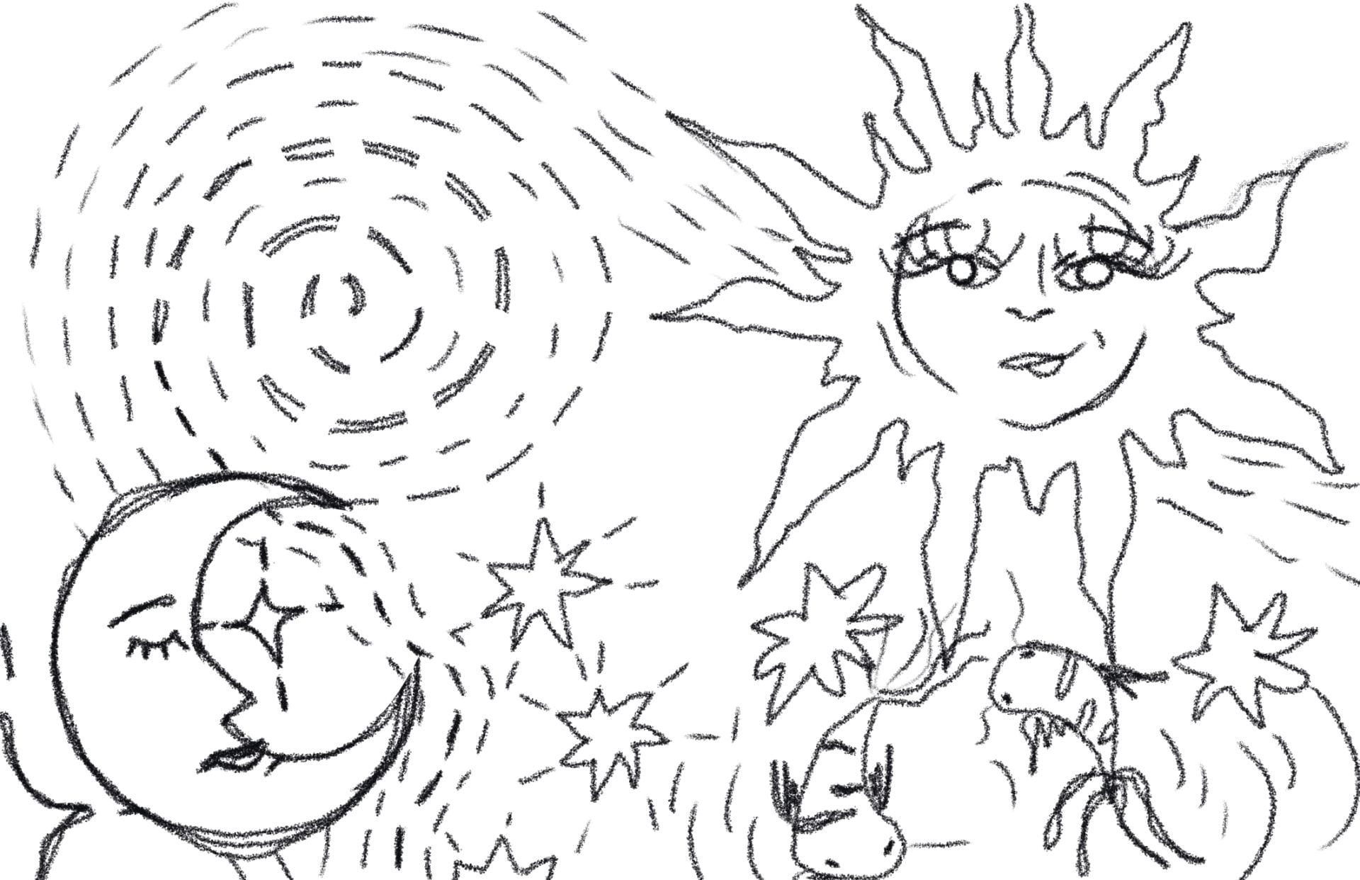
Nothing was really clicking, so I just started thinking of the purpose of a sketchbook, which is a sort of gathering place for your thoughts and ideas. I started doodling my favorite things and incorporating this messy crayon look that I really like.

Iteration / Production
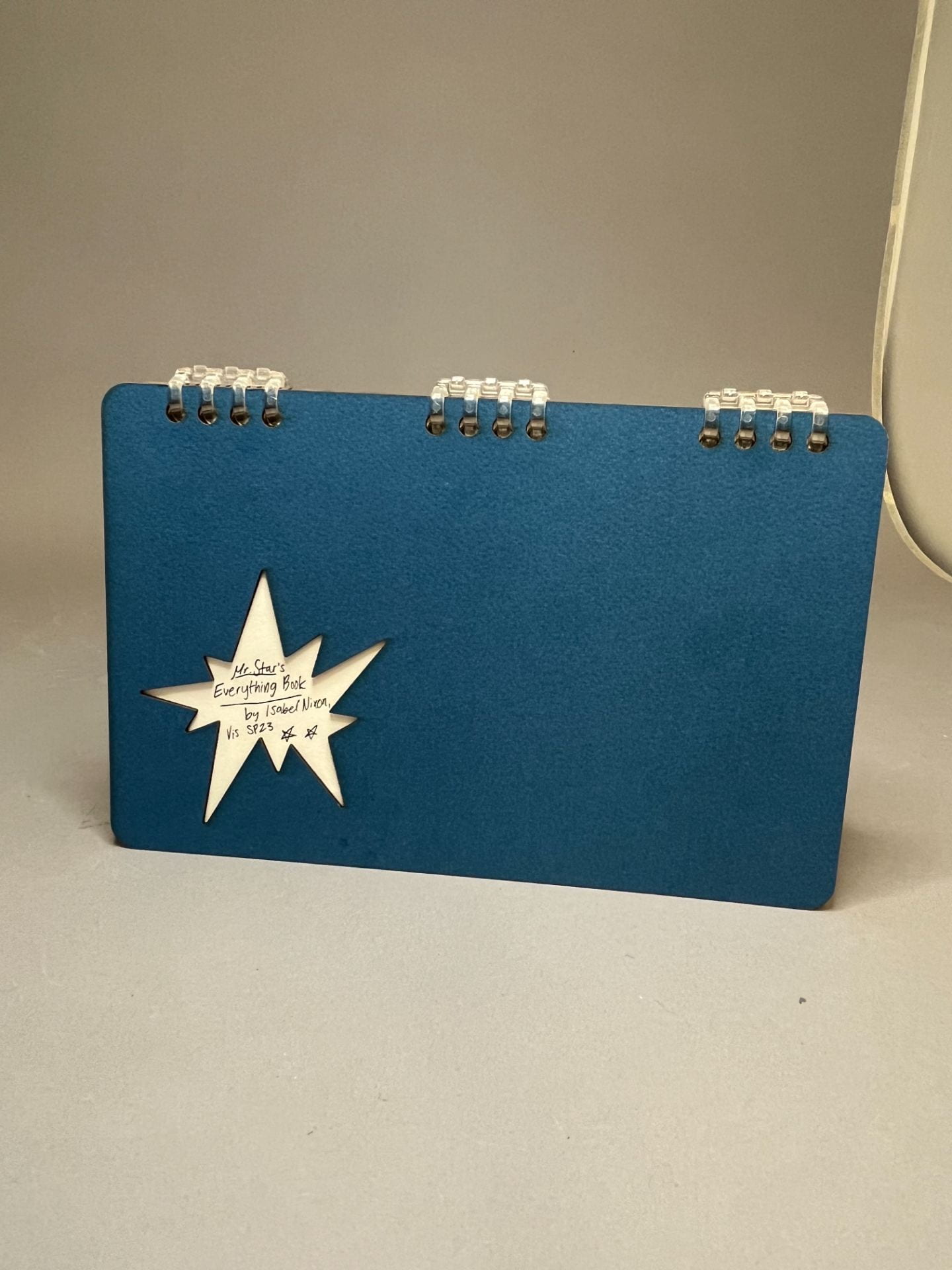
This was my final design for the cover, including Mr. Star at the bottom, who becomes much more important later.

I received my materials for printmaking and immediately got to work. Creating stamps was a rewarding and fun process, but it certainly had its bumps and issues. I took it all with a grain of salt, because I enjoyed learning a new art skill! I only included a few pictures, but the stamp-making process was pretty time consuming and I made a lot of prototypes before moving onto the final.


Finally, I was ready to make my cover print. I felt very smart using what I know from color theory to create the exact ink color I wanted. I imagined a deep red, so I used red ink mixed with green ink in order to darken it.
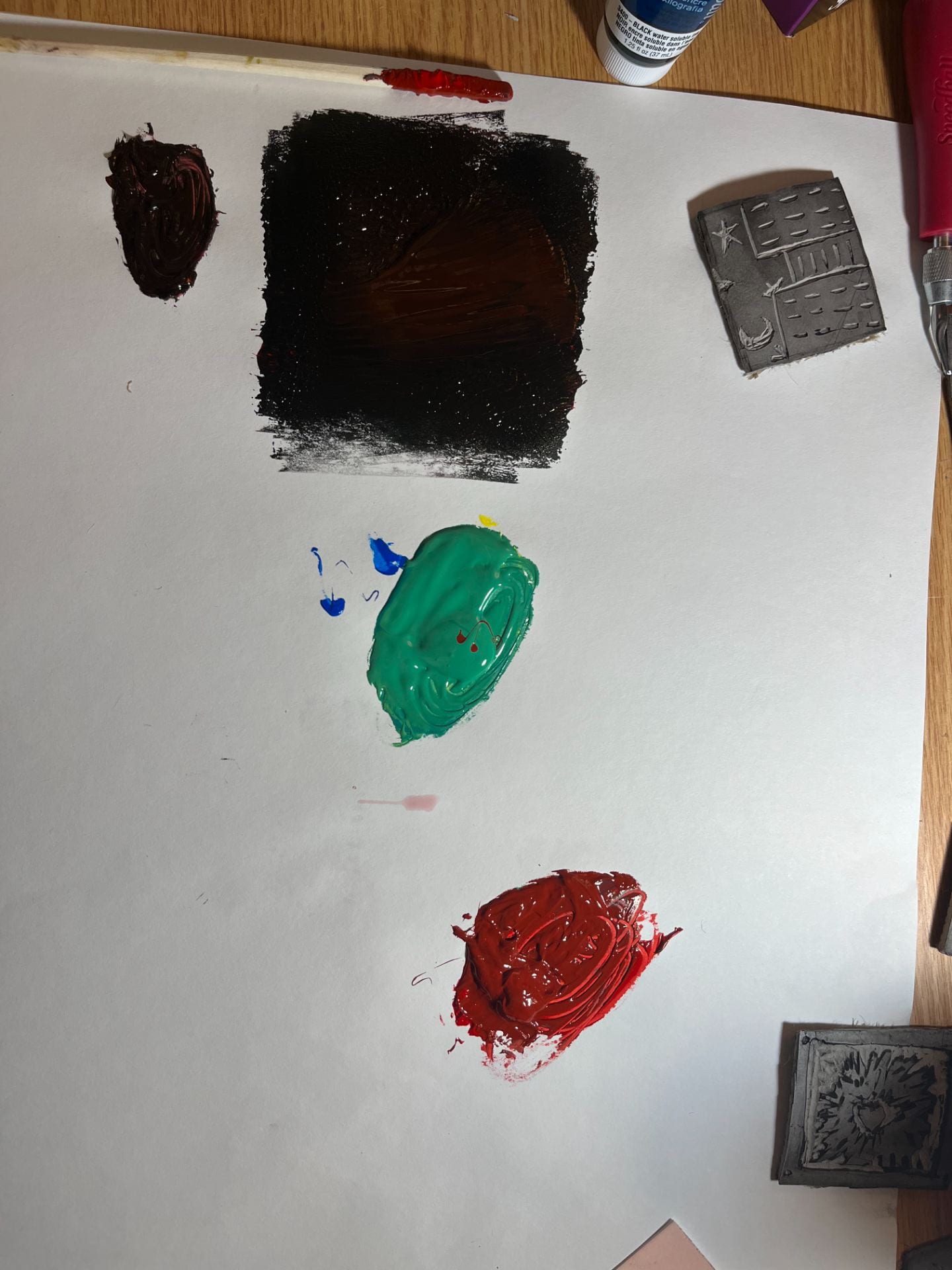
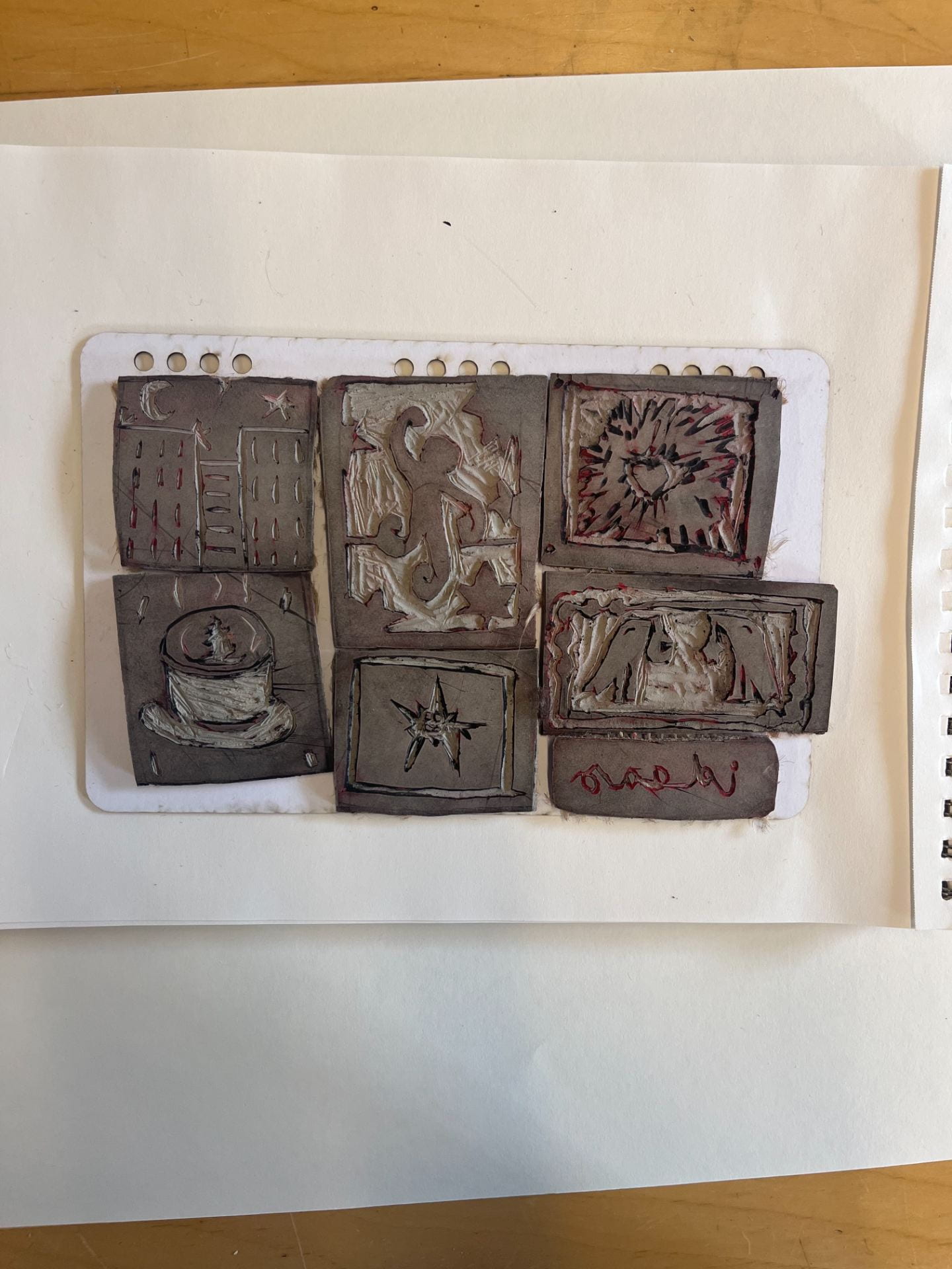
Here are all the stamps I created!
Here is the final product of my original cover, which I had to scrap in the end because it was sized incorrectly.

I created templates for each page, cover, and element in the book. Here is the cover template:
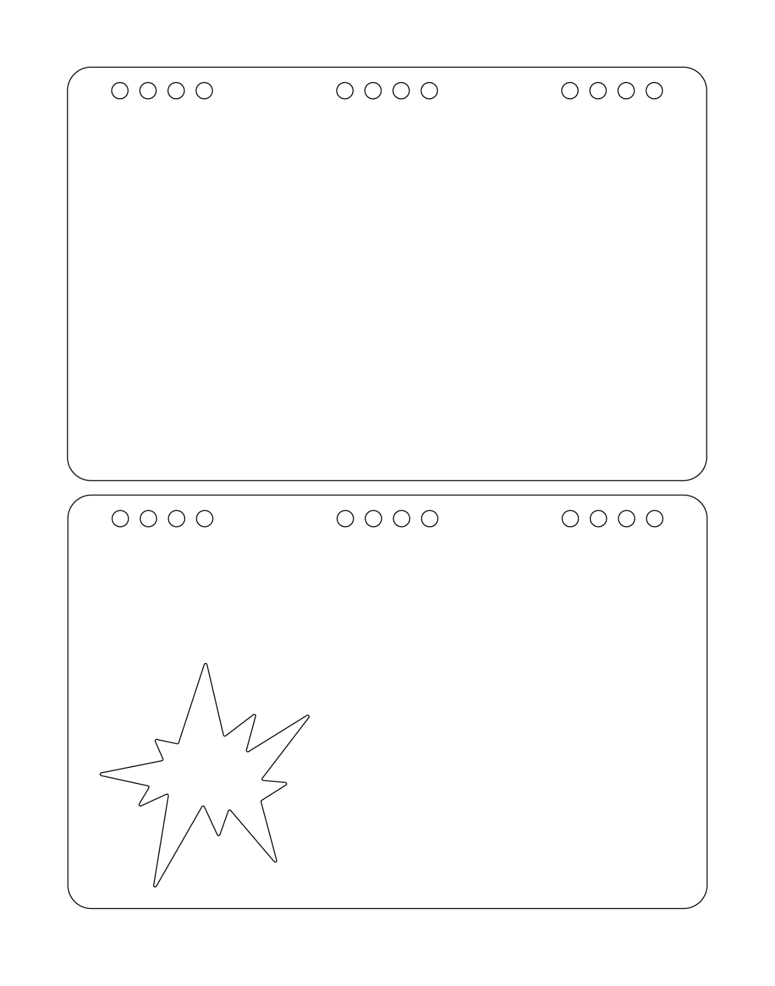
Here is the template for my UI wireframes:

I created a few pocket templates to hold extras in the sketchbook, as well as two title pages to give the book more character. I really wanted it to have an interactive element to it through the character of Mr. Star. The book can be opened from either side (with the sections on the title pages adjusted based on which side you open it), with a divider to each section. I etched these title pages with the laser cutter.

Here are my page templates, where I had the laser cutter etch Mr. Star onto each sketch page!

I created some other grid template pages, which I etched and cut on bristol.

After many hours at the laser cutter, here are the sketch page etches!


The binding clips we ordered (I collaborated with Anastasia Allison, Sophie Chu, and Olivia Cofer on materials) came in, so I put together the whole book aside from the covers, which had to be re-cut to make sure they fit the binding.
Here is one of the covers I cut, which shrunk on its way to the laser cutter and was much too small for the book. Working with the laser cutter, both with scheduling and with scaling/materials was difficult, but I learned to have a backup plan at all times in case things didn’t work out as I’d imagined.

Reluctantly, I re-stamped the cover and ended up liking it more than my original cover! I made a few more adjustments, such as changing the color of the clips I used to bind the book and removing pages so it was easier to turn pages, and then I was done!

Reflection
I really enjoyed this project overall, aside from my impatience with the laser cutter and such. It definitely took some perseverance and better patience when things didn’t work out as I’d expected with my covers and stamps, but ultimately I am very grateful to have learned a new skill and I feel I was better equipped in using materials for projects in a realistic amount of time. Sometimes I felt a bit silly having a mascot as my surprise element, but overall, I just wanted to create a sketchbook I’d realistically use and one with a lot of personality. For me, the presence of a mascot or fun character can help me focus and relax when it comes to ideation. A sketchbook is a place for mistakes, undeveloped ideas, and random thoughts, so it was enjoyable to create a space of my own in which to do just that.