Statement of Intent:
For this project, I didn’t have too much knowledge going in of isometric perspective other than what I had seen online, but I was really excited for a digital project in order to learn more about Illustrator and similar software. I also wanted to do some more detail work than usual, because I like to be thorough and it can be tricky to do that sometimes when drawing on paper with limited tools and time. Overall, I really wanted to explore different methods of creating digitally to communicate a certain concept.
Ideation:
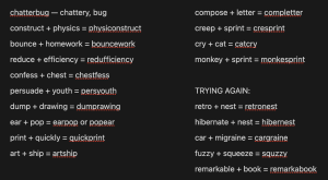
Here are some sketches from our first day working in isometric perspectives, plus a bunch of awkward and pretty boring mash-up ideas.
The only word I really liked was “chatterbug”, which I sketched below.
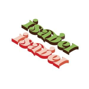
In class, we were asked to find a font we resonated with and put our name in isometric perspective. I chose the font “Letter Magic”, which was groovy and fun, and I tried to create a color palette that matched the funkiness of the font.
When creating word mashups, I was massively uninspired. I used random word generators, and then started mashing up words of things I saw around me, until somehow I came up with “hibernest” in a grand epiphany!
I sketched out some ideas of how I would illustrate the word. It felt most fitting that I incorporate it into a scene; after all, hibernation and coziness are very atmospheric feelings, and I didn’t love the idea of a word floating on an endless background.
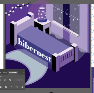
I originally wanted to make the word into the bed someone would be sleeping on, but I attempted it multiple ways to no avail.

I worked on making the scene anyways, starting with some rough sketches of a bed and a table.

Once I knew what I wanted the bed to look like, I worked on building it in Illustrator.
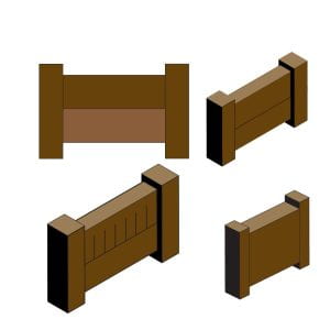
I put the finished bed and table into the scene, using some of Illustrator’s basic blue swatches to work on lighting.

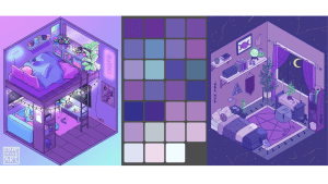
This is where I really started to take off with the project. I found some cool lo-fi isometric rooms online that felt like the vibe I wanted, and I based color palettes off those.
Sources:
Left: Pinterest: Discoversky 17
Right: Pinterest: antiscience
Iteration / Production:
Once I had the basic structure of the room set up, I worked a long time on each specific element and how it fit into the room, starting with the bear sleeping on the bed. I sketched it in Procreate a few times before landing on one I liked and converting it to vector format.

I colored the bear, gave him some shading details to match the room’s lighting, and made a few more versions to make sure it was consistent with the style of the project. I changed stroke width, coloring, lighting, anything you can think of. I finally (finally!) figured out a bear I liked and that was that.

I created a lamp in Procreate, then traced it using the pen tool in Illustrator.

I got some more decorations in the room, including a snowy window, a rug, and some string lights, and adjusting the color palette a LOT from the original. The word was on the side of the bed, but it didn’t feel immersive or fun enough, so I decided to break it up and put it onto pillows.
I created these using the pen tool quite quickly, testing a few different shapes.

I then put the bear and pillows in, along with the definition along the wall, and it was looking alright before I realized I was using the wrong color profile.

I changed the color profile to RGB.

I was having some issues of hierarchy and lack of contrast, so I worked a lot on those tedious details to make sure the word still shined through. I adjusted the color palette so that blues stood out a little more from the purple of the room and changed the rug entirely so the word-pillows wouldn’t get lost. Here is the final product!

Reflection:
I wish I had a way to figure out how many hours I spent on this project, but it was very worth it. I learned a LOT about Illustrator and other digital applications through this process, and I feel a lot more comfortable working with them now. I loved the freedom we had with this project; I really felt myself getting creative and excited to work on it even if I was just messing with small details and colors. I feel like this tested me in the areas of hierarchy and contrast, because those were my main issues in the process. I had to make sure I didn’t lose the original intent of the project was something I really had to keep in mind as I worked, and I enjoyed learning how to keep a cohesive, consistent style throughout the work.


