Introducing new technology without leaving students behind

vertigo
Illustration (such as it is…) by John Muir, based on the Padagogy [sic] Wheel v.2

Weighing what’s worth class time to teach

We try to make the normal online class experience as intuitive as possible, with the hope that instructors won’t need to spend time doing tech support.

What if you or your instructor want to try something different? Try some new app, some new communication method, some new device? This is a great thing! Spending instructional time and resources to teach introducing new technology almost always involves tradeoffs, though.

Here’s how I think about those decisions—which kinds of technology are most worth the time.

Authentic (to the field, the profession) technology

My rating: GREAT USE OF TIME

Teaching students to use technology in a way they’ll use later is a great use of time—and I think online courses should include these skills in their course objectives.

Students will be fairly motivated to learn these skills and will probably see the connection to their personal and professional goals.

  • For a humanities course, this might include online research skills, citation management, ebook creation and electronic textural analysis, and blogging.
  • For an engineering course, this could include math-modeling software, design tools, and research skills.
  • For a communications course, you might have students use web-development tools, social media, and social-science research skills.

Basic digital literacy and productivity

My rating: GOOD USE OF TIME

I think we have an obligation in online courses to help students develop basic digital literacy—for example, how to use Google search or communicate appropriately in email or social media.

We need to provide help for these skills across programs and across the institution, but certain class assignments may give great opportunities for give some guidance. (Not to mention the many teachable moments that will come up for an instructor.)

Ditto productivity skills: taking notes, organizing files, using a digital calendar. (The “study skills” of yore.)

A great resource (or curriculum map) for these baseline skills is Mozilla’s Web Literacy Map.

“Educational technology”

My rating: CAN BE A GOOD USE OF TIME IF IT’S VERY INTUITIVE OR VERY POWERFUL

There are hundreds of “ed tech” web apps, mobile apps, plugins, digital services, and so on, all of which promise to enhance learning, or often specifically online learning.

The only way to figure out which of these is worthwhile is for us all to experiment and share our thoughts!

I think it’s important to be judicious about introducing this kind of tech into a course, though, if it’s going to take much time for students to set up and learn. (After all, they may see the point of learning WordPress or CAD, but they probably won’t feel the same about BlizzJumbo or ZanyTeachPro™, and the time they spend learning it may not pay off beyond that one class.)

Empowering and supporting students

Make technology a part of the course orientation

One essential is having a master inventory of tools and apps students will use in the course. You can use this as a repository for help resources. Include it in your syllabus, both in printable version and in an easy-to-find, in-your-face version in the online course:

Screen Shot of technology requirements page in Carmen


You might also add specific activities in the first week of class asking students to download an app, log in to a service, or whatever, to identify early on if there are any technical difficulties.

Provide just-in-time help resources

You may need to resort to creating a screencast and showing your students how to do something.

I usually find, though, that there are a million walkthroughs and YouTube videos on just about every software application and tech technique.

When you give students an assignment that requires them to use some kind of technology, link to or embed those videos right there in the instructions.

Build flexibility into your tech plans

The most empathetic way to keep students from getting tech vertigo is provide plenty of help but to give them choices about how deep to go.

If some software skill or multimedia program is peripheral to your course objectives, then require only the most basic level of use. (But let students know they can get as creative, complex, or in-depth as they want!)

What I’ve been reading


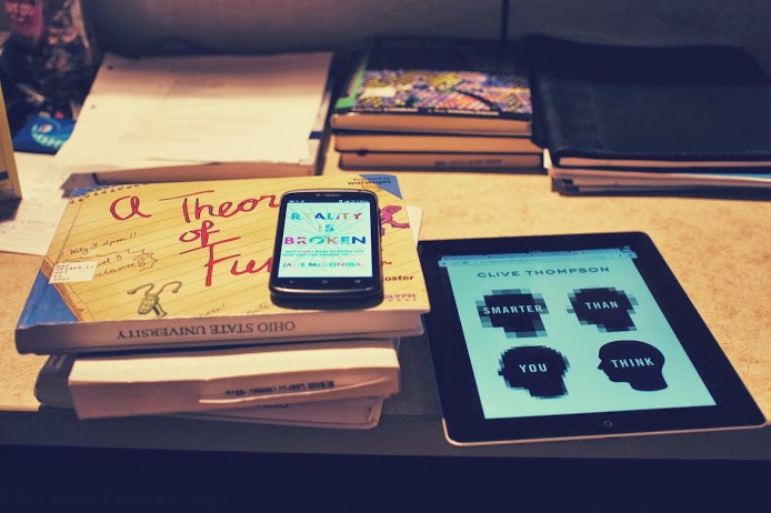
It’s cold out, so I’ve been curling up with some books. (I’ve left off the novels.)

Smarter Than You Think: How Technology Is Changing Our Minds for the Better by Clive Thompson

Are we losing some of our humanity? What happens if the Internet goes down: Do our brains collapse, too? Or is the question naive and irrelevant—as quaint as worrying about whether we’re “dumb” because we can’t compute long division without a piece of paper and a pencil. (18)

I was expecting this to be mostly a response to the Chicken Little “The Internet Is Making Us Dumber!” genre, but it’s actually more interesting than that. (And Thompson doesn’t set himself up as an armchair neuroscientist like many of those books’ authors do.) This is a thoughtful examination of the gains we make when we partner with technology, when we all play to our strengths.

The chapter on learning is fairly insightful. Again, the discussion focuses on using technology to free up humans’ time and energy for parts of the process that really benefit from human involvement: guidance, feedback, and so on.

Reality is Broken: Why Games Make Us Better and How They Can Change the World by Jane McGonigal

McGonigal is a part of the TED crowd, I think. Her ideas are optimistic, intriguing, “worldchanging.” At about halfway through, her book certainly convinces me that lots of people play videos games, that many gamers are productive and happy, and that games can be used for positive gains, but I don’t think there’s much of a case for the inherent positives of the medium itself.

It’s entirely possible that I have insurmountable bias, though; I’ve never been a gamer. (Unless solitaire and the online NYT crossword puzzle count as video games.)

A Theory of Fun for Game Design by Raph Koster

A really playful book, as might be expected from the title. The book isn’t about gamification or  specific game mechanics; it’s about what, broadly, makes games fun. Koster believes that games are all about engaging ourselves with patterns. We learn a game’s pattern and then derive fun from practicing that pattern in different iterations and partially mastering it. Games whose formal mechanisms are too baroque won’t seem fun; similarly, a game whose pattern we can master effortlessly (e.g., tic tac toe) isn’t fun either.

Many of Koster’s observations mirror theories about learning, especially when it comes to that sweet spot of finding graspable-but-challenging tasks. There are good lessons in the book for instructional designers about understanding that spectrum from busywork to fun/motivating to intimidating.

Helping students orient themselves in online courses: Space

Online classroom
The classroom is in the computer

There’s the syllabus and the study guides. But where’s the actual course?
(See my previous post.)

Students are used to two spaces

Students are used to their classes existing in two spaces: the classroom and the desk.

The classroom is the public space where class “happens”—where they enter to begin learning and where instruction takes place. Their desk (or table, or floor, or whatever) is the personal, tangible space where the stuff goes—handouts, notes, textbook, laptop.

One of the biggest conceptual obstacles for students new to online courses is that the classroom space and the desk space are collapsed into one flat, online space.

One of the biggest mistakes we make when we design online courses is to give students an experience that looks only that second space: just like a pile of stuff, with no class space. (If you put a student in a cubicle with a textbook, a stack of DVDs, and a syllabus, she probably wouldn’t understand that to be a class.) Here are our mistakes:

  • The LMS (Carmen) resembles a file repository.
  • The emphasis is on lecture videos placed in as files in a list.
  • The content modules are organized by file type.
  • The materials are in one place, the syllabus in another, and the assignments in yet another.

We can create a natively digital space

An online space will never be the same as a physical classroom space, and trying to simulate that space and experience (for example, with long lecture videos taken in a lecture hall) often only makes the online experience seem secondhand or false, a simulacrum.

The key is creating a native online experience that appeals to students’ understanding of space on the web. Making an online course, on online’s terms, instead of recording a classroom course and just uploading the files for students.

Visual first

The web is visual. Students who use the Internet are used to seeing abundant images and video, concise text, and pleasing layout with white space. It’s not just a matter of prettying things up or adding decoration to engage and attract; students learn better from words and pictures than from words alone.

To operate in this medium, we need to take advantage of its strengths. And if an online course experience is really inauthentic and badly done, students are going to be turned off, are going to doubt the instructor’s or institution’s credibility.

More like this:

NYT interactive feature

Less like this:

Web pages instead of files

A critical part of making a visual, web-first course is putting content into web form. I think it’s fair to say that students still want a second, personal space outside of the online course—whether it’s keeping notes in another program, printing out the calendar, or whatever. But your instructional materials, the parts that you want students to perceive as “the class,” should be a native part of that web experience.

  • Lecture videos: Instead of posting lecture videos as content in the course, embed the most helpful pieces of those videos onto a web page, surrounded by supporting text and images. Make the web page the main content, with text, images, and videos each used.
  • PowerPoint files: Instead of just embedding PPT files for your students to scroll through, you can turn the text and images into a web page. You could also use e-learning software like Softchalk to create a horizontal, paginated version if that’s a better fit for your content.
  • Syllabus and supporting documents: Things that exist in the personal “hold in my hand” space of a traditional class may be best left in that form for an online class. Lots of students want a syllabus to save or print. You can put this information into web page form though, too, so that students can find the information quickly when they’re online.

Intuitive, guiding navigation

Approach the design of your online course from the perspective of a web designer (or find a colleague who has some experience with that). How do you arrange things so that your users (students) will go to the places you want them to go and do what you want them to do?

We don’t have a lot of control over the navigation of the entire Carmen LMS, but we can structure the content—what makes up a module, what the order is, what the hierarchy is. We can create an intuitive structure that walks students through the paths we want them to take and gives them the help and resources they need at each step.

Verbs instead of nouns

It’s important to build in temporal cues and affordances to help students understand the course as doing and not just as stuff. See my blog post on orienting students to the time and sequence of an online course.


No one has figured out a single best approach

The exciting (or scary?) news is that no platform, institution, or instructor has figured out an ideal standard visual space. In 2014, most online courses look like they could have comfortably coexisted with America Online or Compuserve. It’s an opportunity for instructional designers and faculty to experiment. It’s a situation where a little bit of playing around, even if we’re amateurs in this area, can yield vastly better results.

Some resources I’ve found helpful to explore:

Accessible HTML templates for Carmen: Some customizable CSS templates that you can use to give your Carmen web pages a consistent and more visual appearance. (Here’s an intro to what CSS is.)

“What Screens Want”: A visual essay on what it means to design natively for screens—for “digital canvases.”

Stock photos that don’t suck: Links to some free photos that are better than typical (terrible) stock photos. Also see Flickr and Google Image Search, which both offer options to search for photos that you can reuse or modify.

Butterick’s Practical Typography: An overview of good typography, including web type, and an example of a visual web space with no pictures.

Dash: An online learning platform with short lessons on HTML, CSS, and Javascript. It would only take a couple of hours to go through the lessons, and when you were done you’d know enough to be an HTML master in Carmen. (Seriously!)


Helping students orient themselves in online courses: Time

(Perhaps best sung to the tune of a Pixies song…)

Around the time I start working in online education, a friend of my mom’s, who was going back to school to get a new degree, was getting ready to take her first online college class.

We were sitting at my mom’s house on a Sunday night, the night before her class started, and she got out her laptop and asked me a very striking question:

OK, here’s the Blackboard site for the algebra class. There’s the syllabus and the study guides. But where’s the actual course? I don’t get it.

Whatever response I stammered out (I can’t recall exactly) did little to clear things up for her.

This got me thinking seriously about how students experience online learning—how they perceive time and space when they’re signing in to a website instead of attending class sessions.


Laying out time in the online space

For me, a fundamental design requirement of an online course is that the architecture of the site convey the sequence of tasks and materials in time.

In the flatland (Edward Tufte’s term) of a Carmen course site, it’s essential to show time and motion. In addition to all of the nouns (documents, videos, web pages, links), your course site must have verbs.

One way to do this in Carmen is use the Content structure as a sort of calendar. Each week has its own tab on the side, so students immediately see the connection between the web space and the chronology of the class:

Within those tabs, the content module lays out a sequence of events, a checklist where the materials and activities show up in a sensible order. Students can see that they start with the first one and proceed through:


Creating online patterns and rituals

Maybe an even bigger challenge is to get students into the rhythm of the actual activities an online class. Most of them are used to the patterns and rituals of college classes:

  • You go to class, listen, take notes, ask questions
  • You go home and have a couple days to do homework and push through the reading assignments
  • You go to class, listen, take notes, ask questions
  • You go home and have a couple days to do homework, push through the reading assignments, and start (a) writing a paper, (b) studying for an exam, (c) working on a project
  • And so on…

These patterns help students stay on track and stay engaged. So what happens online when these patterns don’t work? When they don’t have class sessions to go to? When it’s all “home work”?

Either you give them new patterns, or (if you’re living dangerously) you trust that if you give them all the course materials on Day 1, they’ll stay on track and be ready for the final exam when it comes.

Online courses can have different patterns and rituals, but you must purposefully build those in and explain them to students.

Some examples:

  • Students have to post reflections on the week’s reading by Friday every week.
  • Each week begins with a short case study, tied to the reading, videos, and assignments, and a report is due each Saturday by midnight.
  • Students can submit questions all week, and the instructor will have a Q&A video session on Sunday night addressing them all.
  • Students each read one supplemental article every week and contribute an entry to their group’s annotated bibliography wiki.

What’s different online is that a lecture is not part of these patterns and rituals, as it is in a classroom. Lecture videos are just nouns—materials on the website. An online course that engages students must be built around patterns of verbs, things that students are doing. Lecture videos can be great as content, they’re just not a part of the doing in an online course.

In a really engaging course, the doing—those verbs—will compel students to interact with their instructor, with each other, with the materials, and with the world outside of the class.

University of Oklahoma’s clean, visual LMS

Screen shot of UO’s learning management system

I was checking out a massive online course from University of Oklahoma, and I was pleasantly surprised by the platform they’re using. (Looks like it’s called JANUX, possibly a homegrown product.)

What I like about this:

  • It’s decidedly visual. Great care was taken to create a visual classroom space. It’s not just text. Every document and discussion has an image or video.
  • The content modules along the side are subtly connected to the calendar. (The date shows up next to each module when you hover over it.)
  • It’s fast.

It’s basically just the standard format everyone’s using right now, but it hits all my priorities. It looks appealing and places the media and materials into time and space in an intuitive way.

User personas in instructional design

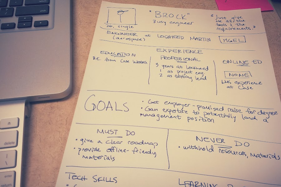
Brainstorming sketch for an engineering student persona

One of the challenges of teaching online is that you have to set up so much up front. Good teachers are used to seeing their students and adapting their instruction according to what they see. So how do you make good decisions when you’re laying out an entire course months before the students enroll? How do you design with empathy for those students?

One imperfect (but worthwhile) solution I’ve tried comes from the realm of user experience design: user personas.

If you can’t see your students while you’re designing an online course, at least you can consider the kinds of students you expect to have, based on experience. By putting those expected students down on paper as “user personas,” you can share that experience with the other faculty or staff working on the project with you. (And the exercise can help you to be more mindful yourself.)

What are user personas?

User personas are research- or experience-based profiles of representative types of users (for a product, website, or—in our case—class).

To force yourself to consider a wider range of people in your target audience, you sketch a brief profile of fictitious users and then keep those profiles nearby when you make design decisions. (For example, “Will this lesson provide enough technology support for our Brock-type students? Maybe we should include links to some outside tutorials.”)

What do you include?

To create a user persona, I’d consider they same type of information instructional designers usually try to find out about students (e.g., from the Dick and Carey approach) as part of the initial instructional analysis:

  • Abilities: cognitive, physical
  • Personality: attitude/motivation, learning preferences, self-monitoring (metacognitive strategies for learning)
  • Literacies: computer/tech, online learning, subject matter, domain-specific scholarly activities, textual, visual
  • Sociocultural: family, economic status, geography, organizational affiliations
  • Biological characteristics: age, gender, possibly race/ethnicity

Does it work?

I’ve used this and found it helpful in the context of designing course materials for a very diverse student population. My experience suggests a couple of keys to making this a useful tool.

First, these personas are useful only if you actively consider them while you’re considering your course objectives, activities, and support systems. This is true of any kind of learner analysis. I think the personas specifically can be useful because you you can have them on paper (or on the screen) while you’re planning.

Second, the personas have to be realistic but fairly short. If you create long fictitious dossiers, you’ll probably never read through them again. It’s best to highlight only the most pertinent of the categories above, and it helps to create a pithy one-sentence summary for each persona.