Helping students orient themselves in online courses: Space

Online classroom
The classroom is in the computer

There’s the syllabus and the study guides. But where’s the actual course?
(See my previous post.)

Students are used to two spaces

Students are used to their classes existing in two spaces: the classroom and the desk.

The classroom is the public space where class “happens”—where they enter to begin learning and where instruction takes place. Their desk (or table, or floor, or whatever) is the personal, tangible space where the stuff goes—handouts, notes, textbook, laptop.

One of the biggest conceptual obstacles for students new to online courses is that the classroom space and the desk space are collapsed into one flat, online space.

One of the biggest mistakes we make when we design online courses is to give students an experience that looks only that second space: just like a pile of stuff, with no class space. (If you put a student in a cubicle with a textbook, a stack of DVDs, and a syllabus, she probably wouldn’t understand that to be a class.) Here are our mistakes:

  • The LMS (Carmen) resembles a file repository.
  • The emphasis is on lecture videos placed in as files in a list.
  • The content modules are organized by file type.
  • The materials are in one place, the syllabus in another, and the assignments in yet another.

We can create a natively digital space

An online space will never be the same as a physical classroom space, and trying to simulate that space and experience (for example, with long lecture videos taken in a lecture hall) often only makes the online experience seem secondhand or false, a simulacrum.

The key is creating a native online experience that appeals to students’ understanding of space on the web. Making an online course, on online’s terms, instead of recording a classroom course and just uploading the files for students.

Visual first

The web is visual. Students who use the Internet are used to seeing abundant images and video, concise text, and pleasing layout with white space. It’s not just a matter of prettying things up or adding decoration to engage and attract; students learn better from words and pictures than from words alone.

To operate in this medium, we need to take advantage of its strengths. And if an online course experience is really inauthentic and badly done, students are going to be turned off, are going to doubt the instructor’s or institution’s credibility.

More like this:

NYT interactive feature

Less like this:

Web pages instead of files

A critical part of making a visual, web-first course is putting content into web form. I think it’s fair to say that students still want a second, personal space outside of the online course—whether it’s keeping notes in another program, printing out the calendar, or whatever. But your instructional materials, the parts that you want students to perceive as “the class,” should be a native part of that web experience.

  • Lecture videos: Instead of posting lecture videos as content in the course, embed the most helpful pieces of those videos onto a web page, surrounded by supporting text and images. Make the web page the main content, with text, images, and videos each used.
  • PowerPoint files: Instead of just embedding PPT files for your students to scroll through, you can turn the text and images into a web page. You could also use e-learning software like Softchalk to create a horizontal, paginated version if that’s a better fit for your content.
  • Syllabus and supporting documents: Things that exist in the personal “hold in my hand” space of a traditional class may be best left in that form for an online class. Lots of students want a syllabus to save or print. You can put this information into web page form though, too, so that students can find the information quickly when they’re online.

Intuitive, guiding navigation

Approach the design of your online course from the perspective of a web designer (or find a colleague who has some experience with that). How do you arrange things so that your users (students) will go to the places you want them to go and do what you want them to do?

We don’t have a lot of control over the navigation of the entire Carmen LMS, but we can structure the content—what makes up a module, what the order is, what the hierarchy is. We can create an intuitive structure that walks students through the paths we want them to take and gives them the help and resources they need at each step.

Verbs instead of nouns

It’s important to build in temporal cues and affordances to help students understand the course as doing and not just as stuff. See my blog post on orienting students to the time and sequence of an online course.


No one has figured out a single best approach

The exciting (or scary?) news is that no platform, institution, or instructor has figured out an ideal standard visual space. In 2014, most online courses look like they could have comfortably coexisted with America Online or Compuserve. It’s an opportunity for instructional designers and faculty to experiment. It’s a situation where a little bit of playing around, even if we’re amateurs in this area, can yield vastly better results.

Some resources I’ve found helpful to explore:

Accessible HTML templates for Carmen: Some customizable CSS templates that you can use to give your Carmen web pages a consistent and more visual appearance. (Here’s an intro to what CSS is.)

“What Screens Want”: A visual essay on what it means to design natively for screens—for “digital canvases.”

Stock photos that don’t suck: Links to some free photos that are better than typical (terrible) stock photos. Also see Flickr and Google Image Search, which both offer options to search for photos that you can reuse or modify.

Butterick’s Practical Typography: An overview of good typography, including web type, and an example of a visual web space with no pictures.

Dash: An online learning platform with short lessons on HTML, CSS, and Javascript. It would only take a couple of hours to go through the lessons, and when you were done you’d know enough to be an HTML master in Carmen. (Seriously!)


Helping students orient themselves in online courses: Time

(Perhaps best sung to the tune of a Pixies song…)

Around the time I start working in online education, a friend of my mom’s, who was going back to school to get a new degree, was getting ready to take her first online college class.

We were sitting at my mom’s house on a Sunday night, the night before her class started, and she got out her laptop and asked me a very striking question:

OK, here’s the Blackboard site for the algebra class. There’s the syllabus and the study guides. But where’s the actual course? I don’t get it.

Whatever response I stammered out (I can’t recall exactly) did little to clear things up for her.

This got me thinking seriously about how students experience online learning—how they perceive time and space when they’re signing in to a website instead of attending class sessions.


Laying out time in the online space

For me, a fundamental design requirement of an online course is that the architecture of the site convey the sequence of tasks and materials in time.

In the flatland (Edward Tufte’s term) of a Carmen course site, it’s essential to show time and motion. In addition to all of the nouns (documents, videos, web pages, links), your course site must have verbs.

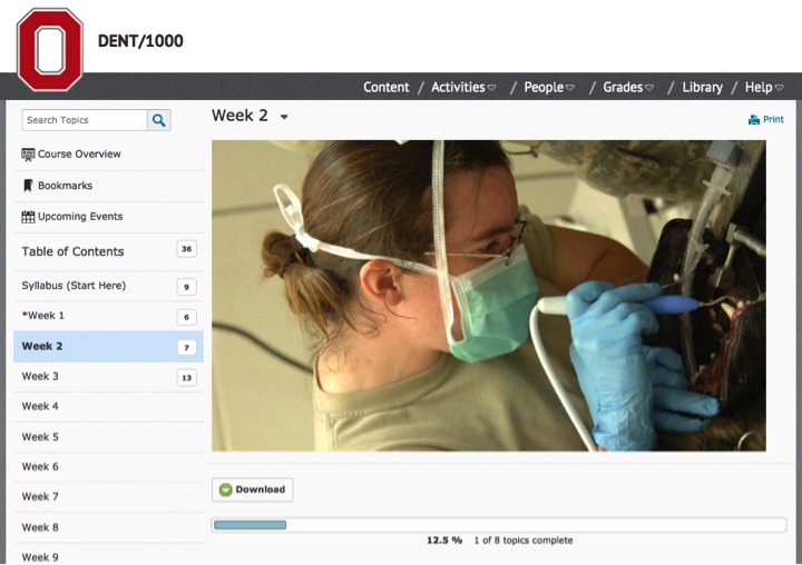
One way to do this in Carmen is use the Content structure as a sort of calendar. Each week has its own tab on the side, so students immediately see the connection between the web space and the chronology of the class:

Within those tabs, the content module lays out a sequence of events, a checklist where the materials and activities show up in a sensible order. Students can see that they start with the first one and proceed through:


Creating online patterns and rituals

Maybe an even bigger challenge is to get students into the rhythm of the actual activities an online class. Most of them are used to the patterns and rituals of college classes:

  • You go to class, listen, take notes, ask questions
  • You go home and have a couple days to do homework and push through the reading assignments
  • You go to class, listen, take notes, ask questions
  • You go home and have a couple days to do homework, push through the reading assignments, and start (a) writing a paper, (b) studying for an exam, (c) working on a project
  • And so on…

These patterns help students stay on track and stay engaged. So what happens online when these patterns don’t work? When they don’t have class sessions to go to? When it’s all “home work”?

Either you give them new patterns, or (if you’re living dangerously) you trust that if you give them all the course materials on Day 1, they’ll stay on track and be ready for the final exam when it comes.

Online courses can have different patterns and rituals, but you must purposefully build those in and explain them to students.

Some examples:

  • Students have to post reflections on the week’s reading by Friday every week.
  • Each week begins with a short case study, tied to the reading, videos, and assignments, and a report is due each Saturday by midnight.
  • Students can submit questions all week, and the instructor will have a Q&A video session on Sunday night addressing them all.
  • Students each read one supplemental article every week and contribute an entry to their group’s annotated bibliography wiki.

What’s different online is that a lecture is not part of these patterns and rituals, as it is in a classroom. Lecture videos are just nouns—materials on the website. An online course that engages students must be built around patterns of verbs, things that students are doing. Lecture videos can be great as content, they’re just not a part of the doing in an online course.

In a really engaging course, the doing—those verbs—will compel students to interact with their instructor, with each other, with the materials, and with the world outside of the class.

University of Oklahoma’s clean, visual LMS

Screen shot of UO’s learning management system

I was checking out a massive online course from University of Oklahoma, and I was pleasantly surprised by the platform they’re using. (Looks like it’s called JANUX, possibly a homegrown product.)

What I like about this:

  • It’s decidedly visual. Great care was taken to create a visual classroom space. It’s not just text. Every document and discussion has an image or video.
  • The content modules along the side are subtly connected to the calendar. (The date shows up next to each module when you hover over it.)
  • It’s fast.

It’s basically just the standard format everyone’s using right now, but it hits all my priorities. It looks appealing and places the media and materials into time and space in an intuitive way.

User personas in instructional design

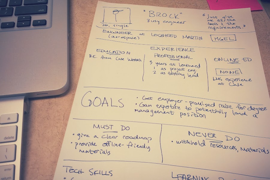
Brainstorming sketch for an engineering student persona

One of the challenges of teaching online is that you have to set up so much up front. Good teachers are used to seeing their students and adapting their instruction according to what they see. So how do you make good decisions when you’re laying out an entire course months before the students enroll? How do you design with empathy for those students?

One imperfect (but worthwhile) solution I’ve tried comes from the realm of user experience design: user personas.

If you can’t see your students while you’re designing an online course, at least you can consider the kinds of students you expect to have, based on experience. By putting those expected students down on paper as “user personas,” you can share that experience with the other faculty or staff working on the project with you. (And the exercise can help you to be more mindful yourself.)

What are user personas?

User personas are research- or experience-based profiles of representative types of users (for a product, website, or—in our case—class).

To force yourself to consider a wider range of people in your target audience, you sketch a brief profile of fictitious users and then keep those profiles nearby when you make design decisions. (For example, “Will this lesson provide enough technology support for our Brock-type students? Maybe we should include links to some outside tutorials.”)

What do you include?

To create a user persona, I’d consider they same type of information instructional designers usually try to find out about students (e.g., from the Dick and Carey approach) as part of the initial instructional analysis:

  • Abilities: cognitive, physical
  • Personality: attitude/motivation, learning preferences, self-monitoring (metacognitive strategies for learning)
  • Literacies: computer/tech, online learning, subject matter, domain-specific scholarly activities, textual, visual
  • Sociocultural: family, economic status, geography, organizational affiliations
  • Biological characteristics: age, gender, possibly race/ethnicity

Does it work?

I’ve used this and found it helpful in the context of designing course materials for a very diverse student population. My experience suggests a couple of keys to making this a useful tool.

First, these personas are useful only if you actively consider them while you’re considering your course objectives, activities, and support systems. This is true of any kind of learner analysis. I think the personas specifically can be useful because you you can have them on paper (or on the screen) while you’re planning.

Second, the personas have to be realistic but fairly short. If you create long fictitious dossiers, you’ll probably never read through them again. It’s best to highlight only the most pertinent of the categories above, and it helps to create a pithy one-sentence summary for each persona.

Feeling over-objectified

Plot table from A Taxonomy for Learning, Teaching, and Assessing

I believe wholeheartedly in the importance of designing courses around meaningful learning objectives.

Online educators, though, often seem to be obsessed with enforcing a very behavioristic system of measurable objectives and sub-objectives using Bloom’s taxonomy. (This comes up in the otherwise laudable standards of Quality Matters. They are extremely specific about how to use learning objectives, even though the matter isn’t at all settled or clear in the research they rely on.)

Before Christmas I borrowed A Taxonomy for Learning, Teaching, and Assessing from the library. This book presents the well-known “revised” Bloom’s taxonomy.

What I found was a detailed guide that seems like it would be very useful for institutions or school districts who are trying to calibrate curriculum assessment at a wide scale. I found less there for individual course designers or for students.

In the absence of a strict institutional assessment regime, I remain convinced that straightforward, general, vernacular-English learning objectives are better than Bloom’s ones, for a few reasons.

We can get a false impression of rigor from the six levels

If every objective was calibrated to have identical scope and depth, you might reasonably say that “Design…” was more rigorous than “Clarify…” But what if the design task is fairly mechanical and the clarify task is extremely thorny and subtle?

To some extent, the levels abstractly make sense on a scale of rigor (remembering is lower than applying, which is lower than creating a brand-new structure). Two caveats, though:

  1. That scale has no basis in research on learning or cognition (which isn’t all that settled anyway), and
  2. The levels don’t relate in any sort of sequence, even if it seems like they do (someone can apply something without understanding it, certainly without recalling it directly, and which of those is more difficult is a judgment call in a given situation).

Tinkering with verbs doesn’t make something fundamentally more measurable or meaningful

The Taxonomy book goes on at great length about the subtleties of placing a task at the appropriate level, and I don’t find too much fault with their suggestions—it’s all fairly consistent. But I don’t think that most instructors or instructional designers want to take the time to plot objectives according to the book’s levels, sub-levels, and sub-sub-levels. More importantly, too, what’s the use of assigning that subtle meaning when a layperson (a student, for example) couldn’t possibly perceive the distinctions?

One of the primary tasks in the Applying the Quality Matters Rubric course I took last fall was to judge whether course objectives were measurable or not. My classmates would pounce on the fictitious sample instructor’s objectives:

“‘Understand strategies for overcoming public speaking anxiety’??? This instructor doesn’t know anything about objectives! We can’t even review this course because the objectives are completely opaque and unmeasurable…

“But we can change the verb to describe, and then everything’s fixed.”

Seriously? First, if you know exactly what the measurable version should be, was there really a problem in the first place? That makes it purely semantic and nothing to do with the meaning. Second, to a student or a sane instructor, isn’t the first version fairly clear? No, it’s not 100% clear what understanding entails, but isn’t describe just as vague? Can’t you describe in different ways, at different depths?

It’s all too neat

The way we use objectives suggests that learning is easily planned, sequential, neatly packaged, and identical from student to student. Certainly the objectives provide direction—and an aimless, directionless college course is probably a bad thing. Has anyone ever learned anything in careful order like that, though? And has anyone ever had a great college course that never changed gears or veered into unexpected areas?

I think Bloom’s over-promises and suggests that we understand learning better than we do. Learning is a complex system, differing from person to person, and it includes all sorts of non-cognitive elements (motivation, prior knowledge, and so on).

Saying that a student met a learning objective is a big claim.

  • It requires that your objective, materials, and assessment were perfectly planned and aligned.
  • It requires that the proxy measurement of that assessment was highly correlated to the behavior described in the objective. (Are all assessments so authentic and transferrable to the real world?)
  • It requires that each learning objective is evaluated individually, objectively, without interference from grading scales, curves, and so on. (Does a D mean you met the objective? If you got a penalty for turning in the project late, does that mean you met the objective to a lesser extent? How often do graduate students get Fs?)

What, then?

Let’s create our courses around clear, meaningful learning outcomes. Let’s focus on providing an overabundance of resources and practice for reaching those outcomes—not just a carefully prescribed sequence that hews exactly to our objectives. Let’s share these outcomes with students in a transparent, easy-to-grasp way, without bombarding them with micro-objectives.

If we give students a few clear, strong course outcomes, they’ll begin to understand the connection between the outcomes and the activities in the course. We’ll also be leaving room for the course to take different paths, for students to learn in the messy, serendipitous way that people really learn.

And let’s judge their learning based on those outcomes, but with the understanding that the data will give us no more than hints. And let’s use that data to try to make the next time go better.