


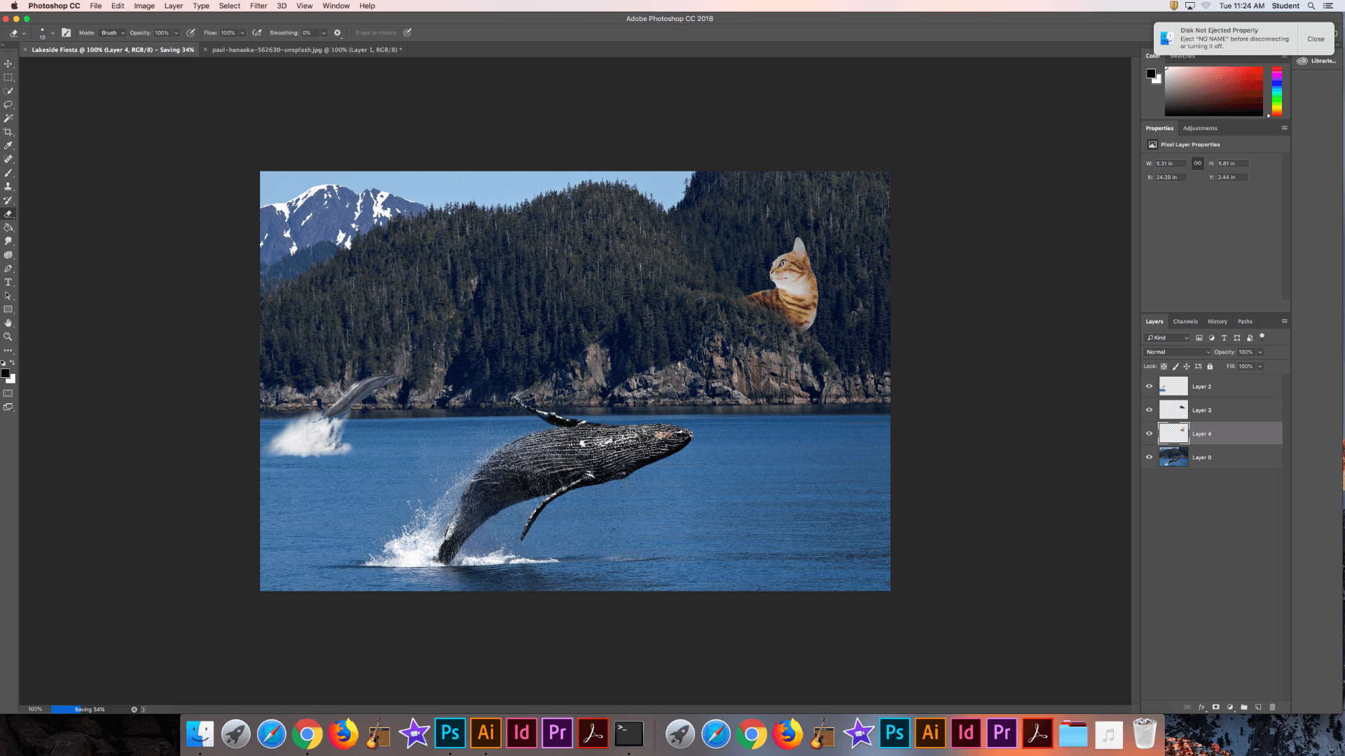
This image seems very random and like nothing makes sense and that is exactly right. When I was deciding where my dream journal would end up I kept thinking about how random and nonsensical my dreams usually are. So I decided to follow the general progress of what my dreams usually consist of. Some landscape with a large number of random events occurring in it.
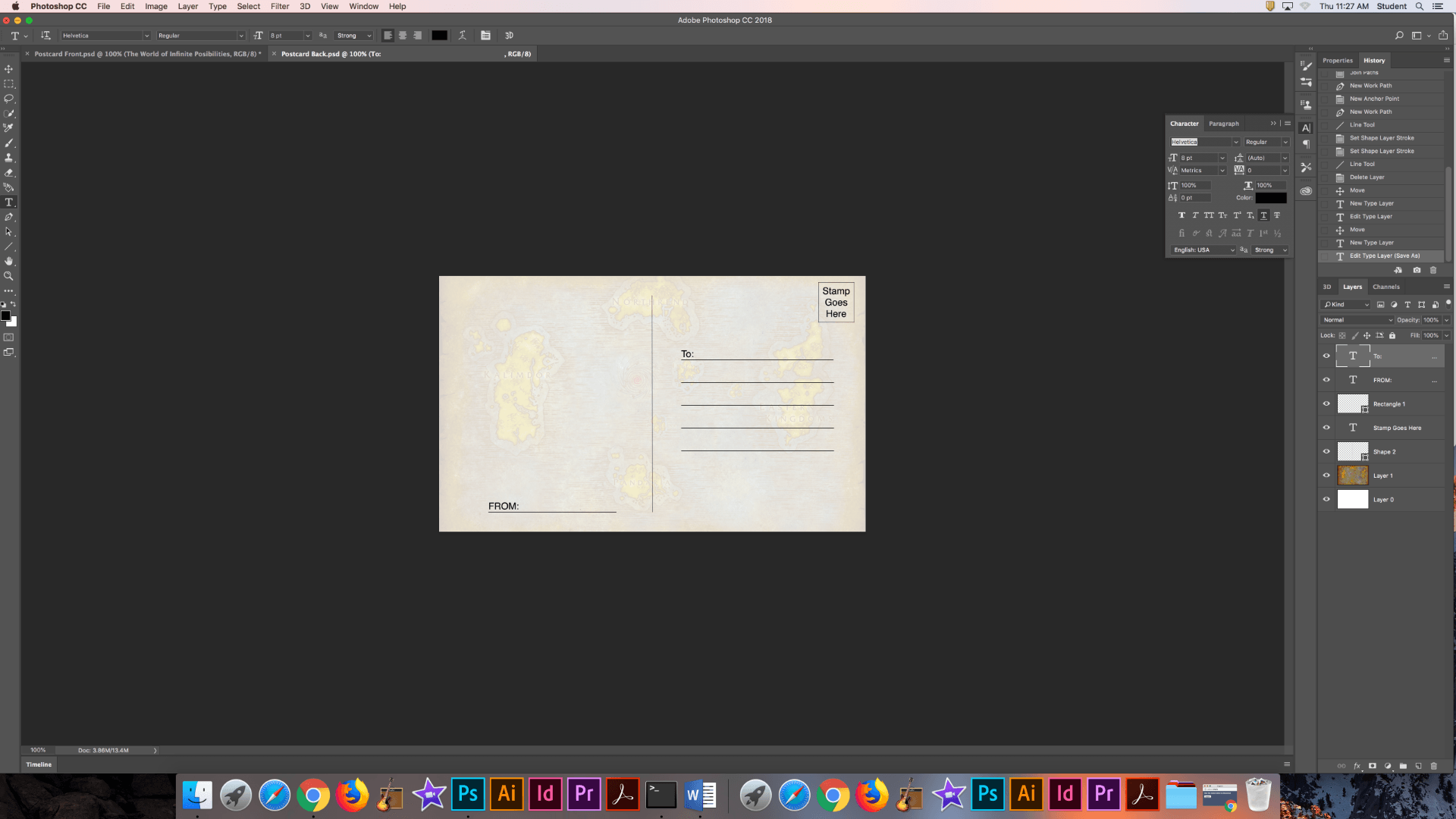
I began with a beautiful picture of a whale cresting the waters of a lake with some mountains behind the water. I then thought it would be cool to add a dolphin also surfacing from the water, which seems realistic, but because of the area the odds of a dolphin being here are not so simple. After adding the dolphin I began thinking about what else I could add and for some reason I came upon cats.
I began first by finding two images of cats that seemed to “fit” together. So I started by adding the cat in the lower right as if it were scared and looking up into the sky at something that was there. The things that it is looking at are a kitten “roaring”, actually yawning, over the hillside across from it and also a rocket league car boosting through the sky off in the distance. Since I play Rocket League I thought it would be a good idea to add one of the cars into the sky of the image as it adds my own personal interest into the piece.

This is the original image that I started with.

The first image I used was that of a dolphin surfacing and jumping out of the water. I began by selecting the dolphin and the water below it that it was displacing when it came out of the water. I used a simple selection tool and feathered the edges to make the image more smooth.

I then pasted the image of the dolphin into the plane of the water. After that I selected an area of the existing water and pasted it into a layer above the dolphin selection. This was so that I could blend the water in the dolphin image into the water of the original image. It also adds a hint of realism because the water isn’t just magically changing color and consistency.
Next I smudged the white parts of the water and blended it into the existing water. As mentioned above, this is to add more realism to the image. I also took a large and soft eraser to smooth the edges of the dolphin so that it isn’t just a hard image pasted over top of the original.

Next I selected an image of a cat staring off into the distance. I used a simple selection to select the body of the cat and copied this selection. I then pasted it into the work in progress image above. I also flipped this copied image so that the cat was looking in the direction that I wanted it to.

After pasting the cat into the image I used the same process that I used for the dolphin. I placed it where I wanted it in the scenery and then I selected the part of the mountain that I wanted to cover the cat. Once selected I copied it and smoothed the edges so that it looked as if this large cat was peering over this part of the mountain at something in the distance. By blending the two layers of the cat and the scenery together it looks as if the cat is behind the mountain and not just on it.
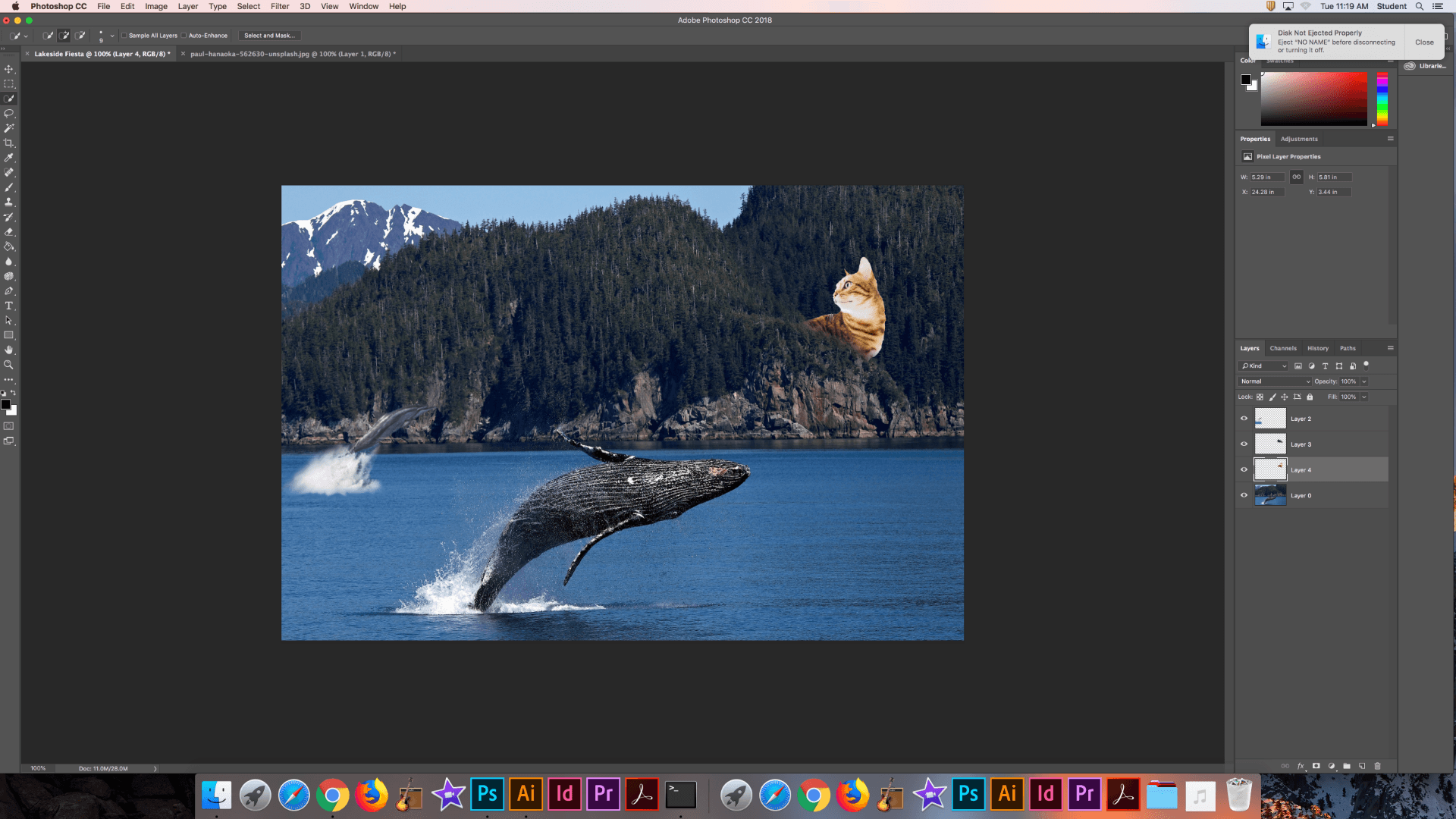
The first of the two images is immediately after unhiding the rest of the scenery and then I used a light eraser and a few other blending options to soften the image of the cat so it looks as if it is sitting in the scenery and not on it.
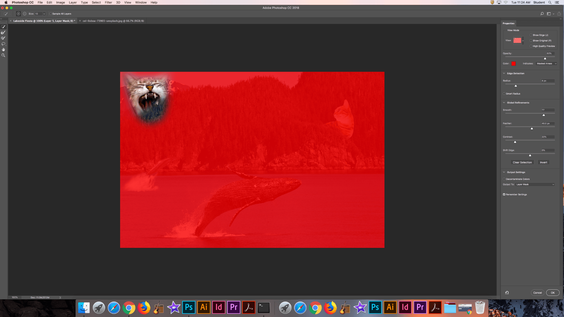
After learning about the mask select tool, I proceeded by pasting an image of this kitten yawning into the mix. I then used the mask select tool to select the part of the kitten that I wanted to use and then put it into the background.

Like I did above I used the same technique of selection the foreground of the image and pasting it over the kitten so that the kitten is in the image and not on it. I used the same soft eraser and blending around the tree line so that the kitten looks as if it is in the image.

After adding the second cat I used the dodge tool and a gray 50% gray layer to add shadows where necessary, like underneath the dolphin, so that there is depth in the image.

Lastly I decided to add the Dominus from Rocket League into the image as sort of a shooting star in the background. I began by using the mask select to choose which part of the car and trail I wanted. After that I scaled down the car and put it where I wanted it.
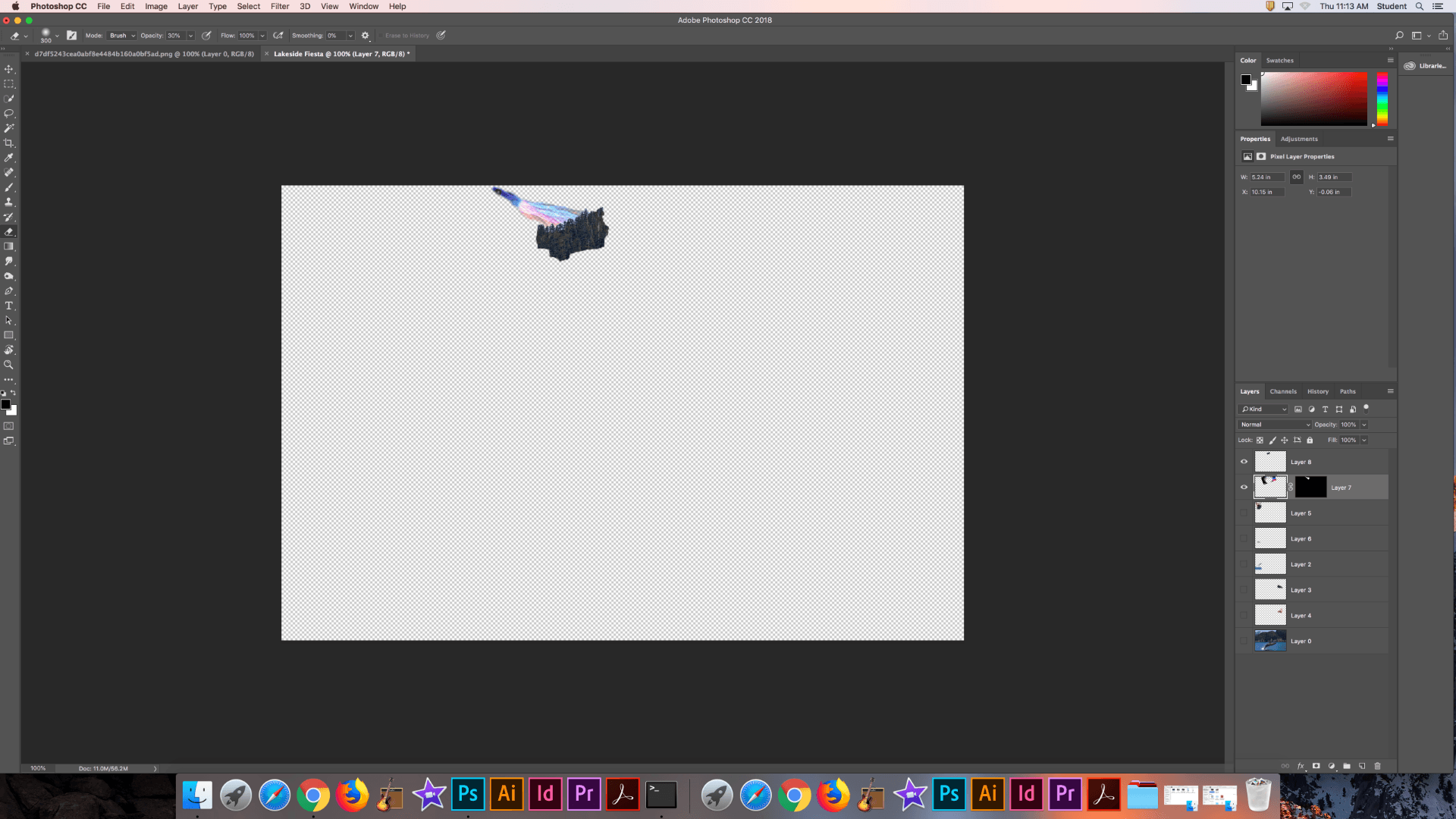
Similar to every other image I added, I used the foreground to hide the image so that it looks like it is coming from behind the mountain and is off in the distance of the sky. I flipped the original image and blended it into the sky using a soft eraser and a blend mode on the trail.
This is the final image as seen at the beginning of the post.

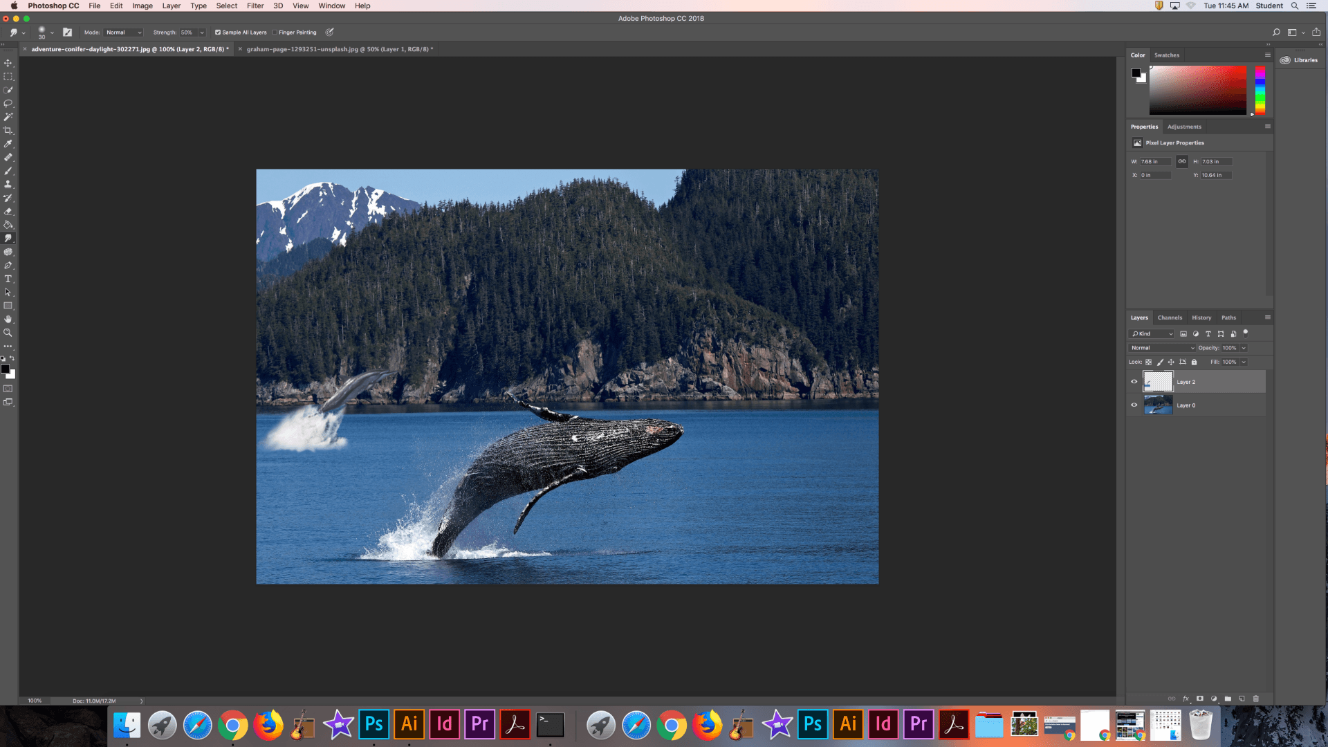
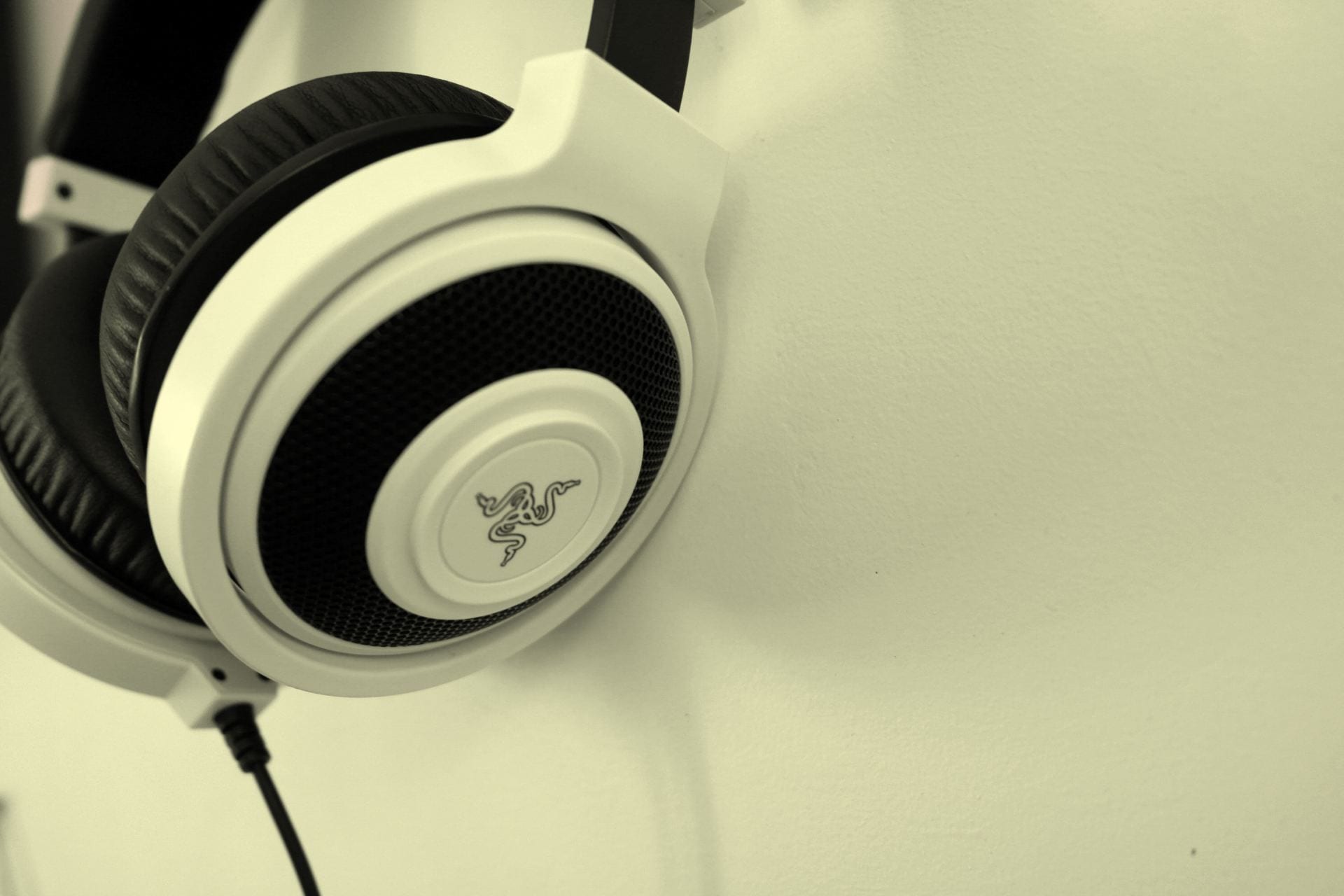
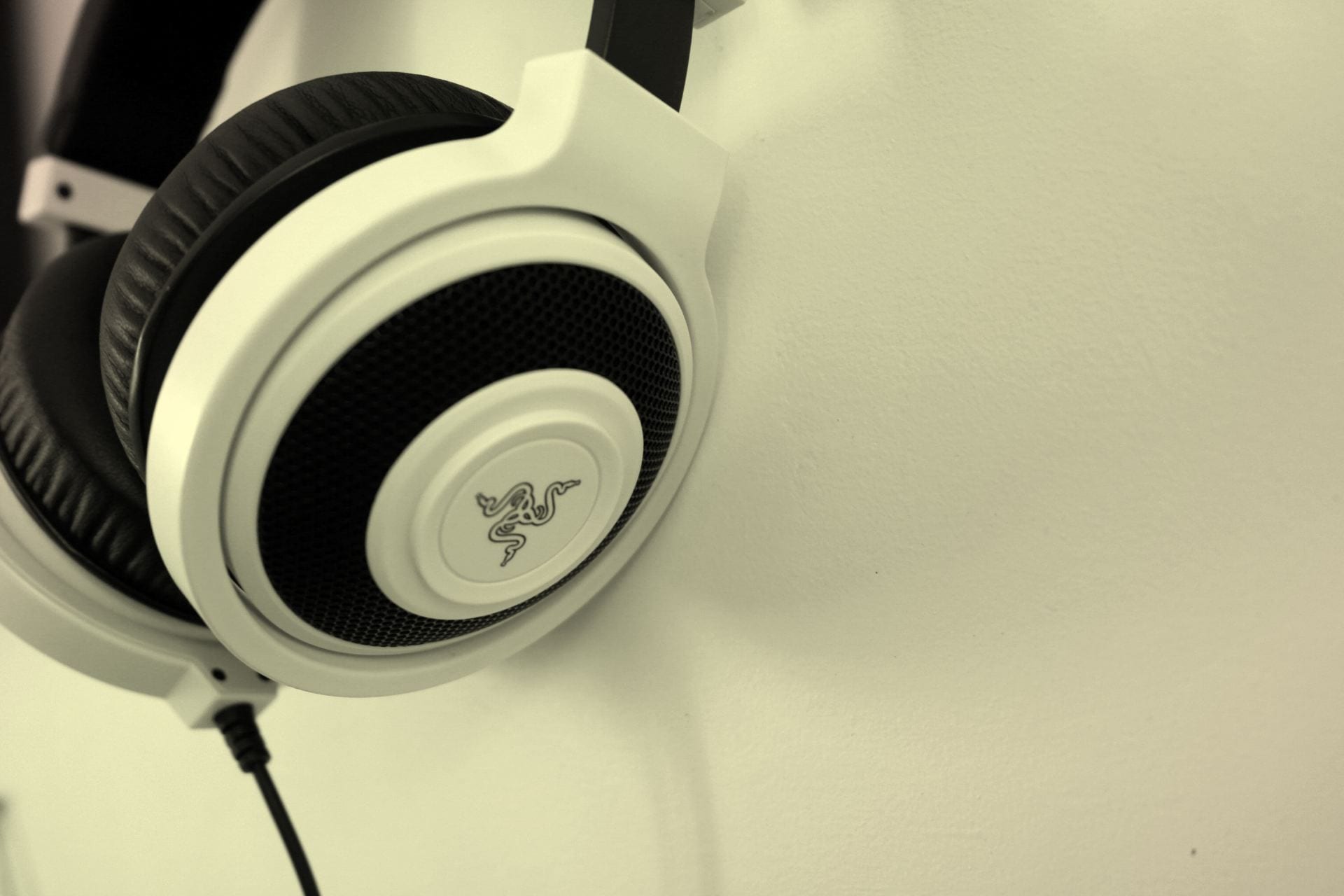
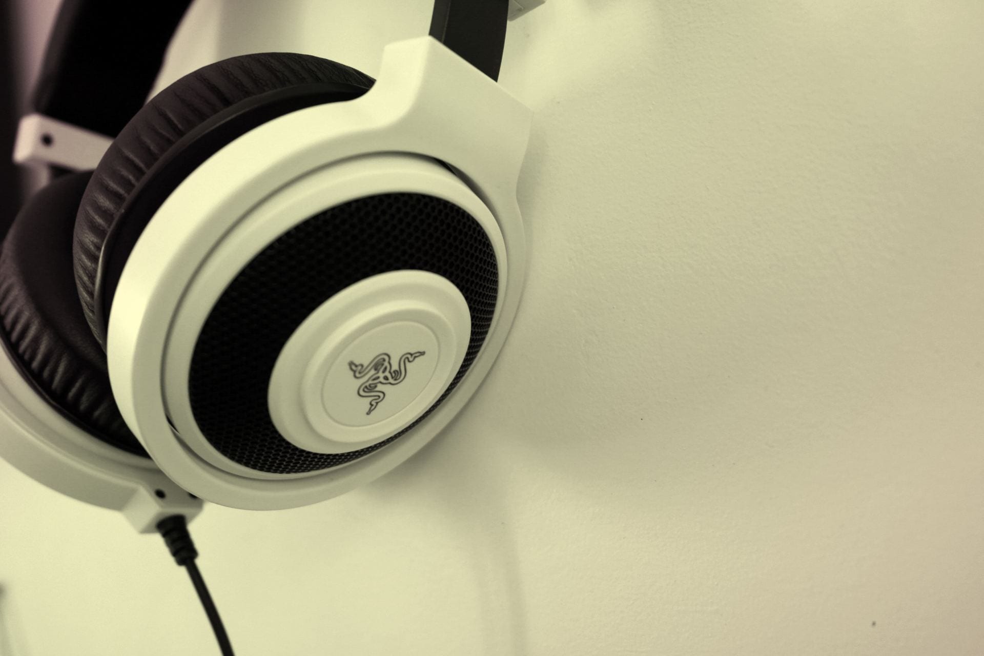
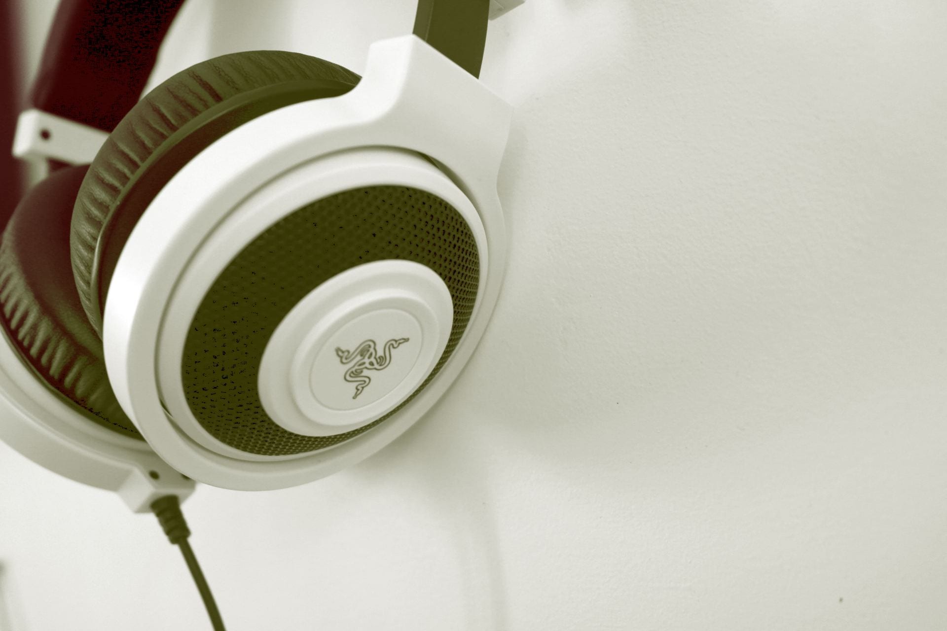
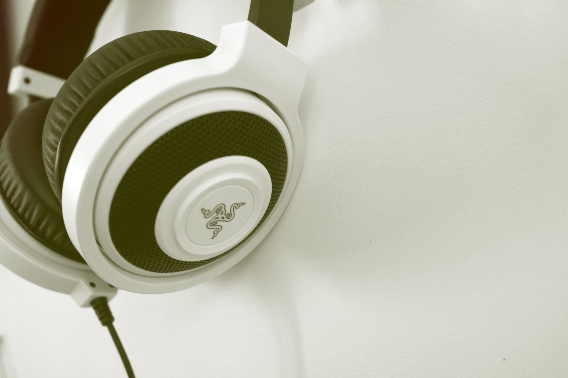
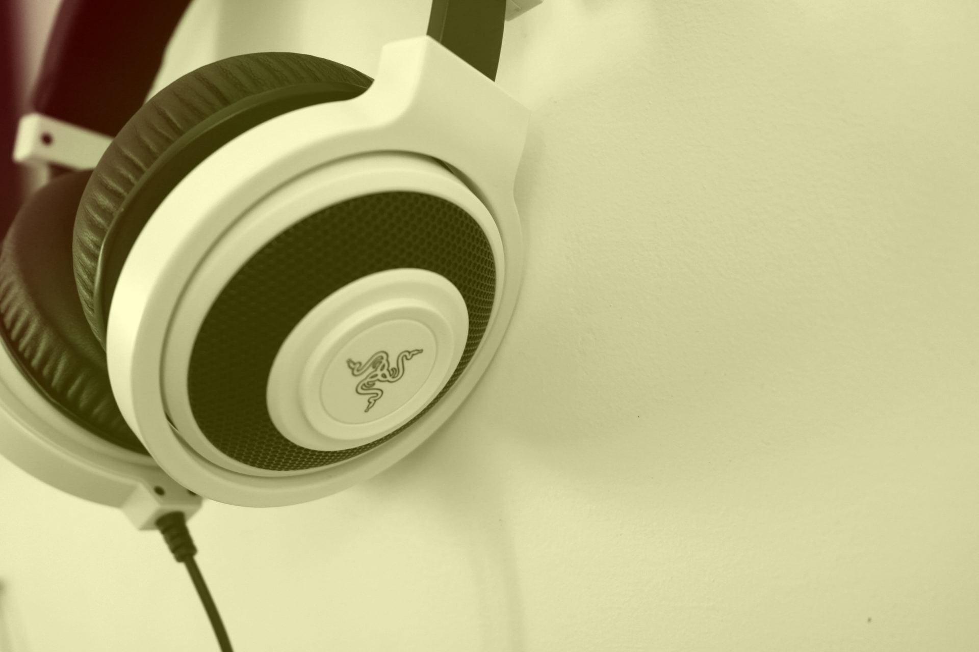
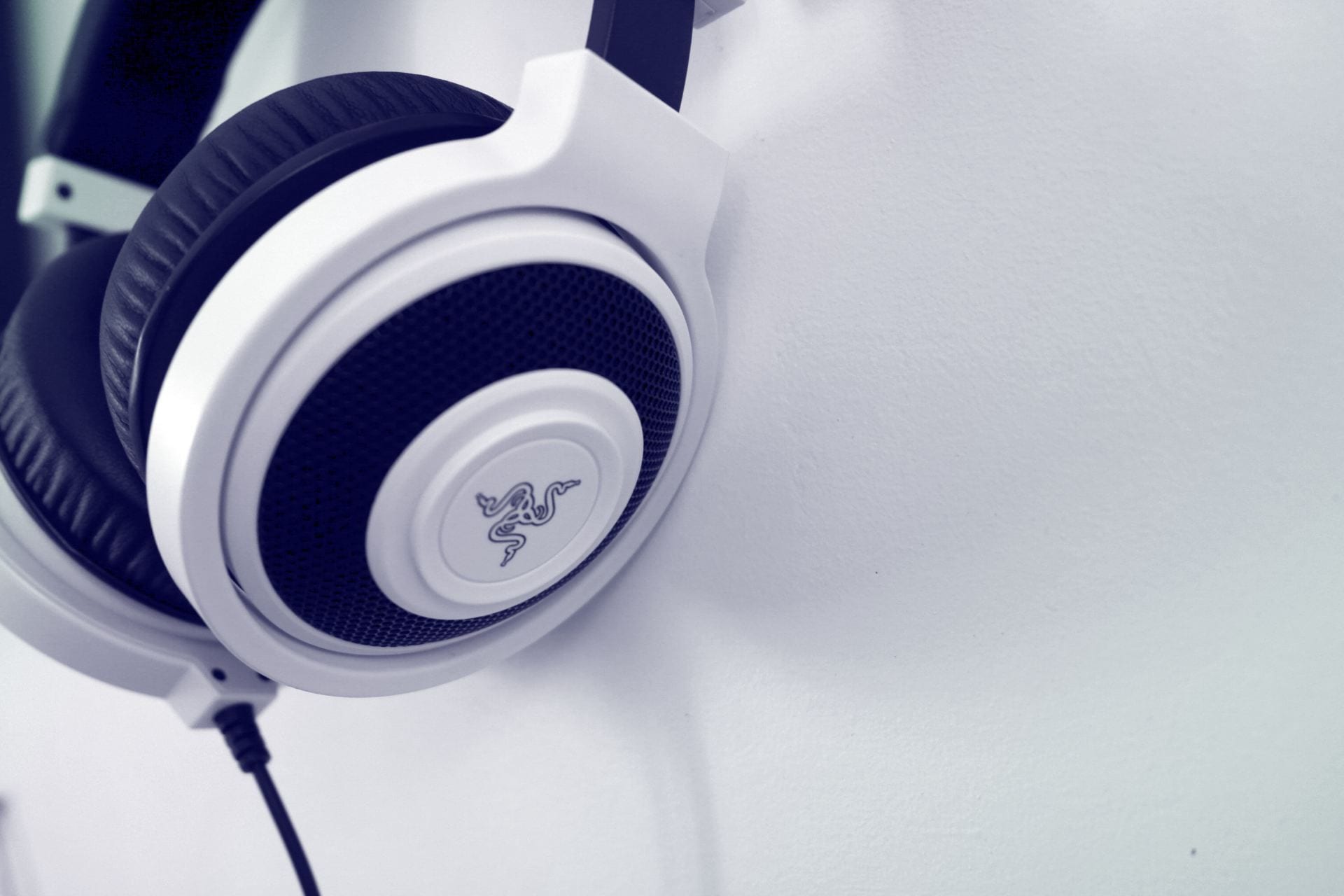
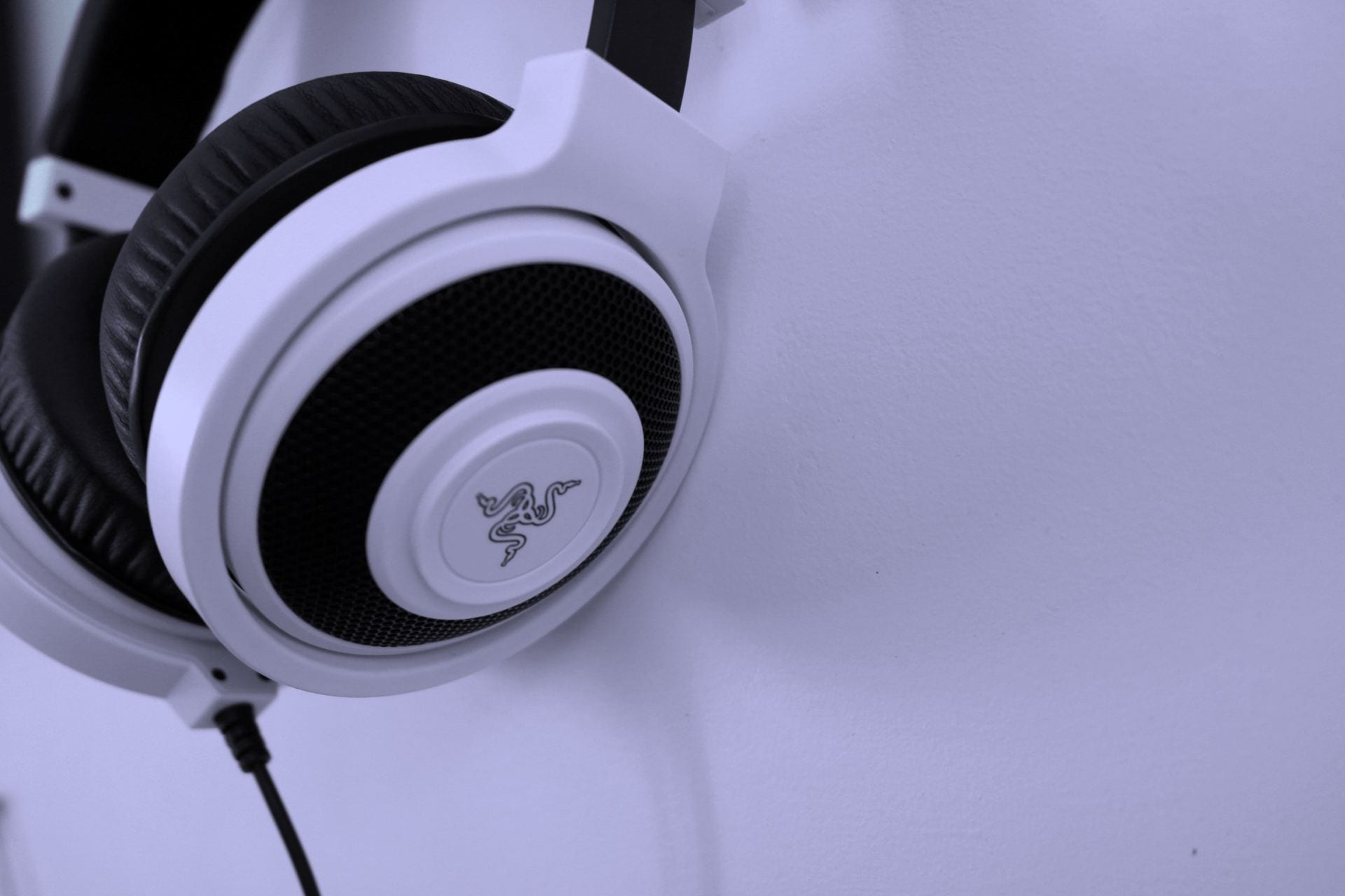
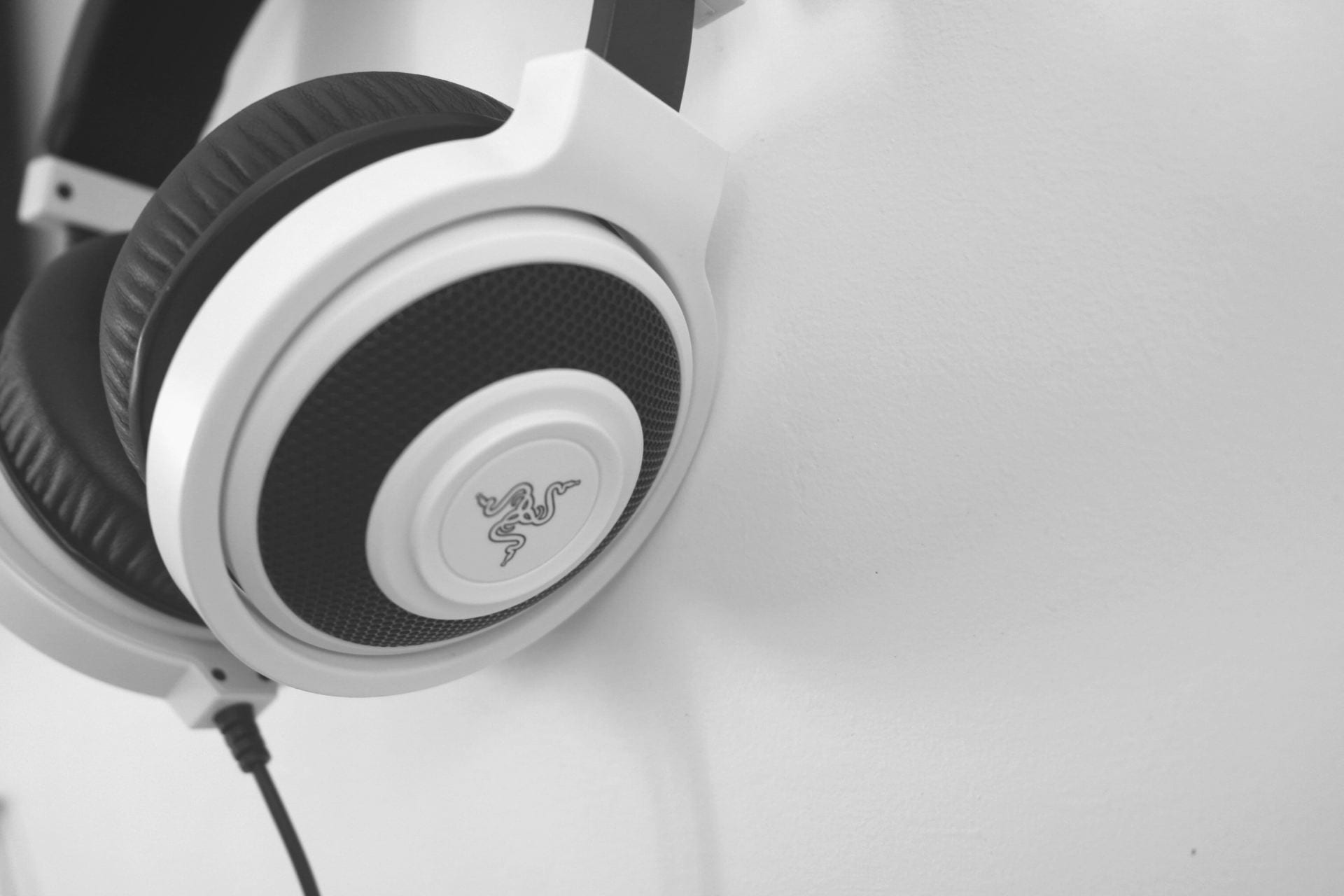
The item I chose to use was my Razer Naga gaming mouse. The reason I chose this object was because it is something that I feel represents something that I enjoy a lot, which is video games. I play on a competitive esports team as well as playing for the Ohio State University Rocket League team. This item will most likely not relate to a majority of people for the reason that I use it, but a computer mouse is something that a lot of people would understand and could relate to. This item has almost no relation to pop culture as it is something that is seen as abnormal to have a mouse for gaming.Some people who also play computer games could relate to this object, but the average joe would probably not be able to relate to what this object exactly is.
Andy Warhol’s big idea was to make the common everyday life art. He was exploring how one can make something that we view as normal or ordinary and make it unordinary or special by making artwork out of it. He was trying to say that anything can be art and that not everything that is art has to be extravagant and expensive or valuable. I think they merit in the sense that it is important to understand the value that even the simplest things have.
I wouldn’t say I am mass producing artwork through photoshop because there are so many different things you can do in photoshop, that is hard to simply mass produce a certain type of image. Having access to photoshop allows any creator to make the minutest of changes to an image or even turn an image into something completely different. This technology allows for many different opportunities when making art, whereas Warhol was limited to what he could physically build and create.

Line – The continuous destination of a point in still space.

Shape – The existence of something in a flat object, like a circle or square.
Color – An image that only presents a single group of colors of colors of similar shades and hues.
Value – The amount of light or lack of light the exists in an image.

Form – The depth or dimension of an object in an image.

Texture – The physical appearance of a surface that insists some sort of feeling or tactile response.
Space – The area in which an object does or doesn’t exist.

Balance – The image is evenly split from the middle.
Contrast – Something in the image suggests a difference from everything else in the image.
Emphasis – Something in the image is brought forth by its separation from other things in the image.

Movement – An image that implies the motion of an object in the image or that some sort of action occurs in the image.
Pattern – The repetition of like objects or imagery in a picture.
Proportion – The relationship of size between two objects in a picture.

Alignment (Repetition) – The position of objects in an image such that they form a straight line.

Unity – The synchronous display of pieces of objects in an image.
 normal
 dissolve
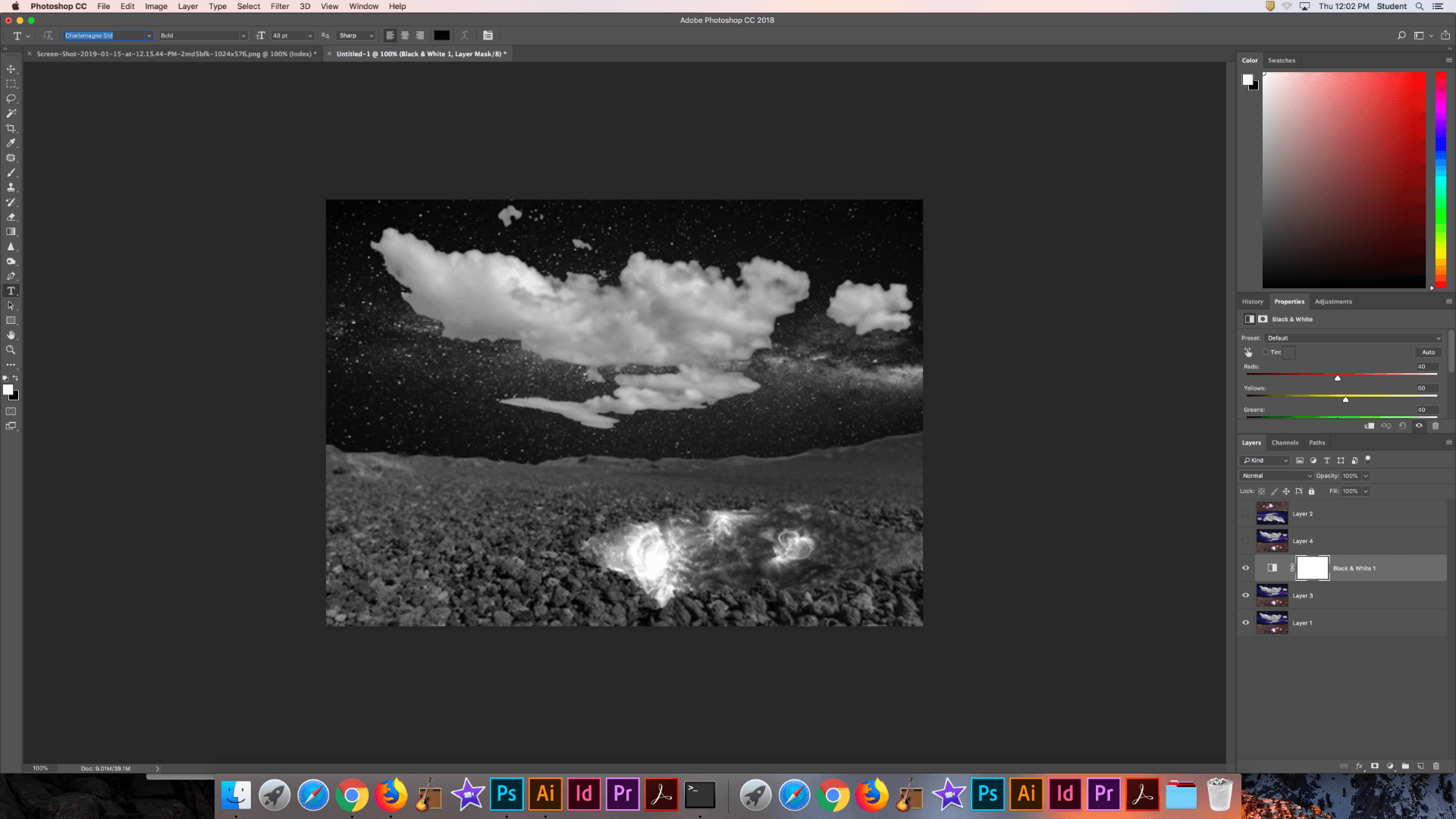
The two images above represent the two blend modes found in the normal family. These two modes don’t blend anything together but rather are controlled by the opacity slider between the layers.
 darken
 multiply
 color burn
 linear burn
 darker color
The five images above are from the darken blending modes. The modes in this section will turn the result colors darker and any white in the lending layer is made invisible. Everything else has a darkening effect on it.
 lighten
 screen
 color dodge
 linear dodge (all)
 lighter color
The five images above are from the lighten blending modes. This mode is the exact opposite of the dark blending modes. It makes all blacks invisible and adds a lightening effect to all other colors.
 overlay
 soft light
 hard light
 vivid light
 linear light
 pin light
 hard mix
This seven images represent the contrast blending modes. These blending modes are a mixture of the darken and lighten blending modes. Except for hard mix, anything that is 50% gray is turned invisible.
 difference
 exclusion
 subtract
 divide
These 4 images represent blend modes form the inversion family. These modes look for variations between the base and blend layers to create the blend.
 hue
hue
 saturation
 color
color
 luminosity
These 4 images are apart of the component blending modes. These modes use combinations of the primary color components to create the blend.

I would say that location is not limited to geography as you can be located in different places, but still be in the same geographic field/plane. For example being in the stands at a football game versus being a player on the field. Different location but same geographic place.
The “personality” that exists in space is completely dependent on who is in the space. Some people might see snow and think it is beautiful, but others might be turned away because of the cold that comes with snow. Space definitely leaves an impression or evokes a feeling because you are constantly evaluating your surroundings and adapting to the things around you. Someones room can say a lot about how they handle themselves.
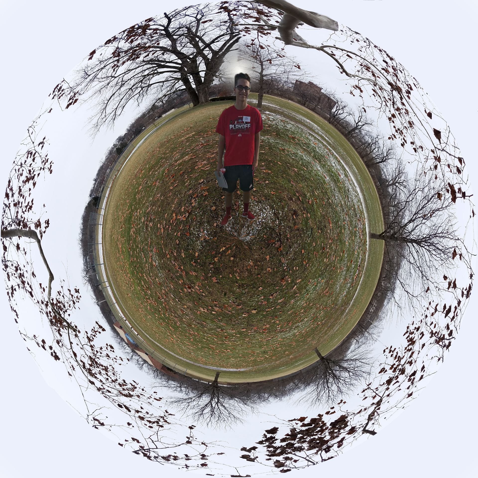
I did the very basics for the beginning of the creation of this by altering the dimensions of the panoramic photo that I had. I then edited out the sidewalk that was on the left half of the image as it was hard to make it blend well when apply the distortion. I also added a lens flair behind my to simulate a sun behind me in the picture/in the background, but also to hide some impurities in the photo. I also whited out the corners using the same color as the sky because there was some weird distortion going on prior to erasing the sky/branches that were there. The last thing that I did was ad a perspective distortion to me so that it looked as if I was coming out of the scenery rather than just sitting on it.


I found that altering the color of the hair and eyes and I even went ahead and changed her lip color as well was pretty simple. I dislike uses photoshop tools to “magically” remove things as often times it does not come close to doing what you want. For example the lack of texture on her wrist and neck are pretty obvious that it was crudely done.
The other big issue I had was moving her to a new scene. Because of her hair and how it was all over the place made it quite difficult just just select and move. So I just selected and erased the background as best as possible and put a photo behind her.
When changing the color of her hair and eyes I just wanted to verify my strategy of selecting and then adding a filter by using google. There were plenty of different ways to do it, but the quickest way was that way I had in mind. I chose to just select the eyes and hair and add a hue/saturation to that selection.

As this process was very straight forward I found it pretty simple to just select, remove, and then paste in the image I wanted. It was not very difficult to do this as I wasn’t concerned with realism. So I didn’t worry about rough edges or very clear selection cuts.