In the beginning of this process, I decided to just play around with some monochrome color schemes to see how I could manipulate tone to enhance my composition. I had a general idea that I wanted to use a blue monochromatic theme and a triatic coral color scheme. 
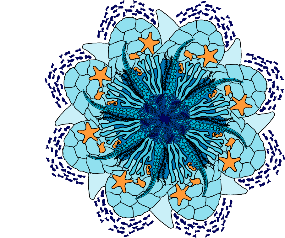
For my first composition, I really wanted to play with a monochromatic scheme. With keeping in the ocean theme, I decided to use blue tones to keep a water feel.

I started with the darkest tone at the center and go lighter as the tones go out from the center to create a sense of depth in the center. On the outside, I wanted to create a border by using a dark blue group of fish. I then decided to add some more tones and have a more natural transition.

Originally, I kept the seahorse, stingray, and sea star a tone of blue, but I realized the composition felt flat. I decided I wanted to add some pop by adding the complementary of blue, orange, to create some contrast.
For my second composition, I was inspired by one of my favorite colors, I am a huge fan of pastels. I liked how it related to the coral theme of the composition and decided to use a triadic color scheme to use a variety of colors.


I wanted to keep blocks of colors because I feel that it looked very messy and random. For each section of color, I used a few different tones to add some laying. In contrast to my monochromatic piece, I wanted the colors to go lighter as they go it so create a bursting effect to play off the bright colors of the composition.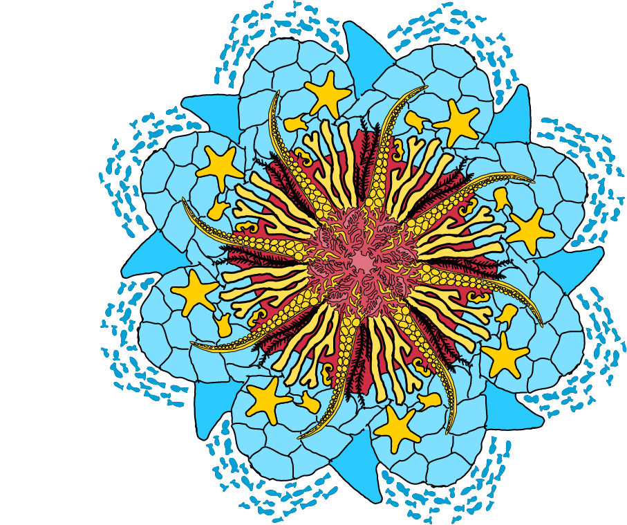

Link to Portfolio