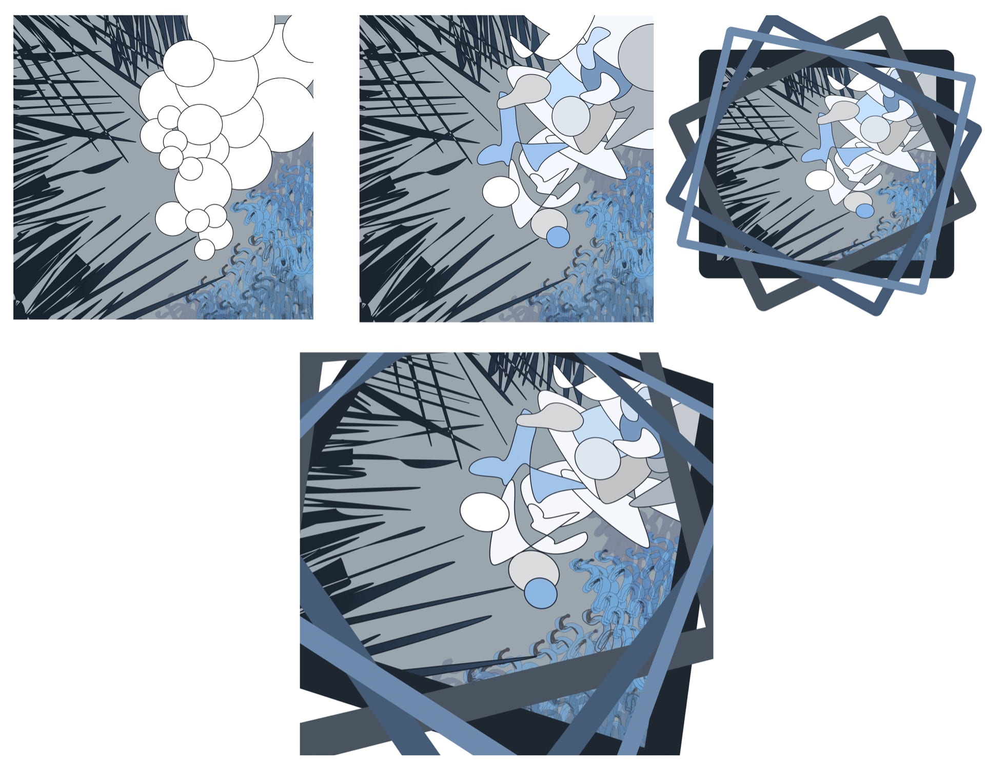
I developed my prototype with the use of the blue as my only color. The blue is representational of the toothpaste; however, the different shades and tints of the same hues emphasize the transformation that from gross and dingy to light and clean. I use the darkest blue to push the sensation of the sharp mint cutting into one’s taste buds. I made the swirled shapes softer and less intense as they present the constant circular movement during the process. Lastly, the organic forms (originally plain white circles) were added into order to express the change in the tooth paste as it coats the teeth. I also included the frames to present the viewer with the message of contained chaos. Notice how the patterns circle each other- this was done to remind the audience that this is a daily process that is included in the cycle of most. The final adjustment of the perspective intent is to prevent the design from being too static. Brushing teeth is a mindless, simple act, yet the toothbrush, paste, and water involve are is constant motion and change. The perspective makes it more dynamic.