During Week 6 in Digital Art we explored the Principles of Design and Elements of Art. This is my interpretation of what they mean:
The Principles of Design

Balance
The placement of what you see within the frame.
Evenly balanced? Counter balanced?
_________________________________________________________
 Contrast
The difference between aspects of a piece of art.
Light/Dark. Male/Female. Many/Few.
There are no limits to what can be contrasted.
_________________________________________________________
 Emphasis
Stark contrast that causes the “subject” to be almost too obvious.
Modeled by Harley Q.
_________________________________________________________
 Movement
The path your eyes are encouraged/forced to take within the art.
_________________________________________________________
 Pattern
Shapes, forms, or designs set in a way that a pattern is formed.
_________________________________________________________
 Proportion
The difference in size/amount of two or more objects.
_________________________________________________________
 Alignment (Repetition)
How items/subjects are aligned within the piece.
_________________________________________________________
 Unity
Unity
How subjects come together to form a unit.
_________________________________________________________
The Elements of Art
 Line
Line
The literal or visual lines found in the piece of art.
_________________________________________________________
 Shape
Shape
The way that 2-D shapes are used within the frame.
_________________________________________________________
 Color
Color
The use of minimal (one color?) within a piece.
_________________________________________________________
 Value
Value
The various shades of a “color”.
_________________________________________________________
 Form
Form
A 3-dimensional shape. It has volume.
_________________________________________________________
 Texture
The “feel” of the subject.
_________________________________________________________
 Space
Space
The way in which subjects take up (or don’t take up) the space within the piece.
 My Warhol
 Dissolve
 Larger Image
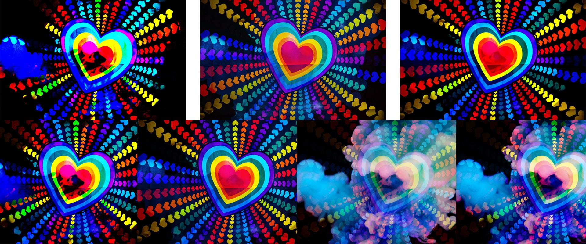 Larger Image
 Larger Image
 Larger Image
 Front
Front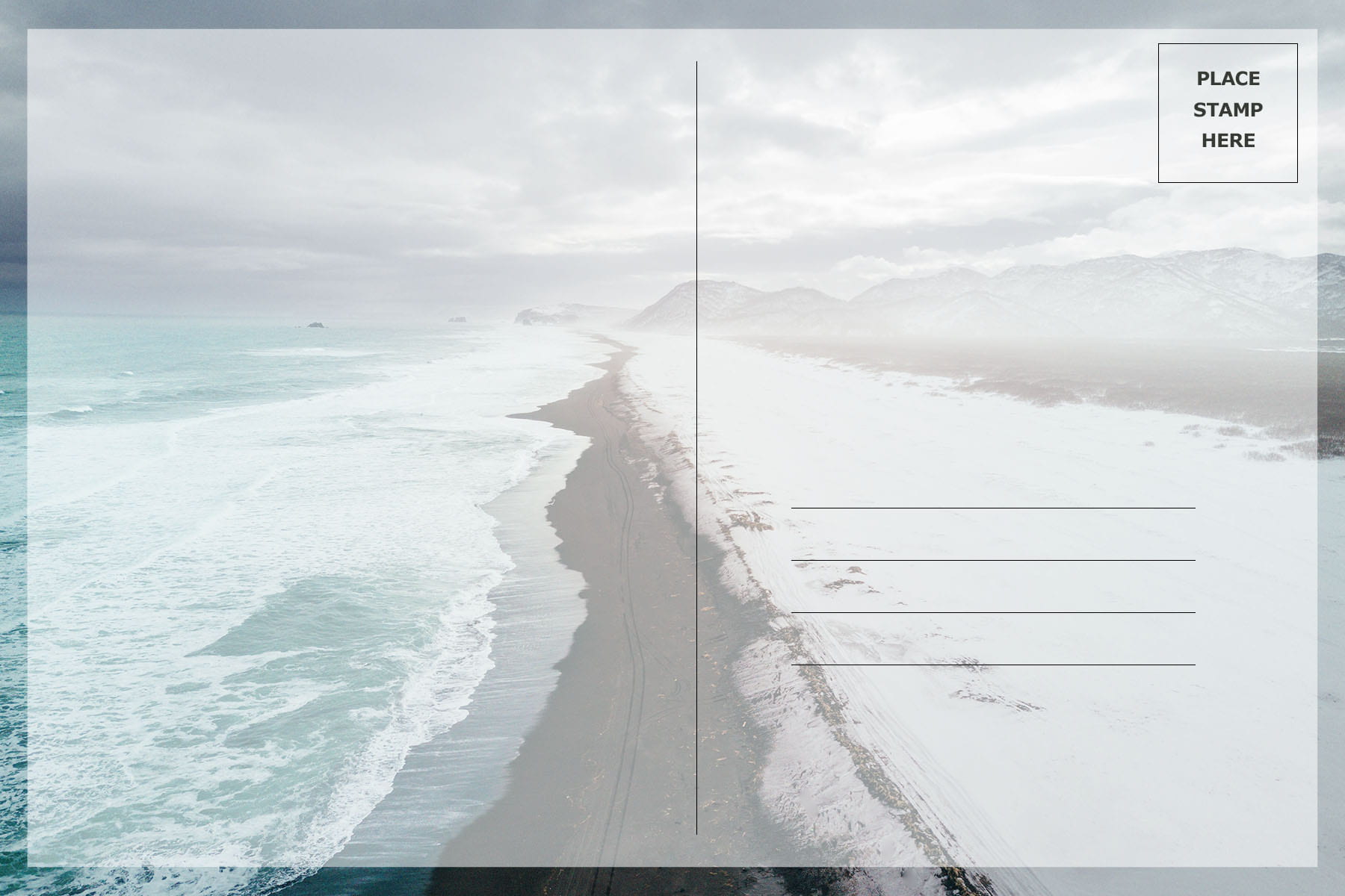 Back
Back Front
Front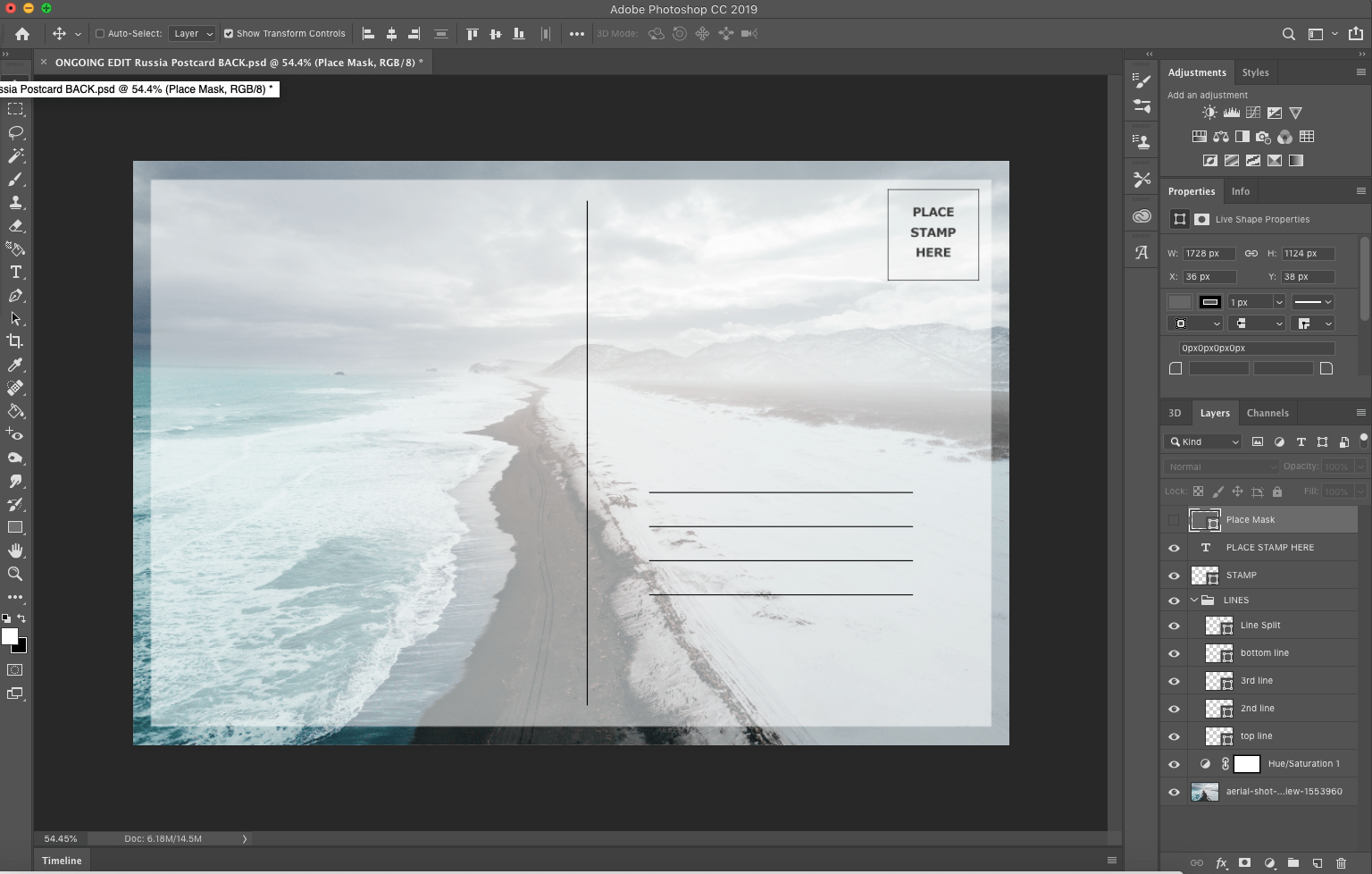 Back
Back Nesting Dolls
 Eurasian Brown Bear
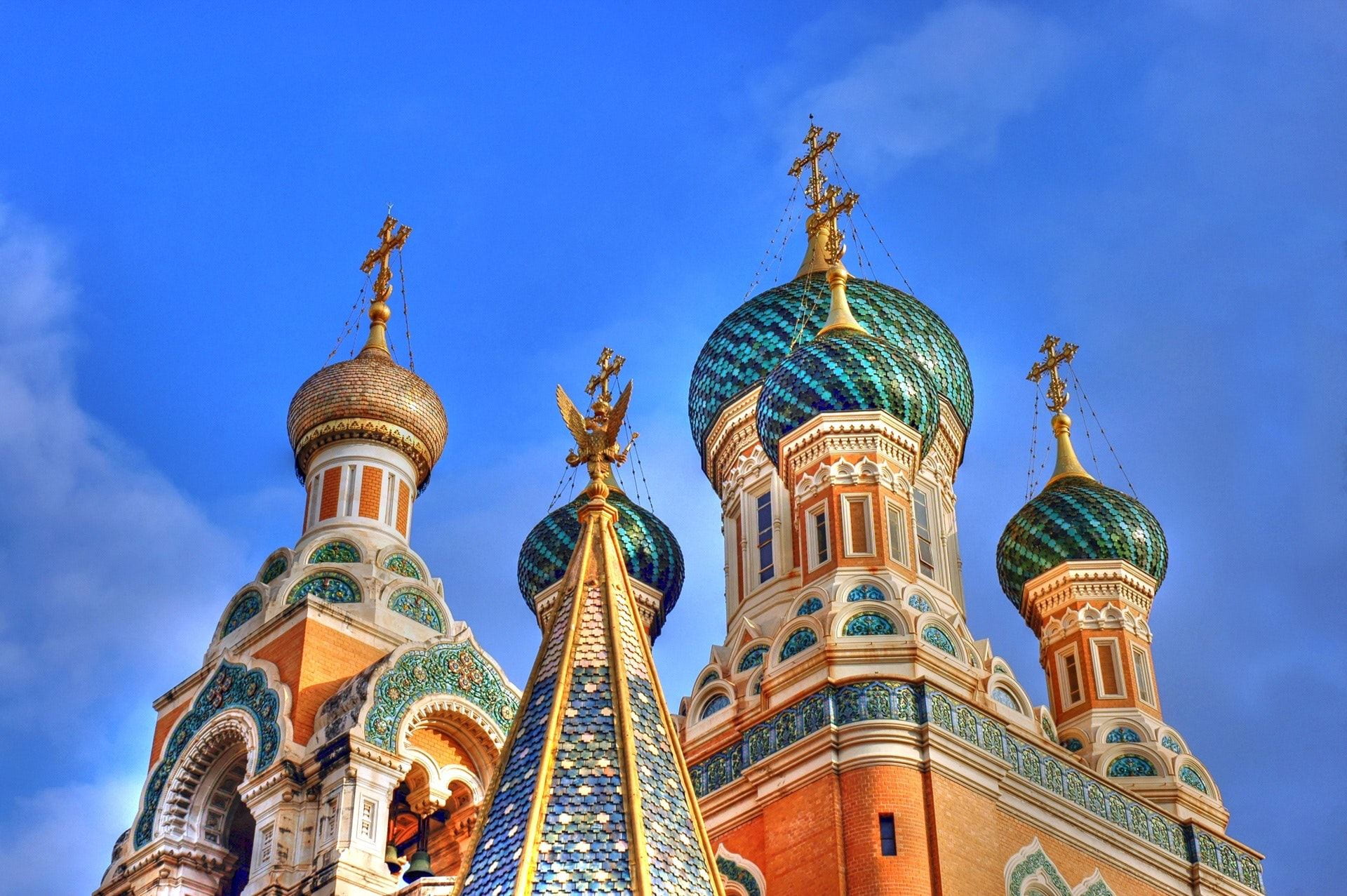 Kremlin 1
 Statue
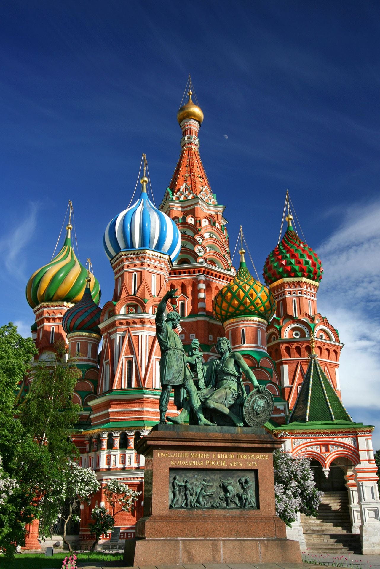 Kremlin 2
 Vodka
Vodka Beach
Beach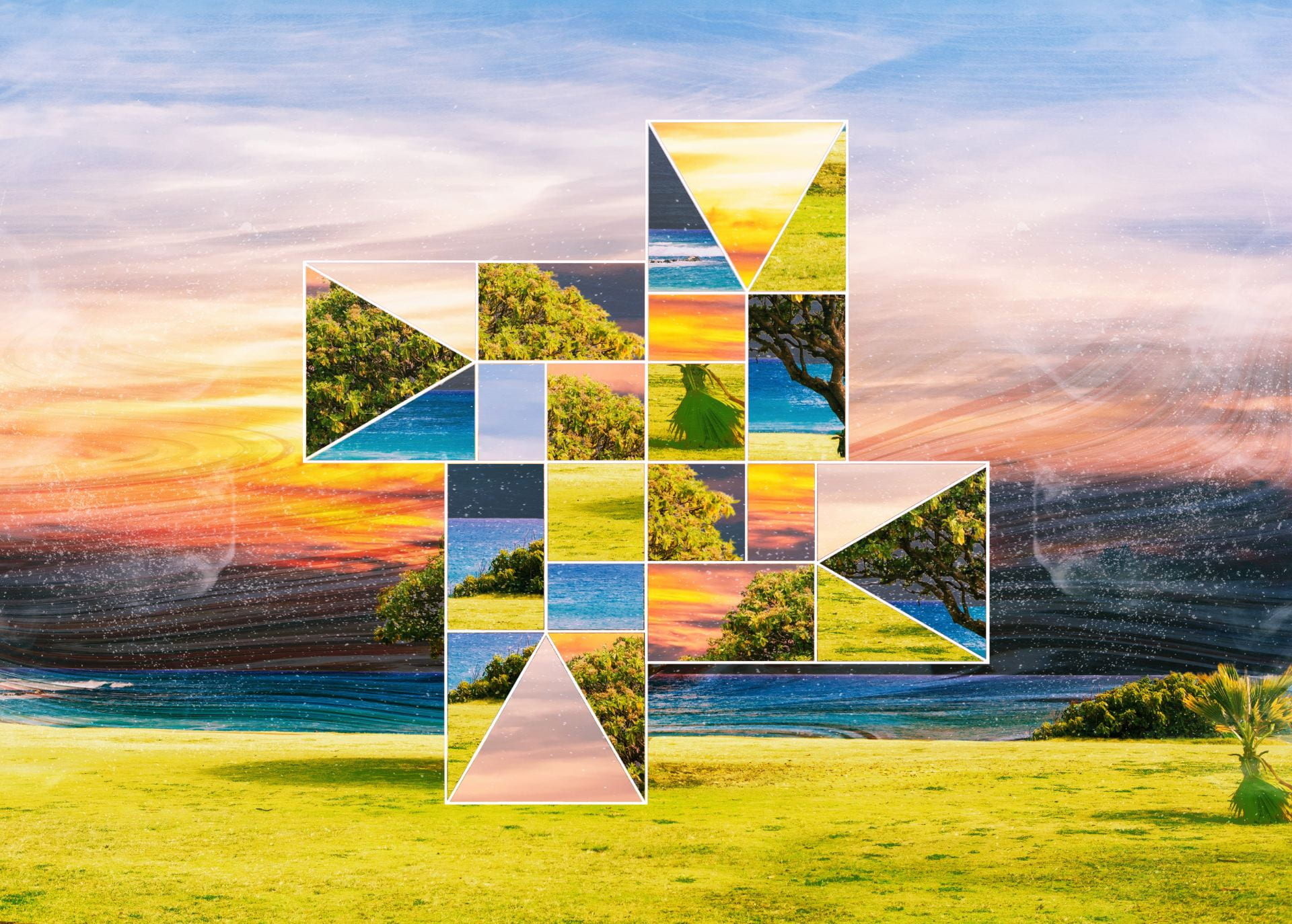 Finished Product
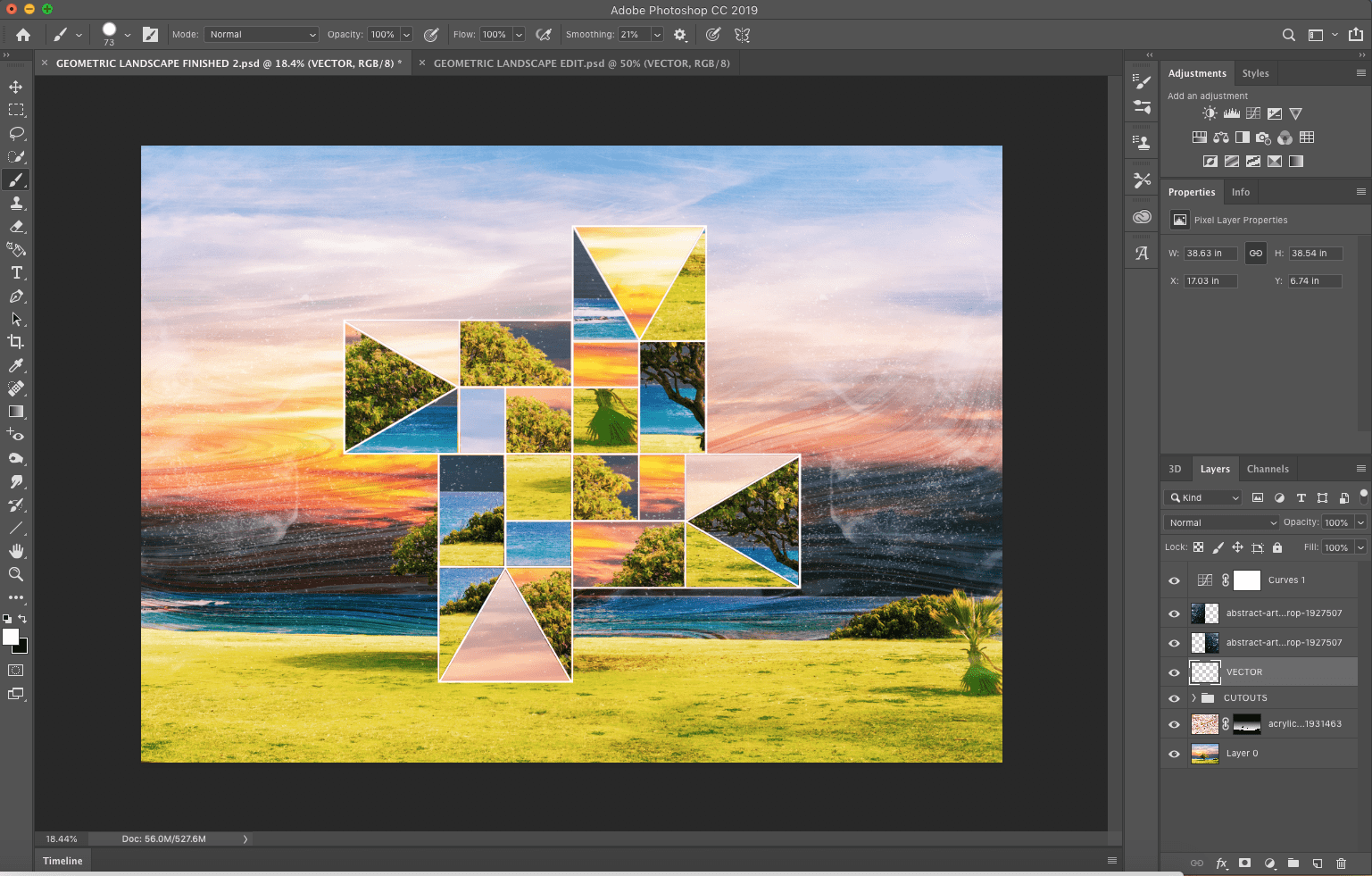 Screenshot
 Screenshot of Workspace
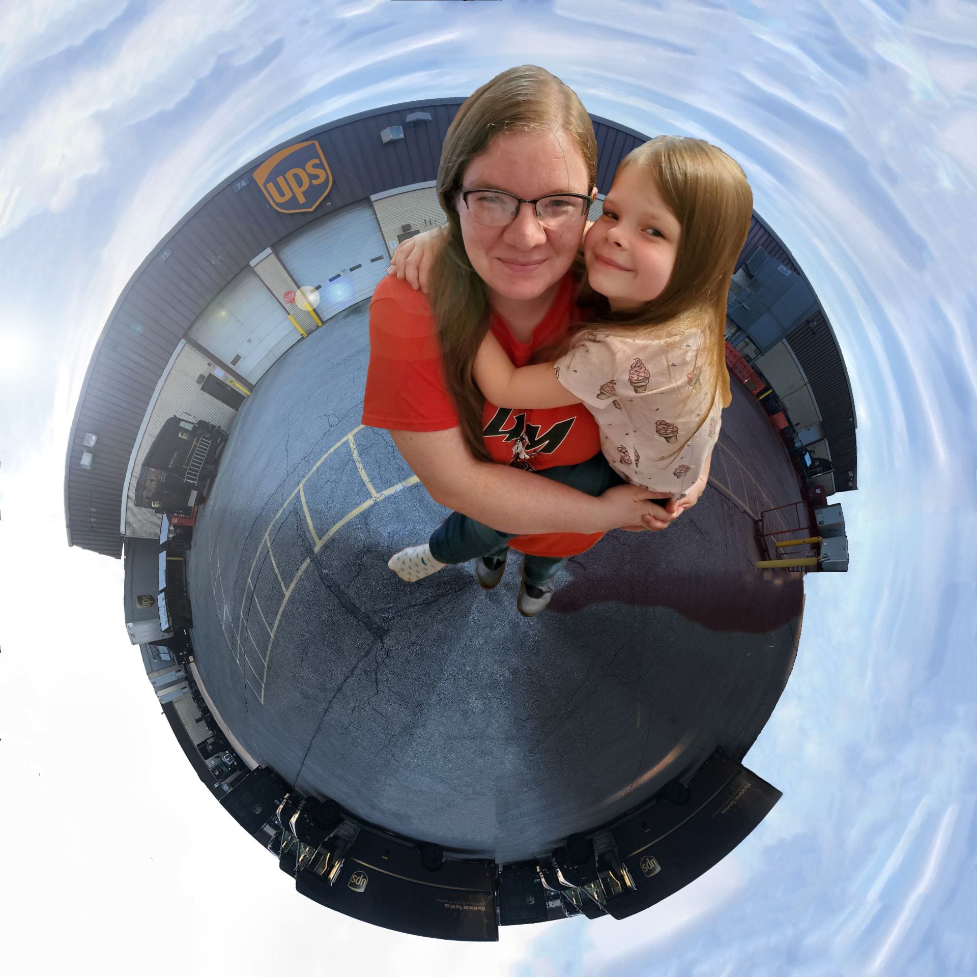 My Completed Tiny World
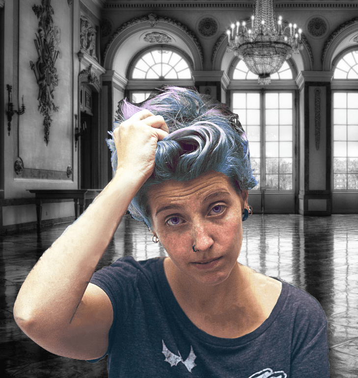 New Version
 Meet Unicorndog
 Poor Mona
 Screenshot
 Contrast
 Emphasis
 Movement
 Pattern
 Proportion
 Alignment (Repetition)
 Unity
Unity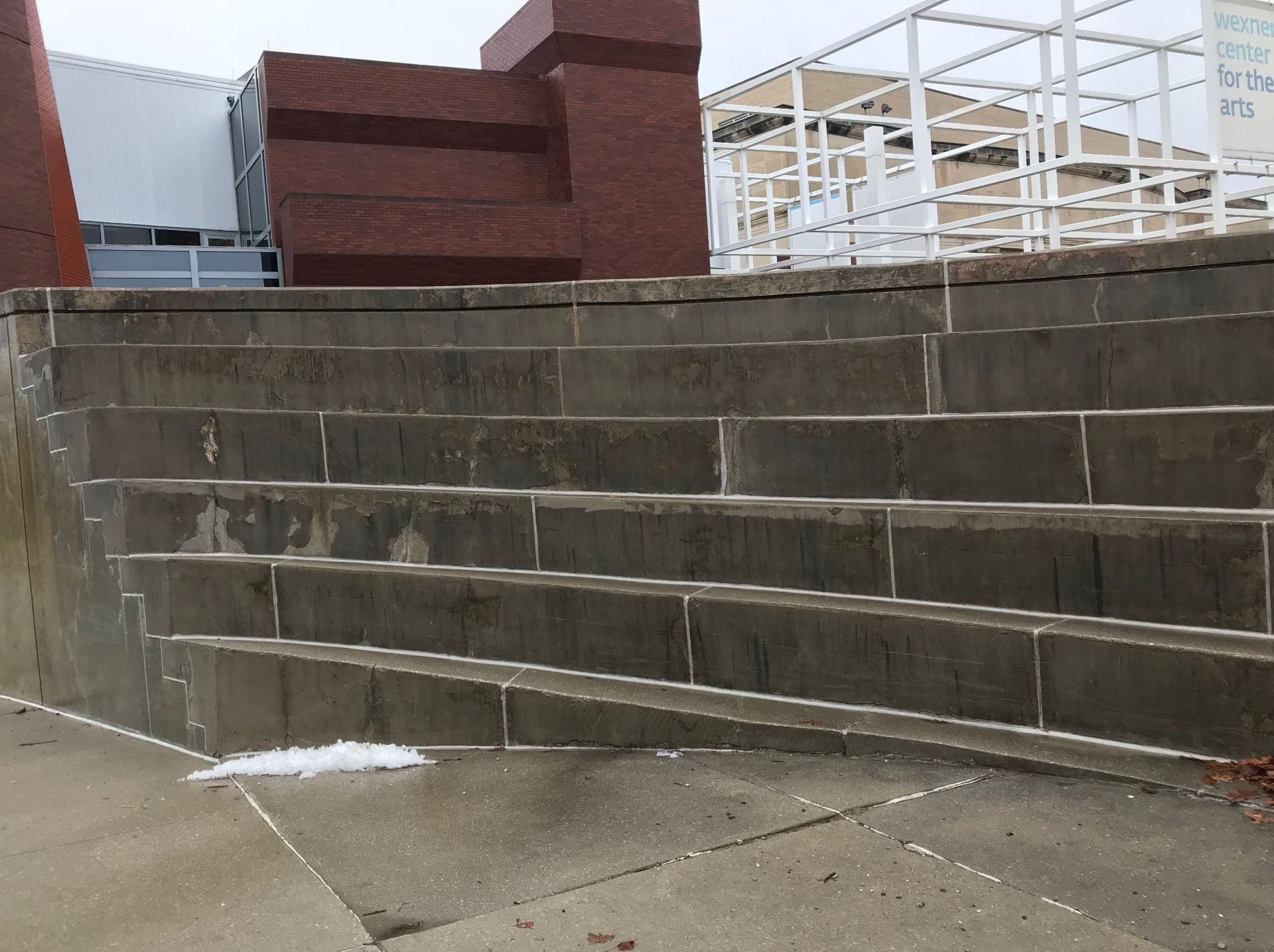 Line
Line Shape
Shape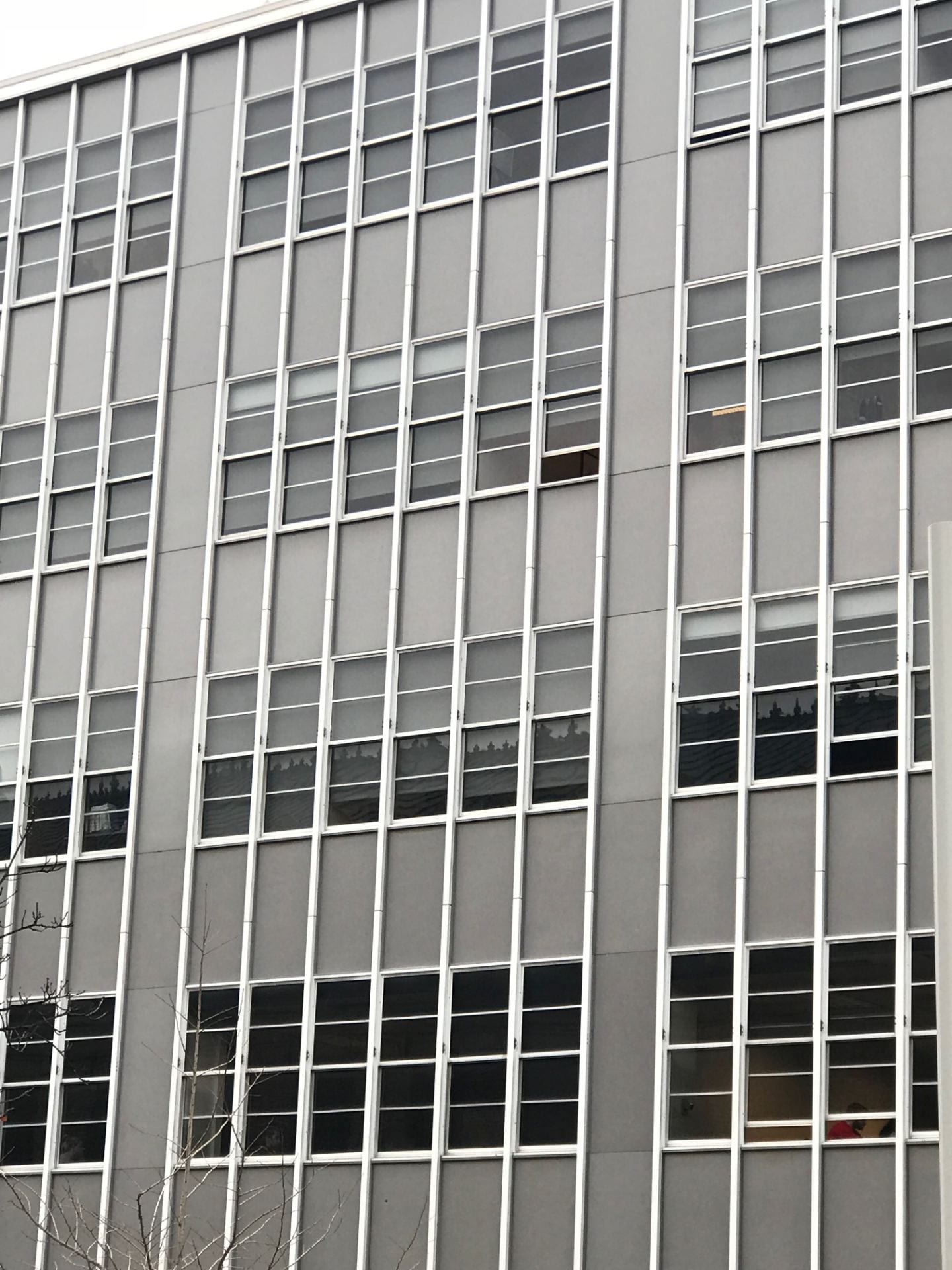 Color
Color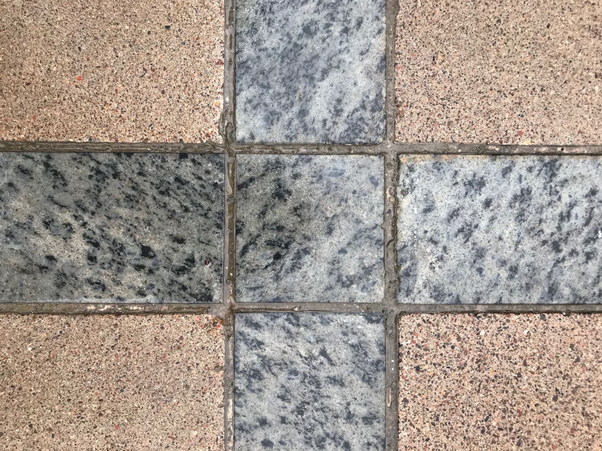 Value
Value Form
Form Texture
 Space
Space
 Posterize
 Hue & Saturation
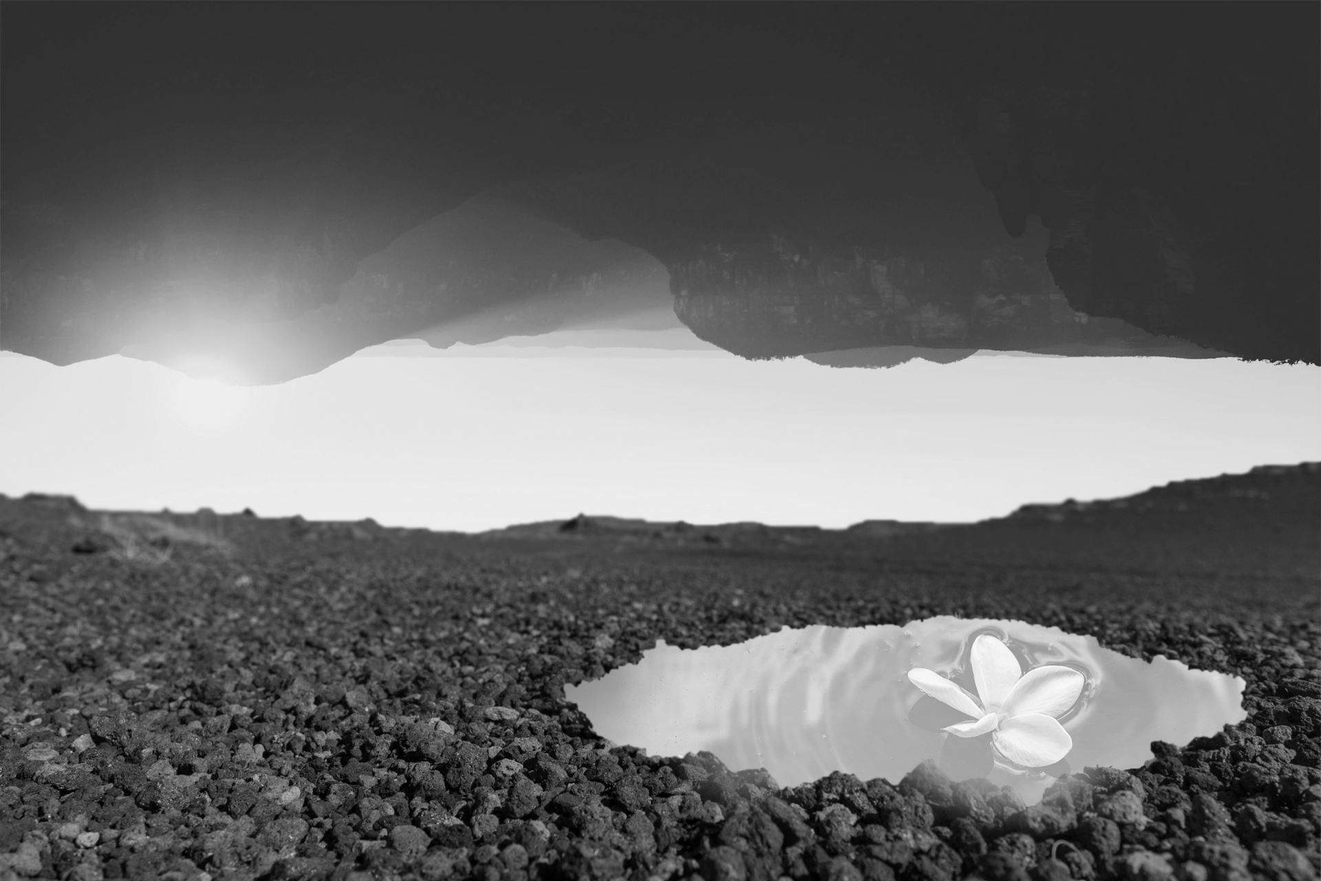 Grayscale
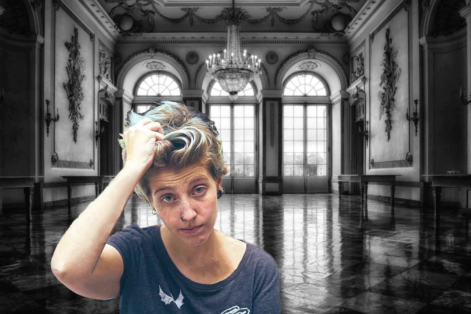 The Tattoo Lady in her new Realm