I made a comic of Kyle the kangaroo dreaming of a giant Trump monster terrorizing his city. Kyle swoops in and fights Trump; finally defeating him. Kyle awakens victorious and proud. I enjoyed drawing in photoshop with the paint brush. I tried to size things accordingly to demonstrate different viewpoints. The part I am most proud of would have to be hiding the Trump monster behind some buildings and not others to give the piece depth. I accidentally merged a couple layers before noticing that I put a shape over the dead Trump monster’s face. I was unable to fix the issue without going really far back because the action was no longer on the history bar. Sorry for the late post and lack of quality. 
Posts
Album Cover
For this project I chose the center of my piece to be the the experimental hip-hop group Death Grips. I made an album cover for them. Something I had not thought about was the very minimal approach Death Grips uses in their art. Believe it or not this project took me a bit of time regardless of how minimalist it seems. I took a giant white head from the creepy “children cartoon” Courage The Cowardly Dog. I put the head in the background and made it a 3-D object with shadow effects and rotated it so it is looking down at you compared to its previous orientation. I cropped an action shot of the singer and placed that around the head as to frame it in a way. I was having trouble finding pictures of the other members so I tossed a piece of their cover art in the other bottom corner. I manipulated a bunch of microphones to create the name of the band. I made the background purple because I like how the white head looked against it and the purple gives the piece an eerie vibe. Check out some Death Grips.
Magazine Cover
I created the music magazine Moss. The main story features Mick Jagger and his ability to defy the laws of physics and perform for eternity and beyond; even through a nuclear fallout. I put a nuclear wasteland in the background and cropped out an action shot of Mick Jagger. I utilized the 3D option for most of the text I used. The depth of text really draws your eyes in and demonstrates some level of importance. I also bent the “Jagger Still Performs” to make it look theatrical like a title of a movie. Everyone should check out Death Grips.
Week 7 Blog Post
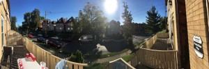
I took this photo outside my front door. I rarely use the panorama feature and I was surprised to see how authentic it looks. The picture looked better than I thought it ever has in person. The panorama is really effective at giving an accurate 180 degree perspective.  Photoshop has useful tools to construct photos like this but the panorama function results in a cleaner product. This panorama shot is able to be viewed in 360 mode here http://www.2vr.in/V-H72 I should have taken more photos to make the photo more complete but it gives an accurate representation of what it is like to walk out my front door. I think 360 pictures and virtual reality is very cool and will soon change the way social media is viewed/posted. It also has many possible uses in education and law enforcement.
I took this picture on high street. I set an 8 second shutter which resulted in streaks of light. I edited the hue of the picture to make the lights have more of a pink color. I put a harsh contrast and darkened the brightness a bit so the lights would really stand out.
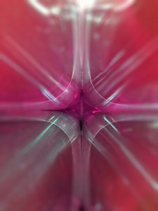
I took this picture of four bottles of ice tea. I changed the color of the tea to a magenta-like hue. I applied the iris blur filter which brings attention to the center of the piece. I like how the light reflected around between the bottles. It is difficult to immediately pick out what you are looking at because the perspective of this shot is strange.
This is a picture I took of thousands of Q-tip sticks without the cotton on them. The picture was originally quite organized and geometrical. R\The picture has been inverted and I used the twirl distortion filter. After that I sharpened the image and used the shake reduction option.
Blog Post 5
In this photo I adjusted the brightness and contrast to higher settings in order to make up for the poor lighting. This effect also brightens the skin and makes the face look better. I also changed the vibrance and hue to give the picture a warmer glow. I went around using the spot heal tool to erase epidermal imperfections. The quality of the photo was worse than I had anticipated so I used the sharpening tool on the lips, eyebrows, and parts of the eyes in order to make them pop a little more.

In this photo I also used the spot healing tool to clean up the skin. I played around with the clone stamp and changed the shadows on my face. I also sharpened and enlarged my lips and ear quite a bit. I changed the hue on the irises of my eyes to a lighter green.
Blog Post 4
While walking around campus I came across the CSE building. The building sits up on a hill and is overpoweringly tall. I got down on the ground and attempted a ground level shot. While editing I warped the picture which distorts the natural lines and geometry of the composition. It almost looks like I was using some type of fish-eye lens.
This building is just southeast of the Oval. The main floor is elevated quite a bit above ground level but I still attempted to get an eye-level shot. While editing I went in and changed the lighting of each room and window. The different color scheme really gives the building a different feeling. The light was a harsher white light that gave it a colder more office or laboratory vibe. The pink light is almost inviting. It gives the building personality and an aspect of mystery.
Exposure/Temperature


Overexposed

Underexposed
After navigating different levels of exposure, I have found that I prefer underexposed photographs as compared to overexposed pictures. Overexposure seems to highlight areas of deep contrast by increasing the intensity at which light reflects off the piece. More of the piece is visible causing the eyes to wander. Underexposure seems to dampen harsh contrast which allows the eyes to explore the piece without the distraction of loud/eye-catching areas. Underexposure can also drown out the background which may or may not work to one’s advantage. In this case my subject was white; and as a result the overexposure took away a lot of the form of the subject. If my subject were of darker tones, the underexposure would have posed a similar issue.
Temperature holds a lot of influence to my interpretation of a picture. I can look at the same photo in different temperatures and have different feelings about subject of the photograph. Certain colors have been found to illicit certain responses from the brain. Cooler colors have more of a calming effect and warmer colors tend to excite. I don’t believe that I have a preference toward warmer or cooler pictures. This picture of Tokyo’s skyline is a very urban, cold, and bright photo. When I look at the warm filter I imagine a city like Las Vegas. When I look at the cooler filter I imagine a city like New York. My personal experiences have influenced these comparisons but the point is without having been to Tokyo, those two pictures are leading me to expect two different realities.

Normal

Warm

Cool
Composition Project
This weekend I helped my father clean out his childhood home. It was an emotional end to a 50+ year relationship with the house. He is the youngest and final remnant of their tight knit five-person family. As we entered we were welcomed with familiar scents that transcend my lifetime and trace back to a time where my father was taking his first steps. A wooden spoon and empty cabinet is all that is left of my old kitchen floor drum set. The house felt empty and the air was still.

He sees the reflection of a younger self and a living room full of familiar faces. (Thirds Composition)

Looking out the window where he remembers seeing the neighborhood kids on bikes insisting that he come out and play. (Symmetry Composition)

One final proud look at the back porch he and his brother built one summer in their twenties. (Open Composition)
Every stair groaned as we walked up to his room. He pulled out board games, flipped through composition books, and took a step back admiring the wall that had all his friends’ names on it. He reminisced of parties, sneaking out, and all the fun times had.
A house is so much more than boards and nails; it is the backdrop of one’s life, the string that sews families together, and a beacon of comfort. It is not easy to say goodbye but it is time for this house to serve another family for lifetimes to come.
Bio
 My name is Jeff Kantorak. I was born in Cleveland, OH. I have studied engineering at both Cleveland State University and Ohio State University. I recently spent #summer16 fine tuning the (now) majestic landscape of the greater Cleveland area. When not landscaping, I can be found poppin’ wheelies on my sick motorbike. Peak my resume for more deets.


