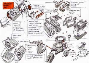
This one is a little messier in terms of composition but I like the accents of color that define the individual sketches.

I really like the layout of this page. Besides the fine line work I think this is a good example of a balanced sketch to study (it has some notes too which I always love to see)

Here what I thought was nice is the combination of different views on the same page.
