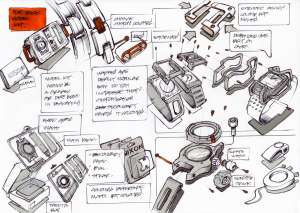
This one is a little messier in terms of composition but I like the accents of color that define the individual sketches.

I really like the layout of this page. Besides the fine line work I think this is a good example of a balanced sketch to study (it has some notes too which I always love to see)

Here what I thought was nice is the combination of different views on the same page.

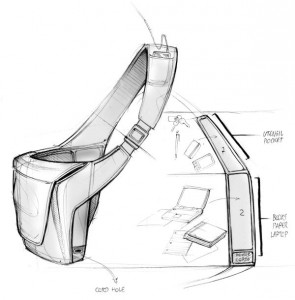
The watch sketch is way to rough, the color accepts are good, but the hand writing is way to stylish and hard to read. We can teach you to write and sketch better than this. The backpack sketch with the blue highlights is very nice.