Posts

Gifting Design: Process

Research

Best Gift Exercise to spark Ideas for this project:

“The best gift I personally have ever received was my bicycle when I was little. I made a lot of memories with the gift and it made me happy so many times just from the experiences I was able to have because of it. A lot of nostalgia and memories come around whenever I think about it, and because of this I want to create a gift that will create a memory rather than just a regular material gift, I want it to be more about the experience of receiving the gift than the gift itself”

I found a quote that I felt demonstrated a key aspect of design that I thought my peer mentor would appreciate. I was assigned Whitney Baxter as my mentor and she had mentioned simplicity and narrative as some of her favorite aspects of design and I really wanted to play off of that as those are things I enjoy cultivating in my work. I found the quote “Design is as much a matter of finding problems as it is solving them” -Bryan Lawson

I thought this quote was really interesting and accurate and could also serve as a good basis for a really interesting narrative. I eventually got the idea to do sort of a maze with software.

That evolved into doing a maze with zip folders to give a sort of challenge and commitment to each step.

I started researching riddles and puzzles, and found some inspiration in a book called ‘Conundrums’ which is a book full of typographic riddles.

Production

I ended up making more of a series of puzzles rather than a full maze as it felt more applicable and let the project be a bit more fun.

I started designing the graphics and ideas for each puzzle at this point. Here is all the puzzle graphics and solutions:

Twilight (This one is a jigsaw puzzle)

A Dime a Dozen

A Piece of Cake

Blue is correct but a special surprise is hidden in red (A very cute cat meme)

J

Tigers


I thought 6 puzzles was enough and showed the concept and provided a bit of fun along the way (the jigsaw puzzle is pretty time consuming so I didn’t want to make the rest of the process too long).

I also included some notes and solutions to each puzzle to provide backups in case the puzzles weren’t easy enough to understand or the punctuation got messed up at all.

I then designed the final “Gift” which was a sort of art piece as delivery method for the quote that inspired this whole idea.

Sadly I had to deliver it as a Word document because it wouldn’t save as a pdf.

Here is that piece: The Gift

Lastly I organized and zipped each folder and sent away the whole thing!

Here is a demonstration video for the whole piece. (Same video in the portfolio post)

Final Project: Gifting Design

Chess Redesign: Process

Ideation

This project was hard to find a starting point for but eventually started running in a positive direction. My project partner and I came to the conclusion of doing sea creatures and reptiles as our sides, but there was an issue finding a relationship between these two sides. We settled on doing land roaming sea creatures as the other side, as to push an actual narrative.

After this we went our seperate ways to design our creatures, giving progress checks to make sure we had harmony between the pieces.

I had decided my creatures after quite a bit of pondering the roles of them in an ecosystem, as well as their shapes.

Pawns- Prawn    Rook- Swordfish    Knight- Seahorse   Bishop- Squid     Queen- Shark     King- Whale

Initially I wanted to do fish eggs as my pawns, as pawn promotion came up and I wanted something that made sense with that, but as it went on prawn made more sense since this is the basis of a lot of life in the ocean as a food source, as well as being its own creature.

I also had wanted to do octopi as my bishops but squids ended up making more sense for my form factor, and their shape and behavior correlate more to a bishop in chess.

My knights took a bit to figure out what to do but as you can see I ended up being very literal with the translation and using seahorses.

I chose a whale for a king due to it’s power in the ocean, but also its vulnerability.

Sharks as my queen for their role as predators in the ocean, paralleling the queen being the most powerful piece in chess.

And lastly I chose swordfish for their stature and method of self-defense relating to a rook in chess.

Production

My visual design process was really complicated and drawn out, but it was a workflow from Illustrator to Blender to Cura, and then I 3D printed my pieces and assembled them.

Here are the vector drafts of my pieces:


I imported these into blender and created the frontward pieces with extruded circle curves that connected the profile pieces. This was the most time consuming process until I got a groove going, creating boolean modifiers for each gap that needed to be there for the parts to connect.

After that, I exported the pieces to Cura as STL files to begin slicing my print files.

Printing was also very time-consuming, but not in a workload manner, each piece took an hour and a half to print so the process of getting each piece off was quite slow.

As I waited for these prints I made a mockup for an ocean themed chess board that I would use for a digital render of our chess set:

I wanted to create a nautical theme that incorporated aspects of both sides, as Alizeh’s side’s pieces were:

Pawns- Penguins    Rook- Walrus    Knight- Arctic Bird   Bishop- Sea Lion     Queen- Polar Bear (female)     King- Polar Bear (male)

Because of the arctic setting I wanted to include the floating ice on the board.

As the prints continued I wish I could have fine-tuned them a bit more, the final pieces ended up looking very draft-y and they were too big, but on the time crunch I was on I couldn’t just take the time to change my whole material or reprint them in a smaller size, so I ended up with not the best looking final pieces. I did however have full 3D models of each piece to render out to fcombat this however, which I believe demonstrates an ability for creative problem solving. I rendered out my chess board with all of my 16 pieces on it in a studio space I had previously built for displaying objects of this sort.

This is the result and I think it looks pretty stellar and demonstrates what I wanted this board to look like and what I intended the final pieces to look like.

Sadly, my outcome in real life didn’t look so perfect, but they are still functional:

Final Thoughts:

I would have spent some more time fine tuning the prints if I had time so they matched what the 3D models were.

I think it works really well in a virtual space, and if I could I would have stopped doing 3D prints for my pieces and laser cut them out of Bristol instead to give a similar effect that the digital render of this set does.

I really like how the digital version came out, I know it’s not a requirement for this project but I just really wanted to include it to show what it was supposed to look like in its finality.

The final real outcome is still cool, it’s just not in the realm of how final and clean cut I wanted each piece to look.

Final project: Chess Redesign

Dynamic Pages: Process

Ideation

This project was a very fun experience, especially because I got to work in tandem with another designer, Alizeh Hasan. This came with both benefits and challenges, but overal I feel was very beneficial, as I would have never come up with design we ended up with if I was working alone.

We started our process by coming up with ideas for our mechanism after we were shown videos on some sample ideas in the project brief. We went through a lot of websites and scrapped a lot of ideas, here’s a post-it of all our potential ideas:

The ideas listed are:

Swing (We wanted to do a sort of diorama with a swing going between our 2 styles, this idea got the farthest before being scrapped.)

Lenticular (The idea that sprouted into the final piece, a shifting image that changes based on the viewers position.)

Origami (A side idea, never really went far.)

Waterwheel (Another thought on a diorama, with a waterwheel-like mechanism meant to carry our concept.)

Kirigami (An interesting concept but wasn’t practical for what we were going for.)

Piñata (Another idea where we would have a two sided piñata we could hang and would spin for our animation.)

Paper Wheel (A prototyped design that was meant to almost work like a spinner in a childrens book, pictured below.)

These were most of our drafted ideas, but we both saw a lot of promise in the Lenticular Image idea, so we started searching for ways to do this and we found a few cool examples we used as inspiration:

Lenticular Street Art: Trick Graffiti Works only at Angles | Urbanist

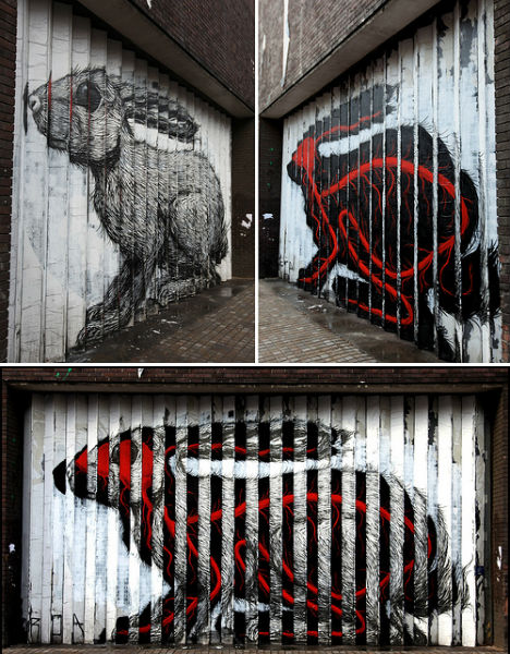
(Image from WebUrbanist)

This was the piece that was a basis for a lot of ideas, we wanted to do a reveal of a similar form like was done in this street art of a rabbit. We also possibly wanted to include psychedelic imagery to push this idea of a reveal into a separate dimension of space into our form.

After we figured this out, we started thinking of both ideas for the final mechanism, as well as ideas for our concept: what we wanted to actually do this reveal on.

I’ll start with the process of the mechanism, as this came first in the production process. It started with the idea to create a board with vertical slats that would have our two images on either side. Here’s the image that sparked this idea.

This didn’t have quite enough movement, as it only required movement of the viewer, not the piece itself, so we decided to make a more dynamic piece while still maintaining this base idea.

Production

I started rendering ideas on how we would do this in blender, and here are two ideas we had.

As you can see, the panels lay flat and connect, and you can lift them up and flip them. This was close to our finalized idea, with the only main change from here to the final being how exactly the mechanism worked to flip each panel. It ended up changing to a simpler system of a hinge piece bolted to the bolt, and bolted to each panel, so you could lift it up, flip, and place back down on just these hinge pieces that would rotate. This is pictured below, and shown in our final for a better understanding of this concept.

Video of final mechanism

This is our final composition of the mechanism, and is also recreated using the same mechanics in the final digital render, shown at the end.

The process of making the physical mechanism was a bit time consuming to say the least, here is how that journey went:

It was just a long day of sawing, sanding, painting, and assembling the pieces to work like the mechanism I had rendered digitally. The first version of this luckily went well enough that the piece functions as it should, and I just printed and glued each frame of our art piece onto the board and was finished with the corporeal rendition of our work.

I’ll talk a little about the process of the artwork portrayed on our board now, but see Alizeh’s post for a more in depth review.

We started with the idea to do a reveal of the mindset or lifeforce of a creature, but this quickly changed into an idea about “Design Responsibility.” There were a few ideas in this category, especially ones considering the evolution of design over the course of history, and how society has changed with that. I had an idea to do an image of the evolution of furniture, using a couch as a medium, and the contents of the couch would change when the panels were flipped. I also had an idea to do a different designed object on each frame that would progress in time as the panel was flipped, for example, a king Louie chair would evolve into the clear plastic mimicked rendition of this chair made in the modern day.

As I continued to work on the mechanism, Alizeh continued to work on the concept and eventually came up with the idea of “Simulation Theory” through mind-mapping. This concept is essentially the plot of the matrix: We live in a constructed reality outside of the “real” universe: we live in a simulation. This idea really stuck, and she started drafting drawings to show the concept. We landed on using a face as the subject, and transforming it from looking like a real reality to a more simulated reality. Alizeh sent me this image and I took it into photoshop top shift the real version into a “simulated” version.

The image on the left is the final version of the “real image” while the image on the right is the precursor that she made to the “simulated image”

I highly appreciate synth-wave and vaporwave aesthetics, and thought they would fit perfectly to describe the simulated reality we were going for, and so that is the direction in which I pushed my photo editing. I took the ‘precursor’ image and messed with the colors a lot, added a lot of outer-glows to things to give it a neon effect, added a high saturation background to push the computer aesthetic, and gave everything a glowing outline to again push this simulated neon vibe. I also added a subtle version of the code from The Matrix, to give a characteristic nod to a piece of media that heavily describes the concept we were chasing.

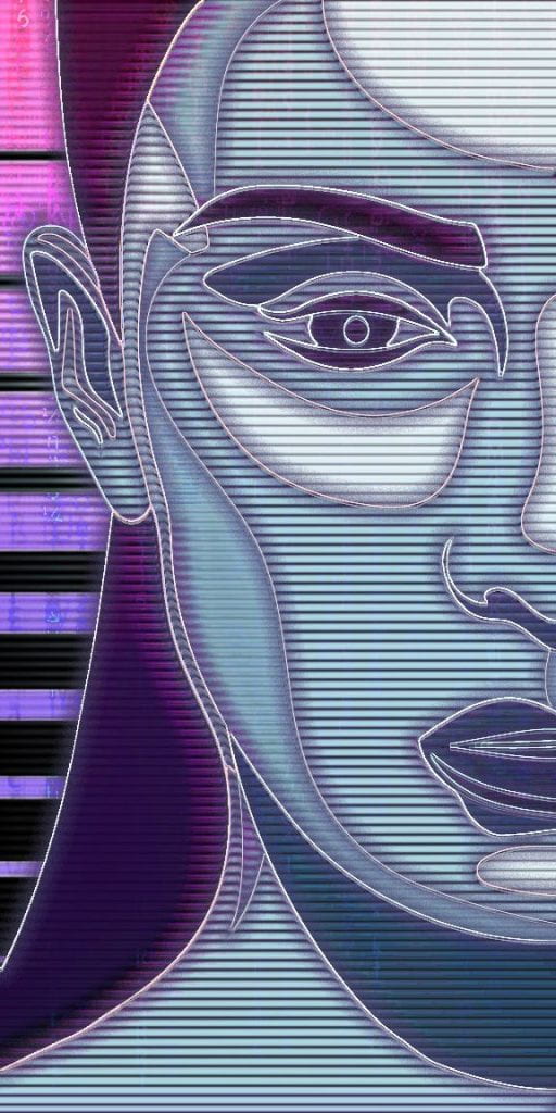
These were the two final results from the process of the art, and I’m quite happy with how both came out, they definitely push our narrative, especially with how the eye is closed in the ‘real’, showing that the individual is blind to the fact that they are in a simulation, but it is open in the ‘simulation’ showing that their proverbial “third eye” has opened and they are aware of the true reality.

The last part of this process was the creation of a digital version of our mechanism, to push our narrative even further, and give a bit of that diptych in how their is a real and simulated version of our mechanism as well.

The process was relatively simple, I have a few years of experience in blender and so the hardest part was really just the animation, but once I got it down for the first board, or the first slice of the pie as you might say, it was pretty simple to figure it out for the rest. I put the board in a neon lit room and flipped each piece between the two realities. This is the final result of that.

This project went shockingly well, and I am ecstatic with the result, I think our narrative pushes through really well and it’s a cool concept to begin with and I’m grateful to have had Alizeh come up with such a successful idea for our artwork.

Final project: Dynamic Pages

Infinite Story: Process

Exercises/Research

The start of this project was relatively slow, but eventually I came up with a simple idea that I wanted to execute because I felt it perfectly fit the description of the project. We were to make “Cyclical narratives”, and what better way to portray a cycle then life itself. This idea grew into doing the lifecycle of a flower. My concept still remains a bit ambiguous, but in summary, I wanted to represent the stages of life in a way that would show the growth, decay and renewal in a universal way. I chose to follow through with this by doing my idea of a flower, and representing these stages through the different frame views. For my first frame I would represent this early renewal stage as the sprout of a flower. For the second, I would represent the growth stage as a mid-bloom flower, the third would be as fully bloomed flower to represent adulthood and prosper, and then the final frame would be a dramatic decay of the flower, with the dust of the petals drifting away. Somewhere along the ideation course I had the idea to make the backgrounds that corresponded with each stage the four seasons of the year to represent the passing of time.

I did the practice exercise for the assignment and it sort of solidified the idea I had in my head about my narrative and what I wanted to communicate with it, here is the outcome of that:

I started drafting with very rough sketches on small flippers and this is what I ended up with:

Production

I liked this as a starting ground and wanted to move this idea to digital. I started by continuing to sketch stuff out and then manipulating the images to where they would properly represent my ideas. This is the first run of my digitally made flipper:

I liked how it came out but there was a few things wrong with it. First of all it was too big and difficult to actually operate as a flipper, secondly the first and last frames seem very disconnected. These were the main issues I wanted to fix in my final rendition.

This is my final flipper, and I’m pretty happy with how it turned out. The changes from the first digital to this are the artificial components of the last frame are now sort of included in every frame to an extent, there was some color correction, the sky from the last frame was incorporated into the spring scene to connect the two, and there was some effects added to the decaying flower to make it stand out from the background. I also shrunk the size of the flipper to a quarter of what it was for easier operation, and the pictures were fitted better to the frame.

Final project: Infinite Story

Reveal/Conceal: Process

Exercises

We started the project process by learning how to use illustrator so we could effectively create our compositions. We did a series of tutorials and created a few simple paths to get our bearings.

The second exercise for this project was to create a piece using one of our initials and forming an idea using the existing negative space. I decided to use my last initial, an H, using a very bold and blocky font. My idea to form was vaporwave aesthetics, since this is a large interest of mine and I’ve always enjoyed them. I started out by finding things that would go well with this idea, and began to create the piece using illustrator.

This was the process of creating my H, I wasn’t sure on my topic at first so i was testing out a few different ideas, and then after I found my concept I sort of went wild with the concept, and ended up dialing it back.

I ended up getting it laser cut and learned how that process worked through that.


My process for my final result started with finding homonyms and figuring out what I wanted to focus on.

This is the document I created to organise my thoughts and decide the art direction I was to move in.


Alex Horton // Design 2130 // 1.26.2021


Homographs:

  1. Circular – taking the form of a circle / a store advertisement.
  2. Die – a cube marked with numbers / to become deceased.
  3. Current – up to date / flow of water.
  4. Right – correct / opposite of left.
  5. Fair – equitable / beautiful.
  6. File – stored information / a line of people.

Project idea:

I want to use die as my homograph and do a six sided- die as the visible part and a skull appears on the die and a coffin appears around it as it is revealed? Possibly a bed of roses on a mid-layer would be compositionally interesting. (Form)

The theme of this could represent chance and the unpredictable nature of death so a purposefully weird principle of rhythm and balance would be fitting attributes. (Content)


Pillars:


Off-putting Rhythm             Chance                Glue, Paper

Balance                       Unpredictable     Cardstock (Laser-Cut?)

______________________________________________________________________

Production

This was most of the setup for my project and my next step was drafting ideas.

These are my three initial ideas that I made in sketchbook, and the third one was what would continue to evolve further into the final piece.

This was the first real draft of my final piece made in illustrator, with the red being the reveal. I enjoyed how the reveal brought forth the rest of both elements in the piece, however it was still lacking some elements of dice in the composition.

I had finished this composition and it was now time to send this to the laser cutter and construct the real piece.

I’m really happy with the outcome of the piece and think that it reflects my original concept really well. It helped a ton with my existing knowledge of illustrator and gave me an oppurtunity to stretch my legs again with the physical construction process.

Final Project: Reveal/Conceal

Interpretive Collage: Process

Research/Exercises

Beginning this project, I read three source materials and wound up choosing The Juniper Tree by the Brothers Grimm, a story about deception, corruption, and the evil surrounding life. I wanted to focus on this because I liked the dark nature of the story and felt it would fit well in a more abstract collage. I started to form the concepts that I wanted to show through this piece. I want to set out to portray this very dark story in a sort of fantastical scenario, as to give the piece a lot more character than if I were to just focus on solely dark elements.

The first exercise we did was to find resources that would fit our concept and described ceratain aspects of the story. This was what I gathered in this search:

I really enjoyed the imagery of the bird in the story and wanted to focus in on that a bit, so that was my main focus for the rest of my gathering after this exercise.

The next study and exercise was to focus on creating a collage to get used to the software and learn to use harmony.

I enjoyed how this turned out and it gave me some more insight into the cloning and blending tools at my disposal.

Our next exercise was focused on giving some perspective. Get it? We learned how to form a space with dimension through the use of collage. As it’s hard for me to travel right now, I chose to use my room as my subject and do a very wide focus collage of it.

This gave me a lot of insight into creating my final collage as I learned how to seamlessly embed these images together and form a coherent space, which would be the main goal of my final collage.

Production

I finally started work on my actual collage and my first step was to just get a few flat ideas down.

These were the main things I was to focus on, using the bird as a repetitive element and the act of cannibalism as a main focus, as that was a pivotal moment in the source material.

This was a slow progression upon a similar idea using space, ending up as my final. I was just building up and making subtle changes to make the piece moreso fit my concept, as well as push the realism and believability of a 3 dimensional space in this collage.

I’m happy with this final result and feel it describes my concept in an interesting way.

Final project: Interpretive Collage

Mandala Color Studies: Process

Exercises/Research

This assignment was started off with an introduction to basic color theory and several types of color combinations. I did a bit of exploration and playing with different color calculators to see things I liked, as well as browsed different social media pages related to color. I’ve always used a lot of pastels in my previous art but I wanted to stray from that a bit while still keeping a more graphic and soft feeling atmosphere.

This was our exercise in color and I found it quite helpful in exploring the different types of color combinations.

I found that I ended up liking the monochromatic and square color schemes the most.

Production

I started exploring color schemes and playing with adobe color to help me get started and find something I liked. I started by doing my man made piece, since that was the one I was less sure about coloring.

This was my first draft coloring it and I had ended up really liking the colors I had chosen for it. I went with an analogous scheme for this one with a relatively wide arc, as I wanted to keep everything close and related in a way, just as all the represented objects in the piece are close and related.

I was essentially done on this one other than fixing a few areas where I had put the wrong co9lor by mistake, so I took it back into adobe illustrator and fixed that small issue to complete this mandala.

For my second mandala, I luckily had made the preface to my analogue piece in a digital vector format, so I just took that and used it as my second colored mandala.

Rather than going with analogous this time, I went with a square color scheme, as that had been one of my favorites in the exploration. It also allowed me to represent some of the objects and create a very vibrant and dynamic piece which I was a fan of. This first drafty ended up being my final as well, I did some minor tweaking and moving around colors while I was working on this first rendition but for the most part I was entirely happy with it the first go around.

This was the point where I realized that I had needed to make two different colored versions of one of my designs, so I chose to stick with the nature  based one for the snow third coloring. I thought the design might look pretty interesting in a monochromatic scheme so I went with a deeper purple as my base color and got my more dulled out and darker tones from that.

I ended up changing the background and linework to white as well, I think it gives t a sort of stark cold feeling, which is the same feeling I got from the purples as I was first discovering the color scheme. I really like how it turned out, it feels very simple but with a lot of intricate detail in it and the overall cold and darker feeling of it adds a bit as well.

This project was super enjoyable and simple to me, I had a lot of fun just messing around with different color schemes and making something that looked really pleasing to me.

Final project: Mandala Color Studies

Inventive Portraiture: Process

Research

Starting this process I created three mind-maps trying to narrow down the shapes and processes in which I work and feel during creation.

I was trying to do this without thinking too much about what I was putting down and just writing whatever came to mind based on the original words. I tried getting into the various mindsets while I was working on each and kept the doodles because they sort of went with each idea.

The next thing I did was create a page of possible shapes that I could place to create a base for the portrait. I took a little bit of inspiration from the three mindsets and tried to base shapes on those mentalities.

Many are just little doodles that came to mind but many fit the mentalities very well and will be ones I choose for the next step of the process. Like the mind-maps, I wanted to draw whatever came to mind and just put shapes down and expand upon them by reacting to them and drawing what I felt.

Before I continued the process of choosing shapes to go into the base of the portrait, I needed a bit of a reference to go off of so I took a self-portrait at a 3/4 view.

This would be the reference I would go off of to create a base sketch to place shapes onto.

Production

I started drawing with some shapes I created

I had stuck pretty close to the shape of the face on this but I enjoyed it so far.

This was the final linework for this draft and I was starting to get a little unsure about it as it highly resembled the original picture rather than being a more abstract piece.

I colored the full piece just to see if that would change anything but I was still not super happy with it, I think it looks cool but doesn’t really fit the assignment.

So I started this part over from scratch.

I decided to go with much larger forms and make them 3D right off the bat. I enjoyed the graphic aesthetic of cross contour lines and the high contrast so I wanted to keep that going. I added some more of these forms and selected a different color palette than the last draft.

I wanted to go with a much softer and more cohesive color palette so I went with a low saturation split-complementary array. I was really liking this so far and liking the graphic style.

I added some core shadows and some halftone shading, as well as pared down a few shapes. I wasn’t too sure about the halftone though, as I thought it was a bit too much so I went back and removed some of it, only leaving it in key areas.

This was my final draft for the project. I’m quite happy with how it came out, and I especially like the colors and how the green and yellow have a heavy contrast and just sneak their way in behind all the purple. I’m also much happier with the shapes in this piece than in my first draft, it feels like a much more successful piece in comparison.

Final project: Inventive Portraiture

Mandala-Pattern: Process

Research

Starting off this process I collected 10 examples each of patterns in nature and patterns in made made structures.

Nature:

Man-Made:


As you can mostly tell from my chosen images, my theme for my nature piece I had deccided to go with either the structure of trees or fruit as a theme, and for my man made piece I was going in a mostly car-based theme.

My next step was to create some sketches and petal ideas from both of these categories.

I wasn’t specific to doing either nature or man-made in these sketches and I almost combined the two a bit. I wanted to test and see how organic I could make the shapes in the man-made materials. A lot of the patterns already present were pretty heavily organic anyway so I wanted to push that a little bit. I had the idea that I was leaning toward a tree based theme for my nature one at first, so most of the nature petals present here are based in that realm.

Production

Next I started testing out these ideas in their own mandalas.

This was the first piece I came up with and it turned out interesting, but the patterns just didn’t feel that satisfying. I had chosen to create value through line weight shifting instead of an actual value change because it felt much more natural and looked better in my opinion.

The patterns in this one just really didn’t feel complete. I was using radial symmetry in this piece rather than true mandala symmetry and the rhythm of it just did not feel quite right.

I shifted from working in sketchbook to working in photoshop so I could take advantage of the mandala symmetry and create my full petal designs from my previous step.


This was more of a test idea to get an idea of the direction I wanted to go with this new process. I had liked the symmetry but it felt very empty and lacked a lot of the depth and texture of the previous design. This was something I wanted to improve upon.

This was my second attempt at doing the nature piece in the new process, I had mainly based it off of the shape of maple leaves. I wasn’t a huge fan of it and it felt really overwhelming where as I kind of wanted to go with a simpler design for this one as it would be the one I transferred to analogue. I decided to shift my focus from leaves and trees to fruit.

This was my first and final draft working in this theme instead of trees. It felt a lot more substantial and the symbolism was more prominent than the last pieces. I liked this much more and preferred it so I went with this as the piece I would be transferring to Bristol.

The next thing I would be working on is my man-made pattern piece. I wanted to make this one look a bit more complicated since it would be my digital piece, as well as to make up for the lack of value as I was still using line weight in preference to this. I started out with a small piece in the middle that I would build off of, it consisted of one of my original petal designs from the first sketching process and a few other sketches based on my found images.

I was really liking how this one was turning out and wanted to stick with this and simply expand it outward a bit.

This ended up being my final piece for my man-made, I had simply continued upon the last piece and added more details of my images and made patterns out of them in the expansion process.

My next step was to vectorize my man-made piece and transfer the nature piece from digital to Bristol.

I started by vectorizing the man made. I just took it into illustrator and used auto trace, it did a pretty good job and I just had to clean up a few details for the final piece.

Finally I transferred my digital design to it’s final place. I printed the design out as wide as I could and covered the back of the sheet in graphite.

Next I placed this sheet on my 12″ x 12″ Bristol board and taped it down. Then I pressed down on all the linework with a ballpoint pen to outline everything.

I took the printed page off and then filled in all my linework with micron pens and erased all my pencil marks from earlier and my piece was finished.

Final project: Mandala Pattern

Reconstructed Drawings: Process

Exercises/Research

Starting off this process I practiced breaking forms down and then building them back up from a different position. This was pretty intuitive with the experience with 3d space from the last couple projects.

I ended up choosing the car in the top left as my subject of focus, I felt a connection to it and wanted to make it have some more tone in an actual piece.

Production

I had a couple ideas in my head that I originally wanted to do as renders in blender but thought they would work perfectly here. I started by thinking of as good mood for the image I already had in my head and I came up with “vast.” I wanted the scene to look like it had no end and this one frame could be repeated in the entire journey. I started sketching my first idea.

This was just to get my basic of the road down. I was going to do a bird’s eye view of the car driving down the road in the rain surrounded by trees.

I started by drawing the outer trees. Instead of drawing each individual tree I found it a better process to use a brush and spin it to create the depth in every tree. I really like how this part came out and definitely feel it represents the “vast” criteria.

Next I worked on drawing and texturing the road. I wanted it to look very soft and rainy and the white dots really help bring the sense of it being nighttime to this portion as they give highlights like streetlamps would. The stippling on the road helps give it a sense of depth and brings out that rainy setting.

I brought these two pieces together and this was the result, I really like how this came out and all I really had left was to draw the car in it.

This was my presketch and I liked the size and postion so moved onto texturing it and doing highlights on the ground for the headlights.

And this was my final piece for the “vast” criteria. I really like how it came out, I decided to dramaticize the viewpoint and texture rather than warping the subject too much in this piece. It fits the target mood quite well I think and it feels very emotional to me.

For my second piece I decided to go with the criteria of “pensive.” It took a minute to think of a view that would fit this well, I just went over different ideas in my head and didn’t like a whole lot of them until I thought of one that really fit the bill. I was going to do a wider stretched angle view of the front of the car with the driver looking ahead in thought.

This was a rough sketch of the view I wanted to go for and I quite liked it so I would end up just building on top of this for the rest of the piece.

Added a few details to expand on the environment.

Added a few more details and sketched the rain out to give an idea of the atmosphere.

From there I started my line work and texturing. I wanted these to be a lot different from the first to emphasize the different mood. The trees are what I think came out the best in this process and add to the effect of the drawing.

This ended up being my final rendition. I’m happy with it and it gives the feeling of pensiveness off very well from what I can tell. This process was pretty fun and straightforward to me honestly, it was interesting testing out compositions in my head and just being able to put those down to create a piece purely from imagination!

Final project: Reconstructed Drawings