Posts

Analogue Game Design


RESEARCH

To begin the new take on this project, we began to research what exactly the conflict, mechanics and goals really mean in a game or while making a game. The conflict is the main issue in the game, or what you are trying to overcome. In my particular game, the main conflict is to avoid the spaceships which shoot lasers to try and get the players to lose stars. Another issue along with avoiding the spaceships and danger spots is to avoid losing all your stars. Losing all of your stars will result in losing the game and not making it to the finish space. The mechanics in a game are the piece that controls most of the players fates or choices. In my game, the main mechanic is the dice. The rolling of the dice controls who goes first, and where the players end up on the board. Another mechanic of mine is the various different types of cards which match the spaces that the players land on. This includes a reward space, a risk space, a danger space and a risk/reward space. Finally, the goal of the game is what the players are trying to achieve while playing the game. In the game I created, the main goal is to finish the game with the most amount of stars. Another underlying goal is to avoid getting hit by the lasers, which will make it harder to win in the end.


VISUALS

Listed here, in order, is how I worked through creating my game. The first photo shows the setup of how I organized each of the types of spaces to land on. I created this in a way so that there was an equal amount of each space, and arranged them so that the game got more difficult as you got closer to the finish. The second photo shows the design of the board that I would have underneath each of the spaces. This includes two spaceships in the top left and bottom right corners, and stars/constellations scattered around. Shown next is how I originally had the symbols for the draft. After getting feedback from the draft, I was told that the safe spaces didn’t communicate “SAFE” as much as I wanted it to. This is shown in the fourth photo as my original sketch for the symbols for safe and danger. In the fifth photo I have shown my iterations for creating a new symbol for SAFE. I immediately thought of the idea of making the safe symbol include a “safety bubble” that would show nothing could hurt the player. I chose to go with the green bubble because green is mostly associated with safety. Shown next is the product of fixing the SAFE space symbol. I have shown in the seventh photo the original sketches of the symbols that I imagined for my game. The only thing that changed with these to the end is that I took away some detail in the reward card symbol and kept one lightning bolt on the risk cards, to keep them more simple. The back of each of the cards is shown next, with examples of what they could say. Next shown is my final creation of the game board and each of the spaces. I also added some planets and laser beams to each of the danger spots, which was also suggested in the discussion board. Lastly, the game pieces are shown. I wanted to keep these simple because the game board already has so much going on. I kept the colors bright so they wouldn’t get lost on the board.


FINAL

Shown above is my final document for the concept of my game. I decided to incorporate the colors I used in my board game and include a light image of the spaceships that I drew on my board tot tie the two together. Creating this document made me feel very confident with how I completed my game and it made me think deeper about it than I did before. I had fun creating this document and it really helped with my process.


Gifting Design


A NEW TAKE

Before spring break, everything was different for this process, and this program in general. We were expecting to come back in a week, ready to prepare our final projects and our portfolios to submit in a few short weeks. After learning of this monumental change, I was worried. I was worried about the lack of space to work, and the lack of materials I would have to use for my projects, and I couldn’t help but feel upset. Even with the studio culture, being around our classmates everyday helped tremendously with the process. Before starting up classes again, I started to tell myself how this is exactly what will challenge me to be my best in these classes. Despite the lack of work space, materials and everyday interaction, I would have this obstacle to overcome and show that something like this can’t stop me from working my hardest. As much as I wish this never happened, it made me want to work even harder than before to prove that I want this and can prove myself.


CREATING QUESTIONS

Before spring break we discussed how we would need to come up with a list of questions to ask the person who will receive our gift. This was to be a list that would dig deeper than the basic get-to-know-you questions. This would involve asking them how they feel about or view certain things. I knew I wanted to ask her some questions that would get to understand her personality and what she loves the most, but I also wanted to ask interior based questions. Some of these questions were, “What do you first notice about a space”, “What was the biggest change from pre-design to interiors?”, “What made you decide on interiors?” and “What is your ideal space/environment to be in? How do you want it to feel?”. I felt that these were also important to ask so that I could get a feel for how she reads a space and wants it to feel, along with me getting more experience with working on interior based projects.


COMMUNICATION

Instead of just emailing Lindsay, we both decided that it would be the most productive to FaceTime. With email, the answers can come off short, and it ends right there. In a video, I can ask another question right away if I think of one or ask about the answer if it isn’t clear. I found our talk to be extremely productive and I left our chat feeling very confident in the direction I want to go with her gift. The photo shown above shows the notes that I have come up with so far, along with the questions and answers from Lindsay.


WHAT STUCK OUT


I ended up asking Lindsay around 17 questions total, all being very different and all over the place. Out of all of her answers, a few things stuck out to me the most. The first being, when I asked “What is important to know about yourself?” her answer was that she is a christian and her faith is very important to her. After she said this, she began saying how she knows religion can make people uncomfortable and I didn’t have to include it. After she made this point, it made me want to design something for her based on her faith, as it was this important to her life. For me, I don’t practice faith a lot, but it does not offend me at all when someones life is based around it. I really appreciate when someone can be that committed to their faith. Another question that I felt was very important was, “What is your favorite color scheme?”. I asked this because I felt that it would give me more information than asking what her single favorite color was. She answered that she really enjoys warm tones such as light pink, rust and mustard with additions such as teal, grey and greens. She also added that she loves pastel colors. This gives me a lot to work with, and I am happy she gave me so many options because color is very important for this gift. The first photo shown is a small mood board that shows the colors I want to work with and the examples of art that she loves.  These colors all made sense to me with her personality. She is a very warm and kind person, and I want that to show in her gift.

Something that Lindsay said she really liked was gestural drawings. What she likes about it is how it looks unfinished and very fluid. I personally have a good amount of experience with gesture drawings, last year I took a drawing class and we had a lot of practice with these types of sketches, and how to create them. The second photo shown shows a small collection of the gesture drawings we did last year of our model, and a few small objects. I practiced many different techniques with these to give off a different feeling for each of them. I want to incorporate gesture drawings into my gift because of Lindsay’s appreciation for them. Even though I didn’t go with the gestural drawings, it gave me an idea of how I should work with my materials and how I should make the aesthetics come off.


PROTOTYPING & ITERATING

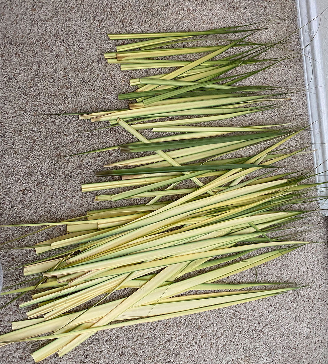
The first four photos shown are my original prototypes for my gift. What is being shown is the two plain sides being folded up, which will create an aspect of reveal and layers while opening the gift. While thinking of what material to use for the middle being weaved, I thought about how Palm Leaves have a large religious significance and would work perfectly for what I have in mind. The next six photos show the palm leaves I will be using, along with a quick prototype to practice the weaving with the palm leaves. The eleventh photo is showing how I completed the final weave and then traced how I would cut it to make my desired shape.

The next row of photos started is my iterations for how I wanted each part to eventually look. In the first photo, it shows how I selected the two words from my quote, and put them in different shades of green to represent how palm has different shades of green, along with the direction of how the words would go, referring to the pattern of the weave. The second photo shows how I would create the prism that would hold the word “HOPE” on the string. The twine would go through the top, leaving a knot to pull and reveal the word “HOPE” on the string.


CONSTRUCTION

The construction for this process went much smoother than I originally thought. The first photo shows how I created borders to go around the edges of my weaved piece. This created a correlation between the color used for the outsides of the project that is seen when it is closed and now the borders. This also made the edges look more clean and sharp. I intended to have these borders, mostly because it gives the idea of the palms peeking out from the inside, like my recipients faith peeking out of her.

The second photo shown is the construction of my prism that would hold the letters that I created. This is representative of having to sometimes find the hope in life. She will have to open up her gift, as if she was opening up to find the hope.

Lastly are the letters that I constructed. This was the most challenging part of creating this gift. I took paperclips and bent them many ways until they created the shape I wanted, and then wrapped them with twine and secured it all with super glue. I am very happy with how these turned out and I think they match the aesthetics of my gift.


FINAL

https://youtu.be/faj4CblNWVw

All the photos shown above are the different parts of my final design. This includes the string that holds the word “HOPE” and the sides which read “WONDER” and “BRAVERY” in different shades of green and at different angles. Along with the photos is a video of how the gift should be opened. Along with the final photos I also included the messages that I created. The first one will be printed out and will be the first thing she sees when she opens the box that holds the gift. The second photo is the message that I am having my recipient read as she is opening the gift. This is meant to tell her my inspirations and explain the decisions I made. Without a doubt this has been my favorite project that I have completed this year. There was so much meaning behind this and it made it even more special to be creating it for someone else to have. Being able to use the most important parts of someones life to create something from scratch is such an unforgettable experience. My ideas changed many times throughout this process and challenged me, but I wouldn’t have had it any other way.


Body Augmentation


EXPLORATION

My partner and I decided to do research before anything, to get our ideas flowing and to get an idea of what we wanted to create. To begin, we created a list of dualities that we found interesting, and started there. Our original list is shown here: OriginalNotes . With this list in mind, we began thinking about the first things that came to mind when thought about those things, along with the synonyms/antonyms of each of those words, this is also shown under each of the terms listed in the photo. Along with the written notes of these ideas, we created quick sketches, picturing what they could potentially looked like in our minds, this is shown here, OriginalNotes2 OriginalNarrative . After a lot of discussion regarding our favorite idea of the height and depth using a pointy nose vs a long, droopy nose, we realized we needed to look deeper into the synonyms and antonyms that we listed. After more research and discussion about our topic, we decided that the terms “peak” and “valley” worked better for what we pictured. with this in mind, we talked with our peers and professors and came to the realization that we were focusing on the wrong part of the body. The nose doesn’t necessarily have peaks AND valleys, but a woman’s chest does. With this in mind, we talked about how there are unrealistic expectations for how a woman’s chest should look, and there are also the more realistic and natural ways a woman’s chest can look. This led us to the idea of creating a type of “bra” that would reveal the realistic vs. unrealistic aspect, along with keeping Mother Nature in mind for the other side of the attachment.


EXERCISE

For our exercise, we were told we had forty five minutes to construct a 3d model of an extension of the body with Bristol. Keeping our original idea in mind, my partner and I decided to create our ideas of the noses with different shapes and sizes. We were still on our first idea when we did this exercise. I started the pointy nose and sketched out the template, Exercise , and then eventually cut it out and assembled it, Exercise2 , Exercise3 , Exercise4 . At this point we were a little over the halfway point of our task, and I was beginning a new template to try and make the scale larger, when we were told to switch projects with our partner. I took over my partners new template as she also started creating a second one, and began working with it, Exercise5 . This exercise taught us the importance of creating prototypes without worrying about them too much, I learned to create one, then stop and create another one with what I wanted to fix about it without thinking twice.


PROTOTYPES

Our first set of prototypes were early in the process of this project, and we decided to create prototypes of the way we could construct and build the sizes and shapes of the bra we were envisioning. I created a few small scale prototypes out of Bristol, Prototypes2A , PrototypesA, I had the same mindset making these as when we were creating the prototypes for the exercise. I created one, then just started making another version with a slightly different technique. I found myself proud of the results and how versatile I was with the materials I had. My partner used another technique that we were interested in trying, paper mâché. She created a few with different natural and organic shapes/sizes, PrototypesB Prototypes2B Prototypes3B Prototypes4B BraPrototype .

We ended up creating even more prototypes for our project in different colors and sizes. We knew we wanted an effect that revealed the realistic vs unrealistic aspect of a woman’s chest, so we thought of the idea to incorporate origami with what we wanted to portray. With this in mind, we knew for the realistic side, we wanted something that resembled a slinky to show what gravity and time does to a woman’s breast, SlinkyPrototype SlinkyPrototype2 SlinkyPrototype3 . After completing this smaller version, I created a larger scale version that I thought we would use for the final, Slinky2Prototypes Slinky2Prototypes2 Slinky2Prototypes3 Slinky2Prototypes4 . After some thought with my color choices, I decided that it would be important for my work to be more inclusive of all skin tones, so for the final I will be creating another version of this, with varying colors of different skin colors. Along with the slinky idea with the realistic side, we needed something like this for the unrealistic side. While thinking of this, we thought about how some women feel pressured into breast augmentation to make themselves look how society wants them to look, so we decided to use this idea as well. My partner constructed a cone that would collapse, resembling how females increase the size of their breasts, ConePrototype ConePrototype2 ConePrototype3 ConePrototype4 ConePrototype5 . I tried this as well in the beginning, and my template didn’t work as well as planned, ConeTest ConeTest2 ConeTest3 .


CONSTRUCTION

The construction of this project worked better than I imagined it would. The only things along the way that paused our production were to fix any messy areas or to revisit an idea and change what we wanted to do in the end. Here is a photo of how the one side of my piece looked before I fixed the left side, CloseUpBefore . The right side clearly has softer lines and curves, whereas the left had sharper edges, which did not convey the message I wanted to give off. The one part of this construction that I struggled with was finding a way to keep the “slinky” inside the side that opened up while it was just closed. After a lot of tests and small models, I came up with a “wall” that would slide under the first layer of the slinky and connect to the top of the “bra” to hold the slinky in place. The right side of the bra is representative of the valleys, this includes the knowledge of depth, going from light green to eventually dark blue (water) in the middle, where the deepest valley is on the body. Keeping in mind the idea of Mother Nature, I included the grass around the edges to make it feel more at nature. With this is the stacking/layering of paper to create a sense of height and depth in the middle.


FINAL

Shown here is the final photos of my part of the project, and my partners, Final1 Final2 Final3 CloseUpFinal Final4 Final5 Final6 Final7 Final8 Final on – closed Final on- open . I am very happy with how our project turned out. It gives off the message that we wanted, while using the elements and principles to create an abstract version of just that.


Narrative Style


ORIGINAL STORY

My original story started off in the genre of horror. It was a short story about a couple going on vacation to Costa Rica. While there, they went zip lining in the forest and shortly after found themselves in a dangerous storm, resulting in a death. The full story is here, OriginalStory.  I originally thought that I wanted to end up with the genre of my story being horror, but I feel that this was a good starting point to develop my story into what it would be in the end. While writing it, I wasn’t thinking of the art movements or color yet, but what I pictured while writing was bright colors in the beginning, leading to dark and depressing colors. Starting with the genre of horror, for our exercise I decided to switch it to romance, comedy and sci-fi. I was more comfortable with writing comedy and romance, mostly because I am more familiar with them. I knew sci-fi would end up being a challenge for me, but I was curious to see where it would take me. Linked here are the changes I made for each genre, GenreChanges. After switching the genres along with some minor details, I ended up going with Sci-Fi for my final genre. I have seen some sci-fi movies before, but not a ton, so I was a bit worried, but excited for how my story would turn out.


ART MOVEMENT

Before this assignment, I knew very little about the varying art movements that we were to choose from. However, the exercise that we did with the wheel of art movements helped a lot. I began to test a few that I was interested in, Fauvism, Futurism and Bauhaus, shown here, ArtMovementTests. After researching each and playing around with the art styles, I found myself liking the way Fauvism turned out the best. I thought it was be too obvious, and easy to use the futurism art movement, and I wanted to change it up and add my own twist to it. I wanted to keep the large brush strokes in each frame, along with the high contrast between the colors. I think this takes a spin on the classic sci-fi style that you would typically see in movies and I wanted to challenge that.


SKETCHING

When I started sketching, I knew we had the option to find inspiration from other works, as long as we weren’t copying any of it or making it too similar, but I wanted to sketch everything from my own ideas and what I pictured. Along the way, I knew it would be easier to find inspiration for these complex scenes, but I wanted to challenge myself with this. I have struggled in the past particularly with sketching people, so I took this opportunity to keep practicing, and I am happier with the outcome than I thought I would be. I began with very light, non detailed sketches, and then took each frame at a time to change some things and add the smaller details. Shown here is the beginnings of my rough sketches, RoughSketches. I found this very productive because when I went to add the details, I already had something to work with and wasn’t starting from scratch.


FINAL

During the process of creating this story board, it is difficult to imagine how it will all turn out when all of the frames are completed. I struggled during the process to see how it would all come together in the end and create a harmony in each frame. Right when I finished and was cleaning up each of the frames, I was very happy with the outcome. Shown here is the final story board: Final. I purposefully used the darker colors all leading up to the climax, and created a big light in the center of the climax frame. From the climax to the end, I used lighter colors to show the change that occurred. I think the art movement of fauvism worked in my favor. When you look at all of the frames, you see the unity with the technique used in each of the frames. Along with the final, linked here is my final story and the points I used for my frames: FinalStory.


Hidden in Plain Sight


EXERCISES

ExerciseAbyss

ExerciseJelly

ExerciseCosmos

ExerciseManatee

ExerciseOurselves

Exercise2a

Exercise2b

Our first exercise for this project was to find five words per table group of the parts of speech and find a font that would accurately show the meaning behind that word. To do this, we had to be trained for the laser cutter, which also would help us in the future with this project. Our second exercise was to use the gestalt principles to select a letter of our name and create something that represented us, by using the negative space. I wanted mine to be more abstract, so the wave mimics the negative space of the bottom of an M without being too representational.


FINDING THE SPACE

Spaceidea1

Spaceidea2

Spaceidea3

Vent1

Ventangle

While going around Hayes Hall, I knew I wanted to find three options that were all very different from each other. This started with the ceiling of the elevator, mainly because I found interest in how no one usually takes notice of the ceiling, and the pattern was interesting. My second option was a window sill on the second floor, because I liked the natural light that was available and I thought it could be interesting to incorporate that light. My third option was the space that I ended up choosing, and this was the stairwell in the basement. The darkness of this area intrigued me. I originally had the idea of using the corner of the space, with the idea of creating light in the space. After revisiting the area a few more times, I decided to go against this idea. With my original idea I was adding to the space that it didn’t have, and I decided that it was more important to use what the area already had and create something using those elements.


MODELS

Prototype1

Prototype2

Prototype3

Prototypeideas

NewPrototype1

NewPrototype2

NewPrototype3

NewPrototypeidea

RiddleNotes

When we were told to create models, I was still stuck on my first idea. The first 3 images shown above are a representation of what I imagined this object to look like, but scaled down a lot. I also inserted an image of a few sketches of my various ideas of how I could create this idea. After I had changed my mind about my project idea, I created a scaled down version of what I was picturing my project would eventually look like (photos 5-8). This is also shown above along with the sketches I created of my vision of this space. Also attached is my notes for how I wanted to incorporate the area around the vent into my installation.


CONSTRUCTION

Construction

CinderblockUsedForLetters

Vent

Bottom

The first thing I noticed when I began planning my construction was that the size requirements are 24in in any direction. While I knew this was a “rule”, I chose to go against it. This is because I feel that if I were to stick to 24in instead of my full 48in x 5 3/4in x 7in box that would sit on the vent, it wouldn’t convey the concept well enough. If I were to make it smaller, it wouldn’t cover the entire top of the vent and would ruin the way that my project hides in plain sight. Also, with the rules stating 24in in any direction, that would be 24+24+24+24, equalling much more than the dimensions of my project. I chose to take the risk of breaking this rule to enhance my project. I had some issues with the construction of this. My biggest issue was finding out the best way to attach the plastic to the box so it would be flat. The first method I tried was to use clear tape to attach it to the inside walls. This method was not successful, even after multiple tries, the plastic would get all wrinkled and wouldn’t attach right. So I began thinking, and made a frame that would have the middle cutout and would connect the plastic to the back of this, and this worked perfectly.


FINAL

Almost everything with my installation turned out the way I imagined it would. The box aligned exactly how I wanted it to and the colors blended good together. The only thing I had issues with was the feathers. I figured that because I used a very light paper (tissue paper) that it wouldn’t be an issue of them not moving. When I first put my box on the vent, there was very little movement of the feathers. I took the box off and began getting out as many feathers as possible and began cutting them to make them smaller, hoping the decrease in weight would help them move. I also cut out larger vents in the back so that the air would circulate more. This helped a little, but it honestly didn’t work as I imagined it would. A few things that I thought about that would make this happen is that the air might be a lower power than I thought, and the air might come in at an angle, making the air not circulate the way I wanted. In the end, you can still see movement from the air and I am happy that it could display that.


Dynamic Page


EXPLORATIONS

Mindmaps1

Mindmaps2

Mindmaps3

Mindmaps4

Mindmaps5

While exploring what I wanted to focus my project on, I had the theme of Life vs Death stuck in my head. I had so many ideas of how I could make this come to life and I only had that option in my head. I came up with a few more to try and get my ideas going, but I really wanted to go with life vs death. After talking with classmates and professors, I decided that this was too vague. I needed something more specific that I could give a voice to.


VISUALIZE

Livingvisualizations

ExistingVisualizations

Visualizations

In this stage I began to think outside of what I previously imagined how I wanted my project to turn out. I started thinking how when you are “living” you are taking risks, and doing things that make you feel happy and alive. Whereas when you are just “existing”, you are simply just going along with your life, not getting much thrill. After getting more feedback, I got the most positive responses to my quick sketch of the dog looking alone and sad. I chose to go along with this, I have a strong support for getting dogs out of shelters and having a good life so this felt like the best option for me.


PROTOTYPE

Prototype1

Prototype2

Prototype2a

Prototype2b

PrototypeIssues

After figuring out what theme I wanted to go with for this project, I had an idea of what mechanisms I would want to use, but not the clearest idea for some of them and how to make them. After some research, I began to test pull tabs as my main idea for these mechanisms. I felt like I needed some variety, so I also tested a “waterfall” paper craft that gives the illusion of something moving while on those pieces of paper. I struggled with the prototype, but after creating the mechanic a few more times I had mastered it. I had the idea of making the illusion of a ball bouncing , so I found one video of the combination of a piece of paper with lines creating a circle, with a sheet of paper with small slices in it, to create the effect of a ball looking like it was bouncing. After many attempts at this(links 2-4), I decided that I was better off using a different mechanic, but I was glad that I challenged myself to try and make it work.


IDEATE

Ideas

MechanicsNotes

CloseupPart3

Part1

At this stage, I knew what visuals I wanted to go with each mechanism, but I needed to figure out how they would all go together. One of the first things that I needed to do to cleanup my project was cover my pull tab mechanism on my very first section of my project. To do this, I decided to make an abstract looking hole around the dog and the ball. I feel that this would also subtly showcase the dog, the main focus of this part. This is shown in the link labeled “Part 1”. Another part I would like to explain is the middle waterfall part. My intention with the blue was to slowly make the blue appear more as it got closer to the sky of the bottom section of my page. This was meant to create an “ombre” effect.


FINALIZE

Shown above is the final product of my dynamic page. I originally imagined that my project would be horizontal, but I thought about making it so the ball falling transitions into the final piece and I’m so glad that I decided to make it vertical. I decided to add a supportive material underneath all of the paper to make the project more stable and I am happy with how much more sturdy it made my page.


Imagined Journey


RETHINK JOURNEY

When I learned we were revisiting our journey yet again, I knew that I would not only have to take the walk again, but I would have to think even deeper about it. This required a deeper thought process and I had to take every feeling/emotion into consideration while thinking about it. Something I realized while thinking about my journey was my transition of this year. I came from the campus at Mansfield last year, and that is a lot smaller than this campus. This definitely required me to come out of my comfort zone a bit, and put myself out there. This is when I realized that I wanted my project to be based on leaving your comfort zone, and how it is a good thing.


MIND MAP


In the beginning of this project, I thought I had a very clear idea of what I wanted to do. I had the idea of creating a video representing each part of campus that I traveled to throughout my journey. I began doing the mind maps, and struggled at first with how the video would portray the idea of leaving a comfort zone(Shown above). I continued with it hoping I would think of something that would make it come to life, and I created my plan for what I wanted to do and what materials I would need (shown above). After discussing with classmates and my professors, it was decided that this might not be the strongest way to show off what my intention was. After a lot of thought, I decided I was going to make a children’s book. I have some experience with graphic design from being in yearbook in high school, so I was very excited to do this. It would show those who read it, or children that a comfort zone is nice to have, but will benefit them to leave. Things that I would have to do were purchase the materials I would need, Print off my pages, get the book bound and eventually attach the extra elements.


PLAN

Shown above is my thought process for my new idea of creating a children’s book. I already felt more comfortable and on board with this idea, and my peers also agreed that this was a better idea. I began by writing out what I wanted the plot to be like and what elements I wanted to incorporate into my book, as we needed a second sense in our project. My plan for the second sense was touch. My idea for this was to use the different textures to represent the different feelings that are happening in the book. I knew from the beginning that I wouldn’t put these textures on every page, mostly because I didn’t want it to take over the book and writing. So for the pages where the little girl felt nervous, there would be rough textures. On the pages where she felt happy or content, there would be soft textures and for the pages with both feelings, there would be both textures.


RESEARCH

I have this first photo inserted above, but I wanted to attach it again because it shows my research. I went a researched color theories so I could use them for the different feelings in the pages. In the second photo, I have shown my research for how the dimensions of the book should be and roughly how many pages I planned on having. Underneath the other details I have listed how I wanted the plot to play out organized by each page. Something I also went into researching was how I would end up putting the physical book together. I found out that staples could do printing and binding for cheap, so I decided I would take a trip there with a classmate and get it bound so it looked nice. Something else that I had to think about was where I would get my different textures. I resorted to looking on Amazon and I found fake grass and Black sandpaper for cheap, and it would get here the quickest.


FINALIZE


Listed above is the link to my video of my book (on youtube). If you just copy and paste it into the search bar it should work. Also shown is a copy of the final script I created for each page of my book. I found it harder that I thought to create this book and the writing, but I am very happy with the outcome. I think it is definitely child friendly, and I plan on showing my little cousins in the future. I also thought in the beginning that I wanted to add 3D elements to this book, like stacked paper. While creating this book, I realized that it would be too much with the already added textures. I think the textures help with the overall feelings and I am also happy with how those turned out.


Sensory Abstraction


RESEARCH

Shown above I have inserted photos of every one of my mind maps from my research phase. The first one is showing the experience of swimming with dolphins. I was excited about this, until I realized there wasn’t much that could go into this feeling, and it was almost too specific. The second set of mind maps is the experience of Thanksgiving day. When I originally had Thanksgiving Day in the center, I was told that was too vague, so I changed it to eating Thanksgiving Dinner and gave it more specific elements. I enjoyed this one, but it was not my favorite out of all of them. Next I have the experience for the Fourth of July. Again, I was told that “Fourth of July” was too vague, so I created a new mind map for “Fourth of July Fireworks”. I was disappointed to realize this didn’t give me a lot of different elements to work with, so I moved forward. My final mind map began as “Amusement Parks” which I realized, again, was too vague. From here I thought of the most exciting part, Riding a Roller Coaster. There were so many different senses and feelings that went into this, and I felt it was my best option. The final photo shown is my final mind map and each of the different feelings/senses that I explored, and how I could potentially show them.


ITERATE

Shown above I have attached the photos of my iteration notes for each feeling/sense for my sensory abstraction. Shown first is the blur of the motion, and seeing the track infront of you. I wanted to make this feel wavy almost, and not have rigid lines. I wanted to have fast movement, to show the fast motion of the roller coaster. I also changed the thickness of the lines as they went up and down to create contrast. For the second image I am showing the yells and screams while being on a ride. I wanted this part of my design to pop out at you, and really give the illusion of something loud happening. This is where I began to brainstorm for what I could do for my 3D element, and this is where I decided I would want to incorporate it, to give a bigger sense of something loud. I knew that the color would have to be a high saturation, because a low saturation color would just take away from it. The sharp edges are supposed to represent how screams can screech and not be pleasant sometimes. The third image is showing the wind and “whoosh” while riding a roller coaster. Like the first image, I wanted this to be more fluid and flowy, and have lots of movement. When I think of wind being shown, I think of it swirling through the air, so that’s what I went off of for most of my iterations for this one. The fourth shown is the “tick-tick’ of the ride and the noises the ride makes. For the “tick-tick” I wanted movement, but not all at once. This is why I created designs with a steady line and then a part of it moving in a different direction, and repeating that. The fifth image is showing the excitement and thrill of being on the ride. I wanted the shapes for these to be more organic, to make it more fun and playful. A lot of the designs I came up with ended up being very similar to other feelings/senses that I already did, so I just went with those other ones. The Sixth image is the anxious/nervous feeling of being on the ride. For this I made each image with harsh lines and fast movement. I wanted them to feel uneasy to the viewer. Lastly I have listed the Hot handle that you touch while on the ride. I came up with some designs that to me felt like touching a hot object, but again these turned out very similar to some other designs I had and I felt this wasn’t the most important part of the roller coaster.


IDEATE

After deciding on which elements I wanted to incorporate from my iterations, these are the three main options that I came up with. The first one is showing the element of the motion/track infront of you for the background, with a lower opacity. In the top left corner, I added a design from my “tick-tick” iterations. I felt this design gave the feeling of that noise and slight pullback when you go up the hill. The top right corner holds the “scream” portion, along with the 3D element here. I wanted this part to be bold. The bottom right has the anxious feeling, and I intentionally made the line weights thinner as I got closer to the corner to create contrast. The swirls connect the two corners represent the wind and “whoosh”. For my second design, I wanted to keep the same kind of idea, but switch up the designs inside. For the top left, I added the wind/whoosh inside the design instead of having it connecting the corners, and I found myself liking this more. For the top right, I made the scream bigger, as I felt it should have a bigger presence. The bottom right has a different style to for the “tick-tick”, and I wanted to experiment with how the different iterations looked inside. I originally was going to go with the first two, but then I decided that I should experiment with color and how I wanted to use it. While playing around with color, I started working with a whole new design. I put the scream in the middle, and everything else went around that. After I added in all of the other colors and designs, it didn’t feel anything like a roller coaster anymore. It felt too random, so I stuck with my middle option, after getting advice from my table critique.


PROTOTYPE

After my table critique, I was told to add another element to the page in the bottom left corner, because it looked like it was missing something. So I went and added this other shape in the corner, with an iteration rooting from the anxious/nervous feeling. Another critique I got was to pick bright colors, but also keep them somewhat cohesive. This is why I kept the two opposite corners similar colors of blue. At our last class of the semester, we got our individual critiques from our instructors. I got a list of things that I could work with, including adding a gradient to the background instead, rethinking the order of each corner, making the lines meet up cleaner, fixing some unneeded white spaces, reconsidering the thick lines, and some other perfecting to some of the separate parts. I went ahead and made all of these changes to my design. I made the background parts a slight gradient(shown in second photo),  I cleaned up the lines, I made the lines less thick and I even made some of the color brighter. As far as the 3D element, I decided that I wanted to do something different rather than just stack the same shape over and over on top of each other. I decided to break up the “scream” shape into smaller pieces, and position each piece at different angles creating the illusion of a hills, because that is when most screams happen.


FINALIZE

FinalFrontAngle

FinalSideAngle1

FinalSideAngle2

The photo shown first is a digital copy of my final design. I used all of the suggestions given to me and I am very pleased with how it turned out and how much better it looks than my draft. This project gained a lot of growth in a short few weeks. When I first printed my final copy, my lines turned out like this, even though I used the same colors on top of each other. I was disappointed at first, then I realized that the intent of my background was the motion blur while on the ride, and I realized that it worked out. The lines inside of the thicker lines are abstractly representing the motion blur, or motion lines while on the ride and you see everything pass by so quickly. The lines are random, and I think that adds to the fact of it representing motion lines, because they aren’t perfectly symmetric. The imperfection of the inside of these lines made me like it even more. The first link listed is a front view of my final project. I added on the 3D elements in a way that made them going at different angles, hinting at the various hills you experience on a roller coaster. The broken up pieces are supposed to represent the screams while on a roller coaster, which is why the shapes are different sizes and seem broken, like a screech and how it hurts to hear. The next two links are the two different angles so you can see how it looks from the side.


Pattern & Scale


ITERATIONS

Iterations

Linked above is a combined  PDF of all of my sketches (scanned) for my iterations for volume, and depth.

Depth is defined as “The apparent distance from front to back, or near to far”, with this knowledge, I knew I wanted to construct something that would lead your eye down/back, along with forward, to create that contrast. I began my iterations as shown by playing around with the different heights of each piece of my design. This lead me to believe that the most visually interesting way to convey depth would be to have a sinking piece, along with pieces also coming out to the viewer.

Volume is defined as “The amount of space that a substance or object occupies”, knowing this I went with the idea that I wanted my shapes to come out to the viewer at all different heights and sizes. I fell in love with the idea of having each general shape of my design being made into different shapes, to create contrast. Along with the shapes being different, I made each smaller shape taller than each of the bigger shapes, to create even more contrast.


DEVELOPMENT

Development Scans

Linked above is a combined PDF of all of my sketches (scanned) for my development for volume and depth for each piece.

For my design for depth, my intent was to create movement by creating a spiral effect with each of my pieces gradually getting taller as the go around counter clockwise. I originally had the idea to have all pieces of my design sinking downward, but when I looked at the depth definition, it is, “the apparent distance from front to back, or near to far”, so I thought about also incorporating pieces that would come forward, creating contrast.

For my Volume design, my intent was to create contrast. This was done by first creating different shapes within the shapes from my original design. These triangular shapes add variety to my design, instead of it being the original shapes. Something else that I worked contrast into is the heights. It was my intent to make the smaller pieces taller than the larger pieces. The smaller pieces having 6 stacked pieces of chipboard, and the larger pieces having 4 stacked pieces of chipboard. I purposefully sketched my development drawings at an angle in 3D so that you could see the different layers in-between and what I planned to do with them. In my sketches originally, I had that I wanted to make some pieces get to up to 2-5 inches tall, but when I began building I realized that this would not be ideal for my designs. I figured this out while testing with chipboard and gluing them together.


CONSTRUCT

DepthEarly

VolumeAlmostFinished

Linked above is photos of my near final products of Volume, and Depth. (would not upload as photos)

The photo shown above is an example of how tiny one of my pieces was and how tiny the chipboard pieces had to be, next to a glue cap for size reference. I had many pieces in my volume design that were small, and required small pieces of chipboard so that it wouldn’t show. This did not stop me, and was a good challenge to keep me going. I failed a few times, but I kept cutting and gluing the pieces until they looked as I wanted them to.

In the first link named “Depth Early”, I just had the structure built, and the box was not made to surround it yet. Making the box to surround the design was my final step.

In the second link named “Volume Almost Finished”, I had the flat piece of Bristol with the stacks of my design on top, but the box stand was not attached yet. Attaching the box stand was my final step for volume as well.


FINALIZE


FinalDepth

For my Volume design(first photo shown), I got good feedback about it, but there were details that I could fix to make it better. These ideas were to make some of the small pieces more stable and create a larger sense of volume by adding pieces of the same size under the bottom most piece. This would make my design not necessarily taller, but make the feeling of volume come out more. I am happy with the way my final piece turned out, and I believe that adding the extra layers made my design pop out more.

The link named “FinalDepth” is a PDF of my final design for Depth, this would not upload as a photo. During our table critiques, I was told that my Depth design didn’t come off as strong as it should, and could be mistaken as volume. With the advice of my classmates and professor, I was told for my depth design to create walls around the structure to close off the edges and create more of a sense of depth than a sense of volume and height. This would allow the viewer to see more of the sinking feeling than the height from the side.


Abstracted Metamorphosis


RESEARCH

The photos shown above were my six choices that I gathered while conducting research. I knew that I wanted to do objects that were not as common. I didn’t want there to be simple shapes that made up the object. I wanted to challenge myself with this project and see where it would take me. I ended up choosing to move forward with the bottom three objects. I found myself very intrigued with that I could create out of these very different shapes and forms. I thought more about if I could only see the silhouette of these images if I could still tell what they were, and I felt these objects were successful with that test.


ABSTRACTIONS


I decided that for my Pinecone, I would use this for the “use” object. For the support of one person, I chose to use my octopus, and for my object that contains more than one person, I chose to use my shell. Right from the beginning I knew that the pinecone would make a really interesting light. Immediately I thought chandelier, because I have always found interest in how unique they can turn out to be. When I chose the octopus, I began to analyze it to think of what I could create out of it, and immediately I got the feeling that the tentacles should be the main support of what I was going to create, as the “legs”. I thought a stool would be the most unique and would give an ordinary stool a lot of character. For my Shell, I went back and forth with a lot of ideas. I had the ideas of a bed, a sleeping bag and even a boat. As I worked with the shapes and tried to make something different and also visually interesting, I trusted my thoughts and went with the creation of a creative tent.


REWORK

I began doing my iterations for each object with my shell. I originally thought that we had to do fifteen for each instead of fifteen total, which is why I did seventeen for my shell to get the additive grading. I was not upset that I ended up doing a lot more because I had a lot of options to choose from. I had to get very creative and imaginative while thinking of what I could potentially create with my shapes from the shell. I only had a few pieces to work with. My favorites were the tent, bed, sleeping bag and the boat. I ended up using the tent, because I felt it was a very different approach to create a tent. For my octopus, I also was digging for ideas with only a circular shape, and swirling lines. I ended up liking the stool, light and swing, but I felt the most successful idea would be to make the stool. It would make an ordinary stool come to life. Lastly with my pinecone, I felt the most successful options were the light, chair and fireplace. I knew I had the idea of light in my head for both of the other objects, but this one felt the most right. I wanted to create a very abstract version of a pinecone chandelier. I really like how we had the freedom to create almost anything that we could think of. This made me think of even more ideas that I wouldn’t have thought about if we didn’t do this exercise.


ANALYZE

Shown above are images of my reworked functional object, in their essential components forms. The first shown is my pinecone chandelier. I reworked this by making the shapes more abstract instead of organic, but still placed them as a pinecone would be. I turned the pinecone sideways with intent of making the chandelier horizontal and more abstract then if it was sitting up like a pinecone. The middle object shown is my octopus stool. With the tentacles, I had intent with how I placed each of them. The two that are at the highest point are for decoration. These are to help convey the idea of a moving and realistic octopus. The two tentacles on either side that are in the middle are placed behind the front tentacles. These would support the weight in the back while being sat on. Finally, the two tentacles on either side in the front are to hold up support while being sat on as well. They are spaced enough so that the weight can be distributed evenly and without breaking. The object on the far left is the beginnings of my shell tent. To create more of an abstraction, you can see that I made the shapes less organic. I will eventually create the finer details of what the tent should look like, but these are also just the essential components. For my tent, the bottom piece will be where people can sleep, whereas above them in the second piece from the bottom, this will be a storage area. This will be large enough to store things such as clothing, food, tools and even sleeping bags. This will allow for there to be more room in the actual sleeping part of the tent, and to keep your belongings safe.


Finalize

PineConeLight

OctopusStool

ShellTent

Listed first above is my comparison from my abstraction/essential components of my Pinecone light into the final version. With the final version I played around a lot with the different ways that I could arrange the shapes and orientation to create this interesting light. In the draft critiques, I was told that at first when I had the more representational pinecone shape just tilted sideways that it would be more interesting to make it look less like a pinecone. I am happy with how my final product turned out and I wouldn’t change anything about it.

Listed second is my comparison from my abstraction/essential components of my octopus stool. At first, I had the tentacles in a way that wouldn’t fully support a human without it either falling or breaking, so I fixed the way some of the tentacles were placed and created to make them more supporting. This stool that I have created reminds me of a fun area in an aquarium where people would want to sit on a stool that reminds them of the animals that they could see, and this was my goal.

The last link shows the difference from my abstracted/essential components of my shell tent. I began with the very hard edged, geometric shapes. This would make it more abstract, but I liked the idea of making it a bit more organic and soft. I wanted to create a tent that was a different overall shape than the ones users normally see. This tent looks like it has four layers, when really the bottom layer is for sleeping, and the second one is for storage. The top two pieces are decoration, and “seams” in the fabric.