
Inspired by Sol LeWitt
Inspired by Sol LeWitt
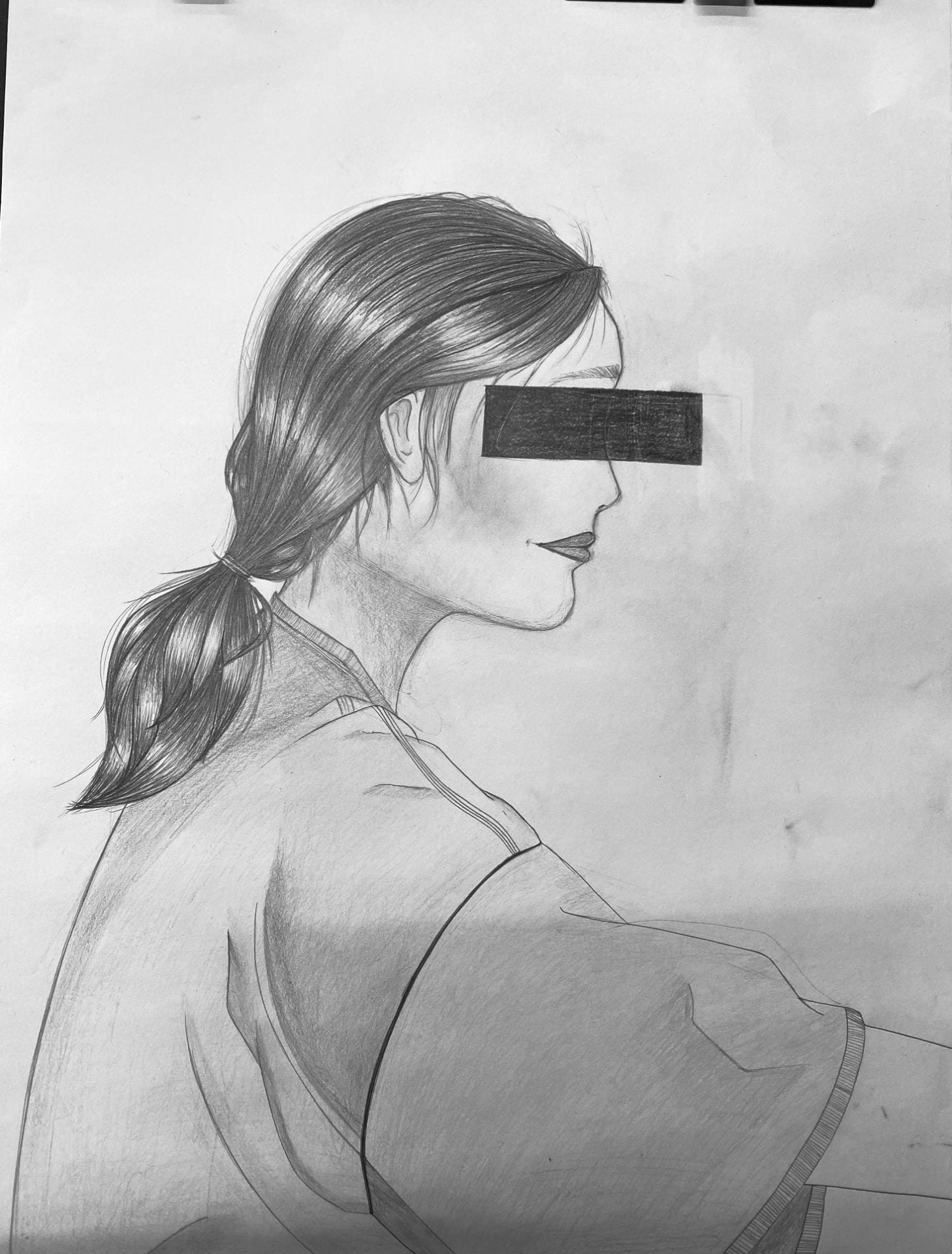
Portrait drawing of my roommate while she was studying. I remember in this one movie I saw ‘Parasite’, on the cover photo, all the min characters had this bar line over their eyes. I thought that that was really cool, and wanted to incorporate some kind of different element that would make it seem less of ‘just’ a portrait.

The image on the bottom is a drawing that I drew in the third perspective of a messy table that represents the aftermath of a girl’s night in. This drawing has a single fictional element included, which is a slim road winding through and behind the objets on the table. The middle on the left/middle was drawn in the second perspective, and this is a drawing of random objects from class with fictional elements included. The third drawing on the right was drawn in second perspective as well, and is a drawing of a building outside Hayes Hall. I used a mix of charcoal as well as an assortment of graphite pencils to complete this project. I don’t know if it is that noticeable, but my drawings seem to be filled, yet have a feeling of emptiness to them which was actually intentional when I was creating these drawings. That is why the labels on the objects on the table were left blank, why the road doesn’t have cars or people, and why there are also no people included in the middle drawing which seems to suppose to represent some sort of play area. I did this because the landscapes that I drew are meant to be a place filled with people and meant to be seen as lively. For example, the university building should be busseling with people walking in and about, the play area should be played on, and the table is a representation of the aftermath of a girls night in. However, I wanted to take these busy moments in our lives and create a still moment where you just appreciate its existence. sort of. 🙂


The three pictures below are the three difference perspectives I used to create my drawings. I utilized a 3-point perspective, 2-point perspective, and 1-point perspective, respectively, to draw the sketchbook. The only object I had in my room that has the closest to a book was my sketchbook, which is why I was only abled to practice drawing the same book. I also did not have color pencils available to me, so I used an assortment of graphite pencils, and grey scaled the images.

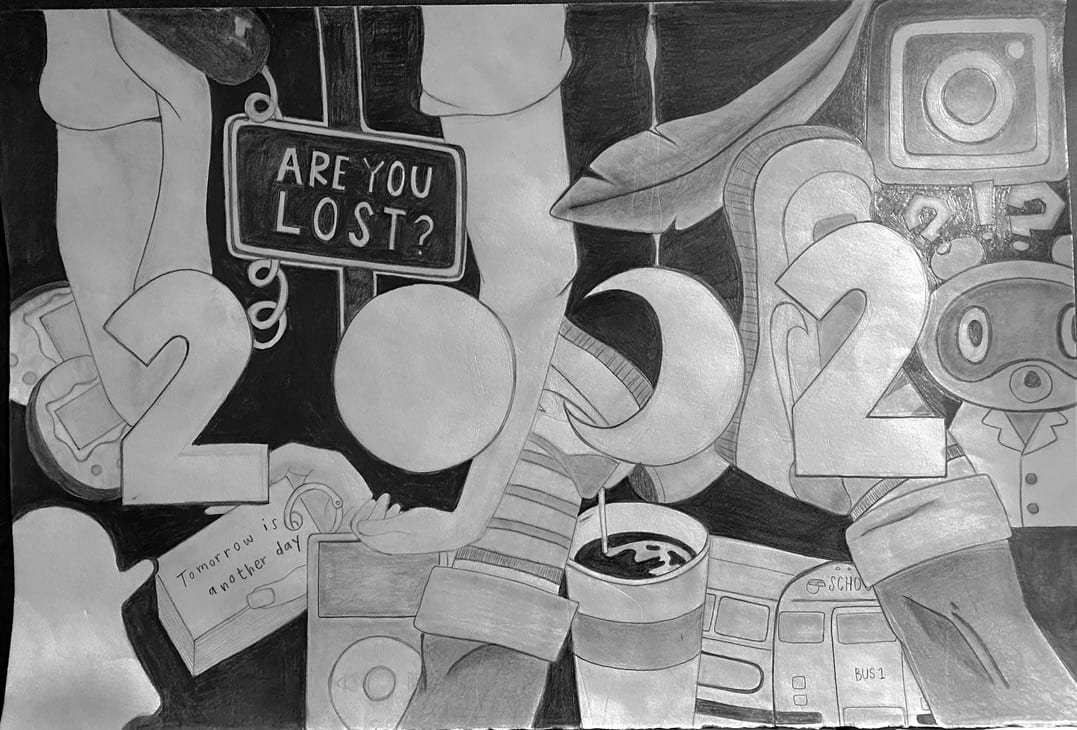
A copy of my dream collage from post #6 using a range of graphite pencils. It is not an exact copy because it was too difficult for me to capture all of the details, so I chose some of my favorite images to portray in this translation. The images that I decided to copy are also the objects that best represented my meaning of “dream” from my previous post: to go back in time/relive life to chase after the innocent freedom of childhood.
The type of dream that I felt inspired to portray was a dream about my personal desire. My dream is to be able to go back in time, and to re-do/relive my life. My collage tells a story about some of the things that I grew up with; starting from childhood to adolescence, to adulthood. Within these different stages in life, I’ve felt the presence of certain emotions more strongly than other times, and I also wanted to portray these different conflicts as well. However, in the end, there is calamity, and freedom in life, and my dream is to be able to pursue that freedom all over again. Thus, the single feather in center that almost seems to be illuminated by the white edge that has been cut around the black and white image.
I think that the biggest challenge I had with the previous assignment (post #4) was trying to find a good balance between the ink and water to create different shades. In the end, I started off with using only the ink to paint in the darker areas, and then slowly add in water to create lighter and lighter shades, as needed throughout the process of creating this painting. This method of painting the darkest areas to the lightest sections ended up working really well for me. Something that I saw done by someone else that I really liked was the way that they contoured their artwork. You could really see the defining lines of where the light was hitting the object, and I really wanted to focus on that this time around for my reinterpretation. However, I felt like it was also really hard to get the clean lines that I wanted with the ink, which is why I ended up switching my medium to charcoal. I thought that charcoal would be a really great medium to experiment with again for this new focus because of how forgiving and easy it is to manipulate, especially with the kneaded eraser. I don’t really feel like I got any serious critique on what to fix, or what to change for the next time, but someone commented on this sliver of white that ended up peeking out in my drawing (even though it was an accident because of the cropping) and wanted to try bringing that out on purpose this time. They mentioned how having that one sliver of white seemed really blinding in the midst of all the darkness, and so I tried to incorporate that again, as well as incorporate really light spots in between dark areas throughout the drawing.


A still life painted with black india ink. This was painted using a standard bamboo brush, but also with the same tools used to create the last painting on my third post.


This texture grid drawing was created using the materials shown in the picture on the right. The following materials were: a spoon, fork, knife, Q-Tip, and a post-it folded into the shape of a triangle.

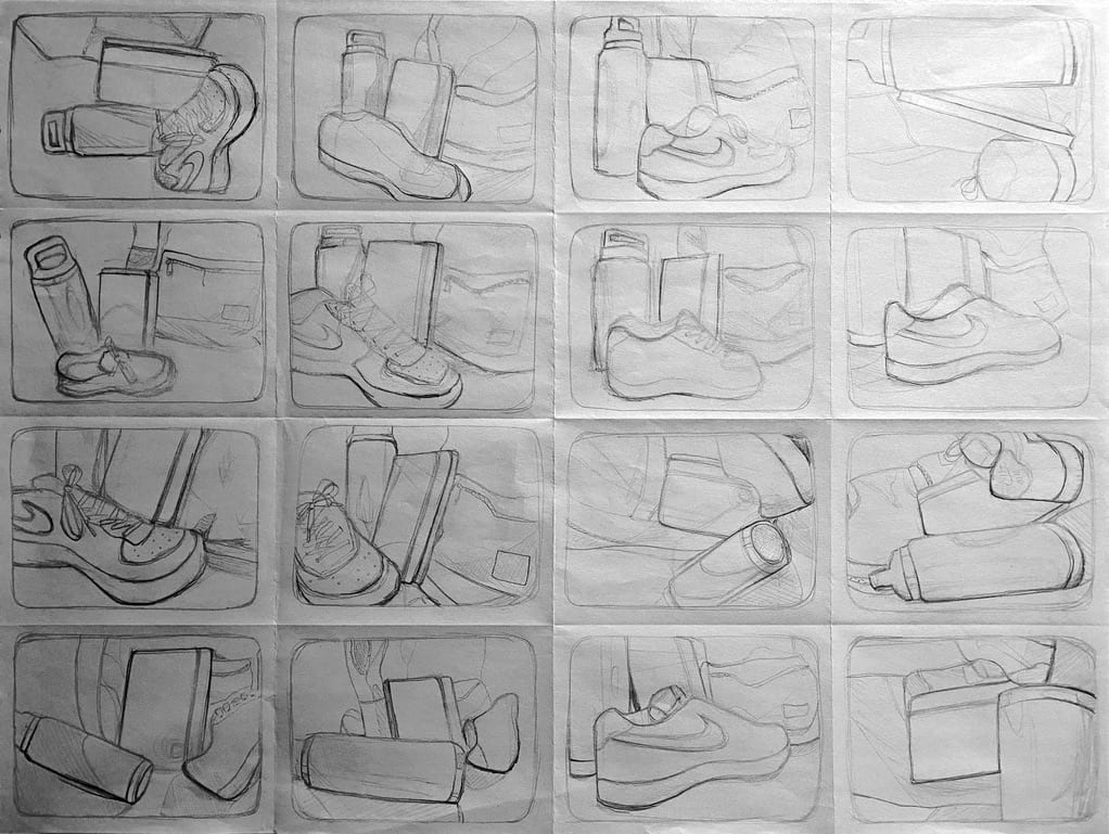
Thumbnail sketches of a backpack, water bottle, shoe, and a journal. The photo on the left is an enlarged sketch of one of the thumbnail sketches I did.