Exploring the Spatio-Temporal Dynamics of Socio-Economic Dimensions of the COVID-19 Pandemic: An Interactive Dashboard Approach

 The COVID-19 pandemic has presented a myriad of challenges to the world. While many of the challenges are related to the medical aspects of the disease and how it spreads, for communities to survive and thrive in this public health crisis, it is also extremely important to understand the socio-economic dimensions of the pandemic. Specifically, the spatio-temporal dynamics of the implications and consequences of COVID-19 are related to a multitude of social, demographic, and economic factors. Exploring these factors, especially their spatio-temporal trends and how they are related to the infection cases, will help reveal the key determinants that can be used to understand the spread of the disease. As a response to this need, a COVID-19 dashboard[1] herein presents a highly-interactive, map-oriented visualization platform to explore the coronavirus outbreak from its underlying socio-economic contexts. The dashboard enables its users through visual exploration and comparisons to recognize the extent of coronavirus spread and its association with socio-economic characteristics of the communities at various geographic scales.

A glance at the plots of the dashboard, one can identify that top-ranked states exhibit two different trends. States like New York, New Jersey, Illinois, and Massachusetts are showing a flattening curve, leading the overall trendline of coronavirus confirmed cases in the United States to a flatter direction (Figure 1 top row). However, coronavirus is still spreading at an alarming rate in many states, including California, Florida, Texas, Arizona (Figure 1 bottom row). It will be interesting to see how modified stay-at-home orders and early reopening of business activities (California – May 8 [3], Florida – May 18 [4], Texas – May 1 [4], Arizona– May 8 [3]) will affect the continuing upward trend of COVID-19 in these states.

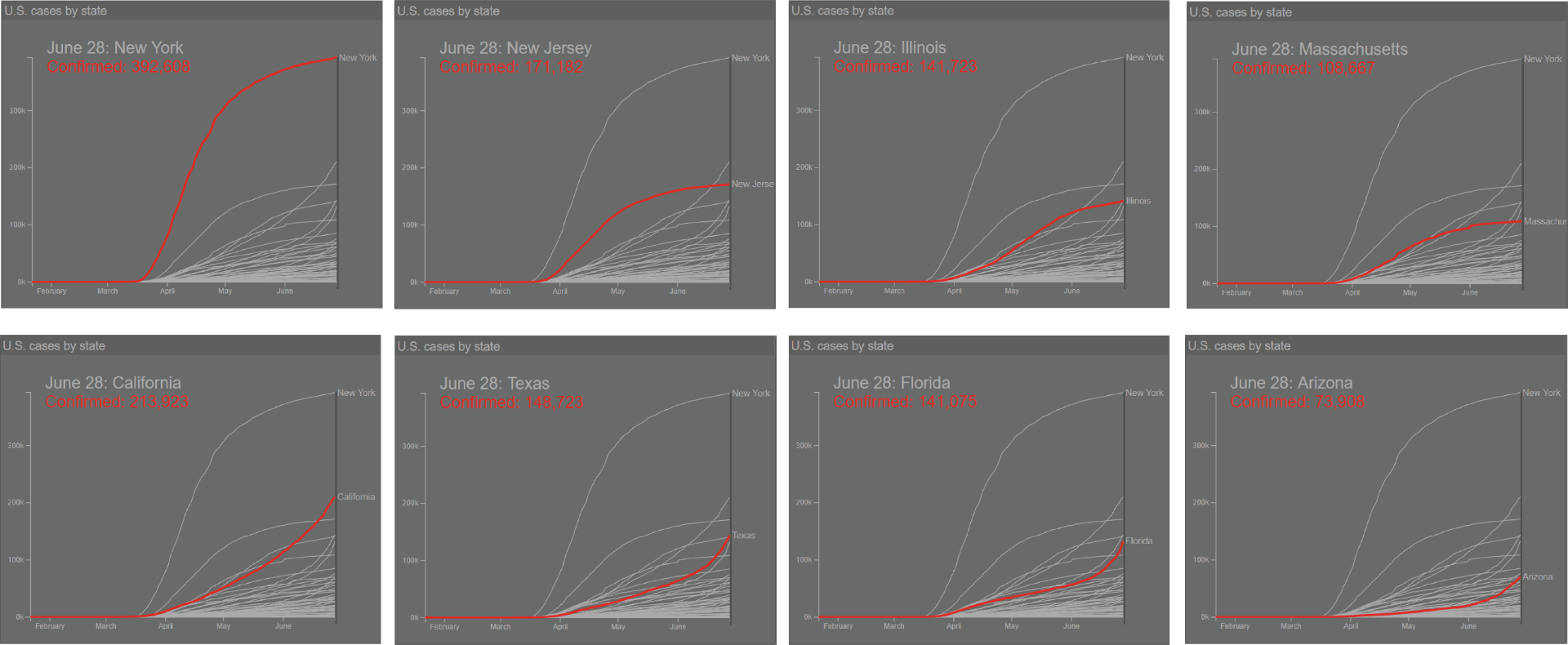
Figure 1: Top-ranked states for coronavirus cases, as of June 28, 2020.

Along with the spatio-temporal dimensions of COVID-19 spread, the dashboard can also be used to reveal that the nature of COVID-19 outbreak is associated with the socio-demographic and economic profile of each state. The following findings can be summarized by further exploring the dashboard.

  • Population. While states or counties with large populations tend to have more cases, the dashboard indicates that the rate of coronavirus spread, however, is indifferent to the population size. As shown in Figure 2, many counties in California, Texas, and Florida (marked in red) have a greater population size with a lower confirmed case and death rates than the counties in New York and New Jersey (marked in yellow).

    Figure 2: Plot showing the relationship between the rate of coronavirus cases (per 1000 people) and other socio-economic indicators in the counties of New Jersey, New York, California, Florida, and Texas. Note that multiple colors are made available by modifying the source code of the dashboard.


  • Age. Although the virus is dangerous for any age group, counties with high percentages of adult population reflect a high coronavirus confirmed rate. The geographic spread of the disease does not show a noticeable correlation with the geography of other age groups. As hinted by this observation, researchers can further explore whether the chances of being affected by

    Figure 3: Plot showing correlation between coronavirus confirmed rate and percentage of non-white population in the counties of Georgia, New Jersey, New York, and Maryland

    coronavirus depends more on peoples’ daily activity pattern and level of exposure to the outside environment than their physical age.

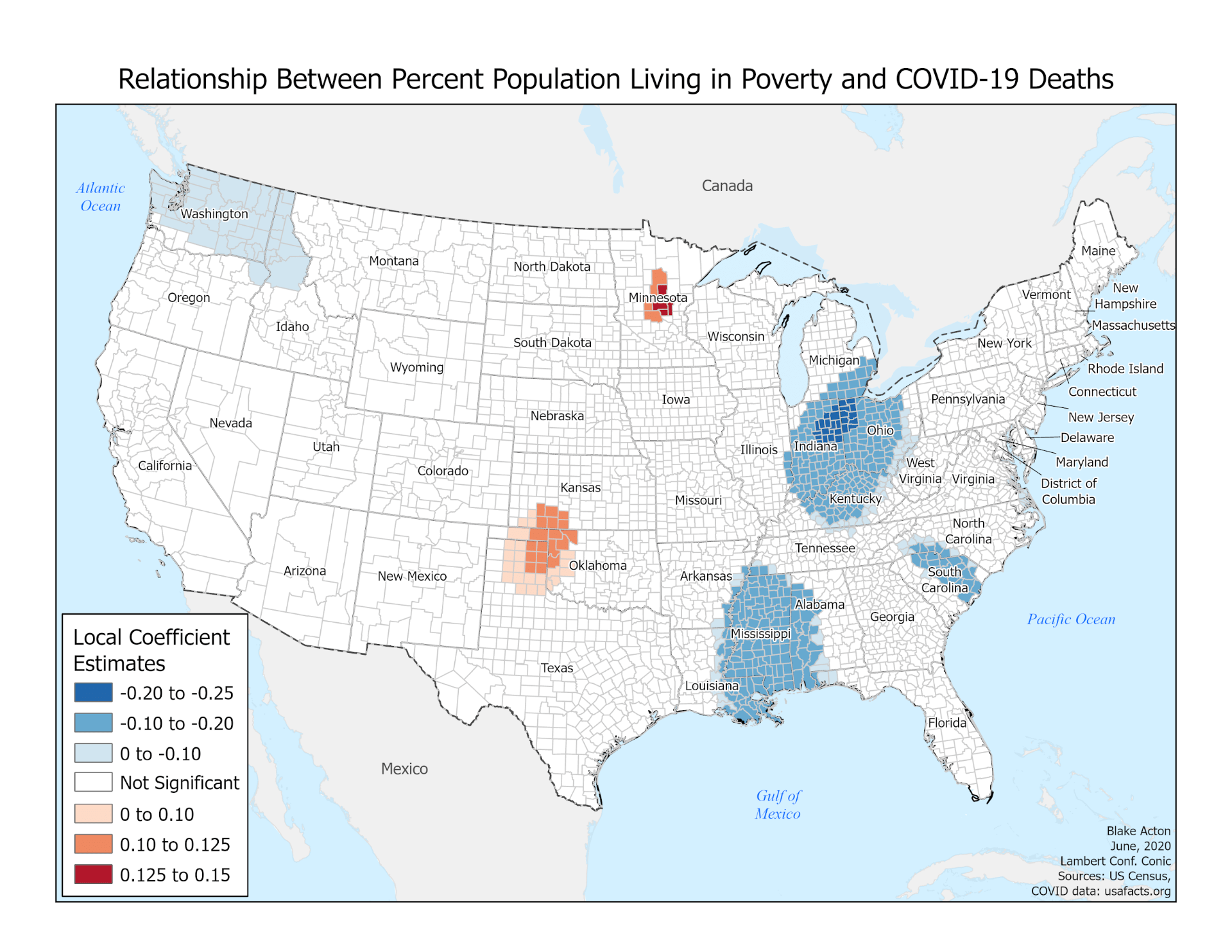
  • Race and Poverty Rate. It is evident that counties with both racial and economic disadvantages are more affected by COVID-19 than other well-off counties. For example, states with high percentages of non-white people (such as New York – 33.9, California – 35.9, New Jersey – 30.1, Maryland – 41.1, Mississippi – 40.2, Georgia – 39, and Louisiana – 36.1, numbers in percent) also have high numbers of confirmed cases. Besides, counties within these states indicate a positive relationship between the percentages of non-white people, and the coronavirus confirmed case rate (examples are illustrated in Figure 3).

The findings from racial profiling also complement the results related to the economic statuses of each state. The coronavirus confirmed case rate tends to be high in the states where a high percentage of households are living below the national poverty threshold (e.g., Mississippi – 15.9, Louisiana – 14.6, and Alabama – 13, numbers in percent, marked in shades of red in Figure 4). On the contrary, New Mexico -15.3, Kentucky – 13.5, and West Virginia – 13 (marked in shades of green in Figure 4), that also have a high poverty rate, show insignificant/negative relationship with confirmed case rate. The difference between the former states and later states lies in the racial distribution. The later states have a lower percentage of non-white populations (New Mexico -22.9, Kentucky – 10.8, and West Virginia – 5.2) than the former states (Mississippi – 40.2, Louisiana – 36.1, and Alabama – 30.1). This observation can further be exemplified by the stark contrast between Mississippi and West Virginia (marked respectively in dark red and dark green in Figure 4) in terms of confirmed case rate, white and non-white population, and poverty level. This finding pronounces the long-prevailed racial and economic disparity of the country, which have been overlooked by the government leaders and policymakers for years[6] and have exacerbated the COVID-19 situation for non-white communities than others.

Figure 4: Plot showing the relationship between the rate of coronavirus spread and other socio-economic indicators in the counties of Louisiana, Mississippi, Alabama, New Mexico, Kentucky, and West Virginia

  • Occupation. The relationship between coronavirus confirmed case rate and job categories mostly depends on their possibility for remote working. The spatial distribution of jobs that can be supported with work-from-home opportunities such as education, public administration, and other services present no significant relationship with the spatial distribution of coronavirus spread (Figure 5).

    Figure 5: Plot showing correlation between rate of confirmed coronavirus cases and percentages of jobs in education (left), public administration (center) and other services (right) in the counties of the United States

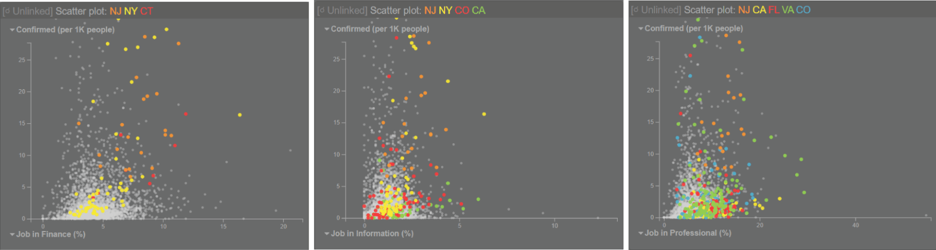
  • The work-from-home opportunity for employees working in information, finance, and professional sectors depends on the subcategory of businesses and the type of services provided by them. However, the percentages of population working in these job sectors indeed show a positive correlation with the coronavirus confirmed case rate. This finding can be attributed to the fact that states with high confirmed case rate contain a high percentage of the population working in information (New York, California, Colorado, New Jersey), finance (New Jersey, New York, Connecticut), and professional sectors (California, Virginia, Colorado, New Jersey, Florida) (Figure 6).

    Figure 6: Plot showing correlation between coronavirus confirmed rate and percentages of jobs in finance (left), information (center), and professional services (right) in the counties of the United States

  • The remaining business sectors, such as agriculture, construction, manufacturing, recreation, wholesale, and retail, indicate no impact on the spatial distribution of coronavirus spread. These business sectors certainly need direct physical presence of workers and consumers, but their business activities were either shut down or operating at a limited scale during the lockdown period of the COVID-19 crisis. These sectors are mentioned in the initial reopening phase for most of the states starting between early-May to late-May [2,3,4,5]. The impact of these job sectors on the rate of coronavirus spread can better be explained when these sectors will be fully operational.

Along with the outlined observations, the dashboard facilitates exploring the spatial relationship between coronavirus cases and their associated socio-economic indicators for any county or state of the nation. By contextualizing the public health crisis, the dashboard can be used as an exploratory tool for the decision-makers, practitioners, and the general public to monitor their local COVID-19 situation. The dashboard can also help researchers to examine patterns of COVID-19 cases, which will prompt interesting research questions and hypotheses for further investigation.


Armita Kar (PhD Student, Geography), Luyu Liu (PhD Student, Geography), Yue Lin (PhD Student, Geography), Ningchuan Xiao (Professor, Geography)

Department of Geography

The Ohio State University


References

  1. https://gis.osu.edu/COVID19-Dashboard/
  2. Treisman, R. (2020, May 28). Midwest: Coronavirus-Related Restrictions By State. NPR. Retrieved from: https://www.npr.org/2020/05/01/847413697/midwest-coronavirus-related-restrictions-by-state
  3. Treisman, R. (2020, May 28). West: Coronavirus-Related Restrictions By State. NPR. Retrieved from: https://www.npr.org/2020/05/01/847416108/west-coronavirus-related-restrictions-by-state
  4. Treisman, R. (2020, May 28). South: Coronavirus-Related Restrictions By State. NPR. Retrieved from: https://www.npr.org/2020/05/01/847415273/south-coronavirus-related-restrictions-by-state
  5. Treisman, R. (2020, May 29). Northeast: Coronavirus-Related Restrictions By State. NPR. Retrieved from: https://www.npr.org/2020/05/01/847331283/northeast-coronavirus-related-restrictions-by-state
  6. Long, H. & Dam, A. V. (2020, June 4). The black-white economic divide is as wide as it was in 1968. Retrieved from: https://www.washingtonpost.com/business/2020/06/04/economic-divide-black-households/

Race, Place, and COVID-19: Mapping and Modeling a Spatial Relationship

This post was independently organized by graduate students enrolled in Geography 5103, instructed by Professor Elisabeth Root, during spring semester of 2020. 

By now, most of us are familiar with the risk factors for severe COVID-19 disease: being over 65, male, and suffering from heart problems, diabetes, or hypertension, all seem to contribute to mortality (Harrison, 2020; Rogers, 2020; Wadman, 2020). What hasn’t been discussed as frequently is how the social determinants of health – the neighborhood conditions in which people are born, grow, live, work, and age that affect health (Florida, 2020) – may also impact the risk of contracting and dying from COVID-19. While the health outcomes of a particular individual cannot be predicted solely by the social determinants of health, these measures allow researchers and the interested public to engage with social inequality in public health resources and to devise location-specific improvements.

For COVID-19 this means that these risk factors vary across space. For example, there are some places where the percent of the population that is obese has a strong positive correlation with mortality, while in other places there is no association whatsoever between the two variables. Understanding these place-specific nuances is key in organizing an effective response to COVID-19 outbreaks in a region or community.

As students, we decided to examine whether the relationship between COVID-19 mortality and area-level factors such as race, age, and poverty, varied across counties in the United States. This is a spatial property called “spatial nonstationarity,” meaning some determinant of health (e.g., race) does not have the same effect on an outcome (e.g., COVID-19 mortality) across space. We used a modeling technique called Geographically Weighted Regression (GWR) which we learned about in GEOG 5103, Dr. Elisabeth Root’s class. It is particularly well suited to capturing different effects of potential determinants on mortality across space. We chose the number of deaths per one thousand people as our outcome of interest, and then picked potential explanatory variables based on the COVID-19 research to date (05/14/2020). Among a large set of candidates, seven variables were selected. The variables are rurality, percent of adults reporting to be obese, percent of adults reporting to have asthma, percent of Black or African American, percent of seniors (65 or older), percent of people living in poverty, and the number of confirmed cases. These variables were found to be significant predictors and explain 43% of the total variation of COVID-19 mortality.

The maps below show how the relationship between each variable and COVID mortality varies across the country. So, for example, in places where the map is blue, there is actually a negative relationship between poverty and fatality (Figure 1). However, as the color becomes tan and then red, we begin to see both a stronger relationship and a positive one. These maps also account for the p-value. This means that the shaded areas show us where our results are statistically significant- that is, that the result displays a pattern or strength of the relationship that cannot just be attributed to random noise.

Figure 1. Relationship between the percentage of poverty and COVID-19 deaths: The impact of poverty on mortality is negative in many parts of the country including Ohio, Mississippi, and South Carolina. Exceptionally, positive relationships are clustered in Minnesota and Oklahoma, indicating higher risks in poor neighborhoods.

What you can see in these maps is that while all the variables have geographic variation, the counties where the African American population is a higher percentage of the population show a strong correlation with our outcome variable of fatalities. It’s also important to note the direction of these relationships. For the percentage of seniors, for example, much of the West Coast displays a negative relationship between the variable and the outcome: there, an increase in the percent of seniors was associated with a decrease in COVID-19 mortality (Figure 2). In contrast, large portions of the country show a positive relationship between the percentage of African Americans in a county and COVID-19 mortality (Figure 3). Indeed, of all our variables, this is only the one that displays such a consistently positive relationship across many different locations.

Figure 2. Relationship between the percentage of seniors and COVID-19 deaths: Fewer seniors are related to higher fatality in several parts including the West, Louisiana, and Illinois. On the contrary, the positive relationships are mostly clustered in Florida and parts of Ohio, indicating higher percentages of seniors tend to associate with higher fatality in those regions.

These results do not indicate that African Americans are somehow inherently more susceptible to this disease but instead reflect the structural racism of our country. In the United States, African Americans are more employed in service occupations (U.S. Bureau of Labor Statistics, 2018) and are more likely to live in a neighborhood with higher poverty (Greene et al., 2017). These social determinants of health make them particularly vulnerable to this disease because these risk factors lead to higher rates of exposure and poorer access to health care. Inequalities in health care access are particularly problematic for diseases like COVID-19. The longer a person waits to get necessary care – often because of a lack of insurance or health care resources in their community – the more likely they are to have severe COVID-19 disease. Recognizing the relationship between the social determinants of health and race, and then identifying how those relationships manifest in local contexts are the first steps in addressing the profound inequality presented in these maps.

Figure 3. Relationship between the percentage of African Americans and COVID-19 deaths: While higher percentages of African Americans tend to associate with higher fatality the Southern and Eastern states, Minnesota in particular show the highest correlation. Given the fact that Minnesota has a lower percentage of African Americans compared to Southern states, Black communities in the state seem to be exposed to relatively higher risks.


Author Contribution: Dr. Elisabeth Root (Professor, Geography & College of Public Health, Division of Epidemiology) conceived the research and supervised writing; Sohyun Park (Ph.D. candidate, Geography) collected data and supervised analysis; Yun Ye (Ph.D. student, Public Health), Kaiting Lang (Ph.D. student, Public Health), and Junmei Cheng (Ph.D. student, City and Regional Planning) analyzed the data; Anisa Kline (Ph.D. student, Geography) wrote the post; Blake Acton (MA student, Geography) created maps. All the authors contributed to interpreting the results.

Respectful Engagement During Fieldwork

Shoveling snow on property of research participants. Photo Courtesy of PhD candidate, Deondre Smiles

As I approach the end of my doctoral journey, I’ve found ample time to reflect on some of the lessons that I’ve learned through my research and scholarship. I’m a firm believer that we never really stop learning even after our formal schooling is finished, and that it becomes much easier to face future learning opportunities with the knowledge of previous experiences. One example of such knowledge that will hopefully pay dividends in future research endeavors is learning how to build relationships with the people and communities that I’ve worked with during my dissertation fieldwork.

It is common sense of course that such relationships need to be built upon a foundation of ethics and trust. The history of our discipline, and of academia as a whole is littered with instances of unethical behavior with marginalized communities, especially Indigenous communities, communities of color, and LGBTQ communities. Speaking from my own experiences as an Indigenous researcher, this has left a legacy of distrust of academic structures that is not entirely undeserved. Understanding this history and positioning ourselves as being committed to ethical, non-extractive fieldwork is the bare minimum that we must do when out ‘in the field’.

Trust is built through communicating and listening. Trust—and allyship may not be automatically forthcoming—we need to earn it. This can be a distressing experience-we are training to be the ‘experts’ in our field, but we are entering spaces where we can not and should not be ‘experts’—that distinction is for the people in the communities who are living the very things we are studying. But, this distress is necessary–we must be willing to put ourselves in the vulnerable position of listening and being fully receptive to the needs and desires of the communities we work within. We must listen, not for the sake of simply listening, but actually hearing what communities have to say about our research—the possibilities for collaboration, the sensitivities communities may have—and be willing to shift our thinking or even the aims of our research to meet those needs. We always possess the risk of unintentionally doing great harm—but knowing that, and knowing how to avoid it means that we can focus on what we truly want to do—produce work that is beneficial to us and communities. In my experience with Indigenous communities, this has meant being sensitive to protected tribal knowledges, to acknowledging tribal ownership of data, and to accepting that there is an accountability that I have to tribal communities that will last beyond my dissertation. Relationships and lines of communication borne out of my work must endure—I cannot simply abandon them or disappear once my research is done. As an Indigenous academic, these are just some of the ways that I work to decolonize my field and the way that I engage with people. The parameters of what ethical research looks like may look different for other researchers in other contexts, but the framework remains the same—respect, listening, and active engagement.

Trust and respect can lead to extremely fulfilling relationships borne out of our research. Early on in my fieldwork, I began communicating with a independent historian who had extensively written about the history of an area that I was researching. A series of visits and conversations evolved into a unique partnership—she would share her research with me in exchange for my assistance with various tasks on her property. This was reciprocal exchange at the most basic level—I provided labor, she provided knowledge that I needed to conduct my research. I spent time pulling weeds and shoveling snow away from buildings on her property—the cost of knowledge was truly physical! But, because of this exchange and communication, the independent researcher also became a friend. Respect for anonymity precludes me from sharing even more stories of friendships and collaborations with tribal communities that has come from my research, but they are also dear and important to me, and have opened doors for future research that has the possibility of benefiting these communities.

I will undoubtedly conduct more fieldwork in my time as an academic. My hope is that the lessons that I’ve learned about respectful engagement in the field will serve me well going forward in my career. Taking the time to step back, listen, and place the needs of the communities that we do fieldwork with at the core of our research agendas ultimately is something that can lead to more sustained and ethical relationships. This, in my mind is truly what can make for engaged fieldwork with people and communities.


Deondre Smiles

Department of Geography,

The Ohio State University


A Geospatial Perspective of the Novel Coronavirus Outbreak

The Department of Geography welcomes Yaoli  Wang – a post doctoral researcher – and Yu Liu – a full professor – from Peking University, providing a guest post during the COVID-19 outbreak.

The Spring Festival of 2020 was determined to be historic. One week before the Chinese New Year Eve (Jan 24), Beijing public transport tubes were still in hustle and bustle like usual. Within four days, the outbound flow back home from Beijing made the city quiet, when the news came clearly to everybody that a SARS-like virus has struck Wuhan. At 10 am, Jan 23, 2020, Wuhan was forced into lock down. Things evolved rapidly from there. Until the time of quarantine, 5 million people had left Wuhan. Along with the flow of migration was the spreading of a very contagious and novel coronavirus – COVID-19. All Chinese provinces and many worldwide countries reported infections. People, however, always have normalcy bias, inclining to believe that nothing bad will happen to them and thus not careful enough. The outbreak worldwide is already good proof.

Lockdown of Wuhan in January

Lockdown of Wuhan in January (Courtesy of Professors Qingyun Du and Zhixiang Fang, Wuhan University)

Lockdown of Wuhan in January

Lockdown of Wuhan in January (Courtesy of Professors Qingyun Du and Zhixiang Fang, Wuhan University)

Underneath the accident is essentially a spatiotemporal problem. Within China, the problem can be divided into two scales: inter-city and intra-city. Now in late February, geospatial scientists are trying to reverse the course of COVID-19 spread over China using inter-city movement flow and city-level reported confirmed cases in time series. We would imagine a spread dynamic like wavefront and wish to construct a model of migration interaction based on which the arrival time or amount of illnesses can be inferred. The lock down of Wuhan apparently put a brake on the spreading process, but could not eliminate it. Already infected people outside Wuhan continued to transmit the virus to other cities or within their own cities. The hierarchy of the interaction network potentially captures the spreading path, which indicates an effective interruption. Here we see the huge potential of space-time big data. There is a study at the beginning of the outbreak which, by analyzing the outbound movement flow from Wuhan to areas around, drew a conclusion that the up-till-then reported illness count was underestimated 1; the conclusion, unfortunately, was proven to be true when the statistics were complete.

graph displaying Novel Coronavirus Pneumonia in China

Figure 1: Spatial distribution of the confirmed COVID-19 cases in China on February 17, 2020, when the total number is 72,528 [2]

Inside a city, the general public is nervous and cautious with 2nd or 3rd degree transmission. Spatially clustered illnesses are the majority of cases, for example, in departments of a hospital, in a family, and in a canteen of a company. Close contact between two individuals is a typical space-time relationship, which in GIScience we usually use “spatio-temporal co-occurrence” to model it. That is why the government asks the public to stay at home and shuts down all public recreation places, especially indoor venues. Random encounters are much more difficult to trace back than regular social networks. Back in 1630, the Milan plague was re-triggered by a big carnival even though the beginning of the plague was well controlled. For the ongoing 2019 coronavirus, people had spent so much time and energy retrieving the individual trajectories of confirmed illnesses. There are even some online gadgets to examine if a person has trajectory overlapping with the confirmed cases. What comes up next is how spatial and information technology can facilitate the process in a more positive way while not intruding on privacy too much? For instance, spatiotemporal trajectories from mobile phone records are ubiquitous, but there is a trade-off: the demand for higher space-time accuracy down to a meter level for automatic screening of virus encounter versus the rejection of privacy exposure and targeted data breach.

Foreseeing the future of urban life and technology, can we imagine a world where every person is implanted with a chip – something we call “human black box” recording all the information throughout life, including his (or her) health, spatiotemporal trajectories, habits, etc? What’s missing is a mature mechanism to protect privacy and data safety. Blockchain might be a potential solution. All the information is not controlled by a central organization. The owner of data has the initiative of data-sharing in an urgent case like the outbreak of coronavirus. As an incentive of sharing data, the user gets bonuses, which is guaranteed by a blockchain system. We believe that most people are not ready for accepting such a technique at present. But could this become reality if we can manage the negative issues, say, 100 years later? Let’s wait and see.

The virus is still happening and boosting technology innovation. City governance needs a more robust system to be responsive to public events; e-commerce is evolving to smooth the channel between suppliers and customers; education is developing new patterns such as online education; crowd-sourcing and public participation is driving for social well-being. Up until the time of writing, many countries all over the world have reported infections, but many of them cannot trace back to the origin of infection. Potentially the geography of virus genomics may map out the trajectories of generations of virus so that we can disclose the mystery of its origin and spreading. All the aspects can be regarded as evolvement of spatiotemporal relationships. We are going for an opening-up of geospatial technologies.

Yaoli Wang (Post Doctoral Researcher), Yu Liu (Professor)

Institute of Remote Sensing and Geographical Information Systems,

Peking University

Yu Liu is the 2019-2020 Robinson Colloquium speaker for the Department of Geography.

  1. https://mp.weixin.qq.com/s/8x8UYZBZwMGn86Wq7iz4og, in Chinese.
  2. https://vis.ucloud365.com/ncov/china/en.html


Post has been updated (4-2-2020) with photos from contributors of the author

Climate Change: The Largest Challenge Facing Humanity

This year we celebrate the 50th anniversary of Earth Day. Climate change is one of the biggest challenges facing humanity and so the theme for Earth Day 2020 is climate action. There are many ways that individuals and organizations can take climate action. As a climatologist in the Department of Geography at The Ohio State University, one of the ways that I am taking action is through helping to assemble, quality control, harmonize and disseminate high-quality climate observations. These data are essential for monitoring and detecting climate variability and climate change. Since 2010, I have been involved in developing the most comprehensive soil moisture database in the United States. With funding from the National Science Foundation, USDA and NOAA, we developed nationalsoilmoisture.com. The map shown below indicates the locations where soil moisture measurements are currently being made in the United States. Data from many of these sites are being provided in near-real-time on nationalsoilmoisture.com. This includes in situ measurements of soil moisture, satellite-derived soil moisture from NASA SMAP and model-derived soil moisture from NLDAS-2.

Figure 1. Locations of in situ soil moisture sensor networks across the United States from federal- and state-level networks. Credit: nationalsoilmoisture.com.

These data fill a critical gap because unlike for other climatological and hydrological variables, there are no national databases for soil moisture. The 2008 report on “Future Climate Change Research and Observations: GCOS, WCRP and IGBP Learning from the IPCC Fourth Assessment Report” (WMO/TD No. 1418) recommended that soil moisture data should be assembled because of its importance for:

(1) improving our understanding of land-atmosphere interactions,

(2) developing seasonal to decadal climate forecasting tools,

(3) calibrating, validating and improving the physical parameterizations in regional and global land surface models (LSM),

(4) developing and validating satellite-derived soil moisture algorithms, and

(5) monitoring and detecting climate variability and change in this key hydrological variable.


Why is soil moisture important?

As we noted in Legates et al. (2011), “soil moisture is not just a process that is integral to climate, geomorphology, and biogeography – it truly lies at the intersection of all three branches of physical geography. A complete understanding of soil moisture and its spatial and temporal variability and impact draws upon interactions among and expertise gained from all three subdivisions. Soil moisture lies at the intersection of climatology, geomorphology, biogeography, and hydrology, thereby providing true integration of the subdisciplines rather than just supplying a common theme.” Soil moisture influences the exchange of energy and water between the land surface and atmosphere. Soil moisture controls the partitioning of rainfall into runoff and infiltration. It modulates vegetation growth and photosynthesis. It also influences mass movements, weathering, erosion and sediment transport. Therefore, soil moisture is a key climatological and hydrological variable. However, compared to precipitation and temperature, there are very few soil moisture measurements.


Current Efforts to Develop a National Soil Moisture Network

Significant progress is being made in the United States to address the critical gaps in soil moisture observations. As a member of the National Soil Moisture Network Executive Committee, I helped to draft “A Strategy for the National Soil Moisture Network: Coordinated, High-Quality, Nationwide, Soil Moisture Information for the Public Good” that was released in February 2020. This Strategy Document was called for in the National Integrated Drought Information System (NIDIS) Reauthorization of 2018. It is intended to review the current status of soil moisture monitoring and reporting in the U.S., and to develop a strategy for a national coordinated soil moisture monitoring network, involving federal agencies, regional and state mesonets, data providers, researchers, user groups, and others. The strategy document identifies ten recommendations for how to implement a National Soil Moisture Network. The goal of this effort is to provide a unifying structure to enhance monitoring activities, establish partnerships for building out the network, develop an organizational structure that will collect, integrate and deliver transformative soil moisture products to the nation. This one tangible way that the Department of Geography at Ohio State is actively involved in climate change research. This effort provides better data for assessing how the climate is changing and to increase the resilience of the United States to these changes.


Dr. Steven Quiring,

Department of Geography

The Ohio State University