
The North American Vexillological Association is the largest organization in the world devoted to the study of flags. The organization created five basic principles that, if followed, should lead to a successfully designed flag. To illustrate these basic design principles. For each one I have included a good flag that follows it and a bad flag that violates it.

The Flag Should be Simple Enough that a Child could draw it from memory
Turkey: Two simple shapes in the center of the flag, very memorable and easy to reproduce.
New Jersey: Overly complicated visual element with a lot going on. Unlikely that anyone could reproduce this from memory.

The Flag’s Images, Shapes, and Patterns should relate to what it symbolizes
New Mexico: The Central element is the Zia sun symbol. It is meant to represent the states native American heritage. The Red and Yellow color scheme represents the Spanish roots of the state.
Cyprus: Central element is an unnecessarily detailed map of the island. it tells us nothing other then what the country looks like, which in most cases is not that relevant to a nation’s identity. The white background and olive branch both carry meaning, but they symbolize the same thing and are redundant. both are meant to symbolize peace

Limit the Number of Colors on the Flag to Three, Which Contrast well and come from the Standard Color Set
Botswana: Only three colors are represented on the flag, all of which symbolize something about the country and its landscape. The white and black are very simple and contrast well with each other. the powder blue is distinctive but simple enough to replicate.
Dominica: Uses 6 different colors, which results in the flag looking too busy. many of the shades are very specific. The purple color specifically would be very difficult to replicate in a drawing, which is frustrating since it is used so sparingly in the flag itself.

No Writing of any Kind or an Organization’s Seal. The Symbols alone should speak for themselves
Tennessee: This flag is visually striking, and distinct. the visual elements in the center and on the side are both simple, yet recognizable. This flag is recognizable from a distance and does not need lettering on it to remind you what flag it is.
Kansas: Includes a very complicated seal. It is difficult to discern what is on this seal both up close and at a distance. Nothing about it is distinctive or recognizable. The Kansas lettering at the bottom is redundant. A flag should represent what it is with symbols, it should not have to tell you what it is.
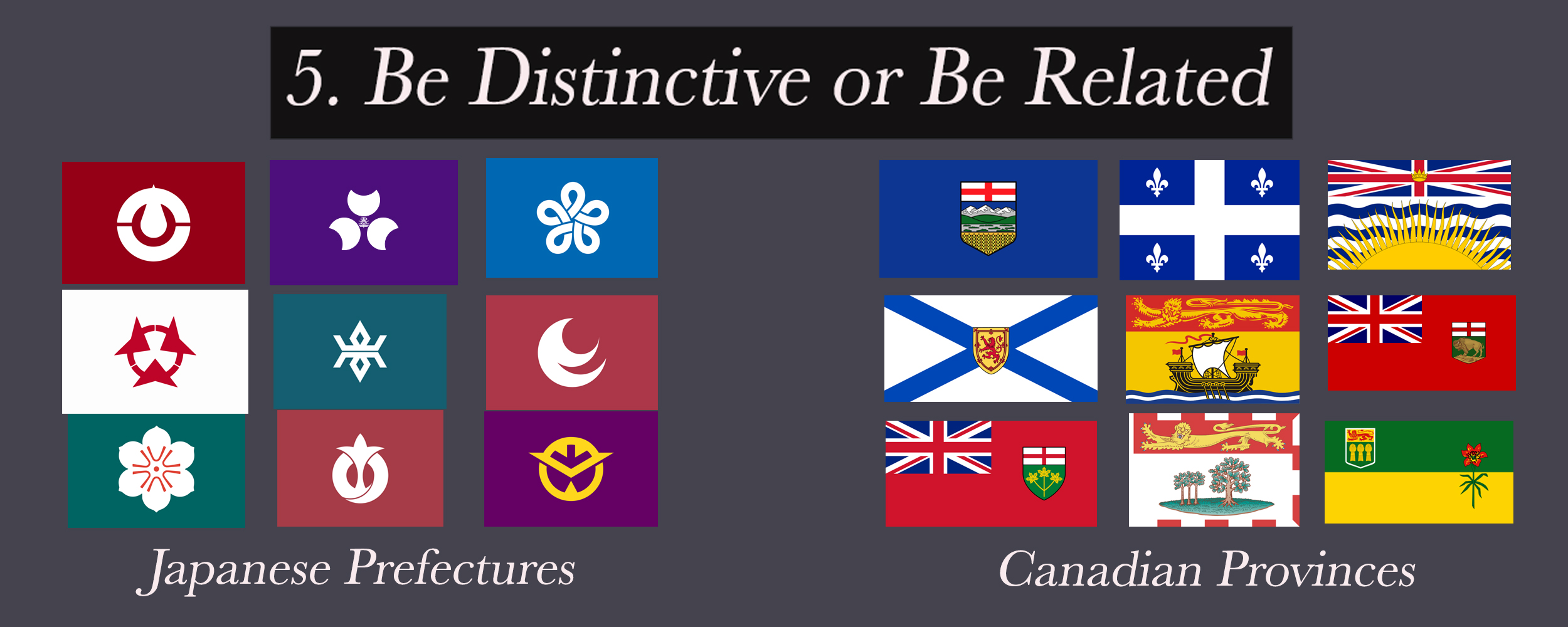
When making a set of flags, Avoid Duplicating other Flags, but use similarities to show connections
Japanese Prefectures: The Japanese Prefecture flags are a very good example of a flag set that fits a certain theme without looking redundant. all the flags are done in the same style, with a simple visual element in the center. the color scheme is consistent, and it is easy to tell they are part of a set. Even so, all of the flags would stand well on their own.
Canadian Provinces: This set is neither distinctive enough nor related enough. there are common things repeated, but no consistent design elements. some of these flags look like they’re supposed to be in a set, while others look very different. the British flag motif is on some of the flags, but not all. The same seal is on three of the flags but absent on the rest. there is simply no consistency.