Research
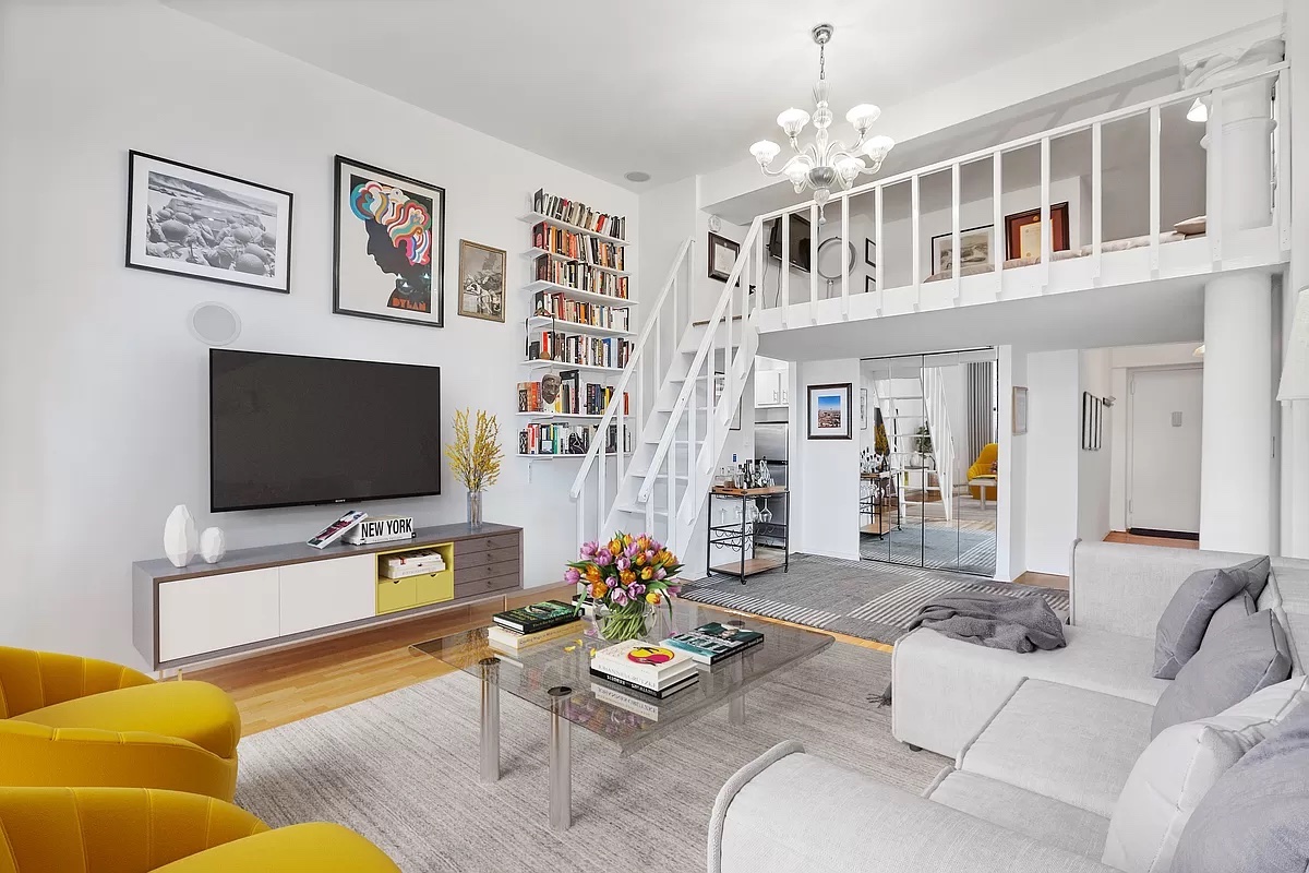
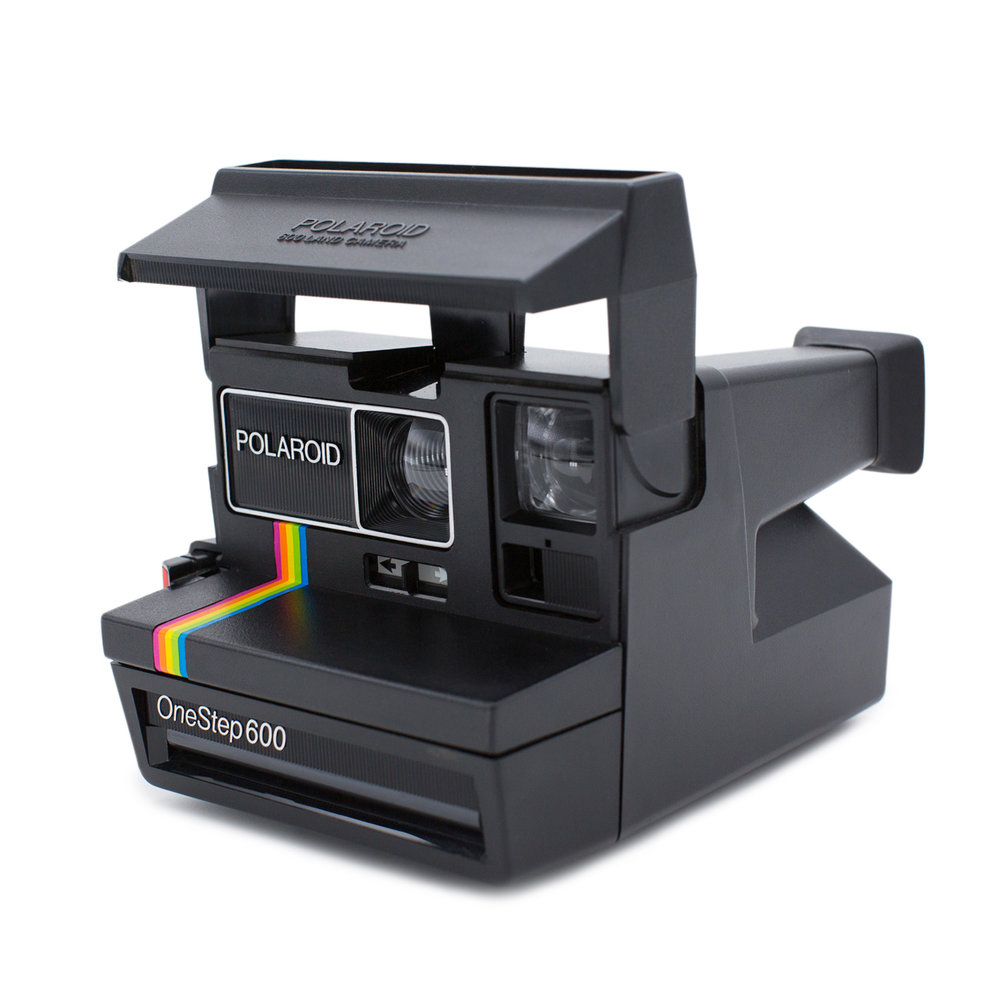
Across all of the exercises, I used a variety of reference images to help me formulate solid ideas of what I wanted to do in each of them. Below are two reference images I used for the final illustration which really was the only thing that required some form of research.


Exercises
Exercise 1 – Practice Drawings
In the first exercise, I took multiple objects of my choice and practiced drawing the contour of the objects. Afterward, I had to choose one object of choice to move forward with. I picked my old polaroid camera.
The images below are some of my rapid illustrations of the camera and some minor details.

After I experimented a bit with this, I moved on to the next part of this exercise where I draw a good and accurate contour of my object, cut it out, and then use the empty space the cutout has created as a stencil to create a unique composition. In addition, I played around with line weight in the composition to further understand its use. Below is the stencil and the composition.

Exercise 2 – Triangulation Practice
The amount of times I’ve drawn this one espresso maker is unfathomable. This exercise started with understanding the shapes within objects and learning how to visualize something using those hidden shapes and illustrating them using triangulation to understand its proportions and various parts. Firstly, I practiced drawing 3-D shapes using triangulation.

After that, I practiced with this little penguin bloke. Finding hidden shapes in this character was definitely easier than some other objects. All in all, it was good practice.

Continuing to move toward the final parts of this exercise, I practiced with triangulation on this (horrible and awful) Espresso Maker. This was pretty difficult at first because it has many different parts from different perspectives and keeping everything proportionate was a hassle. Below are two different attempts at this.


For the final part of this exercise, I illustrated a couple of different locations outside of Hayes Hall and Hopkins hall on campus. The first drawings were done rapidly to get the basic shapes down and some minor details.


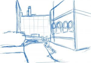
(These pictures were not used as reference but rather to mark the location, thus the perspectives are different between the real and illustration)
After these sort of semi-rapid illustrations were finished, my next task was to draw something more clean and polished. I really could have done more with this and I wish I did. I do feel that I captured the depth and detail of the space pretty effectively, even if most of Hayes Hall (right) is completely barren of detail and that tree right there.


Exercise 3 – Grid Space
This exercise consisted of me experimenting with a hand-drawn grid space to prepare for the final project.

Iterations
Getting closer to solidifying my ideas, I started experimenting first with 3-D shapes and learning to draw in one and two-point perspectives.


From here, I began to draw within the confines of a room. I practiced drawing boxes and various other objects just to get an idea of what I’d be doing for the final product.

My next move was to use that grid space I had done earlier and use it to start planning my room. On tracing paper, I started drawing simple shapes and turning them into more complicated objects like a chair or a desk of my design.

From this point, I wanted to start iterating as much as possible so I moved to digital. I started rapidly illustrating rough-looking rooms with various architecture and features that I felt I’d want to mess around with. Below are two iterations that really brought out some of the major decisions I made like including a wall of windows, a loft area, and curving the ceiling to create some pleasing asymmetry to the room’s overall shape. I’ve never been too interested in sharp and jagged-edged shapes so adding some curvilinear qualities to the room was really interesting to see.


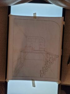
I recreated the grid space from exercise 3 to be more accommodating for my final ideas. After I had a good idea of the dimensions for my room, I began drawing the platform for my second floor and defining the shape of the entire room with thick lines as well as using 5×5 circles to capture the curve of the ceiling. In hindsight, I wish the curves came out a bit more than they did.


Starting with some rectangles and squares representative of the furniture I wanted, I started finding dimensions using some assembly manuals for the furniture I wanted and some of my own. I drew out a chair, a couch, an entertainment stand, as well as a little multi-level pot holder using 1×1 prisms standing up which I used to find the circles in perspective.


I began ironing out the rest of the drawing like the stairs, and the smaller furniture and features. The stairs were really annoying, mostly because I had no idea how to draw them. It wasn’t until after we had reviewed how and then realizing a ladder won’t look as good as I want it to that I decided to draw stairs. I marked where they should begin and end and then practically drew a straight line from top to bottom. They came out very uneven, each step being different from the next. I didn’t remedy this in the digital drawing but knew I’d fix the issue before I finished the final product.

Having drawn the stairs, I moved onto furnishing the upstairs with at least 2 objects like a desk or a workstation of some kind. I also used the same outline of the back wall and ceiling curve to create a window that repeats that shape.

Drawing these two was pretty simple and it consisted solely of rectangles and then keeping it true to the dimensions of an actual desk and sketch table.
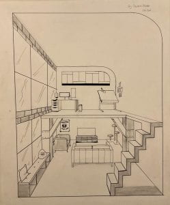
Production
After adding some minor details and including a simple little seating area next to the window, finishing the brick pattern, and getting rid of intersecting lines, the product was finished on digital. This is where things got really difficult. It started with creating the grid space, making it 12×10 inches.

Using the iPad drawing as a reference, I started sketching the architecture and stuff I felt was most foundational to the room.

Next, on a separate piece of tracing paper, I began putting the furniture on the first floor. The same way I drew them in digital, I used rectangles to the correct measurements to create the overall shape and then narrowed down the details.

I added the upstairs furniture and included the window as well as the little seating area next to the window on the first floor. I added the pillows and some little contour lines to demonstrate the wrinkles and folds.

When it came to starting the brick pattern, I used an X to find the center points of the foremost and backmost square and then drew a line from one to the other. From there, I just drew straight lines down using my digital as a reference for how the bricks would’ve been placed.

Given that I didn’t have a lightboard with me and I didn’t feel like walking all the way to Hayes to use one, I resorted to doing something I’ve actually done on other occasions. Using a computer monitor and a Chromecast, I streamed 10 hours of white background to the screen and used that as a light board. It worked really well honestly. At that point, I just went over everything with a pencil and a straightedge.


Going over the pencil was really difficult with the pens because it would mark my ruler and smear across the page anytime I moved it. This got so frustrating I started free handing some of the smaller details. This was a mistake. Below is an example of the aftermath of me messing up the bottom line of the TV Stand.

It didn’t get any better around some edges, but for the most part, everything turned out pretty well. The only change I made to the final product was adding some basic shading to imply light and shadow.
Before
After

Final Production
