Using what you have learnt so far, obtain descriptive statistics and draw histograms of first-year exam —scores, computer literacy, numeracy and lectures attended.
//import data
rexam <- read.delim(“rexam.dat”, header=TRUE)
//set factor for the variable uni
rexam$uni<-factor(rexam$uni, levels = c(0:1), labels = c(“Duncetown University”, “Sussex University”))
//obtain descriptive statistics
describe(rexam[,c(“exam”, “computer”, “lectures”, “numeracy”)])
stat.desc(rexam[, c(“exam”, “computer”, “lectures”, “numeracy”)], basic = FALSE, norm = TRUE)
//round to 3 decimal digits
round(stat.desc(rexam[,c(“exam”, “computer”, “lectures”, “numeracy”)], basic = FALSE, norm = TRUE), digits = 3)

we can interpret absolute values of kurt.2SE and skew.2SE greater than 1, 1.29, and 1.65 as significant p < .05, p < .01, and p < .001, respectively.
//histogram with normal curve on it (using exam score as example)
exam exam
exam + stat_function(fun = dnorm, args = list(mean = mean(rexam$exam, na.rm = TRUE), sd = sd(rexam$exam, na.rm = TRUE)), colour = “black”, size = 1)

Repeat these analyses for the computer literacy and percentage of lectures attended and interpret the results.
//descriptive stats based on groups
by(cbind(data=rexam$computer,data=rexam$lectures), rexam$uni, describe)

//normality test based on groups
by(rexam$lectures, rexam$uni, stat.desc, basic = FALSE, norm = TRUE)

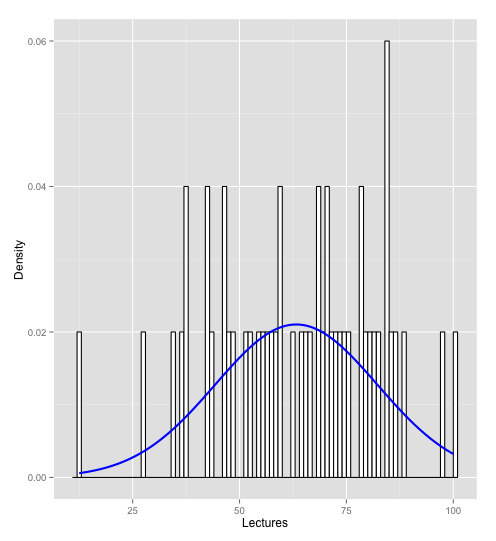
//histogram based on groups using lectures as an example
dunceData<-subset(rexam, rexam$uni=="Duncetown University")
sussexData<-subset(rexam, rexam$uni=="Sussex University")
hist.lectures.duncetown <- ggplot(dunceData, aes(lectures)) + theme(legend.position = "none") + geom_histogram(aes(y = ..density..), fill = "white", colour = "black", binwidth = 1) + labs(x = "Lectures", y = "Density") + stat_function(fun=dnorm, args=list(mean = mean(dunceData$lectures, na.rm = TRUE), sd = sd(dunceData$lectures, na.rm = TRUE)), colour = "blue", size=1)
hist.lectures.duncetown
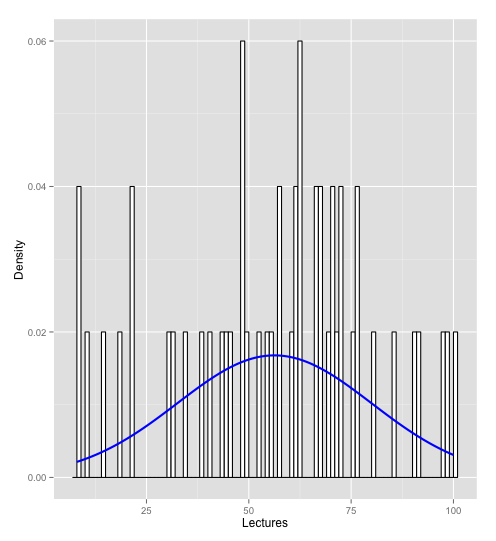
hist.lectures.sussex <- ggplot(sussexData, aes(lectures)) + theme(legend.position = "none") + geom_histogram(aes(y = ..density..), fill = "white", colour = "black", binwidth = 1) + labs(x = "Lectures", y = "Density") + stat_function(fun=dnorm, args=list(mean = mean(sussexData$lectures, na.rm = TRUE), sd = sd(sussexData$lectures, na.rm = TRUE)), colour = "blue", size=1)
hist.lectures.sussex