
It isn’t always white, and it isn’t always blank. White space is the part of your document, brochure, presentation or website that isn’t text or photos. It provides structure, gives your viewers a place to rest their eyes, and adds to your document’s character. It is also one of the most important—and neglected!—aspects of design.
So how do you use white space correctly?
Not only is properly spaced text easier to read—your brain can make out words surrounded by space better than ones competing with other words—but we’re accustomed to it. Everyday, we see important words and concepts that are written larger, placed higher on a page, and typed out in brighter, more eye-catching colors. Headlines, subheadings and quotes are often bolded or italicized to set them apart from the rest of the text. They’re also spaced closer or further away from other paragraphs to give readers visual clues about how to interpret them.
Whitespace is the space that sets apart the headline from the text, one article from the next, and an image from an unrelated description. It also separates your text from the physical side of the paper or screen, leaving a place for images to be inserted or notes taken. When utilized well, it can turn a jumble into an informative piece:
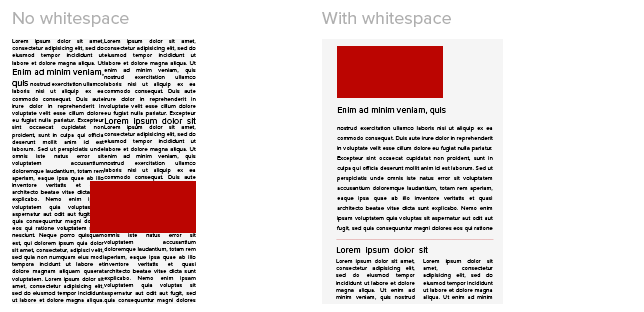
Even minimal amounts of space can help a reader tell one paragraph apart from another. Spacing between lines also aids in comprehension, and studies suggest letter spacing can be important, too. At the very least your paper should have a noticeable (and consistent!) space between each paragraph, and a larger space between different articles or subsections.
White space is sometimes referred to as negative space, a reminder that it doesn’t have to be blank:

(‘The Empire’ Magazine Spread, Darren Schwindaman C 2009)
The photo of New Orleans in the spread above serves both as a depiction of the topic and a space that clearly identifies the phrase ‘TEN THINGS I LOVE ABOUT NEW ORLEANS’ as a headline. Even when you view the spread at such a small size, it provides a clear visual, colorful separation between the headline and text, as well as a physical one.
There aren’t rules for whitespace so much as there are guidelines. But so long as you aren’t trying to assemble a modernist art magazine, these tips will do you in good stead:
- Put at least 1/2″ space between the physical edges of your document and your text. No one wants to read an article that goes all the way to the edge.
- Take a few steps back from your screen or a printout of your document and squint. If you can’t tell where your articles begin and end and which parts are your headlines (or which article they go with), then they’re too close together. Give everything a little more space!
- Can’t add space without going onto another page? Delete the words, not the space. (If you can’t find any words to cut, ask yourself: would you rather the reader ignore all 500 words, or read at least 300 of them?)
- Having trouble fitting the logo in? Always insert the OSU logo FIRST when making your document. It can be very difficult to give it the right amount of whitespace at the end of a project. Suggestions on where to put the logo can be found here.
As always, if you aren’t sure whether your document has enough white space, contact your graphic designer!
Chelsea is the graphic designer for Web Communications in the College of Education and Human Ecology at The Ohio State University. EHE faculty and staff can contact her with any design questions or resource requests.