
Ever since the OSU brand guidelines were released, I’ve heard one comment over and over: “do we really have to use the secondary colors?” It’s usually not an objection about the colors themselves, but a feeling of restriction, a sense that having secondary colors will limit creativity and freedom.
The answer to that question is “yes”, but a better one is, “yes, and this is great!!”
See, as designers around the university know well, OSU scarlet is not actually the easiest color to pair with. Many otherwise beautiful shades clash, are drowned out, or turn the red to brown when put next to it. The secondary colors are guaranteed to go not only with the famous scarlet, but also each other – which is extremely important when making a compelling, professional advertisement for your group or program.
Plus, University Communications allows use along the entire color range of each matching shade. If you haven’t had a chance to look at them yet and see how very many colors there are, check out the extended color section of the branding site here. At 13 colors with 19 options each, plus six accepted shades for OSU red, that’s more than 250 colors to choose from!
The question really is, “how can I choose from so many colors?” To answer that we need a little basic color theory.
There’s an entire mathematics field behind what colors pair well with each other and why – you may have heard the terms “analogous” and “split complementary” and “color wheel” thrown around before – but learning it isn’t necessary for making good color decisions. Unless you’re aiming for a design degree on the side, it’s not necessary to know why colors go together, only the skill to pick out the ones that do and leave the rest alone.
And in this case, you don’t need to reinvent the (color) wheel: millions of volumes of work on the subject have already been done for you. Every magazine, advertisement, and book cover you see involved a designer at some stage of its creation, but beyond even that, so does every product: clothing, telephones, desks, walls, ceiling fixtures. The black and gray of a file cabinet wasn’t chosen just because the manufacturer only had access to black and gray materials – it was chosen to provide a certain effect on the consumer.
Now, this isn’t to say that every choice was a good one and every designer talented – everyone has seen a questionable design choice at some point in their life (and if not, you should take some time checking out Cake Wrecks to get the picture). But we’re only concerned with effective design. Here’s an easy way to ballpark good color combinations: why did you choose the product you want versus the one sitting right next to it? Have you ever looked at a hotel brochure and thought I want to stay there more than the hotel next door? Have you ever seen a cover you hope ends up on the book you publish?
Great! Now, what colors did their designer use?
Here’s the practical color theory: colors that work for other companies, products and events will also work for yours. All you need to do is find a product, ad or flier that matches the look you’re going for.
The following are two hotel brochures:
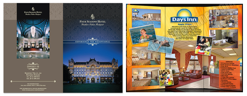
Both of these designs are perfectly fine, but they look very different. That’s because there are good, but different, reasons to stay at both the Four Seasons and the Days Inn, and the companies (and their designers) know this. The brochure on the left is advertising how grand – and expensive – their hotel is, and the one on the right is advertising how much fun the kids will have and how affordable the prices will be. If you have a design degree, you’ll be able to say why the designer of the left brochure chose beige, black, white and navy blue for their color palette, and why the designer of the right one chose bright yellow, orange, and sky blue – but if you don’t, you still might have an intuitive feel for the choices. And if you don’t have that either, that’s also not a problem! Just trust the designer.
Do you want people to think your event will be as much fun as that kid in the pool is having? Here are the secondary colors that match the ones in the fun brochure:

Do you want to give off the impression of being grand and expensive? Here are the secondary colors that match the ones in the serious brochure (with OSU red swapped in for the navy blue):

That’s all there is to it. As you walk around campus, attend an event at the Ohio Union or stop in for coffee at Hagerty Hall, keep an eye out for brochures, digital signage, and posters that look like the event you want your event to look like. If their poster caught your eye, there’s a good chance that the colors they use are going to work for you, too.
Chelsea is the graphic designer for Web Communications in the College of Education and Human Ecology at The Ohio State University. EHE faculty and staff can contact her with any design questions or resource requests.
Welcome to U.OSU.EDU! Comments are automatically turned on for all posts. Visit the following link to learn how to turn comments on/off: http://odee.osu.edu/resourcecenter/uosu/225