CRRPLAN BLOG 5

The building spacing on campus and in the surrounding neighborhood can vary greatly due to the area being very mixed use. On campus, many of the buildings are appropriately spaced, with zoning being must stricter than the surrounding neighborhood. Due to the limited use, the buildings tend to be farther apart, and include ample green space acting as a buffer between buildings. Additionally, almost all buildings include walkable space between them making commutes for walking students much easier. An example of this is Philip G. Faulkner Family Gateway between Blackwell Inn and the Fisher Executive Education building. The stairs allow for people to move between the buildings easily, and prevent overcrowding.

The setbacks of this specific property include limited green space and outdated architecture. The setbacks of the area are appropriate for business region but not so much for the residential housing region. Therefore, in the business region it is expected that there would be a limited amount of green space and in the residential region it is expected that there would be more green space. The setbacks differ in terms that as you head closer to campus, the architecture of buildings look newer and the green space around buildings increase. As you head to the business region of campus around Lane Avenue and High Street, the architecture looks less uniform and older. These differences affect the neighborhood in many ways including affecting the type of person who would choose to reside in this area. Due to these conditions, one might expect younger, less established individuals to live in this area because they do not have families or pets that need a large yard and a quieter area than the city.

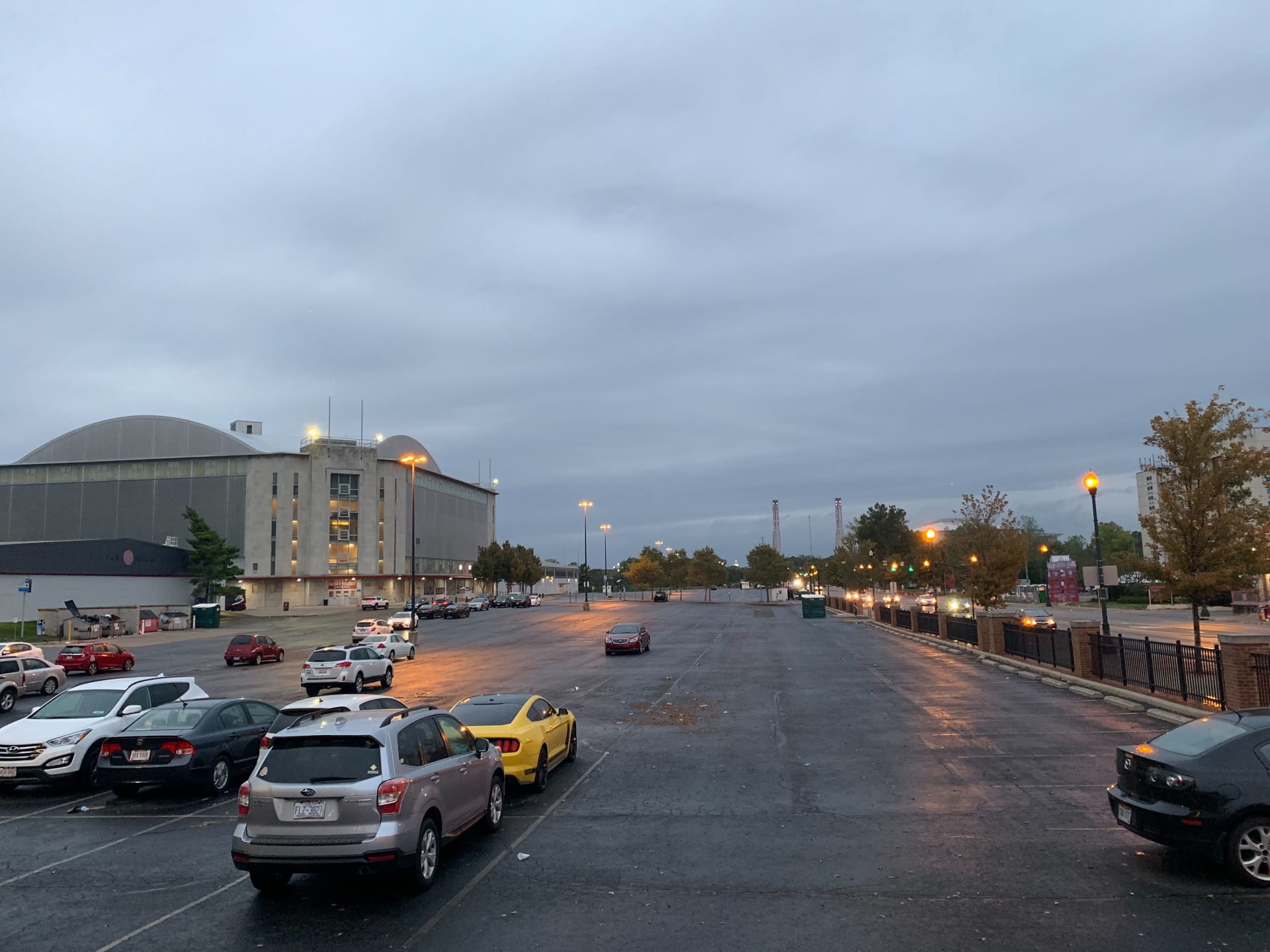
In the surrounding neighborhood the zoning is much more diverse and consists of both residential and commercial. The building spacing in the surrounding neighborhood can vary, with many houses next to commercial structures. The spacing between these buildings creates a feeling of overcrowdedness and could be restructured to be more appropriate. The image below shows how close some of the residential and commercial/industrial buildings are, and the zoning in this area could be improved to allow for more green space, which would make it feel less overcrowded. When it comes to parking, there’s a decent amount but pretty much limited. That places that allow for parking is an indoor, on-campus parking garage, a mid size lot adjacent to the ROTC center and the St. John Arena, among with some on road parking. This seems like a sufficient amount of parking at first, but then you take notice at issue is that the indoor parking is mostly filled up/ reserved for OSU students and staff. Depending on hours, the lot will be empty, but there doesn’t seem to be enough room to accommodate for regular people. The lot can hold a fair amount of cars, but that capacity can be quickly fade out when certain events fill it up, such as tailgates and student events.

In terms of building use, the buildings we saw when walking around on campus are in great locations, with one exception. The buildings are definitely in sync with each other and know exactly what each building is used for. Campus is easy to tell because the buildings are quite a bit taller, with less direct advertising to tell which building is exactly used for what purpose, but with other campus resources, it’s not impossible to tell them apart. The retail buildings across the street that are not OSU directly are in a great location as well since they are close to campus and even some off-campus housing nearby. Panera, Varsity Club, and College Traditions are all great uses of that area. The main building that stands out and is harder to figure out is the ROTC building. The building itself is good, but the location is a little strange. Kind of just in the middle of the parking lot near the ice arena, nothing surrounding it other than parking, and it’s cut off from some of the other buildings on campus that it seems out of place. It’s the only building that is like that in this area and it does stand out on its own, but the rest of the area makes great use of its buildings and locations.

Something that the ROTC building does keep up with though is the structural characteristics of the area. It follows exactly in line with the other buildings and is quite obviously a campus building, which just makes it being alone all the stranger. The rest of the campus buildings are all about the same height, which is to say, they are all quite tall. Then the shops, such as Panera, College Traditions, and Varsity Club, on the outside are also about the same height as each other, but they are smaller than they campus buildings so they can be distinguished from campus buildings themselves since all the buildings in the area follow the same style. They buildings in the area generally are brick buildings with some concrete, like a lot of the campus buildings, or they are a more modern looking sleek black or gray and white color scheme which looks incredible and ties the area together really well, such as the ROTC building or the newer apartment building. Through these size changes though, it is easy to tell which buildings are used directly for campus and which are used for other purposes like shops or food while still keeping a cohesive area that can build community for people who use those buildings for school or live nearby.

Blog 5 Proxima Project

Blog 5 – Proxima Project  

Due: 9 October 2019  


Luci- Building Use: Does building use make sense? Does the use of any buildings seem to be out of sync with other uses in the area? Are building uses appropriate for the location? Why or why not? 


Building uses vary depending on where you are. Campus and city of Columbus buildings are very different. When walking on campus it is easy to distinguish the fact that it is campus. The reason it is easy to tell is because of the style and quality of the buildings. For example, the stadiums are next to parking garages, which are next to a hotel. That way visitors can drive from their homes, park in the parking garage, stay in the hotel, and walk over to the games. When walking from campus to off campus the buildings are houses as opposed to midrise apartment, office, and class buildings. On Lane Ave. A stadium is directly located across from non-campus commercial property, and the housing is behind them.  Building uses are appropriate for the location because student need housing close to their classes, and close to amenities such as restaurants, and convenience stores. The housing is kept together, and the commercial/office spaces line the main streets. No buildings are close to industrial areas. The layout of these buildings provides convince for the residents. It does not provide convivence for those that are driving, but most citizens in this area choose to walk. 


Jared- Structural Characteristics/Building Spacing: Describe how you feel about the height, size, and shape of buildings in the area. Do you feel like the building layout contributes to the area feeling like a cohesive community? How is the spacing between the buildings? Does it feel as though structures are appropriately close to one another? Does the area feel overcrowded?  


The height of the buildings seemed no higher than 5 stories, rectangular in shape, and larger in size than the average American home today. The rectangular shape is ideal for more people in smaller areas, as city blocks limit the amount of space properties can have. There has to be a sense of community living in such tight quarters. There is not much space between buildings, and between these buildings and the road. The area feels mildly overcrowded, but not as overcrowded as other areas in Columbus. 


Mandy- Setbacks/Parking: Do the setbacks of properties seem appropriate? How do setbacks differ for different properties? How do these differences affect the character of the neighborhood? Does there appear to be sufficient amounts of parking? Does the configuration seem appropriate and functional? Would you change anything about the parking layout? What are some ways parking could be improved? 


One setbacks of the residential area was how close it was to busy bars and shopping areas. Most residential areas are separated from commercial but what’s interesting about cities is that many apartments are built on top of shopping buildings. The Wilson Apartments are a perfect example of a residential building being situated on top of a popular attraction (Starbucks and Chipotle). Another setback of the building is the variance in look from building to building. Most are functional but there is a divide between old apartments and brand new/renovated buildings. One side of lane has old and obviously weathered apartments, then right across the street are the newly built Wilson Apartments which are cost much more than the buildings across the street. 

Parking is always an issue in cities. What makes parking harder, is the lack of parking areas in a residential area. All the cars from the leased apartments on Norwich are forced to park in the street since there is no allotted parking area for their cars. Over the tour, Proxima Project saw one parking garage. It was on campus and it also costs a lot of money to park in short or long term. The street makes the street navigation more delayed and hindered by blocking cars. 


Zoning In & Around OSU Campus

Good Examples of Zoning

Retail on Lane and High

The northern side’s characteristic of Lane Avenue and High Street intersection is a prime example of retail zoning. Some of the retail stores in this area includes CVS, Buffalo Wild Wings, Jimmy John’s, Chop Shop, and Dominos. All of the structures are at a uniform height and have a brick and mortar theme that matches many of the other retail stores in Old North Columbus. Businesses within this area all have similar use and occupation. Because of this consistency, there is not a disruption in the community when searching for a bite to eat or retrieving everyday needs. The Buffalo Wild Wings is at the corner across the street from The Ohio State University’s Campus. The height of this building is slightly higher to mimic the dorms directly across, as they both have similar roof systems. This feature unites the identity of the OSU community’s aesthetics and smoothly transitions it into a retail zone of the Old North Columbus area.  

The Residential Neighborhood on West Norwich Avenue


The residential neighborhood on West Norwich Avenue is located right next to campus, so that makes it a great place for not only families, but students as well. This makes it a nice, easy walking distance for their classes. Buildings in this neighborhood are all old models, and most look similar in that respect. The size, height and shape of them are also cohesive with each other because of how the duplexes and single family homes look on the outside and there are similar facades. Housing spaces are narrow, but if there was more spacing then there would be less housing for Ohio State students. Setbacks of the properties are normal since it is student housing. These include: lack of physical maintenance to the exterior, old, dirty furniture on the porches, and overgrown lawns. Parking on campus is rather difficult due to the minimal spaces that are allotted and street parking is always full. A lot of the time, in the backyard parking, people are blocking other cars and that can make it hard to get out of the space.

As seen above the spacing is different on either side of the house and not uniform. Although the discrepancies are not major they still exist and the slight variation is extremely noticeable on the larger scale. Some of the houses are Victorian looking in style as seen on the left. And other homes are more modern in style. Most residences do fall into these categories and overall create some continuity on a larger scale.


Bad Examples of Zoning 

The Outlier on Tuttle 

Blackwell Inn is a hotel located on Tuttle Park Place. It is on The Ohio State University’s campus which seems to be an outlier of it surrounding area. Nearby is Fisher’s School of Business, Knowlton’s School of Architecture, Remembrance Park, and  The Ohio Stadium. While the Blackwell is owned by the university, hotels are normally zoned in commercial areas. Universities are considered an institutional zone, witnessing the functions of this building shows why some zoning should not mix. The circulation of an Ohio State student or staff is disturbed as a valet horseshoe interrupts the sidewalk. It is not successful in function because traffic direction is depended on the workers. If workers of the hotel are not present,  confusion arises between pedestrians and drivers determining who should proceed forward. Another setback with a hotel in an institutional zone, is the lack the common community receives to utilize the facility for everyday educational purposes. This is not a common place on campus that promotes academic studying, but rather attracts the audience of visitors. For an institutional zone, hotels should remain in a more commercial area due to the inconsistency it contributes to the area.

Bar Directly Next to Residential Areas

Threes Above High, along with a couple other bars are located right among residential areas. As seen in the photo above directly adjacent to the bar. This isn’t ideal for the zoning of the area because of noise and traffic congestion. But this is most likely a necessary issue in place because of the sheer number of off campus housing necessary to house all upperclassmen students and without the result of the zoning there would be a major setback in off-campus housing for students.

Blog 5 MAK Productions

Parking lots-

There are a couple of buildings pictured on High Street in which the parking lots are located in front of the business. In all other businesses on High Street, there is no parking located in front of the businesses. As a result, these parking lots look out of place. If they were located behind the business, High Street would appear more organized. Also, these parking lots make turning out onto High Street more dangerous as opposed to accessing a parking lot on a side street.


Different residential styles and spacing

When walking down the street in a residential area on Woodruff Avenue there is a large difference in the way the residential buildings look. There is also very little spacing between the houses. There is no sense of uniformity or organization in this residential area, and to be frank, looks poorly planned. This is a very crowded area that does not look very pleasing to the eye.


Setbacks 

Many of the University buildings that we passed are very well setback from the road allowing a green space on both sides of the sidewalk. This was mainly on the campus side of lane ave, (image 6)  which added view when walking around, and it fits very well with the aspect of the whole campus. While the other side of the road is the complete opposite, with no setback at all, it feels uninviting, as if it was trying to get people to go away.    


The different types of buildings do not fit together.

The parking lot does not fit in with the rest of High Street.

Again the setback of the building does not fit in with the other buildings around it, I would bring the building up to the street and put parking in the back, the Structural characteristics do not fit in with the other building around it what so ever, the building does not make any sense where it is located.

   Great Structural characteristics, everything seems like it fits together, the buildings are not out of place, the spacing between the buildings or lack of it fits together very well.

Must University buildings have great spacing, setbacks, have great Structural characteristics that match other buildings nearby, and have a great sense of building use.      


CCDC Blog 5

Within a city, zoning laws for commercial, residential and mixed use areas facilitate land use and impact the aesthetics of an area. Spaces around college campuses can pose unique issues for planners due to density, the transient nature of student residents, and the need for specific types of commercial businesses. Student populations have a greater demand for lower income housing options, fast food restaurants, and budget retail outlets.

Real Estate Company        Difference north and south of Lane        Ohio Stater Apartments


Residential housing areas are rather uniform along Neil Avenue between Lane and Norwich with the exception of a single real estate company. The company may have wanted a close proximity to the properties they manage and rent. At the end of Norwich moving onto High Street there is a drastic shift from residential to retail establishments. However, this transition is softened by locations north of Lane having housing above lower level retail outlets. Lane Avenue serves as the dividing line for primarily residential neighborhoods to mixed use properties. The area north of Lane Avenue houses small businesses with brick facades. In stark contrast to the old brick fronts, at the intersection of Lane and High there is a tall modern building. The east side of High Street opens the way to a stretch of chain-restaurants opposite the University area. The Ohio Stater Apartments and similar developments currently under construction stand out against the surrounding retail spaces. Given the high demand for housing it is reasonable to have apartments above retail establishments.

Duplexes 2-2.5 stories                Stucco versus siding

Appropriate spacing between houses            Narrow spacing on Norwich near High Street


Structures give character that define areas around campus as being adjacent to campus, near campus, or a part of their own neighborhoods. Structural characteristics can go hand in hand with the building spacing. Shops can be pressed together while houses and duplexes tend to stand alone on their lots. Along the walk, houses/duplexes were consistently two or two and a half stories tall. The architecture began to vary along Norwich where one side of the street had consistent horizontal siding, standing juxtaposed to the stucco houses opposite. Housing remained on separate plots up until apartment buildings came into the picture. As we moved closer to High Street spacing became more cramped, but houses remained stand-alone. (Pictures of spacing are from Google Maps)

Difference in sidewalk width


Setbacks for properties can give areas character while also being a more subtle descriptor of neighborhoods. On Norwich, sidewalks become more narrow than those on Neil so that only two could fit abreast. More narrow sidewalks can give the area a residential feel. Neil feels less residential because of its wider sidewalks and less crowded appearance. Norwich being a one-way street also creates a more intimate city neighborhood environment because of the limitation on through traffic and the shift towards parking being a priority for residents. Within the different zones, it seemed that the setbacks were rather consistent, and it was noticeable when a shift from one zone to another occurred. This had an impact on how the property was viewed, and gave houses with larger setbacks a feeling of importance or increased comfort, while the housing that was closer to the sidewalk felt cramped. (Picture above is from Google Maps)

Parking on Neil Avenue


Parking is essential for both the residential areas and businesses. Residents, commuters, and business guests must be able to stay in a location. Small parking lots are characteristic of apartments along the route, and are extremely necessary. The street parking along Neil and Norwich were completely full during our walk. The fact that Norwich was a battle for parking speaks to the crowded nature of the neighborhood considering again that it is a one-way street. Opportunities for more parking are limited considering the building use and structural characteristics in the area. It also seemed that the majority of the parking was designed for locals (permitted or designated parking zones), which makes it hard for visitors. This makes sense in the primarily residential areas, but it is easy to imagine someone circling for a long time trying to find a spot.

Overall, the area surrounding the university is very clearly sectioned off into zones. We walked through obviously academic, residential, and commercial zones, with relatively little mixing. Additionally, these districts had distinct characteristics that made it apparent which one you were in. Given the high priority of these types of areas to university students, it makes sense that each would have a clearly defined space in the greater campus area. 


KRD & Associates Blog #5

Structural Characteristics/Parking

One building that stands out when walking down Woodruff is the Mendoza House. The  brick color does not match the color used in all of the other north campus buildings. This causes a break in the cohesiveness of the design of most of the North campus buildings. Most of them look fairly similar in color and design but since the Mendoza house is older, it looks different from all of the newer buildings surrounding it. It serves as a break between the College of Business and it is the start of North campus housing. Walking further along Woodruff, there does not seem to be enough parking for the number of students living in the dorms, workers, people working on campus, etc. A parking garage of some sort may solve this issue. The closest garage is on College Avenue right across from Curl Market. This garage is one of three around North campus. Surface parking is the main issue rather than garage parking.

Setbacks

The setbacks of the buildings are not all equal while walking along Woodruff. This creates a sense of dysfunction and unconnectedness. By not having equal setbacks, it seems as if buildings are just placed in random array. Some buildings on Woodruff have a front green space while others just have a sidewalk. There is no way to feasibly fix this issue though because the buildings are already there and it would be too expensive to move them in order to add a setback. The building height also varies comparing each building on Woodruff, there is no real consistency in height. This lack of consistency also adds to the sense of unconnectedness. A uniform height would clean up the skyline of the area. 

Building Use

There is a church on the corner of High and Woodruff which seems to be out of place. The brick color does not match and the architectural style is completely different from that of the dorms. This space seems like it could be used for more North campus housing instead. The church breaks up the cohesiveness developing as one moves along Woodruff towards the North campus dorms. The church does not appear to have a strong affiliation with Ohio State even though it is right on campus. 

Structural Characteristics/Parking/Setbacks

The dorms along High Street all have a uniform look and feel. The buildings are evenly spaced and the setbacks all include a small portion of green space. This makes this part of campus feel clean and organized and it starts to make the area feel connected. Across the street, the buildings are various sizes and have different architectural features. There is not a common feature that the buildings share so it does not flow as nicely or look as clean as the North campus dorms. There is more room for parking but it is still an issue. This again could be solved by adding some type of surface lot or a parking garage in the area. 

Building Spacing

On Norwich there are more two-story, family style homes. Most of the homes in this area are rentals and are split up into multiple units. They are all fairly simple and basic homes. All of them have the same outside aesthetic. There is ample street and lot parking on Norwich for residents living in these homes. The houses are very close together with little to no space between some units. The setbacks are fairly consistent throughout this neighborhood. In between some of the houses there are entire apartment units, which give the area a more commercial feel. It does not feel like a cohesive community due to this. Most people live here for a short period of time so there is not a strong sense of a community feel in this neighborhood. 

Structural Characteristics/Parking/Building Use

As you get closer to campus, it begins to feel a little more cohesive with the look and feel. Jesse Owens North Recreation Center on north campus seems out of place. It is on the corner of Neil and High. This is further away than the other gyms on campus for students. The location is not entirely convenient for everyone since it lies near the outer edge of campus. It can be difficult to find for some people who don’t know the area well because the buildings around it block it from being seen from a distance. The design and color of the building does not fit with the flow of North campus as a whole. It is missing the brick element, which connects all of the other buildings. Fisher Hall seems to tower over the other buildings on North campus in the College of Business. There is more parking here in the parking garage across the street, which is a main lot for faculty and staff working on North campus. North campus seems to have a cohesive feel. The other buildings around campus have a common feel inside, but as a whole they seem to be out of place. The architectural elements differ drastically in some cases, making things seem hectic and not planned out very well.

Sam DeLong, Casey Klusman, Ari Roby

JEB Blog #5

The area from the corner of Lane and High to the corner of Lane and W Norwich Ave is home to many chain restaurants such as BWW, Dominos, Chop shop, etc. All of these restaurants are connected by one large building that meshes perfectly with the other buildings that surround it. In terms of structural characteristics, the building has a brick finish to it that is just like the other buildings you see up and down High. The buildings height remains constant with its surroundings and without a doubt the building layout contributes to the area feeling like a community. Since these restaurants share a small stretch of building on High the amount of space each restaurant has can definitely be seen as very close quarters. The proper when walking past it definitely feels very close to road and sidewalk space is very tight. With these restaurants seeing high volumes of people walking in and out in my opinion the building should have been set back further. This would give bikers and people more space to walk on the already crowded sidewalks. One major problem that we discovered when observing this building was its parking. The only parking we saw was right on High street. The complex had no parking lot or area for customers to park. Behind the complex there is a very small parking lot that no customer would know is there if they are traveling on High. One way that this building could help its parking problem would be to advertise the parking in the back of the complex. Overall this area seems to be very well planned out and there are not many issues related to it.


The houses on  W Norwich Ave are very uniform in the way that they have very neutral colors and are also covered in siding. The use of the buildings make sense in that they give students cheaper housing than the dorms while also bridging into independent life. It is appropriate for the area because it is close enough to campus for students while also being off campus. The height, size, and shape of all the buildings in the housing area are all very similar and placed about the same length apart. I feel like the buildings are very close and that they feel like a cohesive community. It also helps that on the weekends all the students are home and tend to hang out in their yards, causing more interactions between neighbors. With how close the houses are together, it seems as if they are too close to one another and that you could hear what is going on in the other house if they are moderately loud. The buildings are open lawns with little to no greenery separating the houses, causing a lack of privacy. The setbacks of the houses are very minimal and do not seem appropriate. The only housing with more setbacks are the ones with the parking in the front, causing the character to be a bit less uniform. This is not always a bad thing, but it becomes one when the only thing different about the buildings are the spots of parking. Some buildings have none, some have some in the front, and the others have it in the back. There is not a sufficient amount of parking for these houses even with the lots that they provide. Just walking through the neighborhood you can see the mass amount of cars parked bumper to bumper on the streets. I would make more space in the back lots for parking so that the streets could remain cleaner and more easy to move and drive on. This housing area is overall very uniform except for the parking in that some have lots while others do not. The best thing would be to move the parking off the streets and into bigger lots behind the houses.

   The stretch of road between Neil and High on lane is filled with mostly residential buildings and churches. Most of them are brick, with a few having tan siding instead. Most of them fit in fairly well with each other, except for the small gas station that sort of sticks out. The setbacks are fairly even and close to the road. Most of the residential and church builds have their own small private parking, but no public parking is available on this stretch except for when using the gas station. Building spacing is tight and very close, with campus dorms taking up most of the campus side of the street, luckily the road is wide so the street doesn’t feel cramped. Also much greenery is placed on the street to make the area feel fresh and vibrant. The traffic is heavy and it can be quite difficult to cross the street during busy hours. Overall the area has some of the nicer apartments on campus and is a good area to live in for students. Being close to high street allows for easy access to restaurants and convenience stores and the walk to campus is extremely easy. The only criticism I would have is the lack of crosswalks on Lane Ave.

Blog 5 team Sim City

Building Use

A majority of the area’s building use flows well since it is mostly residential. However, there are a few points where commercial meets residential is a not so cohesive way.

A bar directly next to housing

The location of a gas station next to housing seems alright at best. However, a bar so incredibly close to the house beside it seems out of place. The loudness of patrons and basic bar settings would disturb the peace of the housing next door.

Church and parking lot directly next to housing

As for the church, having the location be next to housing isn’t completely out of the question; however, having the parking lot in front and directly next to the house seems odd. I would believe that whenever church services would be in action, the noise of the card in the parking lot would also be a disturbance to the nearby residence.

Vacant business, barbershop, and waterbed supply store directly next to housing

The mixed use businesses really don’t seem to belong sandwiched between two separate apartment buildings. While the barbershop potentially belongs in a residential area due to the services rendered, the waterbed supply store seems I’ll placed. The vacancy of the one on the far left also adds a less than stellar feeling to this block


Structural Characteristics

While there are some areas in this residential sector that are very cohesive, the majority of buildings tend to be a hodgepodge of height, size, and design. These discrepancies lead to small sections of the neighborhood feeling connected, but overall it is not a cohesive community.

Four buildings that have no cohesiveness whatsoever

These apartment buildings seemingly have separate styles and color schemes. While the first and third building appear relatively similar, they do not flow well into the other buildings and are a bit jarring. Also, the first three buildings all seemingly have two stories while the fourth building has three. These differences make this section very disjointed.

Housing with various sizing

Continuing down the street, the housing in this area varies wildly, especially considering the multi floor difference and overall housing use. We observe here multi-level, multi-family housing with a single family home in the middle. The heights of the building are not cohesive whatsoever, neither is the shape or style of the housing. This section of the street feels even less like a community than the previous section.

Varying sizes in businesses

Additional varying sizes of businesses

Business building height is pretty stark between the CVS and Wilson Place, and even more so with the businesses further down the road. While the business use in the area makes sense, the overall height, style, and shape of the buildings is just as jarring as the residential area we had just walked from.

Building Spacing

We found many building spacing issues as we walked through the surrounding neighborhood. Most of them are about whether the spacing is appropriately and how these spaces are used.

Extremely narrow spacing between houses


As the picture above shows, an alley between the two houses is only enough for one person to walk through, which makes the two buildings very close to each other. The tiny alleys make the neighborhood overcrowded and lack of privacy; it also prevents the house from more sunlight. We observed most of these tiny alleys and they all look gloomy and dirty. There are rarely plants along the alley.

There are also spaces between the building that are not reasonably planned and used. Besides the crowded spacing, there are many others spaces of different sizes, which make the neighborhood not look uniformed. Some building spaces near the commercial area are poorly used. For example, we can clearly see the stairs, pipes and half of the other building through that space-as shown in the picture below. This makes the area disordered.

Awkward alley space between housing and a business

Setbacks

Most houses in the surrounding neighborhood has a fair amount of setback from the streets. There is enough room for a set of stairs and a front yard with grass. There is a shared stair firat and two private stairs that lead to each house. Residents may feel more privacy and have more fun with these setbacks.

Housing with moderate setback

Next door is housing with a low amount of setback

However, this housing, separated from the housing next door with decent setback, has a much smaller setback-no shared stairs and almost no front yard. Different setbacks of these two buildings avoid all the houses on this street standing on one line, which have a negative impact on the outlook of the neighborhood. We also think that these may lead to the inefficient use of the space.

Parking

Small parking lot between/behind houses


The houses that are located on Norwich Ave have very sparse parking. Most houses have a driveway that gives the homeowner a place to leave their car. Instead of a driveway, the house on Norwich have an area to park behind the house which looks like a cluster of spaces. Some houses like the one shown above have a small area next to the house where the homeowner can park their car instead of leaving it behind the house. This seems functional in that it gives the homeowner access to parking, but it seems that it could be better executed. If there was a driveway attached to these houses, the land behind the homes could be used for building or as space for a backyard.

Narrow two lane roads with both side street parking


Another issue with the parking on Norwich is the allowance for cars to be parked on both sides of the road that is two-way. This is dangerous and makes it hard for two cars to pass one another on the road. This could be avoided by the cars only being allowed to park on one side of the street. This would allow for cars to pass safely down the road.

Plan “OH” Blog 5

Occupying the stretch of land extending from Tuttle Park Place to Neil Avenue are the Point on Lane Apartments, three smaller-scale apartment buildings and the Harrison Apartments. Although each of the buildings serves as a source of multi-unit, living space, characteristically they couldn’t be any more different. It is worth pointing out the Harrison specifically with respect to its height as it is arguably one of the tallest structures in the area, which may in part be due to the fact that it is not grounded at the same level as the other buildings in the area. However, even with that being said, the ground level difference between The Harrison and the other apartments is not vastly significant if you take into account the small parking lot it has in the front of the building; it is still a massive site.
Both the Point on Lane and Harrison apartments are large-scale developments. They completely soar over the three properties in between them. Although there is a decent amount of spacing from building to building, there doesn’t seem to be an adequate allotment of space for traffic flowing off the main road (Lane) to the surrounding area. In addition, the structural and design characteristics of each building as well as their physical condition vividly lends to the age of the properties. The Harrison is not the most aesthetically pleasing building in comparison to the Point which has a very modern, sleek-like design, but nonetheless, like the Point it looks newer. It is clear the three rental properties in between the Point and the Harrison are older. They appear more worn condition wise. Structure and design wise they closely resemble housing properties in the surrounding Tuttle Park neighborhood, which would lead one to conclude they were there prior to the building of both the Point and Harrison. Because, each of the buildings is so different though, the space as a whole lacks a sense of cohesion. The builds are different. The designs are different. The sizing is different. Nothing flows.

On the corner of Lane and Neil is a Shells gas station and Subway. Right next to the gas station is the Thirsty Scholar Bar. Although the bar and the gas station are not connected, they are so close to each other it is easy to mistakenly think they are connected. Not only is there not a whole lot of space between the businesses, but besides the small strip of spaces allotted for parking to the right of the pumps on the Shells lot and the little available parking spaces on the street in front of the bar, there isn’t a whole lot of parking space available in the area at all. Because that area gets such a large flow of traffic, it would make more sense to have a larger surface lot or garage built in close proximity to the buildings to accommodate the parking needs of those traveling throughout the area. Placement wise, although I’m sure many would agree that having the gas station/Subway at the corner is very convenient for those coming and going in and out of the area, the placement in addition to that of the bar, seems so random. Similarly to the comparison of the apartment complexes mentioned in the prior paragraphs, there is a lack of cohesion to the space.

Another space we explored was the residential area along Norwich Ave. One of the first things we noticed was that there was a lot of small-scale multi-unit housing. However, from building to building, the structure and design of each significantly differed. The only characteristic the units seemed to share is that there was not a significant size differential comparing one structure to the next. In addition, there was also not a large amount of space between the buildings and the space that was allotted to residents for parking did not seem to be hardly sufficient enough for the amount of people that must reside in the area. All together it felt very congested.
As we were traveling down the street, we actually had a chance to speak with a realtor in the area, who mentioned that the zoning of the area was actually changed as the university and city became more involved in its development. The realtor said the area had previously been a residential neighborhood, designated AR-4 and was changed to commercial in a push to make the area more high-density.


Our group found a lot of variation in the appearance of buildings on High Street, particularly the stretch between West Norwich Avenue and Woodruff Avenue. Most of the storefronts on the east side of the road were made of different materials, ranging from old stucco to modern metals. While some people may think this makes the area look unorganized and confusing, others might see the history of the buildings. It is obvious which buildings have been there longest and which ones have appeared as OSU naturally expanded. However, all of the buildings share a common past connected to the university. The area suddenly becomes more cohesive when the street is viewed from the lens of history. All different building uses are present along High Street, such as residential, retail, and restaurants. In other areas, this combination could be the result of poor planning, but High Street is unique because it must cater to the needs of a college student without a car. Everything a student wants must be located within walking distance of campus, so the variety of High Street does serve a purpose. Similarly, the spacing between buildings is very close together, but instead of feeling tight, the layout makes it more convenient for students to walk from place to place. While most students do not use cars, there is still a lot of traffic congestion on High Street from commuters going downtown. There is not enough parking for these people to stop and eat or shop. The couple random parking lots that are present are oddly setback from the road, interrupting the line of buildings, and tend to fill up very quickly. More parking garages need to be built behind the buildings so commuters and students alike can take part in the amenities offered by High Street.