Blog Entry 9: Postcard

This is my postcard that I made almost entirely in adobe illustrator, then touched up a tad bit in adobe photoshop. The city I chose for my postcard is Canton, OH, my beloved hometown. I was born in Canton and spent my entire childhood there. Canton is a small-medium sized city which holds a few notable attractions, mainly the Pro Football Hall of Fame. The Hall of Fame is located in Canton, because that is where football originated long ago. In order to make this piece, I followed instructions in class and looked through the tutorial, duplicating letters, ungrouping them, giving them shadows, etc. Yet at one point when attempting to add in a photo that was much too large, I somehow managed to delete my entire piece and had to start all over the next day in class. Nonetheless, I used the tutorial to help guide me through, and asked questions when I needed in order to finish my work. By the end of the day I had mostly completed my work. However one thing that was pointed out to me is how the “Welcome To” and “Home of the Hall of Fame” phrases seemingly look weird/out of place/hard to read. I believe it is due to the multiple colored background of the Hall of Fame building. I attempted to fix this by changing font and adding a border to the letters, yet it only helped a little in my opinion. I think the main problem is the background image itself, I figure I need something more monochromatic. Yet, I loved the background to much to change it so I am content with my work. I really enjoyed making this piece, it was one of my favorite things we’ve done all semester. I am excited to attempt doing this again on my own with different words/place. If done correctly, I believe I could make a really cool looking postcard that I could actually use with my friends and family!

Blog Entry 8: Final Photoshop Project

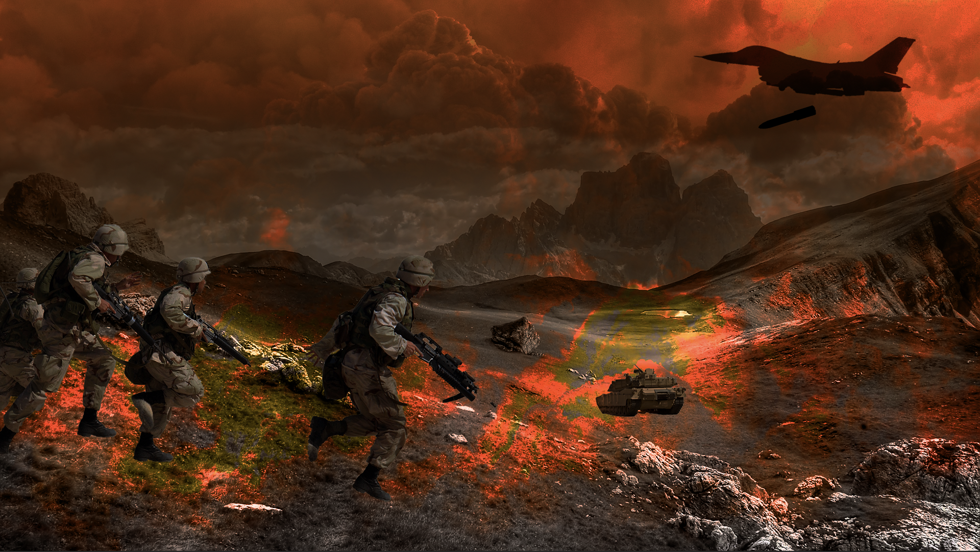
For my final Photoshop art project, I choose to create a 3 part conflict-resolution series in which a population underwent a war, followed absolute devastation, and then eventually the rubble turned to hope and a new beginning with a period of resolution. While designing and creating this imagery, I kept many things in mind such as which art elements I would use, which tools I could utilize on Photoshop to help build what I envisioned, and how I could create my project without the use of dull and overused imagery.

The whole point of my project was just to shed light on a topic near to me. My grandpa served in war, as did many my uncles and dad’s cousins. This being said, I’ve always had some sort of passion for the art of war and wanted to share that with my fellow classmates. My piece specifically shows the cycle of war, and that it may be never ending so long as people continue to not meet eye to eye on international issues such as religious battles, territorial claims, terrorism, etc. After each and every war, rubble is left behind in the ruins of cities and landscapes, then over periods of years, decades, and even century, things are slowly rebuilt, although they may be likely to undergo this process soon again in the near future.

I speak for all three images when discussing the elements of art that I used, however some of these elements are more apparent in a particular image. I definitely thought about color during the creation of these pictures and even as I was selecting stock photos to use. I wanted the warzone image to be a fiery red almost hellish-like, whereas the destruction scene I wanted to be more dull and mellow with browns and grays, as if everything had just turned to rubble and ash. Lastly, I wanted the image of hope and rebuilding to be most vibrant, with light coming in through the top and having bright colors and green plants all around. Another element I took into consideration is texture. I realize a war zone, and the aftermath of a war zone must have unique texture aspects to it such as all the broken parts and pieces of intricate buildings and objects that were left behind. This being said, I specifically picked stock images to use that were full of interesting textures such as the many objects on the ground in images two and three, as well as the grassy and rocky hills of image one. One more art element I thought deeply into was the value of certain objects. In the second picture, the image of destruction, I made sure to desaturate the image so that it seemed dark and dreary. Also, in the first image of the war zone, I purposefully made the image of the military jet and missile completely blacked out, as if they came in so fast all you could make out was the figure of them. Various principles of design were also used in my thought process of creating this piece. I definitely thought a lot about proportion when adding in images on top of the background images. For example, when I put in soldiers and a tank into the war zone image, I made the tank smaller since it was further away. and the soldiers appear large because they are close up. I also created an emphasis on the kids in the last picture, by placing them in the very center, along the pathway.

To go about creating this three part series, I created three separate Photoshop projects. I used similar tools in all of three of them however. I used a layer mask and the gradient tool to create stormy cloud backgrounds in the first picture, whereas I used the same tool in the third picture to create rays of sunlight coming in from the top. I was able to make my background transparent in the second image, thus allowing me to place a smokey image into it to make it seem as though there was fresh smoke and/or dust amidst the air in that picture. I also focused heavily on tools to cut out and crop images, as I placed many stock images into the three pieces. The magic wand tool helped me very much with this, as I used it mostly to do all my selections, being very careful with it as I would zoom in and out to accurately select what I wanted. I also used various layer masks to apply filters across the whole image such as desaturation and decolorization. I specifically used these two in order to make specific images look dark and dreary like a war zone and destruction.

I knew going into this project that it would be hard to create a war zone and resolution type series without making it seem cliche. Thus being said, I thought long and hard about what type of imagery I wanted to include in my pictures and made entire lists of what I should and should not use. I ended up using images, that I thought were relatively unique to the subject, and I also edited them heavily so that they were truely unique, and so that I could claim the piece as my own. The stock images helped me to create this series, but my edits, and what I created with them is the work of  art. It is my hope that the viewer looks at the series and thinks unique intricate thoughts about each of them, thinking differently than any other cliche military art post. Of course I used the images of soldiers, I almost had to so that the viewer would at least understand the scenery, but its with certain objects such as pathways and doors leading to hope and rebirth that one does not find all to often in a military piece of artwork. Other small details such as rustic cars and revolver pistols lying on the ground help to make my work stand out as well and stray away from the typical cliche images. During the in-process critique, my colleagues warned me of using images that may seem too cliche, this being said I tried very hard to be unique and creative in the sense of choosing stock pictures to use. Then, later on during the final critique, I received virtually no negative feedback, and I was happy with my work as it was, so I decided to leave it as is. I hope you enjoy! Feel free to leave comments if you desire.

Blog Entry 6: Final Project Brainstorming

Topic: Conflict/Resolution Series of War, Destruction, and Rebuilding Period

This topic interests me because it is very graphic, there is much to see. So much that we do not ordinarily see in our regular day-to-day lives. Also my grandparents served in war as did my dad’s cousins. I find the idea of illustrating a conflict and then solving it through a series of pictures to be intriguing.

I know war is deadly; I know I have relatives who have served. I’ve seen the destruction created and the lives destroyed. I know many wars are fought over religions or cultural differences.

What I would like to learn is how to illustrate an elaborate scene of warfare/destruction/rebuilding without coming a cross as cliche.

In order to do this, a good start would be to eliminate the use of any cliche items associated with those words, such as: Mushroom Nuke Cloud, Green Plant, Rubble, Guns, Soldiers.

I think everyone could relate to this project in some way some how. Everyone has an opinion on war and many people know those who have served. It would be unique for people to see a piece about war and resolution in person.

In order to create this series without falling back on overused imagery, there will be a strict use of no guns or soldiers. I will rely on finer details that paint the picture even more vividly without being too obvious. Such as a burnt car or a grenade in hand on a hill over a war zone and I will use dim lighting when needed.

If I can create this series how I envision it, then I am sure people will be attracted to it. There will be much to see, many hidden metaphors and so forth. It is my hope that people will enjoy this.

Blog Entry 5: Group Joiner Project

Photoshop Automate Feature

Manually-Assembled Digital Collage

Cut’n’Glue’d Collage


This project was very interesting to say the least. The idea of Joiner pictures is quite unique, and it makes for beautiful artwork. There are very many ways to represent a given moment, and a Joiner helps to capture all of them; it allows the artist to show what they want and intend to show in a given piece. My favorite part about this project was being able to think creatively to try a new type of artwork I have never done before. The most frustrating part of this project was simply working with tech and trying to get pictures uploaded/correctly transferred from phone to computer.

In my opinion, my 2nd image, the Manually-Assembled Photoshop collage was the most successful. To me, I see many patterns of linear use and repetition of shapes such as square that help to make the piece stand out to me. We kind of just made it as we went and ended up loving it. Many people saw many different aspects in that piece that weren’t even entirely intentional, the piece is just full of thought and wonder. All in all, the piece was successful because Photoshop is generally pretty user friendly and is a useful tool for creation. I believe for the most part, that Photoshop was capable of allowing the user to do whatever he or she wanted with their piece, but when Photoshop attempted it’s own automated feature, it was pitiful. Many groups were unsatisfied with the automate feature and for good reason – it didn’t really do much.

Photoshop is 100% a tool for creation in my opinion. It is a piece of equipment (technology) that allows an artist to express his or her inner creativity. It provides many features that help to do this such as filters, cropping tools, paint brushes, and so much more. In more ways that one it is actually easier to work with Photoshop then in real life, because if you make a mistake you can just delete it. For these same reasons however, Hockney hates Photoshop. He says work becomes too uniform and  perfect and loses side of human connection and creativity working with the blunders. These feelings are reflected in his artwork in how he manages to uniquely create joiner after joiner, each filled with a sense of connection and admiration. Work created by AI, algorithms, or computer is most certainly art, sometimes these forms of art are actually the most beautiful or aesthetically pleasing because these devices can create art in such accurate form that designs end up being very precise and perfect. Those pieces of equipment are all even forms of art, an algorithm is a piece of art in themselves. The structure behind them, the design process and the well-though out algorithms that are used to perform tasks, all of this is very calculated and must’ve taken an extremely creative and talented person to come up with.


Blog Entry 4: Composite Landscape

This is the piece I composed by combining multiples photographs together! Started with the water as my background, I then added a view of a city and put a gradient layer mask on the water background so that the sky would appear to be water. After this, I added a lady who was actually resting on an inner tube although it appears as if she may be doing a back-breast stroke. Next, I added in a guy swinging a golf club and a potted succulent just for fun. Below is a picture of my work from class.

Blog Entry 3: Completed Face Swap

This is my finished face swap! I swapped a selfie of me I took while running with the great “American Gothic” by Grant Wood. I choose this painting, because I thought it would be an easy face-swapping choice, due to the characters looking head on. Also, I have always seen this piece throughout my education, teachers have used it in my high school and middle school classes and I have always liked it. It is an accurate representation of an average farmer couple in the 1920s. To do this, I first took a cross section from the forehead on the man in the original painting, then copied it over to the picture of me running. I then took a cross section of my own face and blurred both of these cross sections so that they were one solid color. After this, I used the curves tool to edit the RGB channel outputs and created a new curve layer which masked the background picture of me running in a colorway that more cleanly overlapped with that of the painting. I then deleted the cross sections and combined the picture layer with the curve layer and took a new cross section of my face which I transported over to the painting. Here, I adjusted the transparency of my own face so that I could line it up correctly with that of the painted man’s face. Next, I made a face mask and erased all unnecessary parts of my face cross section, then put the transparency back up to 100%. Lastly, I took many new cross sections of the painted mans face and overlapped them onto my face, then stretched and morphed them to fit my face better, and I made them very transparent so that they would blend into the overall picture better.

Blog Entry 2: Color Manipulation

Greyscale: An image that has intensity but no color values.

Monotone: Only a single color is shown.

Desaturated: The intensity of color is lowered, however it does not have to be lowered completely. 

Channel Mixer: Editing the amount of red, green, and blue, within the red, green, and blue pixels.

My Personal Gallery of Art Elements & Principles of Design

The Elements of Art

Line – The path of a moving point.


Shape – The contour of a flat object.


Color – An object’s chromatic quality.


Value – An object’s brightness/darkness.


Form – A 3D object having depth.


Texture – The tactile quality of a surface.


Space – An object’s external/internal areas.


The Principles of Design

Balance – A distribution of equal visual weight.


Contrast – A juxtaposition that accentuates difference.


Emphasis – An accentuation of importance.


Movement – The directed path of optical motion.


Pattern – An orderly repetition of visual elements.


Proportion – A scaling of objects in relation to each other.


Alignment (Repetition) – An arrangement forming a straight line.


Unity – The harmonious arrangement of visual elements.


HOME

Hello everyone and welcome to my digital art portfolio.

Here is where I will be posting all my material for the ART EDUCATION 2520 class taken at the Ohio State University.

I hope you enjoy!