Posts

SP23 Vis: A3 Chess “Check-Mate” Process

To view the portfolio post click here.

Intent:

Concept statement: A three-way chess game with a Greek Gods theme. Each set of pieces represents either Hades, Zeus, or Poseidon. The chess pieces are representative of the Gods and the things associated with them. Since the three Gods have a history of hating each other we wanted to connect that to the dueling aspect of chess. My pieces are made out of acrylic, cardstock, double-sided tape, pen, and Posca markers. My partners used acrylic and different forms of glue.


Ideation:

For this partner project, I was in a group of three with Isabel Nixon and Kelly Chen.

We started the ideation stage for this project by doing an exercise in class. We had to create icons, symbols, and indexical imagery with themed words. This helped us practice taking concepts and making them visual:

(Picture taken by Kelly)

We used this as a reference photo for one of our images:
 

https://www.texasrhinestone.com/black-lives-matter-curved-with-fist-vinyl-transfer/


After this exercise, we moved into understanding the history and rules of chess. I was only a little familiar with the game before starting the project so I did a little bit of research to help me understand the game more:

I used this website to get a better understanding of the roles of the chess pieces, how many of each there were, how they were allowed to move, etc.:

https://www.chess.com/learn-how-to-play-chess

Illustration of chess board setup

https://www.thesprucecrafts.com/setting-up-a-chess-board-611545

I sketched this out just to have a laid-out version of a chess board with the pieces:

I also used some other sites and images to teach myself the roles of the pieces:

List of Chess Pieces: Their Names and How They Move | LoveToKnow

https://family.lovetoknow.com/family-games/list-of-chess-pieces
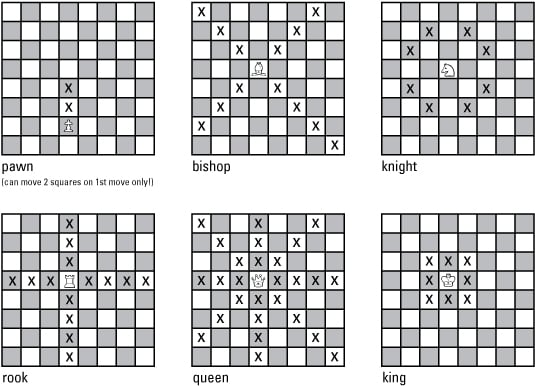
 

Knowing the Moves the Chess Pieces Can Make - dummies

https://www.dummies.com/article/home-auto-hobbies/games/board-games/chess/knowing-the-moves-that-chess-pieces-can-make-186936/


I looked into the history of chess so that I had a base layer of knowledge about the origins of the game:


As a class, we discussed which pieces would play certain roles at a party. We played a game of chess Jeopardy where we were quizzed on the rules of chess and the roles of the pieces. This helped us review the material we had been learning and researching.

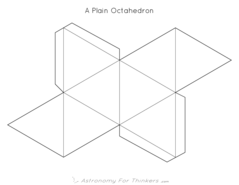
We did two more exercises in class. We used paper to make structures. First, we made paper balls using paper that had slits in it to allow us to put them together to create the sphere structure. We had to cut out the template Taylor gave us and then put the pieces together. This exercise took a long time because it was hard to put the structure together without it falling apart at the same time. I tried to build it on my own multiple times and it would not stay together long enough for me to finish the entire structure, so Isabel and I helped each other put them together. One person held the structure together while the other put the remaining pieces together, and eventually, we both created the spherical structure.

We were both very happy when we both were able to make the forms together:

Then we made paper structures using the slip method and templates Taylor had printed out for us:


After doing research and doing exercises in class, Isabel, Kelly, and I moved into our brainstorming stage. Since there were three of us we had to come up with ideas that would allow for three parts. While in the brainstorming process, we came up with a lot of broad ideas and then narrowed them down to 3 specific ideas: our zodiac signs, the three main Greek gods, and “past, present, and future”.

(All pictures taken by Isabel from her sketchbook)

For the Zodiac sign idea, I am a Sagittarius, Isabel is a Virgo, and Kelly is a Cancer. We played around with the elements associated with our individual Zodiac signs.

Sagittarius: Fire, Virgo: Earth, Cancer: Water

Since these are the three elements that are often put together we thought that would work well for the “dual” or “war” aspect of chess. We also thought that the “big three” of Greek Mythology (Zeus, Hades, and Poseidon) would also work well for this aspect of the game. Our “past, present, and future” idea was a little less developed but we thought it could be an interesting concept, especially since we had three people so it didn’t just have to be past and future.

I dove a little deeper into the zodiac sign idea and gathered information about each of our signs.

These are the references I used while sketching and ideating:

12 Zodiac Signs - Dates, Meanings & Compatibility

https://emma.ca/zodiac-signs

All zodiac constellations | Who invented the zodiac | Are ...

https://starwalk.space/en/news/zodiac-constellations
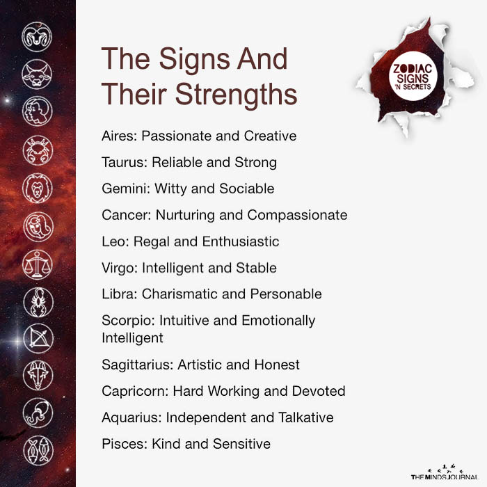
The Signs And Their Strengths

The Signs And Their Strengths

https://www.usatoday.com/story/life/2022/10/18/sagittarius-zodiac-sign-key-personality-traits-dates/8120501001/


After doing some sketching and ideating outside of class, we came together in class to discuss which idea we wanted to commit to and continue with. We narrowed it down to the zodiac idea and the Greek God idea and ultimately landed on the Greek God idea because we thought it was a better trio. Air is a fourth element of the zodiac signs so we thought “the big three” of the Greek Gods fit better with a three-person group. I was to do Hades, Isabel was to do Poseidon, and Kelly was to do Zeus. We had already decided generally which each piece would represent since the pieces themselves would be different depending on which God they represented. These are the sketches I made from our conversations. I used Procreate to make them:

I ended up switching the pawns and rooks after the sketch because I thought the imagery I had created would be better flipped. I also changed what the King would look like after testing the slip method with a column shape:


Pawns:

The underworld is associated with a lot of fire so that is why the pawns are flames.


Rooks:

Spirits are associated with Hades and do his bidding.

“Like other pieces, the rook captures an opposing piece by occupying its space. The ability to move any number of squares in a straight line makes the rook a formidable piece in a chess game, but that power often takes several turns to carefully develop from their starting position.”

https://www.masterclass.com/articles/what-is-a-rook-in-chess

Used this as a reference/inspiration for the face of the spirits sketch:

The Scream, 1893 by Edvard Munch

https://www.edvardmunch.org/the-scream.jsp


Bishops:

3 fates:

https://www.britannica.com/topic/Fate-Greek-and-Roman-mythology

Their names were Clotho (Spinner), Lachesis (Allotter), and Atropos (Inflexible). Clotho spun the “thread” of human fate, Lachesis dispensed it, and Atropos cut the thread (thus determining the individual’s moment of death).

We decided Hades is most associated with Atropos since the underworld is associated with the dead.

Atropos


Knights:

I combined Hades’ Cap of Invisibility, Bident, and Three-Headed Dogs to create a symbol that could represent his powers/weapons. The design was inspired by all three plus the helmet of Magneto from X-Men and devil horns since Hades is associated with death. I eventually in Illustrator combined the devil horns, dog ears, and bident prongs to inspire the look of the horns sticking out of the helmet.

Helmet:

https://en.wikipedia.org/wiki/Cap_of_invisibility

Bident:

https://en.wikipedia.org/wiki/Bident#:~:text=A%20bident%20is%20a%20two,the%20ruler%20of%20the%20underworld.

“Hades’ weapon was a two-pronged fork, which he used to shatter anything that was in his way or not to his liking, much like Poseidon did with his trident. His identifying possessions were the famed helmet, given to him by the Cyclopes, which made anyone who wore it, invisible and his dark chariot drawn by four coal-black steeds, always an impressive site.”

https://www.allaboutturkey.com/gods4.html#:~:text=Hades’%20weapon%20was%20a%20two,Poseidon%20did%20with%20his%20trident.

References:

File:Greek helmet-MGR Lyon-IMG 9724.jpg - Wikimedia Commons

https://commons.wikimedia.org/wiki/File:Greek_helmet-MGR_Lyon-IMG_9724.jpg

Can we please have one X-Men movie without Magneto in it? Just one. Isn't 7 enough? - Quora

https://www.quora.com/Can-we-please-have-one-X-Men-movie-without-Magneto-in-it-Just-one-Isnt-7-enough


King:

The right-hand man/woman to the Queen piece.

Persephone:

https://en.wikipedia.org/wiki/Persephone

AMI - Isis-Persephone.jpg

Since she is associated with nature, I created the bush sketch with flowers and bugs and the Greek column with vines and flowers growing on it.


Queen:

The most vital piece, so it had to be each God.

Hades:

https://en.wikipedia.org/wiki/Hades
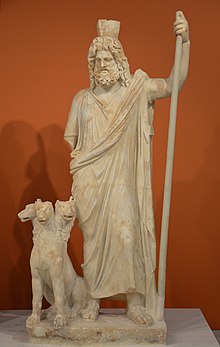
Heraklion Archaeological Museum

I used this reference to make the skull in my sketch:
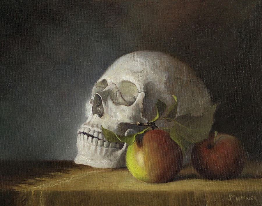
Still Life With Skull Painting by Joe Winkler - Fine Art America

https://fineartamerica.com/featured/still-life-with-skull-joe-winkler.html

I was inspired by the blue hair of Hades in the Disney movie Hercules for the blue flame on top of the skull in my sketch:
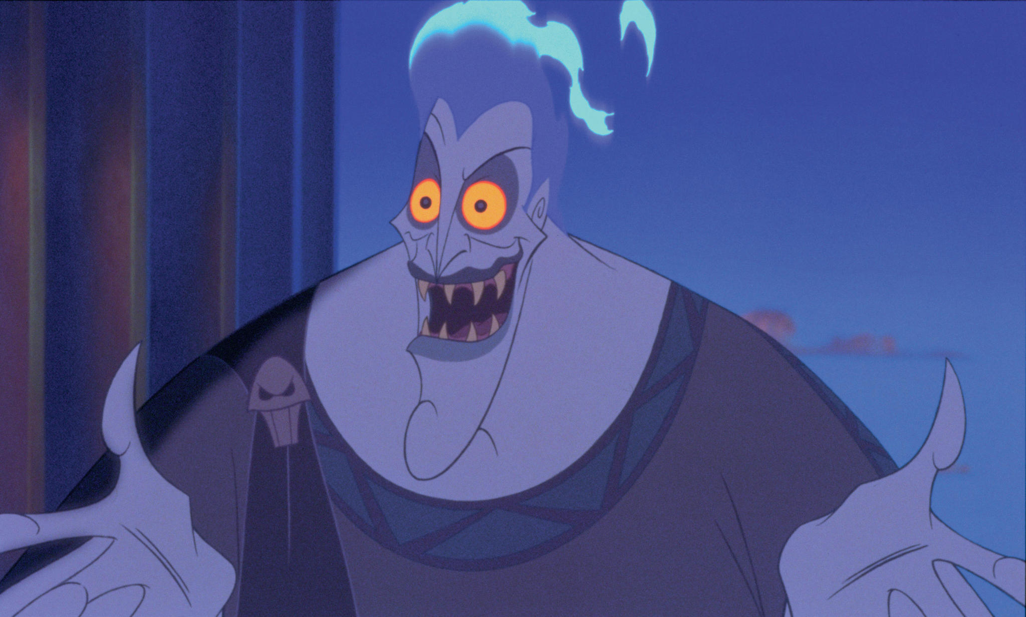
Hercules (1997) - IMDb

https://www.imdb.com/title/tt0119282/


Production:

I started by importing the images of the sketches I had created in Procreate into Adobe Illustrator. I used the pen tool to trace over them to create a file for cutting on the Cricut:

I then made a file for the bases of my pieces. What I originally cut out is toward the left and does not have any slits in the middle, but they turned out to be too small:


I had to size them up and recut them. I also added slits to experiment with that function:

After I successfully cut out my bases with the laser cutter, I cut out my pieces using different colors of cardstock and the Cricut. I had to do multiple recuts because things were too small or too big or they got chewed up in the Cricut. I used double-sided tape to add layers of cardstock to each piece. I also used pen and Posca paint markers for details on the pieces. I slipped them into their bases afterward:

Assembling the pieces:

Close up/detail images of the basic cuts and silhouettes of the pieces:

Final images:


Pawns:

Rooks:

Bishops:

Knights:

King:

Queen:

Image from critique:

Isabel’s pieces (pictures taken by Isabel):

Kelly’s pieces (pictures taken by Kelly):

Isabel’s post

Kelly’s post


Reflection:

I already had some experience with being in a group of three during the Carnival project, so I found it comfortable to work in a group that size again. We did a lot of the exercises and ideating with each other and then went off on our own ways to create our sets of pieces. It was an equal balance of individual work and teamwork. I did a good job of booking enough Cricut appointments for myself but probably could have been better at booking one or two more laser cutter appointments t experiment with the size of my bases more.

I really liked the theme we came up with and I learned a lot about Greek Mythology while doing research for each piece. I think we picked something that fit a group of three well and also fit the dual aspect of chess well. If I were to do this project again I think I would have experimented with more materials like cardboard, chipboard, etc.

SP23 Fnds: A3 Gifting Design Process

To view the portfolio post click here.

Intent:

Concept statement: My gift is the invisible connection that siblings have (specifically twins) visualized through a pattern of knots. The knots are made of macrame rope, and the colors represent the twins. These knot forms create keychains that the twins can hook onto their belongings so that they always have a piece of each other. The end of the keychain is held together with hot glue. The keychains have carabiner hooks that hook onto the lid of the container. When opened, the keychains hang from the lid, showing how they can be used. In the bottom half of the box, the quote “The best gift our parents gave us was each other”- unknown is seen on a piece of paper. This quote is the origin/starting point of the gift.

We did an exercise in class to help us encapsulate our ideas into a small number of words, which helped me create my concept statement:

Ideation:

We read “The Shape of Design Chapter 10 Gifts and Giving” by Frank Chimero and “The Gift” by Lewis Hyde. These are parts of the readings that resented with me:


While getting to know my mentor, Delaney, she was going through a lot in her personal and academic life, so it made it hard for her to meet in person often. We had a lot of conversations over text and she was very flexible when it came to my questions.

After our first time meeting in person, I sent her some questions to answer to help me start coming up with ideas for her gift:

Here are some of the conversations Delaney and I had over text:


I did some ideation based on the things Delaney told me about herself and about her and her brother. I also wrote down some things about myself and my brother to make connections:

Deb helped me do some more ideating with this chart:


Exercise 1 “Best Gifts”:

We shared in class what the best gift(s) we ever received were and what made them so good. I noticed that all of the best gifts that I had received had a personal touch to them and were thought out and planned.


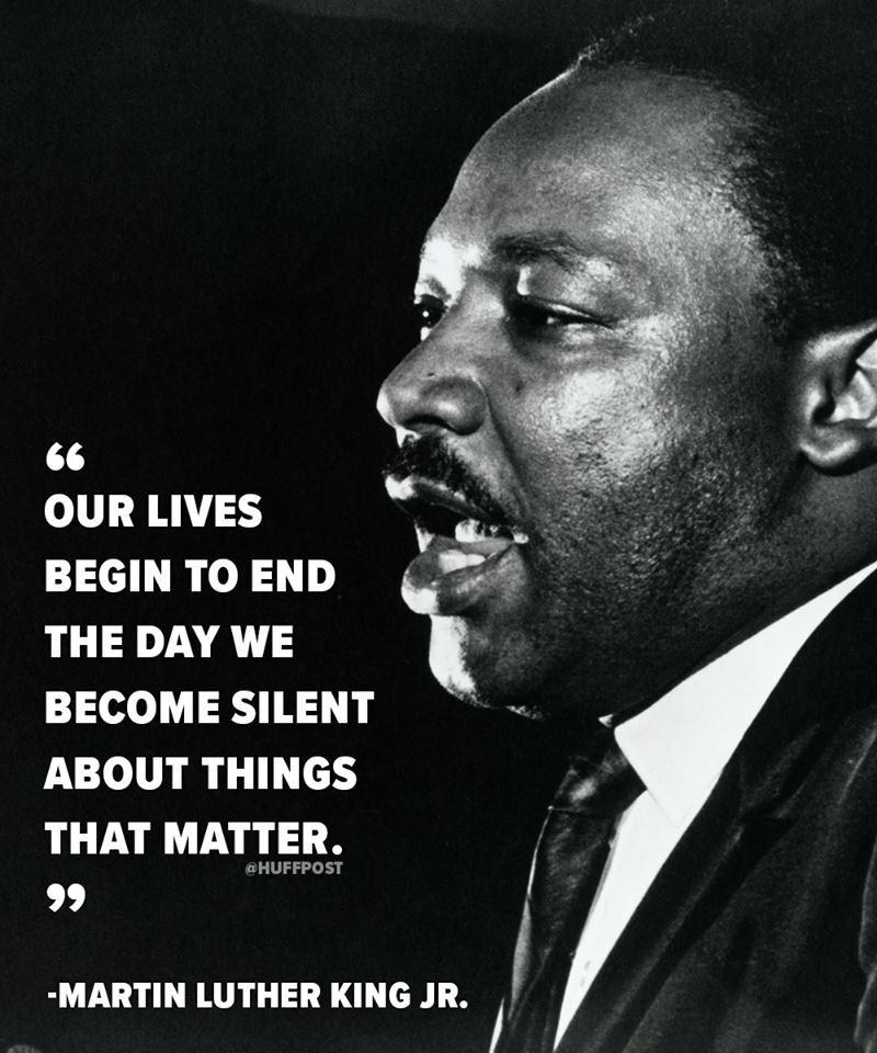
In class, we searched for quotes to start brainstorming off of. I have a lot of favorite quotes from MLK, so I included those in my search:

Did MLK Say 'Our Lives Begin to End the Day We Become Silent'? | Snopes.com

https://www.snopes.com/fact-check/mlk-our-lives-begin-to-end/

I used this quote in a painting I made in high school during the Summer of 2020. It was after George Floyd was murdered and there were a lot of Black Lives Matter protests. Being a part of the Black community, my outlet to express myself during this hard time was art/design:

(I did not create any of the slogans used in this piece they were gathered through my viewing of the news and social media during this time. I saw them at protests as well. The circle with a fist symbol is also not mine and I do not take credit for it.)

Black Lives Matter. Black and white illustration depicting BLM Fist in Circle. EPS Vector Stock Vector | Adobe Stock

xileodesigns: https://stock.adobe.com/images/black-lives-matter-black-and-white-illustration-depicting-blm-fist-in-circle-eps-vector/357729227

Another MLK quote:

21 Empowering Quotes on Faith To Help You Keep Moving Forward

21 Empowering Quotes on Faith To Help You Keep Moving Forward

Then I found a quote about design:

51 Inspirational Quotes on Design and Creativity | Real Thread

https://www.realthread.com/blog/51-design-and-creativity-quotes-guaranteed-to-inspire

I then focused on finding quotes surrounding my topic of sibling relationships and gifting and found this quote that I thought was a perfect place to start for creating ideas for my gift:

20 Amazing Quotes About Siblings to Share on National Siblings Day

https://pureessencegreetings.co.uk/blogs/pure-essence-greetings/20-amazing-quotes-about-siblings-to-share-on-national-siblings-day


Exercise 2:

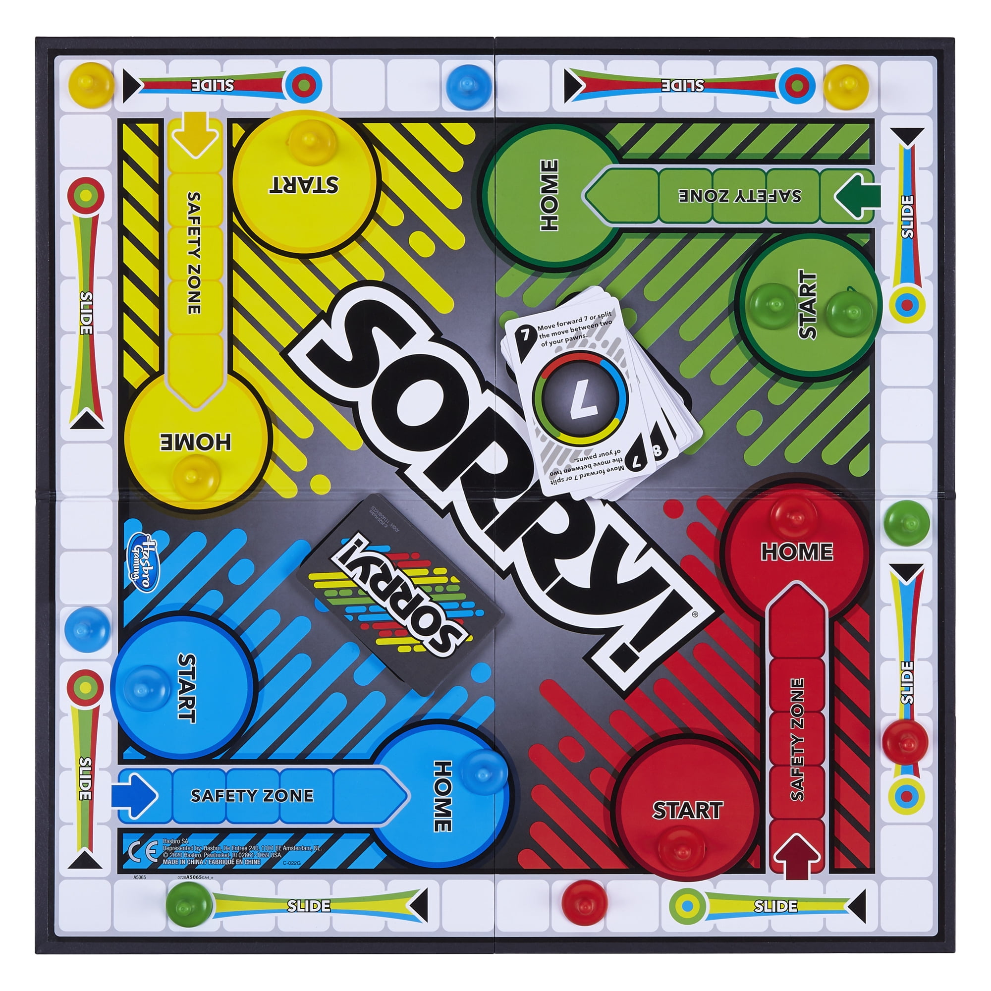
We were tasked with finding an object in the building that we had to “gift” to an audience. I found a Sorry! board game in the workroom and decided to use one of the small pieces as my gift. We had to create a container for this gift in just one class period. This exercise included a small competition where we had a couple of categories that we would then pick which student’s container and gift combination best fit each category.

After finding my gift, I looked into its history and use. I have played “Sorry!” many times so I understood the rules of the game and how the piece I chose is used, but I also just wanted to look into the base information and history of the game to better understand my gift:

https://en.wikipedia.org/wiki/Sorry!_(game)


I decided to use drawing paper because I had a lot of it and I was used to working with it. I wanted to experiment with different types of containers, and I found this tutorial that showed you how to make a small bag out of paper:

Mini Cardboard Bag for Presents – DIY

This ended up becoming just a prototype/experiment because I didn’t think it went well with my gift:

Since the gift was part of a board game, I wanted to make a miniature version of a board game box. I used this tutorial to create my container:

Used A4 paper: 8.3×11.7 inches: https://www.brother.co.uk/support/answers/is-a3-bigger-than-a4


I used these images to make a cover image for the box:

Sorry Logo PNG Transparent & SVG Vector - Freebie Supply

https://freebiesupply.com/logos/sorry-logo/

Sorry! Kids Board Game, Family Board Games for Kids and Adults, 2 to 4 Players - Walmart.com

https://www.walmart.com/ip/Sorry-Kids-Board-Game-Family-Board-Games-for-Kids-and-Adults-2-to-4-Players/298923226


I wanted to play into the funny aspect of gift-giving. Siblings often prank each other, and when I was younger my brother and I would play board games including “Sorry!”. The narrative I created behind this gift was that a sibling stole a piece of the board game to be funny and then felt bad so they gifted it back to their sibling, but when they open the box they are met with yet another joke/prank and they have to flip over the lid to find the gift. I played off of the fact that there is an adult version of “Sorry!” called “Sorry! Not Sorry!”.

https://en.wikipedia.org/wiki/Sorry!_(game)

My design won the “funniest” category which showed that my intentions came through in my design! The success of the prototype got me really excited for the making process for my final gift and container design.


After the class exercise I started to do some research on different containers and techniques I could use for my gift:

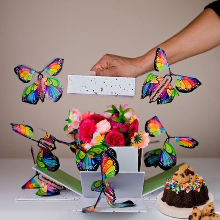
I remembered seeing boxes that had paper butterflies fly out of them when someone opened the box. I was exploring how the container could be connected or a part of the actual gift:

32 best birthday boxes for your loved ones in 2023 - TODAY

https://www.today.com/shop/31-birthday-delivery-gifts-can-be-sent-their-doorstep-t178422


Delaney mentioned multiple times that she and her twin brother Tasker have a really close relationship and bond. I also have a brother but he is 2 and a half years younger than I am, but we also have a very tight bond. I wanted to gift Delaney something that encompassed the sibling bond/relationship. I started thinking about what visuals/imagery could represent that bond and I landed on knots. Different siblings have different relationships just like how there are different kinds of knots. Knots come together at one point but have ends that go off in different directions. This is similar to how siblings, especially twins, have a connection but are also their own person and travel on different paths.

I did some research about siblings to get more information for my concept:

What is a sibling?:

“one of two or more things related by a common tie or characteristic”

https://www.merriam-webster.com/dictionary/sibling


I played around and sketched out possible symbols and designs I could use to represent Delaney and Tasker. I also brainstormed some possible container designs:

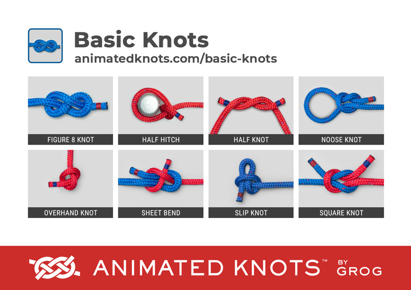
I started researching different types of knots to see what kind of knotted form would best support my ideas:

Basic Knots | Learn How to Tie Basic Knots using Step-by ...

Basic Knots

I was thinking about things that are made out of knots and thought of macrame. I visited South Carolina last year and met a man who made decorative macrame forms but also hammocks and hanging chairs. He had been working this job for decades and was just getting ready to retire, but he had so many stories to tell about himself and others. He made everything by hand and made connections with all of his customers. He was so interesting to talk to and he even taught me how to make a small hanging macrame piece that I got to take home:

The weaving and knotting of rope and yarn can have so much meaning, especially when handcrafted. I wanted to incorporate this idea into my gift. I used this concept to do some ideating and to do some prototyping/practice with materials I looked up how to macrame:

A left facing square knot

https://www.thesprucecrafts.com/basic-macrame-knots-4176636

I looked into the history of macrame and found this quote that inspired more ideas:

“Materials used in macramé include cords made of cotton twine, linen, hemp, jute, leather or yarn.  Jewelry is often made with a combination of knots and using various beads (glass, stone or wood), pendants or shells. Sometimes focal points are used for necklaces such as rings or gemstones, either wire-wrapped to allow for securing or captured in a net-like array of intertwining overhand knots.”

A Brief History of the Art of Macrame’

I did sketches of both keychain ideas and a hanging macrame idea:

I met with Deb one on one to do some more brainstorming and to decide on what materials I would use. She gave me a book that had a bunch of knot tutorials that I could use to help me learn how to tie different kinds of knots.

I went home for a weekend a bought materials to start making prototypes. I started by exploring and practicing with the different types of knots from the book:


I also experimented with regular braiding:

I had decided on making keychains, one for Delaney and one for Tasker. Delaney had told me that her favorite colors were blue and purple and Tasker’s was green. I picked out macrame cords in these colors.


When thinking about what to create to contain/hold the keychains I focused on the concept of hooks or things being held together.

I experimented with a tube-like form that could be closed by clipping and unclipping a carabiner, and the keychains would clip on a loop inside the tube:

I also experimented with the keychains being wrapped together with the same macrame cord that they were made of:

I ultimately landed on the idea of a box covered in macrame cords. I decided to repurpose the box I used for our exercise and make it into something new:


Production:

These are the variations I made of this pattern, I decided on using the two images on the right as a base for the keychains:

I decided on this pattern because I thought the weaving of the blue cord through the purple and then the green cords were representations of the twin bond Delaney and Tasker have. They are their own people (individual colors) but are connected in many ways (blue cord in both keychains). I wanted the gift to be something they can take wherever they go so they always have a part of each other with them. They go to different colleges so I know they are apart for most of the year. Also, the idea of keychains being attached to things is similar to how the two siblings are “attached” to each other for life.

Since I had already practiced making this pattern multiple times, I moved right into making the final keychains:

I was having trouble coming up with a way to secure the ends of the keychains so that they didn’t unravel. Deb suggested and demonstrated this method:

How to Make a Paintbrush: 8 Steps (with Pictures) - wikiHow

https://www.wikihow.com/Make-a-Paintbrush

I tried a variation of this method where I created a knot to create a loop, but it did not hold and started to loosen/unravel:

I experimented with other ways to create a secure end for the keychains. I remembered how hanging macrame designs and started and secured and I also tried an aglet method with tape:

I was planning on using a hot glue gun in the process of making my container, so I experimented with capping off the end of the cord with hot glue. The test was successful so I moved on to using the method on my final keychains:


I cut two holes in the lid of the box to allow for the clips of the keychains to hook onto the lid. I then started gluing the macrame cords onto and inside the box. I took off the “Sorry!” label that was on the top of the lid before cutting the holes in it. I covered up all of the imagery from the exercise:

Fully covered, the box looked like this. I tested out the mechanism I had created in my head with one of the keychains:

Then I put it all together. The lid mechanism showed off the function of the keychains perfectly. When Delaney opens them they will dangle from the lid and are able to be unclipped for use:

I also added the quote to the bottom of the box  (this is a shortened version of the original quote so that it would fit on the piece of paper):

Gifting it to Delaney:


Reflection:

Delaney and I not being able to meet in person often made it difficult to ideate and to make a connection with her, but I think the work I did to create questions for her to answer over text really helped me in the ideation process. I wanted the gift to be connected to each of us in some way and I wanted to gift her an idea or concept more than something she needed or wanted because she never mentioned anything of that sort. A good, strong, and healthy sibling relationship doesn’t just happen out of thin air. Not all siblings have a close relationship with each other. My relationship with my brother is very important to me and I really take the quote I chose to heart. The best gift I have ever been given was him. Delaney was a great mentor and was always willing to answer my questions, I enjoyed getting to know her and hope to keep in touch throughout college.

I had a lot of frustrations during this project, more with myself than anything. I got stuck a lot and found it hard to come up with solutions quickly. Also, the amount of freedom we got with making this project was overwhelming. I got to make anything I wanted within the confines of the project restrictions, and I had a hard time creating solid ideas. Also working with a material that would fray and unwind when touched too often made it hard to go back and change things. I would definitely pick a different time of cord/yarn if I were to do this project again.

I learned that a gift doesn’t have to be something someone wants or needs and it doesn’t have to focus solely on the physical object. Gifts can be messages behind an object or an idea/concept.

SP23 Fnds: A2 Carnival Body Augmentation Process

To view the portfolio post click here.

Intent:

Concept Statement:

A pair of glasses that have a pair of butterfly wings attached to them. There are panoramic images of a carnival inside the glasses. The glasses and wings are covered with sheets of iridescent material.  A video is played, which is accompanied by a demonstration of the product. One of the presenters is experiencing the product while a video is being presented. The product is being shown on the presenter. The video shows the things that a participant can experience while using the product. While the video is playing, the other two presenters are creating the 4D effects of the product. This shows that this technology may seem like it is fixing a problem, but it is actually just distracting its participants from the real world. After the demonstration is over, an advertisement for an alternative reality technology headset is seen in video format. The video shows off the product and a voiceover explains what the product is and how it is used. The video also introduced our brand and mission statement. The video contains a backtrack of eerie music and a compilation of footage that eventually starts to glitch, revealing reality. This video is a sales pitch for our product. We are attacking the idea of how our escapes and distractions from reality actually continually harm our reality. We cannot keep running from our problems and we can’t hide from them in our human-made technology.


Ideation:

In class we had discussions and Deb presented us with lots of different material and inspiration to get our ideas started on the project. We talked about the Bauhaus and how movement and physical things can go together with music and other design aspects. For this project, we were paired with people in the class. I was in the only group of three in the class, which consisted of me, Phil Biondo, and Vivian Phan.

Since we were tasked with incorporating a carnival theme into our body augmentation, we as a class did a lot of individual research on the history of the carnival and how it is similar and different from things like the circus. After doing our own research we created mind maps that we then uploaded into Miro to start our brainstorming process. While in a brainstorming session/discussion, Phil put our three first initials together, which spell out POV, and that’s where the basis for our ideas came from. We wanted to use “point of view” as the base concept for our project. We used Miro to combine our ideas and research and to start working on coming up with concepts.


I did a lot of sketching while we were in the early stages of brainstorming. Carnivals remind me of fun summer nights when I was younger, so I really allowed myself to be silly and creative with the ideas I was coming up with:


As we were brainstorming Deb introduced us to the AI program Dall-E. I played around a lot with how the words you put into the generator affected the images in the outcome. These images became a big inspiration for our final project because we wanted to focus on a dystopian future and we think AI is going to be a huge part of our world’s future. One thing that intrigued me about the AI-generated images was that they looked like things that were familiar in our reality but looked distorted or altered. An example of this was how the generator would never spell carnival correctly in the images. We took this idea of distortion and applied it to our final concept/idea. Dystopian worlds are often distorted or reality-bending. In the movies or other stories that have been made about dystopian worlds, the government or big companies like to distort people’s perspectives or ways of thinking to distract from the bigger problems in reality.

https://openai.com/research/dall-e


To help us with modeling and creating things quickly, Deb has us do an exercise where we were given a random “where”, “Carnival thing”, and “theme” and we had to create a physical body augmentation/performance that fit these three things. Our where was “ears”, our “thing” was ring toss, and our “theme” was lost. We had to make something within two hours that we could show off to the class. Phil came up with the idea of a “lost rabbit” and from there we decided to create physical rabbit ears that a person would put on their head, over their own ears. We then incorporated the ring toss aspect into the exercise by creating carrot shaped/looking ring that the participant would try to throw onto the rabbit ears. The lost aspect was part of our performative part. The rabbit was lost so it would hop around in different directions while the participant tried to toss the ring over the ears. We made these things out of random materials we had, found around the classroom, or that Deb provided us with from her office and other places in the building. The big thing that I learned was that we as a class are fully capable of modeling and making things quickly from ideas. Everyone in the class had a unique and working product to show at the end of the two hours. It was a very fun and creative process that loosened us up and allowed us to move through the rest of the project with fresh eyes.


                                                 Taken by Vivian                                                                   Taken by Vivian


With the momentum that we had from our exercise and the discussions we had with Deb, we started to move into the final decision-making process of this project. We decided on creating videos to accompany our physical body augmentation. The physical aspect would be a head/face augmentation that was inspired by VR goggles. Taking inspiration from Ready Player One, and present-day VR equipment, while coming up with our final idea, we integrated a carnival theme into our ideas. The goggles would be futuristic looking but would incorporate face paint-inspired designs.


Production:

To create our project, we decided to divvy up the work. We wanted to play to each other’s strengths when dividing up the work. Phil had a background in editing and when we decided we wanted to add a video component to our performance aspect, he volunteered to do that part. Vivian crafts really well and wanted to take charge of the body augmentation (glasses) part. I wanted to focus a little bit on logo creation and typography, so I worked on creating a logo animation for POV. I also have a strength in writing, so I created the concept statement and also helped Vivian with the general glasses design and modeling. I discussed a lot of the video components, such as the glitch, with Phil. I also gathered the props/materials needed for our performance aspect.


Vivian worked on designing and crafting the physical body augmentation portion of our project. I helped her with modeling and prototypes in class and helped solve problems with the physical design when they arose. Vivian wanted to put face paint-inspired butterfly wings on the front of the glasses so I made a small prototype of what it would look like to have a design on the front of the glasses.


I had a one-on-one discussion with Deb about this project, but also about what I am working towards as a designer. I also expressed that I had a big interest in typography and that I wanted to learn more about it and incorporate more into my designs and projects. She gave me a very helpful reminder that I can start exploring the aspects of design that I am really passionate about within the projects we are doing this term. Our conversation inspired me to do some experimenting with logo design and animation. I used Procreate to play around with a potential logo animation for our group.

I also used this video to refresh my memory on how to use Procreates animation function:

I experimented with color and orientation when creating the animated GIF:


I think it is just as important to have a good visual/physical design as it is to have words/text to back it up. I do a lot of writing outside of my design classes for personal and academic use so I want to focus on the concept statement for this project. I also focused on logo design/typography. We did not end up using this aspect in our final product, but it was a large step in our process. It played to our idea of our performance being a company selling a product to an audience. All companies have a logo so it was an important aspect of our behind-the-scenes work.


Vivian was creating the glasses with Bristol at first, but we felt like it didn’t look clean and that it still looked like a prototype. We consulted Deb to see what else we could use to make our glasses, and she recommended acrylic. The clear acrylic would make the glasses look like actual glasses, and with the file that Vivian already had made with the design, it would make them look futuristic. Deb took Vivian over to the laser cutter and what they brought back was a very elevated version of the Bristol design. They cut the glasses out of acrylic and then bent them with heat to create the round form of the glasses. We were all very excited about this design and felt a lot more confident in what our final product would be.


We included our “POV” idea into the side of the glasses.


This is some of Vivian’s work and inspiration. For a more in-depth look at her personal process, visit her process post here.

https://www.pinterest.com/pin/637470522275619297/feedback/?invite_code=f7992abfa9ae4b9c802552c9b54a2146&sender_id=637470659663932736

https://www.pinterest.com/pin/637470522275580637/feedback/?invite_code=e796c49195b342c39f9839fcec1cf446&sender_id=637470659663932736


After creating the glasses we started to add cosmetics to them. To incorporate the butterfly face paint-inspired wings into the glasses Vivian used the laser cutter to cut out the wings and then I helped her put holographic tissue/gifting paper (that we received from Deb) behind them to make them look like a hologram. The wings are a component of using the glasses. Since the user is at a carnival, face paint is shown on the outside of the glasses.

We also added this material to the inside of the glasses. We used double-sided tape to adhere everything together.

To add more elements of a carnival we put two panoramic carnival photos inside the glasses. One image faced outwards toward the audience and one faced inwards toward the user/participant. This blinded the user so that they were not aware of their reality.

Vivian used this source for the images in the glasses:

http://bigeyeinthesky.com/NewPan/MNStateFair/StateFair2006-1.html


After finishing our glasses, we had Phil model them to see how they would function on an actual person:


We needed to include videos of our glasses in the advertisement video Phil was making, so we worked together to get videos of the glasses. Phil used his phone to film while Vivian held the light and I sprinkled glitter over the glasses, which were sitting on a wood plank on a rolling chair that we could spin. We also put a backdrop behind the glasses to block out what was behind us while we were filming. We also filmed the glasses “floating”. Phil tied three pieces of fishing line to the glasses and I held them up and let the glasses hang from them while Vivian showed the light on them and Phil filmed.


Before Phil started working on the video we talk about how we wanted it to feel like an advertisement or a product presentation. I thought about the conventions where companies like Apple would present their newest product. We wanted our performative aspect/presentation to have that same type of feel. We also wanted our product demonstration portion to feel like we were actually selling a product to an audience, so we added a 4D experience part to the performance. We wanted the participant to be experiencing the 4D aspects, but for the reality of the experience to not be so glamorous. I gathered some materials such as cotton balls that we would use as cotton candy, and a spray bottle that would be used for a splash/spray effect. We ended up only using the spray bottle. We tested out the cotton balls along with some old fabric to create fake cotton candy, but it didn’t give the effect we wanted it to, so we decided to just use the fabric and to use drawing paper to make a small thin stick/cone.

Ella-Scott McLaughlin (a classmate) gave us the black cone that was from the previous project.

We revised the cotton candy design using a different cone structure and strictly the fluffy blue material:


At the end of our production stage, we worked on documenting our product:

Details of Glasses (Filmed by Vivian):


Phil ended up making two videos, one for our product demonstration and one for an advertisement.

For the demonstration we used our fake cotton candy to simulate concessions at a carnival, we use the spray bottle to simulate games, and we used a wheely chair and the back of a Bristol pad to simulate rides, specifically the scrambler.

POV Tech Demo (Made by Phil, partially filmed by my phone):


POV Commercial (Made by Phil, videos of glasses included created by all 3 of us):

Phil compiled this list of the sources he used for the videos:

Soundtrack:

Footage:

Natural Disaster:

Ai Voice Over:
https://beta.elevenlabs.io/


For more about Phil’s process, visit his process post here.


Reflection:

Before starting this project I had not met Phil and Vivian. I really enjoyed the brainstorming process with Phil and Vivian. It was a nice bonus to have an extra person since we were a group of three. It allowed for a lot of bouncing off of ideas and when problems arose we had multiple brains to tackle them. Having three people also presented challenges, such as multiple clashing ideas and incorporating all three of us into the performance aspect of the project. We also had to divide the work in three ways, which had positive effects and negative ones. There were more hands to work but that meant that there needed to be work for everyone to do. We ended up helping each other out and everyone’s part of the project overlapped with others.

One thing I learned from working in a group was that when I am working on a solo project, I should show my work to others more often and earlier in the creation process. I would get feedback earlier and I think it would strengthen my designs. It’s very easy to have a quick conversation with someone about ideas and concepts. I am often a put my head down and work kind of person but I learned from this project that I need to lift my head up every once in a while and talk to others. Hearing other people’s ideas and discussing my own are all ways to spark inspiration and new ideas.

This project was definitely challenging. I struggle with coming up with ideas that would translate well to the physical world and I also initially struggled with the carnival aspect. The exercise we did in class really helped me work through a lot of the struggles I was having, but there were still bumps along the way. It often felt like we were making enough of a body augmentation and that our idea was not realistic enough. We had a lot of discussions where we were discussing concepts and ideas and it felt like what we wanted to create was not going to translate to the physical world. The biggest takeaway I have from this project is that the product of the design process may be small but the ideas and concepts surrounding it or not. The physical object does not have to hold all of the weight. I think that the addition of the video aspect elevated our design even if it was not a part of the physical design.

SP23 Vis: A2 Dynamic Page Process

To view the portfolio post click here.

Intent:

Concept Statement:

A Michael Jackson-themed diptych. On the left side is a representation of 16 seconds of “Billie Jean” through shapes and lines that can be pulled towards the left. On the right side are 2 legs with a mechanism that moves the legs into Jackson’s famous tippy toe pose to reveal “Hee Hee” to represent Jackson’s signature sound bite. In the video portion, the legs move up and down while the music plays and the left side moves to reveal shapes. The shapes are representational of the different aspects of the piece of music. The overall design is inspired by the MJ Productions logo.

Ideation:

For a mini exercise, we played around with paper mechanisms. We used this website to choose an example to create. (I chose #9)

http://cutfoldtemplates.com/index.html#09

It was kind of difficult to make this mechanism work without any written instructions, but I tried to create it using the video reference:


We also did an exercise where we had to take a couple of seconds of an instrumental song and turn it into shapes. I used the 15 seconds of “To Build A Home” by The Cinematic Orchestra and Patrick Watson:

As a class, we went on a field trip to Thompson Library to look at one of the universities special collections. We looked at a bunch of different books that had been acquired by the university or made by past students. It was a fun activity and we got to see many nonconventional books:


Before starting our final project, we did an exercise with our partners where we made a paper mechanism in a card that encompassed a surprise element (pictures taken by Deni):

While brainstorming and discussing different types of music, Deni and I discovered that we both have a shared love for Michael Jackson and his music. We decided to use his song “Billie Jean” because it had a large instrumental part. We used this video for inspiration:

Deni found the logo for MJ Productions and that was the starting part of our idea-making for the project. We wanted to use Jackson’s movements from the video and combine it with his logo.

Mjj Productions Logo PNG & Vector (EPS) Free Download

https://logosave.com/mjj-productions/


These are some of the sketches I did while brainstorming:


Production:

Deni and I split up the work so we could be efficient with our time. I focused on the right side of the diptych and she focused on the left.

I started by taking my sketches and putting them into Illustrator so that I could create a file for the Cricut.

The font I used was “Berlin Sans FB Demi Bold”.


I used the Cricut to cut out the pieces we needed for our paper mechanism:

And they came out like this:

Deni prepared the background for each side of the diptych. We used this iridescent sticker paper that Deni had to give the socks a shimmer:


We looked at this to get inspiration for how to make our forms move:

After cutting out the pieces we need to assemble the right side of the diptych, we needed a way to attach the pieces in a way that they could move. I first tried to use string, but the legs would not move the way we needed them to:

We consulted Taylor to help us out and he showed us this way:


I took his suggestion and created a version for our pieces:

I created attachments for the back of the legs:

We adhered the top of the legs to the page to keep them in place:

While I was working on the right side of the dyptych, deni worked on the left side, where she created a movement of shapes that represented the music we chose:

For more information on Deni’s process, look at her process post here.

This is the video we used for our music:

For our reveal, I adhered the words to the background and underneath the shoes:


When put side by side, our piece looked like this:

Taken by Deni


Deni took a video of the page being pulled out from behind the right side of the diptych:

I then took this video and used Wondershare Filmora to edit images into the video that would be on beat with the music:


I could not save this video without having a watermark on it, so Taylor offered to edit them together for us to make it cleaner and without a watermark:

Reflection:

This project was very fun and I felt very creative while creating it. Deni and I got along really well. I think we have a similar way of thinking and similar work ethics. Since our schedules were complete opposites and we never had time to meet up with each other outside of class, we had to make a lot of compromises while in class and had to communicate well. Even though we were doing a lot of work on our own when we had time outside of class, our final project still came together very nicely. My experience with a partner in this class was different from Fundamentals because I was in a group of three for that project. There isn’t anything necessarily negative or positive about having one more person, it was just a different experience. Deni and I had to do more work individually compared to how the work was split up in the group of three. Overall I enjoyed working with Deni and putting our shared love of Michael Jackson into a design project. It was fun to play around with how music influences visuals in design.

SP23 Vis: A1 Sketchbook Process

To view the portfolio post click here.

Intent: The sketchbook needs to be functional for me for the rest of the semester. It should be unique and cater to my style and needs. I want to become more comfortable with using the laser cutter since we will be using it for this project. It needs to be durable, especially the covers because I am pretty rough with my sketchbooks. We are encouraged to recycle materials so I want to incorporate recycled materials into my sketchbook.

Concept Statement:

A sketchbook with covers made out of a cereal box has different types of paper and is held together by a spiral binding. The inside of the covers is covered in stickers and decorative paper. There are different colored cardstock, drawing paper, and graph paper inside of the sketchbook. There is a braided place marker attached to the top of the spiral binding and laser-cut pieces taped to the front cover. The recycled covers allow for it to be used roughly since it isn’t made out of expensive or fragile materials. The design is simple but functional for me.


Ideation:

We had discussions in class about the importance of sketching, specifically in the three disciplines but also in other aspects of life. Sketching can be used in all professions and it can help improve engagement and memory in academic settings. I personally doodle and sketch a lot, even when I’m not in design or art classes.

Exercise 1: Mini sketchbook/zine

I had a lot of fun just playing around with this mini sketchbook. I’ve always loved doodling and using lots of colors to play around in my sketchbooks, so I wanted to bring those elements into my exercise. I also love to talk about things that I really like, so choosing the favorites prompt was a no-brainer. This was a great way to get back into a creative mindset after taking a break during winter break.


Taylor gave us a reading, some PowerPoints, and a video to look at to help us start on this project. They talked about doodling and sketching and the different forms of sketchbooks.

I then went out to the internet to find some more information about different kinds of sketchbooks:

https://cowans.org/blogs/cowans-art-knowledge-know-how/how-to-choose-a-sketchbook

This just gave me some more ideas and helped me start coming up with my own ideas for my sketchbook.

I thought about my current sketchbook and what I like about it to start brainstorming ideas for a handmade sketchbook. I prefer a smaller sketchbook to a big one because the large blank sheets of paper scare me and make it hard for me to start brainstorming. The small size feels more personal and intimate. I also always decorate the front cover in some way to represent and express myself. I started brainstorming in my sketchbooks and started coming up with ideas for my sketchbook. I thought about what could possibly be a part of the sketchbook and planned out what kind of paper I could use for the pages:

I decided on 8.5 in(H) by 6.5 in(W) for the size of my sketchbook. This size was a little bit bigger than the sketchbook I was currently using.


We had to use the laser cutter in some way for the project, so I decided to create a design that was kind of like a personal logo. Before going to illustrator, I sketched out designs in my sketchbook. I also needed to include the course and term on the cover. I created multiple iterations in my sketchbook using my name:

I collected materials from multiple different places. Since we were encouraged to use recycled materials I cut up boxes I had in my recycling and then asked my grandma for some scrap fabric that I could experiment with. She does a lot of quilting and sewing so she has an overflowing amount of fabric scraps that she reuses for different projects. I have a lot of materials at my house and when I visited home for a weekend I went through all of my art supplies to find things that might be useful for this project.


Production:

I found a journaling kit that I had bought from Amazon that I thought could decorate my sketchbook. It included stickers and decorative paper:

Amazon link: https://a.co/d/aKsAaQC


In my recycling bin in my dorm, I had a Honey Bunches of Oats cereal box and it was thick enough that I thought it would work well for the front and back covers of my sketchbook. To cover up the imagery on the box, I covered the pieces in stickers and paper from the journaling kit. I used double-sided tape to adhere the decorative paper to the cardboard box parts:

I actually really enjoyed this process. I have always loved collating because you have to work with what you have to create a design. I was really happy with my design:


I decided to include 20 pages of drawing paper, a rainbow of cardstock (1 page per color), and 10 pages of graph paper. I already had a pack of cardstock from the card project we did last semester, so I used pages from that in the sketchbook. I used the paper cutter and hole puncher in the student workroom to cut my pages to the right size and punch holes on the side of the pages.


I also included one piece of black cardstock and put pictures on them. They are pictures of family and friends and then a picture of the castle at Disneyworld that I took because my major career goal is to work at Disney someday. It is a reminder of my goals:


I then took my spiral cord that we were provided and put the cord through the holes, binding the pages and covers together:

I bought rainbow string to give the sketchbook a pop of color and I braided the string into a braid so it could be used as both decoration and as a placeholder in the sketchbook. At this point in my process, I was also exploring whether or not a pen/pencil holder should be included in my design:


I started working on my laser cutter file because we had to include the use of the laser cutter somehow in this project. I wanted to put something on the front cover, so I started working on designs in Illustrator. I used the “Freestyle Script” font for the circular logo and the “Buckeye Serif Black Regular” font for the course and term.

I cut out these designs onto red cardstock. Anastasia Allison, Sophie Chu, Isabel Nixon, and I all shared a pack of colored cardstock.

This is what they looked like after being cut out. I used double-sided tape to adhere the two pieces to the cover of my sketchbook. I wanted to keep it simple and minimalistic because I know I am rough with my sketchbooks and I didn’t want things to be falling off of the cover:


Detail images:


Reflection:

I had a lot of fun with this project. I enjoyed crafting the actual sketchbook as well as the visual designs. I also really enjoyed seeing what everyone else was making. Everyone’s sketchbook was unique and personal and I think that’s what made this project so special. I think that if I did this project again I would do a little more with the outside of my front cover without making it too fragile. I also struggled with trying to find time to use the laser cutter, but Deb and Taylor were very helpful in giving us more hours and Deb came in on the weekends to help us get our cutting done. They also provided us with other locations on campus that had laser cutters. I am much more comfortable with using the laser cutter, but I would still like/need more experience with it before I felt comfortable using it truly on my own. Overall, I am really happy with how my final sketchbook came out. It feels personal and that was my goal. I am planning on using it throughout the rest of the semester and participating in the advancement part of the assignment.

SP23 Fnds: A1 Layers Process

To view the portfolio post click here.

Intent:  I wanted my design to have some sort of personal connection. I wanted to have experienced at least part of what I was portrayed in my composition in order to depict it more accurately for my viewers.

Something we focused on during this project was the idea of concepts and concept statements. We did an exercise in class where we were timed and had to write concept statements that got shorter and shorter.

I thought this would be appropriate to include in my intent section since it is an overview of my ideas.

Concept statement:

Looking through the frame of the shadow box, a snorkel scene created through layers of paper portrays deep and murky space. The contour edges are clean cuts to not distract from the main elements of the composition. Through a pair of snorkeling goggles, the deep ocean can be seen. The water is too deep and murky to see what is below, giving a sense of deep space. The hidden element revealed by a light source is a sea turtle. This reveal comes as a surprise because it cannot be fully seen without the light. The warm light is used to portray the warmth of the Sun on a summer day at the beach.

This final revised version came out of multiple conversations with Deb and her revisions really helped me understand the necessities and structure of a concept statement:

Ideation:

For this project, we were introduced to the laser cutter. We were taught how to use it safely and then got to use it to create our exercise. While learning how to use it, I took notes so I could have a “cheat sheet” when I was using it on my own. It also helped me commit the information to memory:

In addition to the laser cutter notes, I refreshed what I knew about the Cricut process as well.


Exercise:

For our exercise, we were tasked with creating a design using the negative space in our initial(s). I started by brainstorming in my sketchbook and flushed out different ideas that I had:

We were allowed to use already-made fonts, but I originally made my own and when we did an informal critique I got positive feedback on my original font.

I borrowed this font and symbol to help come up with ideas and explore in both my sketchbook and in Illustrator:

Vector illustration of the iconic protester raised fist isolated on white background - graphic style silhouette

https://stock.adobe.com/be_en/search/images?k=black%20power%20fist

RETRO FONT SVG Vintage Letters Svg Retro Clipart Retro image 1

https://www.etsy.com/listing/1240078660/retro-font-svg-vintage-letters-svg-retro?gpla=1&gao=1&&utm_source=google&utm_medium=cpc&utm_campaign=shopping_us_c-craft_supplies_and_tools-canvas_and_surfaces-stencils_templates_and_transfers-clip_art&utm_custom1=_k_CjwKCAiA2fmdBhBpEiwA4CcHzQnggJZdpc9Y5zuWN6-N1Rn00mLdO3cVt4Nax3F43pYDRQxUo0cYdhoCHtwQAvD_BwE_k_&utm_content=go_12573354959_118375455286_507851841262_pla-295943621186_c__1240078660_556192062&utm_custom2=12573354959&gclid=CjwKCAiA2fmdBhBpEiwA4CcHzQnggJZdpc9Y5zuWN6-N1Rn00mLdO3cVt4Nax3F43pYDRQxUo0cYdhoCHtwQAvD_BwE


I really liked the soccer ball idea and after doing my own sketches in my sketchbook, I went online to look at some clip art soccer balls because that’s the kind of feel I wanted to go for when creating my file in Illustrator:

https://www.ebay.com/itm/333675460436?chn=ps&var=542766342411&norover=1&mkevt=1&mkrid=711-117182-37290-0&mkcid=2&mkscid=101&itemid=542766342411_333675460436&targetid=1262779891809&device=c&mktype=&googleloc=9060263&poi=&campaignid=14859008593&mkgroupid=130497710760&rlsatarget=pla-1262779891809&abcId=9300678&merchantid=113614396&gclid=CjwKCAiAxP2eBhBiEiwA5puhNQ9CUJrsFt2H4_DW-XBUlSdqq5MQmcynSGyinln1gEV-bbJL6VKB0RoCDt4QAvD_BwE

I liked the feel of this image so I went into illustrator and started playing around with how a soccer ball design could fit into the “O” of my first name, with as few pieces to cut out as possible. Eventually, this led me to my final design.


Since I needed a digital Illustrator file to cut on the laser cutter, I took what I had physically drawn and recreated some of the designs in Illustrator:

This is the design I decided to go with, and I prepared it for cutting through the laser cutter:

I used a scrap piece of matt board to cut out my exercise. This was my first time using the laser cutter, so I was very happy that the cut came out just how I wanted it:

After finishing the exercise, we moved into creating ideas for our project. I wanted my ideas to be connected to things I have actually experienced.

I furthered some of these ideas into new sketches:

I used this reference image to create this sketch:

Star Wars - Wikipedia

https://en.wikipedia.org/wiki/Star_Wars


I decided to move forward with my movie theater idea, but when I started modeling for it, I realized it was going to be very difficult to implement deep space into my idea, and I wanted to take the project in a different direction. This modeling process sparked a new idea, and allowed for me to understand how the physical layers would function off of the pages of my sketchbook:

The new idea I came up with was a snorkeling scene. I just visited Hawaii last summer and I was thinking about when we went snorkeling with sea turtles. The ocean water was so deep and murky that you could not see the ocean floor. You could not see anything but water until a sea turtle came up for air. When I was in this moment I could feel the sense of deep space that we were talking about in class. I didn’t know how far down the water went so it felt very deep to me. I immediately started modeling for this idea to see if I would run into the same problems that I did with my movie theater idea. I did not and it actually worked very well in physical form:

I decided that my surprise element would be some sort of sea creature revealed with light. At first, it was an octopus/squid creature but then I decided on a sea turtle since that is what I had personally experienced.

We did an exercise where we played around with making shadows of objects into imagery and shapes. We focused on how negative and positive space can work together to create imagery and visuals:


Production:

To give myself some room for mistakes and adjustments I cut out 11×9 in pieces of Bristol Board paper. The frame I was using to insert my layers into was this size, but the slot size was 9×7 in so this larger size allowed me to cut down my paper so that they lined up correctly when layered behind one another. I used the paper cutter to cut out my Bristol Board.


I had multiple versions of my layers created in Illustrator to test some on the Cricut. I had multiple layers, each layer was an actual physical layer of the piece. I would cut them out separately after creating them together in Illustrator so everything lined up perfectly.


I originally tried to create the sea turtle through poked holes that the light would shine through, but when I would try to poke small holes in the Bristol Board, it would make big rips. I also could not achieve this through Illustrator, so I had to just create a contour line drawing of a sea turtle that would be cut out and allow for light to shine through


This file was one I used to see what the layers would look like all lined up:


There was a lot of trial and error with the Cricut but once I got the hang of it, I was quickly creating my layers. I had road bumps, like when the paper wouldn’t stick to the cutting mat and it moved while I was trying to cut. I learned that I needed to use masking tape to hold the paper in place.


I cut down my pages to fit in the frame and started to test out how all of the layers looked together in the frame:


I added some detail layers and tested different types of light:


We took an entire class period to go through a critique process where we would present our concept statement and project in front of the class and receive feedback. After I presented mine I got feedback to add some more detail to emphasize that it was a snorkel scene, so I started working on creating a snorkel to add to the goggles. Deb encouraged me to break the frame of the composition.


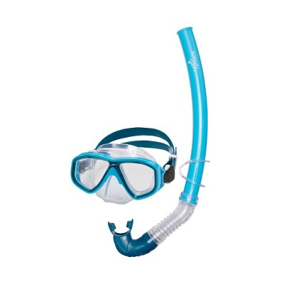
During the critique, there was a lot of confusion about what the goggle contour line was, so I decided to add some details that would make it more obvious. To come up with ideas I look for a picture of a snorkel:

Speedo Kids' Surf Gazer Mask & Snorkel Set - Blue/atoll Clear : Target

https://www.target.com/p/speedo-kids-39-surf-gazer-mask-38-snorkel-set-blue-atoll-clear/-/A-80130935


I realized I left out a crucial part of snorkel equipment, the breathing tube. I had wanted to incorporate bubbles into the layers and this was a perfect way to do so. I experimented with different designs in Illustrator and tested them on the Cricut:


I decided to tape a snorkel piece onto the second goggle layer I had created and made a mouthpiece to tape to the first original goggle layer. I played around with how I would incorporate these things into the layers I already had and printed out more parts using the Cricut.

In my final decisions, I attached the snorkel piece to another goggle layer that would sit by the original goggle layer I already had, and I attached a mouthpiece to that original goggle layer as well. I used double-sided tape for both of these attachments. I felt like these revisions made the whole composition more whole and made it easier for the viewer to understand what was going on.


These small simple details added a lot to the final product, and after finishing our revisions we showed each other our final compositions in class:


Reflection:

At the beginning of this project, I had a really hard time visualizing how I could create an idea that would work with physical paper layers. I liked the sketching/brainstorming process, but I didn’t get a full vision of how I would physically create ideas I had in my head until I started modeling. I realized how important modeling really is when tackling a project like this one. Modeling allowed me to change ideas and revise things early in my process. After this, I really enjoyed creating the layers in Illustrator and organizing them in the layer function. Once I started test-cutting my layers using the Cricut I got really excited about the final product. I enjoyed the process of putting my layers in the frame and using the light to reveal my surprise element. The critique process was really enjoyable and I liked being able to spend time looking at one person’s project at a time.

Addition reflection after critique and revisions:

I could keep adding to this project for weeks. There were a lot of small details I wanted to add but just didn’t have the time to do so. I tried to focus on emphasizing the snorkeling aspect of the layers. If I were to do a project like this again, I would do cutting experimentation earlier rather than later so I could physically see the piece and the problems that arose. I talked to Deb one on one and she gave me a lot of great feedback and little details to add but I just didn’t have enough time to test and produce them. Time was very valuable during this project and I did not realize that until toward the end of the project.

AU22 Fnds: A5 Pattern Process

To view the portfolio post click here.

Intent: For this assignment, I wanted to create a 4×6 in postcard that also came with an envelope. I wanted to focus on rhythm, with a little bit of emphasis on scale. When I think of rhythm I normally think of music first, and I wanted my pattern to have that sense of rhythmic beat, just like music does. I wanted to combine abstracted nature forms to create my final design. We had the choice of creating a color version of our card in addition to a greyscale version, so I wanted to experiment with color. I really wanted to allow myself to have a lot of fun with this project and to use all of the things I had learned over the semester so far. I wanted to be open to changing up my ideas and not get stuck on my first idea. I wanted the card to be functional, easy to use/understand, but also pleasing to the eye.


Ideation:

To start off this project, Deb showed us a slideshow that went over different forms of patterns and how rhythm is involved in patterns. She talked about how poems are a type of pattern and we watched Maya Angelou her most famous poem Still I Rise. The repetition of poetry is very similar to the repetition in visual patterns. We also watched Janet Jackson’s Rhythm Nation music video to learn more about rhythm and how we could apply it to our patterns. I really enjoyed this presentation and it got me excited about the possibilities that could come from this assignment.


To start thinking about nature and how aspects of it can be turned into abstract forms, we took 20 photos, and then chose 10 that we wanted to create abstractions from:

This was a continuation of the abstraction grid:


In class we used a pattern technique where you would make a design cut it in half, switching the sides, and cutting it in half again and switching those sides. It created this pattern that when copied could be continued:

I used some abstractions from my grid to create this pattern.


In class, we were shown how to do tessellations by hand.

I created this one in class:

And then I created this one for our class tessellation challenge:


I knew about Cricuts before starting this project, but I had never used one before. I was really excited to learn this new skill and to see what my classmates and I would do with the Cricut. We did a tessellation practice in Illustrator and then put them into the Cricut to cut them:


We also did other practice through Illustrator. Jennifer walked us through how to make pattern swatches and how to use the pattern flip technique in illustrator:


For practice, we were tasked in small groups to find ways of making patterns and to create patterns to show in front of the class. I used this YouTube video to guide me through a different way of making patterns in Illustrator, and this was the pattern I made:

Following the tutorial, I made my own practice pattern using the techniques in the video:

Version 1:

Version 2:


I did a lot of practice work in my sketchbook and was just churning out different ways to abstract natural forms.

I went through my camera roll on my phone to find more pics of nature that I could pull out abstract forms from. I had a lot of photos from places I had visited over the summer, so I did some sketches to create abstractions based on these photos:


I wasn’t really happy with any of the ideas I had come up with from the nature photos I took on campus, so after going through my camera roll and finding images to play around with, I settled on using one or both of these for my final design:


Iteration and production:

In class, we were tasked with making as many iterations as possible within part of our class period. I played around with what a card could be and what it could look like:

I also started implementing designs into these iterations:


About halfway through the process of creating my card design, Deb and I had a conversation about my abstractions and prototypes. Since I was creating a postcard I had to consider what the other side of the card would look like. I originally wanted to encourage people to write on the other side of the card, so I added lines to imply that words should be put there. I wanted the design to be clear and easy to understand because if a product is too complicated to use, it will not be successful and people will not want to buy it. Deb reminded me that there also needs to be a balance between simple and complex, otherwise a design could be bland and boring if it is too simple. Communication is very important to me in my personal life so I want to make sure it’s a part of my designs.

Deb had me look at this image, and encouraged me to look at the dotted line in between two bold lines. These implied words should be put there. It made me think about what I was really encouraging in this iteration and what I actually wanted to encourage.

I also started working on what could be incorporated into both the design of the front of my card and how I would print and cutout the cards:


I wanted my card to be 4×6 inches and needed to create envelopes to hold the cards, so I looked online for a tutorial. I have never made my own envelopes before, so I had no idea where to start.

This is what I used to help me make my envelopes:

“How to create a 4×6 envelope”

https://www.ehow.com/how_6518997_make-4×6-envelope.html

I modified this design/tutorial by adding a message I came up with that fit the theme of my card. The message is on the inside of the flap that closes the envelope:

“Embrace yourself the same way we embrace seasons… slowly & overtime”

I liked how it opened up on the end, rather than the top like a traditional envelope would. It felt unique but still classic and easy to understand. I experimented with both drawing paper and bristol board to see which one was both easy to fold and durable. I discovered that the bristol board was incredibly difficult to fold, and when I did fold it, it looked messy. I decided to go forward with the drawing paper because it folded nicely but still felt sturdy.

On the left is the drawing paper and on the right is the bristol board:

I wanted the envelope to be simple because, for me, the envelope was a vessel for the card and for it to be mailed. I focused more on my card design rather than the envelope. The reason I wanted the envelope to fit a 4×6 in the card was that I wanted whoever was using it to be able to include photos in the envelope if they wanted to and 4×6 in is the standard size of a printed-out photo.


I got to a point where I was working a lot in Illustrator around the logistics of card making but was not happy with my pattern design, so I went back to my sketchbook to work on some new ideas, using the photo of a pineapple and the photo of sunflowers.

As I was playing around with my abstractions and trying to create designs and patterns out of them, I realized that what I was working on kind of looked like a snowflake. This sparked an idea to incorporate all four seasons into my final design in abstract ways.

I took these sketches to Illustrator to see how they would look digitally:

I really liked the direction I was going with this design, so I made multiple iterations of it, playing with color, scale, and orientation of the forms on my card:

I was very satisfied with the iteration work I had been doing and it was time to make final decisions. I decided that in addition to my greyscale version, I would use yellow/orange color for the color version. I chose this color because it resembled the pineapple and sunflowers I was using as inspiration. The colors together also reminded me of a bee, which went along well with the four seasons theme of my design:


I decided to just print out a version of my design using the Cricut. I did not plan on using the Cricut for my final design, but I wanted to at least try it out and see how it looked. I also wanted to become more comfortable with using the Cricut for future projects:


For printing, I used FedEx printing services.

When I sent my cards for printing I had put 5 copies of each version (greyscale and color) onto single sheets of paper. Part of the image was cut off in the printing process and when I cut them the cards didn’t look how they were supposed to. The pattern was not oriented the way I wanted it to be, so I had to reprint them. This time I put one card on a smaller piece of paper and just made 5 copies of each version. I placed the design in the middle of the paper so there was no way for the design to get cut off in the printing process.

I also realized the cards were too small when I put them next to an actual 4×6 in card:

After reprinting the cards, they came out how I intended them to, and I cut them out. I had decided to keep the back of the cards blank, but add a phrase that would give the user a direction to go in, but they had the creative freedom to do what they wanted on the back of the card. The phrase I added was “Express yourself here:”. This is up for interpretation by the user and allows for people’s uniqueness to shine through when using the card.


Reflection: Out of all of our projects this semester, I think this one is my favorite. I really felt like I had a lot of freedom and the ability to play and just try things out. It felt like we had more time on this assignment and that allowed me to relax and just work. I had so much fun ideating and making different iterations that I had a hard time creating/choosing a final design. I felt like everything I had learned over the semester was contributing towards this project, and I felt really confident during every part of the making process. I feel very confident with using Adobe Illustrator now as well. I think if I were to do this project again, I would experiment more with the Cricut and add some sort of 3D element to my card. My design achieved my goal of functionality and is easy to use, but it may feel static to some people. I will remember this in future projects and will push myself to think a little bit more outside of the box. I feel very confident going into second semester and I feel confident in the skills I have gained and enhanced throughout this course.

AU22 Vis: A3 Mashup Process

To view the portfolio post click here.

Intent: For this project, I wanted to make sure that there were personal aspects in my word mashup. I wanted my word to have personal meaning. I wanted to use a good amount of imagery in addition to the text. The imagery would add to the overall design and would make the text a little more lively. I wanted to make sure I had a solid understanding of how to draw isometric letters by hand before going into Adobe Illustrator and creating my final composition. I wanted to be very intentional with my practice work and to draw out my final composition a couple of times before creating my final piece.


Ideation:

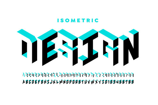
While first starting the ideation process of this project, I did some searching and exploring on the internet to find some isometric fonts just to see what a potential final project could entail. I did not have a lot of prior knowledge about isometric text so I wanted to have some background knowledge before starting to iterate.

Isometric Font Vector Art, Icons, and Graphics for Free Download

https://www.vecteezy.com/free-vector/isometric-font

Isometric Font Images – Browse 17,801 Stock Photos, Vectors ...

https://stock.adobe.com/search/images?k=isometric%20font

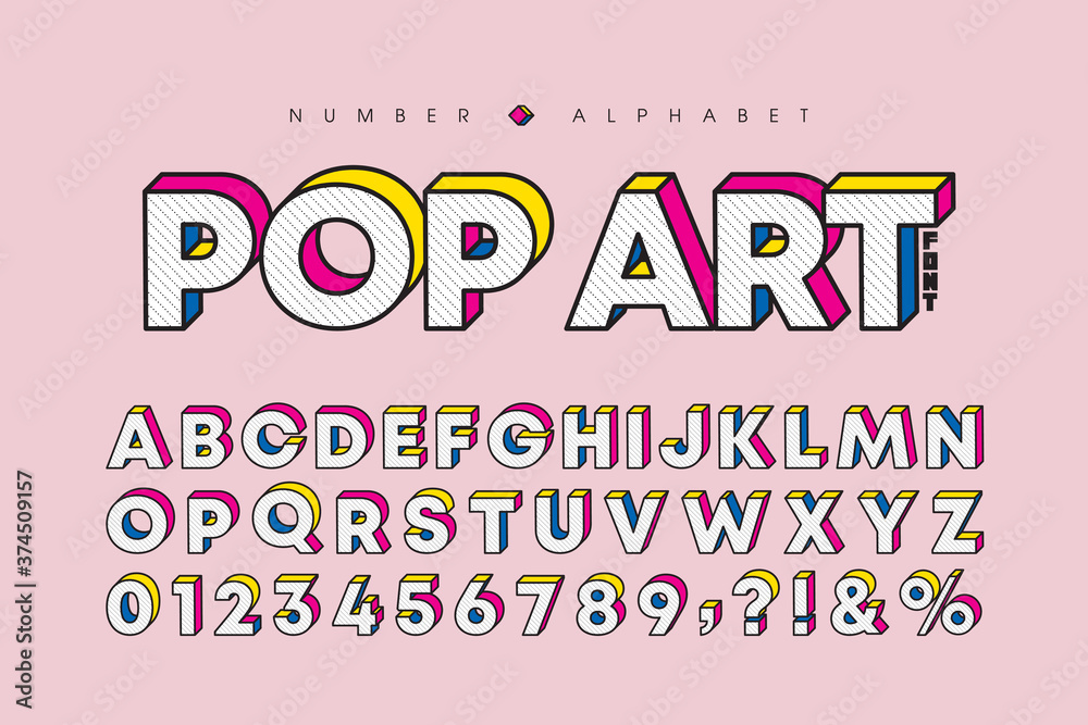
Modern pop art 3 dimensional letters and number set. Stylish bold font or typeface for headline, title, poster, web design, brochure, layout or graphic print. Flat vector 3D alphabet & number.

https://stock.adobe.com/search/images?k=isometric+font&asset_id=374509157

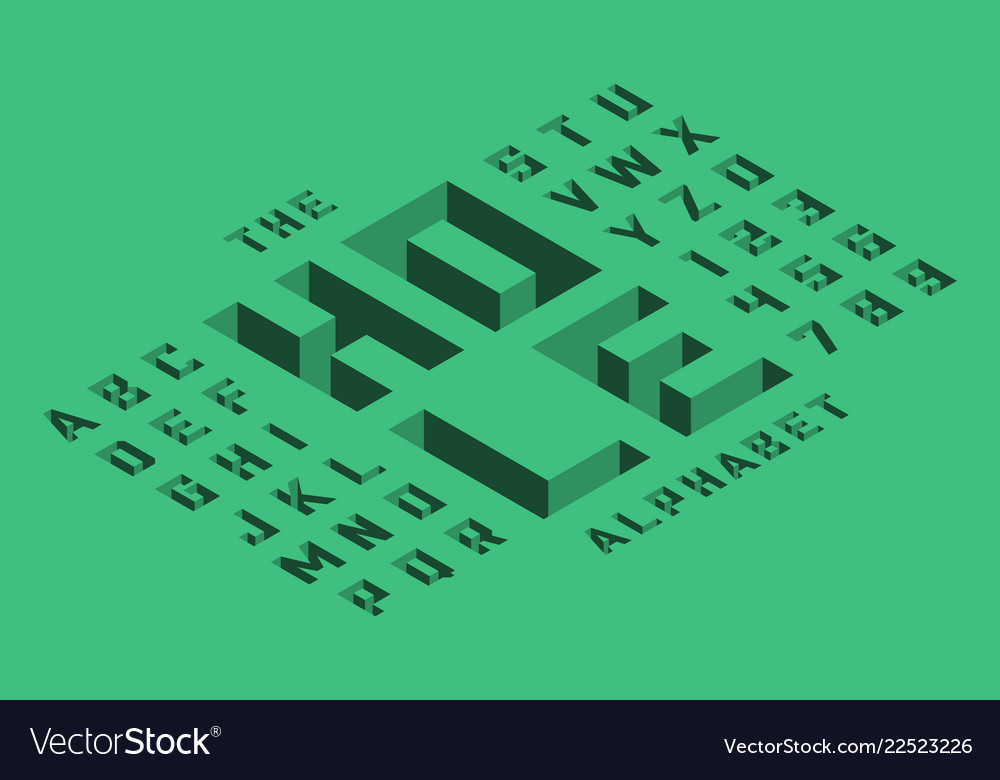
Isometric 3d font design Royalty Free Vector Image

https://www.vectorstock.com/royalty-free-vector/isometric-3d-font-design-vector-22523226

Isometric font. 3d geometry

https://creativemarket.com/AntonMalina/1039179-Isometric-font.-3d-geometry

https://heyletsmakestuff.com/cheap-and-free-summer-fonts/


Taylor provided us with these visuals to give us an idea of what we would be doing throughout this project:


In class, we practiced writing our initials on an isometric grid. I had never worked with an isometric grid before, so I had to learn how to use it:


Exercise 1:

We were tasked with playing around with isometric text in Illustrator. We were provided with a video tutorial on Carmen to learn how to use the text functions and isometric functions. We also played around with fonts and colors.

Exercise 2:

I really enjoyed playing around with different word mashups and working on the imagery that would go with those words:

I then created dictionary definitions for the 3 finalist words:

I decided to go with “calmping” as my word mashup of choice. In 2020, my family got a small camper and ever since then, we have frequently been visiting state parks and other campgrounds in and around central Ohio. We go in late spring, summer, and fall, and this part of my life has become something very special to me. I get to spend time with my family while also relaxing and immersing myself in nature. Sometimes the places we go don’t have the best cell service, so I’m forced to do things that don’t involve the internet. I’ll read, go on walks, sit in a hammock, or play board and card games with my family. These short trips are some of the only times I truly feel relaxed and at peace. When there is nothing to distract you from what’s right in front of you, you calm down pretty quickly. One memory, in particular, that sort of fueled my word mashup choice was when my family was staying at Mt. Gilead State Park in early July one year. There was a river not far from the campgrounds, and my dad wanted to go fishing so I went with him. I’m not a huge fan of fishing so I brought a chair and the book I was currently reading and just sat in the shade while he fished. This memory stuck with me because I was so in the moment. I really unplugged from everything else in my life and it was just me, my dad, the rushing water, and my book. It’s one of my favorite memories. This helped me land on my word mashup decision.

To continue to get more comfortable with using isometric text in Illustrator I created this mini design with my word. I was thinking about tents and their triangular shape. I also was playing with bright colors:


Iteration and production:

To help myself better understand how to write my word on an isometric grid, I used this video to practice writing my letters in different orientations:


I then started to design what my final word mashup could look like. I altered the letters and added aspects to them that were associated with camping and being outdoors. I made the letters smaller or larger to fit the way I wanted them to look. I divided the letters in half and made 4 face one way and 4 face a different way to make the design less flat and more dynamic:


Using a light table I transferred my very messy iteration onto transfer paper so that I could clean up the design:


I was happy with what I had done by hand and wanted to move it into the digital space. I took a picture of my drawing and uploaded it to Illustrator and started working on top of it:

I was planning on making the “M” have a graham cracker pattern, but I wasn’t able to create a pattern that I liked, so I decided to change it to a plain grey, and this made this whole piece a little more cohesive:

I cleaned up edges and made final touches and decisions, which wrapped up this project:


Reflection:

I learned a lot when it came to Illustrator during this project. Learning how to manipulate text and how to utilize the text features in Illustrator will be very helpful for future projects. I feel a lot more comfortable with using Illustrator as a whole. I enjoyed every part of the process while making this design. I really immersed myself in the practice and exploration work which allowed my final design to be stronger. I really enjoyed playing around with color and working with multiple different colors side by side. I do wish that we were allowed to use more colors so I could add more details to my imagery, but the limit of 3-4 colors gave my final composition a cohesiveness. I gained a better understanding of how to use the pen tool and the scissor tool in Illustrator when going over the image of my sketch. I overall just gained more skills and experience in Illustrator. I did get frustrated at times when I wanted to do something but couldn’t figure out how to do it, but I would play around with the different tools and functions until I did what I wanted to do. I feel a lot more confident with my Illustrator skills.

AU22 Vis: A2 Observation and Communication Process

To view the portfolio post click here.

Intent: For this assignment, I wanted to create a map that led the viewer from Hayes Hall to a place I was at frequently. I also wanted to implement text and different types of text/font into my final map. I wanted to combine traditional and non-traditional map elements to make the map more fun to look at. Since we could only use one color, I wanted my choice of color to have meaning behind it. I wanted to make sure my map had the information needed to make sure my viewer was never confused, but I also wanted to make sure that the map wasn’t overcrowded and messy.


Ideation:

To begin this assignment, we read and learned about “slow looking”. In class, we did an exercise where we would look at collages for long periods of time and write down the things we saw, such as color, shapes, lines, imagery, emotions, feelings, etc. This exercise allowed us to practice slow looking and to prepare ourselves for what we needed to do in our assignment:


We did an exercise where we went out to the Oval and took pictures, chose a picture, and then sketched it. we then wrote a haiku to represent our drawing. Then we put all of our sketches and poems together on an oval shape. Each paper was where the location would be in real life:

We did a texture activity where we borrowed images of different textures from the internet and then recreated them on paper. We also had to turn the texture into a gradual value scale.

These were the images I borrowed:

3D Textures Images – Browse 2,700,902 Stock Photos, Vectors, and Video | Adobe Stock

https://stock.adobe.com/search?k=3d+textures

How To Create Hand Painted Textures Without Painting | by Lettier | Medium

https://medium.com/@lettier/how-to-create-hand-painted-textures-without-painting-aa7374fef815


As a class, we went over to Thompson Library to go to the map room for inspiration. Jan Wagner, who is the map room Associate, talked to us a little bit about maps and their history, and then guided us through the map room. We got to look around at the different kinds of maps and take pictures for inspiration and to know what we needed to achieve in our own map:

I also made a practice map sketch with a route that I know really well. I chose to do my drive from my house to my high school. I also wrote of the directions for it to practice that part of the assignment as well:

As a class, we split into groups and we did an exercise where we had to find an image or symbol and write directions that would allow another group to draw it without having any idea what our image was. My group chose to do the Yin and Yang symbol. This exercise helped us practice writing directions and showed us how effective they were.

yin-yang Meaning | Pop Culture by Dictionary.com

https://www.dictionary.com/e/pop-culture/yin-yang/

when picking my destination for my map, I wanted to pick somewhere that I visited often. I do work and study at the Starbucks very close to North Campus, and I am always very aware of my surroundings when I am there, so I thought it would be the perfect place to include in this assignment, especially because of the sensory detail aspect.

We did two exercises before starting on our actual maps. The first one was a written exercise where we had to create directions/steps to get to our destinations and then add sensory details:

The second exercise was to take pictures of the route we would be putting on our map. This gave me a better visualization of what to include in the written details of my map:

Iteration/Production:

To start making iterations of what our final maps could look like, we made quick and simple thumbnail ideas. Taylor provided us with some details to help us get started.

Examples:

Thumbnails:

And then I created this one that I then turned into a physical draft:

Draft:

I used these images as reference for my draft:

Ohio State University Photograph - Hayes Hall Ohio State by John McGraw

https://fineartamerica.com/featured/hayes-hall-ohio-state-john-mcgraw.html

Timashev rendering

https://music.osu.edu/events/timashev-dedication-and-celebration

https://www.google.com/maps/place/2139+N+High+St,+Columbus,+OH+43210/@40.0060591,-83.0092026,3a,75y,131.29h,102.95t/data=!3m6!1e1!3m4!1sFiQ7otMlDSNAZR8Spv40jg!2e0!7i16384!8i8192!4m6!3m5!1s0x88388ebb561518fb:0x16807517b984f9c8!8m2!3d40.0060448!4d-83.0092378!10e5


I hadn’t written in cursive in a while and I wanted to include it in my map, so I borrowed a reference from online and practiced writing cursive before starting my final map:

The shapes would represent the other buildings around the route that weren’t necessarily important during the journey. They would also contain writing that would describe sensory details to the viewer.

Reflection:

I really enjoyed the whole process of this assignment. The exercises made it clear what I needed to convey in my final map. The exercises really prepared me for my final map. I knew exactly what I needed to include and had already come up with most of my ideas during the exercises, so all I had to do was bring those ideas to life. I think if I was to do this project again, I’d want to add 3D details and make the map more interactive. I might also think about if the map needs to be a rectangle, or if it could still function as a circle, triangle, etc. After having a combined critique with Deb’s class, it made me really inspired to do more out-of-the-box thinking in future assignments. I learned that asking questions is very important when a new assignment is being introduced and that questioning why there is a certain requirement in an assignment can create amazing conversations. Overall, I wanted to take my future assignments to the next level and work on having more discussions with both Taylor and Deb and my classmates.

AU22 Fnds: A4 2D to 3D Process

To view the portfolio post click here.

Intent: 

For this assignment, we were tasked with making a polyhedron of our choice, and then creating another version of it and altering it in a way that would align with one or more options out of a total of 4 options. I wanted to make two pentagonal-based dodecahedrons. I chose option 4 so one form would be plain and the other would have some sort of visual illusion on the surface. I wanted to practice my cutting and gluing skills, and I wanted to get more comfortable with making 3D forms. With the option I chose, I wanted to explore how 2D visuals could complement a 3D form. I knew in advance that since I did not have a lot of experience with 3D form-making, I would make a lot of mistakes, but I wanted to allow myself to make those mistakes and then learn from them. I wanted to gain new skills from the mistakes I made, and be open to new information throughout the assignment process.


Ideation:

As a class, we all tried to make the perfect cube. We all found out very quickly that it is very difficult to create a really accurate/perfect cube. This exercise allowed us to learn how to draw templates and cut them out. We learned about tabs and how to fold them to attach the different sides of a form. We also learned how to glue the sides together.

This is the template I borrowed from the internet to make the cubes:

Cube Templates | Free Printable Templates & Coloring Pages | FirstPalette.com

https://www.firstpalette.com/printable/cube.html

I knew early on that I wanted to create a pentagonal-based dodecahedron, so I found a template to borrow and looked up how to draw a pentagon using a compass:

Untitled

https://homepage.math.uiowa.edu/~goodman/algebrabook.dir/polymodels.html

Once I had created the pentagon, I used tracing paper to duplicate it to make the template:

I realized that this template was only half of the shape:

I created the template again but switched which side the tabs were on. I now had a template for both halves of the form. I transferred this template on to Bristol board to create my first iteration, and taped it together instead of gluing it so that I could open it back up and look at the inside for reference:

To keep practicing my shape building I also made two other shapes using different templates, borrowed from the internet:

Octahedron:

Polyhedral Globes

https://www.astronomyforthinkers.com/downloads/polyhedral-globes/

Pyramid:

My final exercises:

We also learned how to make digital templates:

Before changing my template I used it to practice making a digital template:

Moving forward with the pentagonal-based dodecahedron, I had an idea that would complete Option 4. The form reminded me of a soccer ball, so I had the idea of representing countries that have talented national women’s soccer teams. The teams/countries would be represented by letters and their flags.


I used this site to add to my knowledge of successful women’s national soccer teams:

https://www.fifa.com/fifa-world-ranking/women?dateId=ranking_20221013

I then used this site to figure out what the 3 letter abbreviations were for countries that I didn’t already know the abbreviations for:

https://laendercode.net/en/


I worked on this idea in my sketchbook to get a good visual of what the possible final project could look like:

I also sketched out what letters could look like in 3D form:

Iterations/drafts of what the surfaces could look like:

After coming up with this idea, Deb and I had a discussion about whether or not the narrative aspect of the idea was overpowering the core design of the form. Afterward, it got me thinking and I realized I just took the first idea I had and ran with it, which is partially a good thing because it got me working and thinking, and eventually would lead me to my final idea. But I didn’t allow myself to come up with other ideas. I thought that the colors would overshadow the design and I had to learn that it was okay to let an idea go. I talked with some of my classmates about how we could balance art and design. They both are very similar and overlap a lot, but have their own individual differences. The objective of this assignment was to focus on the design and craftsmanship of the form, so I went back to brainstorming ideas. While I was frustrated at first because I was making myself start over, I reminded myself that this was all a part of the iteration/ideation process and that I didn’t have to commit to one idea and stop brainstorming.

I really liked how I was creating the 3D letters in my original idea, so I took that aspect of the design and created a new idea. While I was crafting one version of my final form, I realized that “dodecahedron” had 12 letters and I had the idea to put each letter on one of the sides. I also added numbers not only to remind myself what order they needed to be in but to also guide the viewers through the form, allowing them to read the word.


Iteration and Production:

When transferring the template from transfer paper to Bristol paper, I used a light table:

While I was preparing to glue together my final forms, I came across a problem. The template I had been originally using created two halves that were almost impossible to glue together:

I knew it would be a mess and that there would be glue all over the form, so I decided to go back out to the internet and find a new template for the same form. I found a more complex template that worked and was much easier to glue together:

Blank Dodecahedron Printable Template | Free Printable Papercraft Templates

https://www.supercoloring.com/paper-crafts/blank-dodecahedron-printable-template

After finding a new template and creating a draft iteration of it, I sketched out the letters onto a draft to see how my new idea would actually look on the form:

I also sketched it onto the template when it was flat:

I really liked how this looked and decided to move forward with making this my final design. After crafting the final form, I sketched out the letters and numbers onto the form:

Before moving on to my final steps, I wanted to make sure my letters and their shadows were accurate, so I checked them while borrowing this photo and made small tweaks when needed:

With a black brush pen and Micron pens, I added borders to each panel and went over the sketches. I wrote the numbers with the Micron pen:

I decided to keep both forms the same size, instead of making one larger than the other. I made this choice because I wanted to focus on the comparison between the blank original forms and the detailed second form. I thought a size difference would take away/distract from that comparison. I instead focused on contrast and movement. The two forms are vastly different from each other, the only thing they have in common being the form itself and the size. But the second form has a sense of movement. I intentionally made it so that viewers could spin it around and move it. They’re supposed to read the word on the form, using the numbers to guide them.

I took a video of me spinning my second form to show how it could be viewed and to capture what I could not in a photo:

Using Procreate, I turned my physical template into a digital one to add to my submission document:


Reflection:

This assignment was a very big learning process for me. It was very frustrating in many ways. I couldn’t land on a final idea and I really struggled with construction, specifically gluing. I also had to restart in the middle of the project, but there were a lot of positives in this process as well. As I got comfortable with drawing out the templates and cutting, my process of making the forms got quicker every time I made one. I was becoming more familiar with the steps in the process and therefore making things more efficiently.

For future assignments similar to this one, I want to set aside time to think about how I want to display my final composition. I wanted people to pick up my option-based form and move it around to read what it said but did not give myself enough time towards the end of the assignment to create something for the form to sit on. I could’ve also made some sort of sign to let the viewers know that they can pick up my form and move it around.

In addition to my first template not gluing together properly, I made plenty of mistakes while trying to make my final forms.

Before I changed templates, I accidentally cut through a tab, which made this attempt unusable. I was very careful not to cut through my tabs throughout the rest of the process:

I accidentally flipped my template around and the shape didn’t come together as it was supposed to. The final part of the form that I was gluing didn’t have a tab where there needed to be one. I doubled checked my template every time after this one:

I learned that not all online templates created accurate and clean shapes. This form did not have a flap to close the shape: