Posts

Mandala Process

...With Color

Introduction

In the works of this project, we will experiment with translating color into value color applications to illustrate the visual impact through observation, evaluation, and iterations. We are to organize strategies relating to color theory structure and apply it to digital mandalas.

Process

To begin the exploration of color theory, we were given a template to experiment with the use of technology, grayscale, hue, saturation, along with different harmonious ways of working with the way colors can communicate with one another.

When experimenting in this first stage I had come in with intentions that complementary colors were my favorite. I previously liked how when put next to each other they create such a protruding visual effect. I still really enjoy the effect, but I’ve found a new favorite balance of mine to be split complementary. I had no previous knowledge of using this technique, and from this exercise, I found that I really enjoy how it still kind of gives off the effect of complementary but has a little jazz to it.

Within the Procreate app, I  began experimenting with more ways of communicating color. I found that I really enjoyed the analogous scheme as well.


Inspiration


For my first color scheme, I wanted to incorporate a princess feel, along with a creepy feel. I took inspiration from some of the tones from the photos as I felt that they worked together to communicate this effect. I decided to do a split-complementary to be able to combine and communicate my ideas.


For my second mandala color scheme, I really liked the idea of incorporating some warm tones into my mandala. When researching colors I found that the colors in these photos worked together to be almost calming and relieving.

I had really liked the idea of the princess, pink tones working together, and so I continued to search for photos that included pink and warm tones. I found this image and noticed it looked similar to an analogous color iteration I had previously explored.


I decided to go with this purple/pink/green split color scheme for my first mandala. I wanted to tie together a pink lighthearted feel with a creepy one, and I felt that these colors worked best with one another. In specific, I enjoyed the purple-green color aesthetic, and how those two colors are associated with toxicity.


For my second mandala color scheme, I decided to choose an analogous idea. I felt that this scheme tied together my idea of the warm tones, and keeping true to the pink aesthetic.


Exploration With Mandalas

1st Mandala

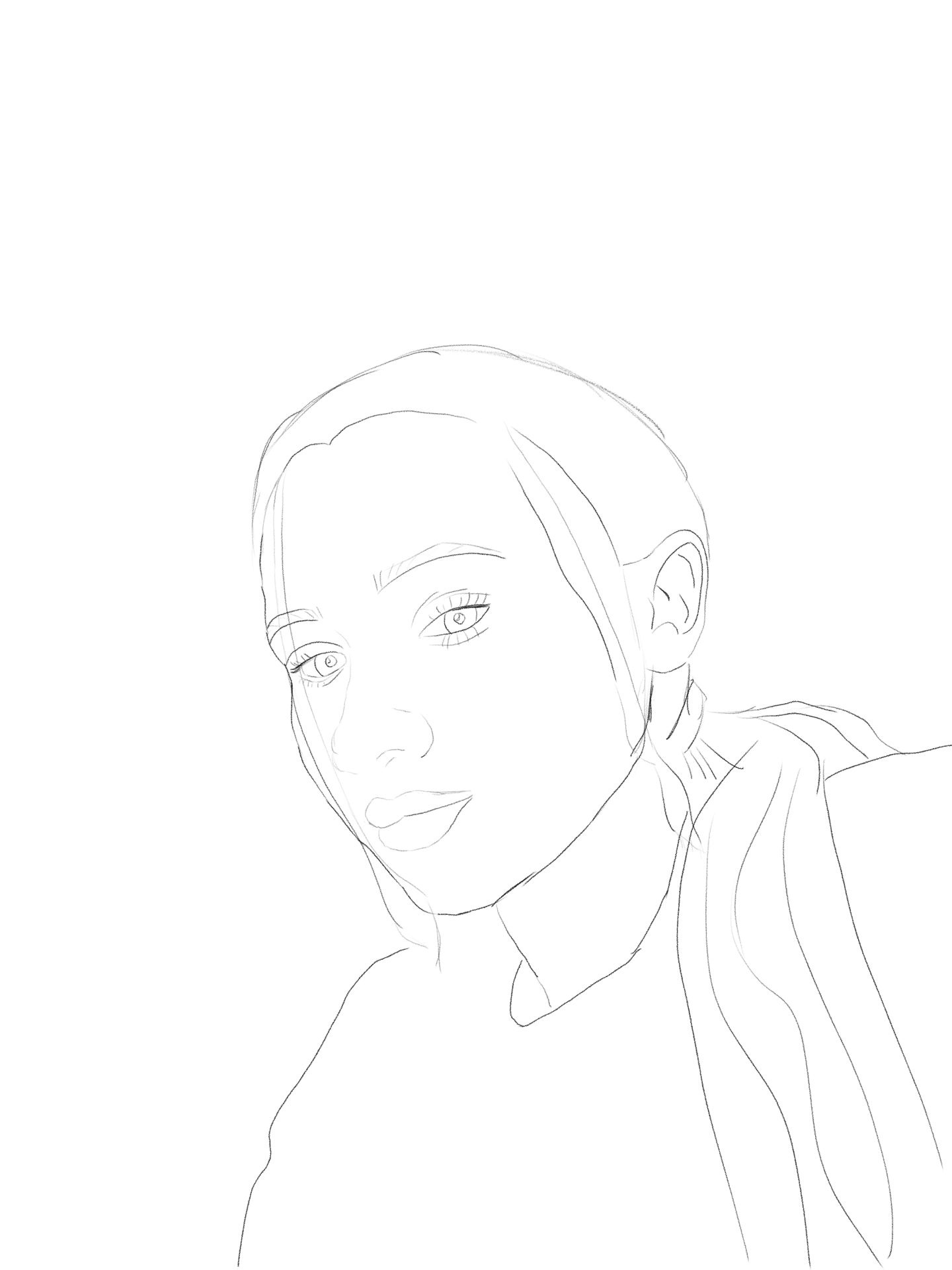
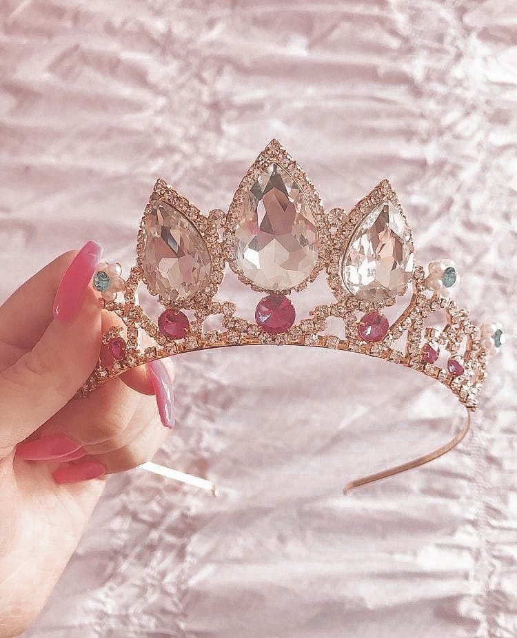
In this first experimentation of incorporating color into my mandala, I decided to place the pink tones in the middlemost area. I had taken inspiration from a tiara to create iterations for this man-made inspired design, and I felt that the pink represented this portion of my design the best. I continued to use this method in all further experiments.

For the middle section, I was currently working with a different grayscale at the time and felt that the purple felt most in place within the diamonds pointing outwards. This section was inspired by the texture of Epcot’s exterior, so I associated the tones to be almost an icy shade of purple.

I also decided to contrast the purple and green against each other on the outermost part of the design. I felt that with these two colors right next to each other, was somewhat what I was envisioning with the purple and green inspiration. I created a gradient effect with shades using a greyscale effect. I wanted the deeper shade to be on the most exterior to lead from a lighthearted pink princess vibe to a darker, more creepy vibe with the eyes.

In this second experimentation, I adjusted the hues I was using. I liked how the green and purple were on the most exterior part, so I decided to keep the concept, but reverse the roles. I also changed the middle section to be purple as well, to help lead into the more eerie side of the design. I was pleased with this design, I felt that this one pertained most to my intentions of creating the design, but I decided not to continue with this one as I was drawn more to the aesthetics of my final experimentation.

12×12 Man-made Inspired Mandala Colored Design #1

In my last experimentation, I decided to combine both of my previous explorations to get this one. A few of the ideas I liked from the two previous explorations was the gradient effect of the green arrows, the purple diamonds and T’s, and the pink center.

With this design, I explored having a colored background and decided to go with a shade of pink. I felt that without this, the greens and the purple took away from the effect I was trying to portray in the center. When doing so I also decided to change the color of the heart pointing outwards. It was originally a lighter shade but lost effect with the background. I decided on a deeper hue to help lead into the more eerie side. I also added purple within the hearts pointing outwards to aid with leading the eye from the pinks to the purples and greens.

One new thing I explored within my final design was adding color to the eyes. I decided to combine the purple and greens to tie in the exterior.

Reflection

As I was deciding between the second and third exploration to choose as my final design, I choose to hear feedback from the last one in a class critique due to me exploring a combination of the first experimentation as well. I was unsure how I exactly felt about it because it stepped away from my original intentions. After hearing feedback from peers, I heard it gave off “Princess-Zombie,” vibes, and I liked that. If someone wouldn’t have pointed that out, I honestly would have gone back to my second exploration, and finished it off.


2nd Mandala

With placing color with the second mandala, I would constantly go back and forth between working on my first one, and this one. I took inspiration from the first one to help modify ideas in this one.


In exploring the color placement of this second mandala, I didn’t have much intention of color placement and explored different aspects.

I first tried switching up the gradient effect, and the color within the diamonds. At the time I was thinking about a thanksgiving aesthetic. Overall I thought this just looked like a mess, and I quickly moved on to another exploration.

Some areas that I did like was the shade of the T’s, somewhat of the center color placement, and also the colors placed within the eyes.

In this second exploration, I decided to only keep the color placement of the T’s. I decided to revert to the concept of the gradient arrows used in the first colored mandala.

I explored keeping the hearts pointing outward the same color as the background to see how it would feel, and also changing the tones within the eyes. I continued to play around with the placements of pink within the center.

I liked how the gradient effect looked on this design, but I strongly disliked the colored background. I felt that this colored background blended everything.


12×12 Man-made Inspired Mandala Colored Design #2


Like my final exploration of my first color scheme, I combined the aspects I liked from both of my first two experimentations. I continued to keep the same tone of the T’s as the first two had, as well as continuing the gradient effect.

I changed the eye color back to the colors from the first and removed the background. When removing the background, I enjoyed the way the center area looked better. Something I didn’t explore in another experimentation was changing the line color of the center part, and keeping the background all the same. I liked how this worked out with these colors and felt that it suited the color scheme.

Reflection

As I didn’t have much set intentions with working with this color scheme, other than having more calm and harmonious energy, I liked how it turned out. I feel that the analogous color scheme help take away from the princess/pink/eye/eerie mood, and bring it all together. I feel that with the specific shapes, the colors should help direct in the direction of both ideas, but the color schemes tie everything together.


Final Reflection

In the process of applying color to my mandala, I felt that my mandala was very flat. This could have been prevented in Project 4 by adding in more layers to create more dimensions, but at the time I was pleased with my work. I feel that this is something that I will pay more attention to in the future to ensure that my work is more enjoyable. I find it helpful to hear back from peers because they all you to see an aspect of your design that you maybe didn’t see. After reviewing and hearing feedback from others it helped direct me into a direction in which I felt more pleased about my decisions on my design.


Inventive Portrait

Introduction:

In this project, we would be able to compile a reflection of our mental thinking process by incorporating both organic and geometric shapes. Through rapid iterations, use of color, shapes, and placement we are intentionally creating a visual representation of multiple mental states and emotions.


Process

Mind Map 

To give a little structure to my mind map, I began the thought process by trying to answer the question “how do I think through a problem?” It was a little difficult to answer that question, so I put it aside and began creating another map to the question “describe your thought process through an adjective, energy, feeling, emotion.” As I began to visualize words to describe how my thought process works, I numbered and categorized adjectives relating to each stage of my process. I then broke it down even more and took one word from each categorized stage that best describes that step of the process, and organized it into another, more condensed category. 

Iterations 

For the next step in the process, we had to create 50 iterations of simple geometric shapes such as squares, circles, and triangles. I decided to take each of those 5 adjectives from the more condensed list and create iterations relating to similar feelings. I mostly took words from each categorized section relating to the steps of my process and used them as inspiration for different iterations. I focused on the energies and moods of being overwhelmed, focused, optimistic, impulsive, and eased.


When iterating

focussed

Optimistic

impulsive

eased


After completing the 50 iterations, I went back and reviewed all the iterations section by section. I starred all the ones that I favored over the rest. When considering if I liked that specific iteration more than any of the others, I considered how well it expresses my thought process to the corresponding word, and if I can potentially see myself including them in part 2 of the project.


Photo Transformation

I chose to select this photo to begin breaking down for this project. I originally thought this would be a perfect photo to use because I took this selfie when I was in quarantine from having Corona. In this quarantine, I was struggling to get work done and had to constantly reassure myself to focus back on my work. I was sitting at my desk working on school work at the moment and had taken a procrastination break. I felt like this photo somewhat represents one of the lowest motivations, and reflects my thought process the best.

To start the process of breaking my face into more of a geometric form, I simply just traced the photo of myself to get a better concept of what my face looks like flat.

I then rewatched class videos and used the reference photos to break my face into more simple planes. I  decided to keep some facial details such as the eyes because I felt that when the detail was left in,  it help illustrate my mental state right from the beginning.


Shape Placement

As I experimented with shape placement, I strongly didn’t like the way any of the shape placements ended up. I felt that all of these iterations didn’t help contour the facial structure, even when I intentionally placed them to do so. I felt that the shapes just seemed as if they were just floating in space, and didn’t correlate with each other like they do in my thought process.


I took inspiration from those iterations to compile a final shape placing. I decided to keep the eye visible again, along with the lips. I also decided to rotate the head to have the chin facing more upwards, to correlate the shape placement of feeling overwhelmed. When doing so I found that the shoulders took away from this energy, and so I removed the outlining. As the angle of the photo, I took of myself was from a lower angle, this outline pulled the energy of the portrait down and created a negative tone.


Color !

Inspiration

When coming to the stage of this project where it was time to incorporate colors I approached the idea in a few different ways. One of the first steps in doing so started with researching images to find tones that accurately represented my thought process.

I drew inspiration from this photo because I felt this represents my mental state when initiating a problem. I felt that the blue tones were really soothing, and reflects how I try to stay calm, even when situations become overwhelming.
This is another image I drew inspiration from. I really liked that these two colors together are very artistic, and give off a creative feel. I associated the feeling of being creative with my optimistic state, as being creative plays a role in being optimistic about a situation.

From gathering this information I began to look at ways I could incorporate all these feelings into a color scheme. I began by looking at the color well and playing around with the closest colors to each mood. When I selected a tetradic color scheme I found that these four colors represented a different aspect of my thought process, and was excited that it would all work to be aesthetically correlating as well.

From inspiration and research, I decided to do a tetradic color scheme using these colors. I did further research, along with personal feelings to assign different parts of the portrait to different mental states.

I found that the orange/red/peach color represented the overwhelming feeling. When I become overwhelmed, I also become frustrated as well. I then played around with different saturation, shades, and tones to create an idea of colors to place within the shape.

I felt that the purple color represented optimism. As I personally associated the color with creativity I felt that it only made sense to assign it to my optimistic state.

The shades of green represented me being or remaining the focus. An interesting fact I found out about myself by playing around with the shades and tones is that I may be a little bit color-blind with the tones of green specifically. I didn’t know this at all until I was in this stage, and so I honestly had to focus super hard to compute my intentions into this section. With the help of technology and feedback from others I used context clues to figure out if I accurately was placing the correct color in the right place or not.

I incorporated the blue into my initial mental state, which is represented by my more recognizable face planes. As I also drew inspiration from a photo, I found that the coolness of the tone helped ease the mood of the portrait by reflecting the part of me staying calm.

I first started by adding in the blue tones, as I was most excited about how well this color ties together the portrait. I decided to use the tones to correlate with the planes of the face. I then began working on the orange overwhelming state by using tones to create a 3D effect.
I then added back in the outlines of my optimistic and focussed states, along with incorporating somewhat of another shape from iterations.
I like two of the shape placements of one of my iterations of where it was located on the top of the head, and where the neck is. From inspiration, I decided to add a few drips off the neck because it helped tie together the calm state to the focussed state, as it draws attention. I then took a different approach and added triangles popping out of the head. I create this shaded texted of flat triangles on the surface of the head, leading to pyramids coming upwards. I felt that this represented being open-minded, as the triangles lead in many different directions. I also began working on the purple optimist state as well. I chose to use the slinky shape from inspiration from a class exercise. When doing the exercise I kept thinking about how it felt when looking at the directions the spirals went in. I thought about how when you play with a slinky it always goes in different directions and correlated it to the way of being optimistic, and how ideas are always bouncing around. In this stage of coloring the shape, I decided to highlight and shadow the shape to appear slinky like.
By adding color to the green focussed state, I wanted to create a gradient from a lighter done to a deeper tone. In doing so I felt that it would create a dimension to lead into a steady-state to correlate with the way the ovals, and turns lead into a steady stream of spheres.
I finished the portrait up by finishing up unfinished ideas and adding an airbrush stream of two of the complementary colors that I favored the most. I intentionally did so to emphasize each aspect of the portrait by drawing attention to the curves.


Final thoughts:

I am really pleased with the final result of this composition. From last-minute critiques, I felt like I could maybe incorporate my of the project guidelines into the final deliverables instead of moving further away from them as I did. However, by looking at the finished portrait, I personally feel that my mental states were all delivered by intentions in doing so. In the future, I would like to work on abiding more by the limitations given to help better my creativity of thinking outside of the box.


Mandala Process

Project Description:

Throughout the works of this project, we will be able to use a range of principles, and elements to explore and develop patterns through analysis of natural and man-made forms. Without direct representation, we will develop abstract patterns that relate to both natural and man-made shapes and structures, by focusing on elements such as line, shape, texture, rhythm, movement, scale, etc. Through observation, evaluation, and testing relationships of natural and mechanical forms, we’ll be able to show and organize the development of our iterations into mandala form.


Process:

Inspirations & Iterations

In the first step of our process to developing a mandala, we were to find 20 different images of patterns. 10 of the images were patterns we found in natural objects, and the other 10 images were to be of patterns found in human-made objects. Once we found our 20 different images, we were to create iterations exploring different aspects of textures, shapes, lines, spacing, etc.

Nature Inspired Iterations

When finding images of patterns, I found that I was drawn to elements of lines, and symmetry. I enjoyed most the patterns of flowers, and with aesthetic line work.

Man-Made Inspired Iterations

In all honesty, I struggled the most with the man-made iterations from the very start. From the moment the assignment was assigned, I would constantly keep on my radar objects that were man-made, and try to find patterns from them. I found it super difficult to find patterns within objects, however, working through this challenge however helped me become more creative with pattern-finding.


A Closer Look To My Favorite Patterns

When looking closer to the patterns within this object, I was drawn to the curves that worked together to create shapes such as hearts.
I favored the circular shape structure as a whole and on the individual pedals.
I found the shading of the texture to be intriguing and thought it would be fun to begin to incorporate into my mandala in some way.
I am unsure of what this piece is, but I found it on google images at some point in my research and found it very aesthetically pleasing. I thought this would be fun to find a way to use it in my design.
The pattern within the leaves is very eyecatching. I wanted to explore different ways of communicating the pattern.
I was originally drawn to the tentacles of this image. As I explored in iterations, I found that the concept helped initiate more ideas for my final deliverable.
I found myself exploring designs relating to eyes subconsciously, and wanted to incorporate the idea into my iterations.


Man-Made Inspired Petal Iterations *click on image for better resolution

In the first column, I explored different ways to communicate the pattern of the wood object I found on google docs. When exploring ways to visualize the pattern, I first started off by taking an idea from one of the first few iterations inspired by the design to grow new ideas off of it. By the third row down I reevaluate the ideas I was trying to express, and decided to test out a different way of translating it into a pattern to be used within a petal.

In the second column, I originally began exploring a way to convey the pattern inspired by tie-dye. By the fifth row down I started to recognize an eye pattern and rerouted my thought process to explore different ways to visualize the idea.

In the third column, I explored different aspects of the crown. I was very intrigued by the curves and created began exploring ways on how I could incorporate the hearts and curves into a petal for my man-made inspired mandala.


Nature Inspired Petal Iterations


In the first column of my nature-inspired petal iterations, I took inspiration from the octopus idea and continue to explore different ways to get the effect of viewing tentacles. I played around with the value and line weight to create many different options.

The second column was the start of different ways of exploring the hexagon pattern I found within the wood of a tree. I didn’t like the idea of it at all, so I didn’t bother exploring it more than 3 iterations.

The third column was different explorations of the leaf pattern. I mostly played around with the different line work, along with changing up the shape design slightly for each iteration.

Although I chose not to include much inspiration from the fourth column, I still enjoyed finding unique ways of translating a mushroom into an indirect pattern. I created ideas from this exploration that I would use as inspiration in the petal development in the fifth column.

The fifth column included a combination of all flowers used in my iterations. I also took inspiration from other designs to develop a concept of value, shade, and shape.


In one of the last stages of developing the mandala, we created grids to help with guidelines for placing our petals. I created three different but similar ways to help create mandalas with symmetry. When practicing placing petal iterations on the grid, I didn’t enjoy using the first grid.

I played around combining different nature-inspired petal iterations together on this grid. As I checked in on the design by creating multiple more petals to fill the inner circular shape, I analyzed the drawing and felt like it would be better if explored as an analog version.


Final Compositions:

12×12 Nature Inspired Analog Mandala

When composing this final design I took previous ideas and iterations and combined them. I mostly found the best quality from each iteration concept to combine them all together.

In a design aspect, this mandala mostly incorporates inspiration from an octopus. The most inner part of the design includes a combination of iterations focusing on ocean life. When working on the petals I grew from the original concept by incorporating inspiration from bubbles, fish scales, sea urchins etc.

As your eyes move from the inner part of the design, and work outwards, it follows the natural flowing lines to observe more of a transitional mandala design. The next part includes petals that were ultimately inspired by flowers, and plants. The design’s most outer shape incorporates the inspiration of  tentacles. This final touch to the design adds confusion, and allows for viewers to think, and analyze the design further. 

Similarly to my man-made inspired design, this one also gives an overall unique viewing experience. When first viewing the design one may be overwhelmed by the bold tentacles design. However, when closely observing the design, and allowing yourself to naturally follow the lines, they’ll notice the organic matter.


12×12 Man-Made Inspired Digital Mandala

In this design, man-made objects were used as inspiration to create a mandala. I focused on creating this mandala to be as original as possible, by finding odd objects that have a unique and distinguishable pattern to them. Some objects used for inspiration include the design within a crown or a tiara, the exterior to Epcot’s building, halloween candy, and an engraved wood board. Through iterations, I found a way to place them all together to create a unified use of space. 

In the inner part of the mandala, the inspiration from a tiara is placed. The shapes of diamonds, trimming, and swirls are working together to create this magical feeling. As you move slightly out, the use of shaded diamonds are used to create a transition from lighthearted energy, to an erie one. The boldness of the inspired arrows and T, working together with eyeball design creates a unique feeling when viewing the mandala as a whole. 


Reconstructed Drawing Process

Project Description:

In this assignment, we were to analyze compositional structures of images, and apply composition to digitally create drawing with intentions of supporting a specific mood, feeling, or energy. In addition to supporting the desired mood, feeling, or energy, we were able to apply linear perspective and manipulate forms to help support corresponding feelings or energies. Once we had an idea of what the space offered, we would create a corresponding drawing to communicate the opposite mood, energy, or feeling.

Practice:

Composition Viewpoints

One of the first exercises we practiced was working with different compositional viewpoints. We focussed on the same subject matter for each example. 


Composition Image Structure

In addition to the composition viewpoints, we did another exercise that focussed on the different image structures. We were supposed to continue off the subject that we had chosen for the viewpoint’s exercise.

In-Class Activity

In our in-class activity, we were given different options of ways to work on incorporating different image structures, viewpoints, and also manipulation. In the prompt I choose,  I was to create different ways to communicate JackO’Lanterns in front of OrtonHall.


Manipulation

In this exercise, we practiced simplifying and manipulating forms. We were to find images of specific subjects, and strip them down to their most basic forms. For one of the simplifications, we were supposed to manipulate it’s form. I choose to manipulate the skull example by simply just making the sphere part more oval-like, and making the rectangular part more square.


These exercises helped me grasp a better understanding of different elements and aspects to include in my project. I really liked how when we worked on the different viewpoints, and image structure examples, we used the same subject for every example. This helped different elements stick in my mind, and it also ultimately created examples to refer back to when working on the project, and even for future use.

Process:

When starting this assignment one of the first subjects I thought of was the Oculus. The Oculus is a building located in the Financial District of New York City. From just simply viewing this building from the exterior, you are just amazed by the unique structure of the space.

Interior Of Oculus
Exterior of Oculus

I remember very well how uplifting and strong the energy of this space was. It evoked many strong emotions, so decided to choose this for my drawings.  I began creating a mind map of the emotions/feelings/adjectives etc. that I associated with this space from experience.

After reviewing how the different emotions and feelings that that space gave off were, I began sketching out some ideas. I wanted to focus on the idea that the exterior offered an overwhelming feeling, while the interior offered a feeling of amazement.

When focusing on the feeling of overwhelming, I wanted to enhance the “wings,” and the overall size of the building. I first started off trying to sketch out the basic structure of the building. I thought about including a worm’s eye angle to help emphasize the actual size of the building, but I found it a little challenging to highlight the building without a corresponding background. I then decided to add in some background buildings such a the World Trade Center, and other random buildings from memory.

As for the opposite energy, I felt that I should reconstruct an area from the interior of the building. When viewing the space from the inside, it’s a memorable experience for all. In my personal opinion the interior of the building kind of looks like a rib cage, or fish bones. With the amazing structure, the building is always filled with so much light. Even if it is night, cloudy, raining, the interior of the building always radiates lots of positive energy.

I decided to start creating a drawing of walking on one of the floors. I thought it would be a great way of representing the energetic feel, while feeling connected by the leading lines, and flow of the space. I choose this angle to communicate the energetic feeling better. 

I liked the direction I was heading in from the sketchings itself, however, after hearing feedback, I realized that the two drawings shared similar characteristics.  I needed to reevaluate how I wanted to communicate the two different energies.

When reevaluating my drawings, I felt that it would be better to try to communicate the two different experiences you have when you are in the Oculus.

In the first of my final drawings, I decided to change the idea of communicating the overwhelming feeling that the exterior of the building gave off. I thought it would ultimately be better if I try to communicate the harmonious and balancing feeling that the space offers when first entering the building.


Harmonious

In the construction of this first drawing, I wanted to focus on the openness of the building, while still drawing attention to the ceiling. As I really wanted to look at a photo of this space, I mostly tried to use memory to recreate the feeling and energies it gave off. As a result, I exaggerated the number of lines in the space and the direction of them. I however wanted to focus on the lines so that I could create leading lines that drew attention to the ceiling space.

I might have taken a different approach as to the manipulations. I didn’t intentionally manipulate the spaces, instead, I refrained from using a reference photo, and let my memory construct and manipulate the drawing to emphasize more of a personal experience.

In the opposite composition, I decided to continue with the idea of one of my sketches. I like how it gave off overwhelming sense, even though it wasn’t what I initially had thought for the drawing. I felt that once I changed my ideas for the first drawing, this one became more of an opposite energy to the harmonious/balanced.

Overwhelming

When recreating the sketched image, I kind of just followed along with the ideas I initially had. I like how it had already had a canted feel to it, and felt chaotic already. It was already far from balanced and harmonious, so I felt that it would be alright to continue off of.

The most challenging part of all was communicating the texture of the interior. I couldn’t remember what it, so I decided to just add a little bit of shading. From memory and picture, the entire interior was very white, bright, and textureless.

Overall, I originally liked the direction I was heading with these drawings, but I hit some road bumps and was redirected. As I thought my idea was very complex, I wish it would have been a little busier so the drawings could have more life t0 them. This building is very compelling and nosologic, and from just viewing the drawings, it brings me back to pre COVID-19 times, and living in the city.

Studio Space Rendering Process

Being introduced to the Assignment

In the works of the Assignment, we would continuously practice drawing techniques to accurately depict 3D space and volumetric form. We were to imagine if we had our own private studio space of at least 200 square feet and were to visualize, and place at least 4 objects in it. These four objects were to be a desk, something to sit on, a personal item that was smaller than a human, and a wall, or other structural objects.  At the end of the assignment, we would be able to understand forms of shapes could be reduced down to essential form. In addition to that, we would be able to apply all types of perspectives to construct and position form and space together. Throughout the works, we would grasp the understanding of how relationships between forms and their position in spaces, along with understanding how linear perspectives derive from the implied line and observing the invisible.

Process

Exercises:

I found the exercises given during the online section of class, along with the ones worked on in class extremely helpful in many regards. The way we would continuously practice a simple concept of placing shapes, such as one-point perspective, or two-point perspective, along with practicing rotating shapes to relate to a space, this helped me developed a way of looking at shapes and see how they related to elements surrounding it. The practice of the worksheets, implying the concepts of multiple perspectives, help me grasp the ideas of shapes when it came to practicing placing objects in the grid.

Starting The Grid:

When initially starting to layout the grid for practice,  I struggled many times to get the concepts right. Although we were watching a video, it wasn’t until I was in class that I understood how to construct the Grid. When following the video tutorial given to help understand how to construct the Grid, I found myself trying to follow the instructions exactly step by step. I later learned that this wasn’t exactly necessary, as you can play around with the vantage point, along with other elements to the drawing.

First Grid Drawing
Second Grid Drawing


After reflecting on my first two grid drawings, I noticed that I struggled to figure out the ceiling. This concept took me a long time to grasp, as I learned how to incorporate this during in-person classes.


Practice

First Practice of Placing Shapes in Grib

In this first practice drawing of incorporating shapes into a 3D form, I decided to practice around with rectangular objects. It was more easing to start with basic shapes, rather than incorporating complex shapes. Although these shapes are very much asked for in the final deliverable, I felt that it was essential to start small. After practicing placing putting in a few shapes into the grid, I decided to move on the somewhat designing what my studio would look like.

Second Practice of Placing Shapes in Grid

In the second practice of placing shapes in the grid, I wanted to completely remove the idea of the bed, like incorporated in the first practice. I felt that the bed was no fun, and it took up a lot of room. On the other hand, I decided to create a couch. I thought the couch was very comfortable and made the space feel warm and welcoming. This is something I would idealize if I was given a real space, and was allowed to turn it into my studio.

After placing the couch, I began to play around with the intention of the wall. I have this intention in my room, and I liked the idea of it and wanted to incorporate it into this. This intent helps me separate my work from the rest of my room, so I thought it was idealistic to include. I then filled in the necessary work materials. I wanted to keep it basic looking, with a plain desk, and a simple stool. I didn’t want to over clutter my drawing with unnecessary objects.

I then moved on to incorporating objects that I just felt was necessary. The bookshelves help make the indentation a real workspace. The rug and coffee table add to the coziness, and the record table just adds in my taste. I added in a window as well. I found this cool window on google and wanted to include that somehow. Lastly, I added texture to the walls by creating a brick material. I felt that this texture added to the homelike sense of comfort.


Production

Final Production of Space

In the final Production of the space, I decided to incorporate many elements that were included in the last practice. In the beginning stages of creating the final Production, I began with recreating the brick wall and indent. This was my favorite part of the last practice, and so I wanted to include it. I simply added a light source, as it would be a workspace, and a light source is essential. I also felt the need to include the books, and the plant on the bookshelf. I felt that this was cute, and I wanted it to be apart of my final deliverable.

I similarly added the couch. I changed it up to appear to more of my aesthetics. I also added the rug, coffee table, and record table. I like the sense of comfort it added to the last practice. These pieces make it more personalized to myself.

I decided to change the window from the last practice to be a little shelf. I saw an example of the shelf somewhere on the internet, and last minute decided to change that to add a vase with a flower. When taking out the single window, I decided to add a floor lamp to at least add artificial light. However, I started to visualize 3 large windows right behind to record table, and across from my work area.

Overall, if this was my real-life studio, I would genuinely like it. Through the practice, I was able to find elements that I really liked and found a way to incorporate it into my final production. I think this 13×16 representation of a studio idealizes a lot of elements that I would value to have in a personal studio.

Shape Grammar Process

Being Introduced to the Assignment

In the works of the shape grammar assignment, we would iterate multiple designs, and explore the use of relating the principles of design as compositional and communicative skills. Through iteration, we would come up with designs and illustrate complex ideas relating to the essential principles of design. We would then move onto analyzing our observations and actively defining key vocabulary related to the course with the goals of determining what best ideas could be used for completion of the assignment. We would also use self-critiquing, and critiques from peers to help refine our designs.

Process

Exercise

In the first step of the assignment, we were given an exercise to rapidly iterate multiple concepts. In both the analog and digital version, we made a template with specific measurements to create six squares to work with. We were also restricted to use only squares, triangles, and circles with measurements of 1/2”,1”,1.5”, and 2”.

When starting the process, I thought I was accurate about creating the template but after analyzing it when finished, I believe I didn’t keep my ruler straight, and I also didn’t cut out the shapes I used as precisely as I could.

First Exercise Iteration

In the first use of the template in the exercise, I just let my mind wander to find ways to use the shapes. I wanted to see how the use of not just using the shapes, but also using rotation, and outlines could create something. After creating each design, I would sit and analyze what I did, and why I was doing it. I found that I was mostly drawn to create designs for the aesthetic, and that had movement and harmony in it.

Before moving onto more iterations, I wanted to be neat about getting the mesasurements correct. I found that once I started perfecting the shapes it was fairly easy to create the templates larger in size than the smaller ones. I also found it difficult to make perfect circles. Out of frustration, I began to continousuly look around my room to find cylinder objects with the same measurements needed, and traced them to get more accurate circles.

I then moved on the broadening the use of shapes in the process. I wanted to see how incorporating more than one type of shape could create designs with more meaning to it.

Second Exercise Iteration

In this part of the exercise, I focused more on how each design made me feel, and then related it to the principles.

Top Left: I was inspired by listening to music at the time and thought maybe if I used triangles and circles, I could make a simplistic form of a rocket ship that had been on the album cover of the music I was listening to. The shapes created a sense of movement that made me feel as if the rocket ship was entering outer space.

Top Middle: I had started this design with the use of just the square and the circle, and wanted to see how I could make more out of it. I started to add triangles to create a sense of movement. In my head, these simple designs almost illustrate a little story. I felt that even though the two triangles located near the bottom left of the design were inside a box, the other triangles weren’t limited by lines, and were moving closer and closer to the circle.

Top Right: In this design, I wanted to work with the idea of creating a sense of direction. I began to just simply put shapes together until the movement principle was indicated.

Bottom Right: I began this design by layering circles on top of one another. I then moved on to add the triangles. I kept the principles of harmony and balance in mind when doing this.

Bottom Middle: Throughout the iterations, I saw the circle templates laying by each other, and thought they looked like bubbles. I decided to play around with not limiting the use of the shapes within the box, and layering them on top of each to create a feeling of unity.

Bottom Left: I began playing around with the idea of scale. I started with a large triangle, and began to add more and more triangles to add more movement to this. With this design, I found that I favored the principle of movement. I would later use the idea of this design in more iterations that lead to my final six considerations.

Moving on to the use of creating iterations digitally, I found the beginning stages of using Vectornator frustrating. I was practicing with incorporating the use of the shapes to not only be inside of the box. I tried using the erase tool and placing a new frame around it, but the program would warp the shapes. I had talked with peers about working around this issue, and I didn’t get much useful feedback, as others were struggling as well. I decided to work around this issue, as many of my favorite designs didn’t leave the limitations of the box anyways.

I then used the prior iterations and built off of them to create six of my favorite versions of each.

Final Six Iterations

Top Left:

I took inspiration from one of my digital designs that got all warped by trying to work outside the boxes. In the exercise, I simply just had one 2 inch circle, and I and I used three smaller ½ inch circles to create a simplistic use of scale. I also liked how the contrast between them allowed them to be perceived as two different objects. For this design I decided to add a 1.5 inch circle, but still use ½ inch circles inside. I thought this created an interesting contrast that emphasized the shapes in two different ways.

Top Middle:

I kind of played around with the multiple shapes of squares to get this design. I thought it was interesting how the design offers a ladder effect, but also a sense of balance and harmony with the surrounding squares. I decided to choose this design as one of my final designs because I took a different approach to it. Instead of keeping the principles in mind, I just let my mind flow to come up with a design that I was oddly pleased by.

Top Right:

I also built off of a previous design for this one. I felt that the direction of the arrows coming from the top, pointing down created this dominance feel of the triangles. I really liked how the design allowed a sense of movement, that almost looks as if an army of triangles are invading the two triangles at the bottom of the design. I decided to leave the bottom triangles open/white to add to this feeling. The openness of them creates this feeling of weakness in the whole idea of dominance.

Bottom Right:

I hadn’t actually used any previous designs to build off of for this one. I had some friends stay over at my house, and in the morning when all our alarms were going off, I created this image in my head of what alarms would look like if they were shapes. This image stuck in my head as I was working on the other designs in this template, so I decided to create a design that related to it. The alarms almost had a rippling effect and came from several different directions of the room. This was very irritating at the moment, but it made for some good inspiration for this assignment. I also thought it was interesting how it created an odd sense of harmony and thought it would be perfect to include.

Bottom Middle:

I had created a similar design in the exercise by just letting my mind flow. In the previous design, I had incorporated other shapes than squares, but when getting feedback from peers, I thought I should build off of it. I thought it was interesting how I unintentionally was able to create two different senses of direction. I felt that it creates a direction from the larger squares from the bottom right up to the smaller square at the top left. Similarly, yet different the smaller squares in the top right flowed into an almost arrow effect. This design was one of my favorites because when layering the squares together, the contrast between them created a sense of depth as well.

Bottom Left:

I had created a design in the previous exercise that created a bubble look. However, without the contrast of the background, the circles didn’t stand out to create what I was fully envisioning. With this, I simply just modified the previous design by just adding a black background that I was more pleased by.

Final Decisions

When deciding what design I should use for the final two 8×8 compositions, I was torn between my two favorite designs. I honestly didn’t know which one would be better so I created an analog version of both of them. I felt that I could judge which one I liked better at a larger scale, and could also ask friends and peers for advice as well.

8×8 Movement Analog

I was excited to recreate this one. I had changed it up a little from the digital version, and decided to add a black background to the large square located in the bottom right. I felt that this adjustment was able to allow the design to have more depth than the previous one. However, with working with squares I idealized the perfection of the shape, and I found that this design wasn’t exactly what I was envisioning. Even though I used the detail knife to cut out the shapes, there were still some imperfections about the analog version that made me realize, I didn’t want to continue working on this, nor turn it in.

The Final Compositions

8×8 Analog Composition
8×8 Digital Composition


 After getting a lot of feedback from friends, family, and peers I decided to choose this design as my final composition. Although it’s very simple, many people enjoyed and related to the idea of the sensation of alarms going off.

I really enjoyed the outcome of how both versions emphasize a different aspect of the design. With the black background, the design almost feels sunken in. As if everything is falling in towards the middle. This is exactly how I felt when all those alarms were going off. I felt like I was in the middle of everything. However, the white background offers the feeling of the alarm itself. The contrast of the black on top of the white creates the feeling of the sound going off.

I didn’t receive many critiques as to how I could modify this design to appear better, but being that this one was more spontaneous, and was created later in the process, I was able to use prior knowledge from the exercises and lessons to create a design that related to the assignments and principles. Ultimately these final compositions offer a meaningful and interactive design to any viewer who uses alarms.


Observation Process Journal

Observation Drawings

The walkway between the Field House and St. John’s Arena’s Observation Drawing

When observing the campus, I was drawn to the walkway between the Field House and St. John’s arena. When first viewing this area,  I remember thinking it’s a very unique space. I used to come here for state competitions throughout highschool, and thought that it was interesting that this walkway connected two completely different spaces. The area itself proved emotions of  nostalgia, and a sense of motivation and excitement. When viewing this spot I believe I associate the emotions I would feel as l would walk through the space to go from the practice room and get lined up to compete, to feel the wistful senses of motivation and excitement I felt during that time. 

When staring the process of using triangulation throughout this drawing, I began with the opening that was at the end of the walkway. I found it easiest to use the known points of the rectangular opening to align other angles together. I then moved on to finding the angles of the ground and the ceiling. From there I started working on the walls, and moving down to the entrances of both buildings. The last step I took when completing the drawing was detailing out the doors and windows.

Throughout the process of viewing the photo to complete the drawing, I noticed I felt different emotions about the space.  When viewing the photo I am more drawn to the ways the space fits together from the sense of direction of the lines. However, when I view the space in person, I am more drawn to how the way of the openness connects the two buildings to create a unqiue feeling. I am drawn to the lines and how the space is all connected, so I thought it was oddly pleasing to connect all the lines together.


Entrance to The Horseshoe Observation Drawing

I found that I was also drawn to the entrance to the Horseshoe by the symmetry and balance of the ceilings and entrance. I believe this helps the stadium have an inviting and welcoming feeling. I found it to be very comforting by the way it creates this welcoming feeling. To have come from a school in New York, I didn’t have the opportunity to be engaged in going to sports events, which I truly missed. I’ve grown up with always having a love for Ohio State Football, and when viewing this location I get this sense as if I am welcomed back home.

Rather than drawing the entire front entrance, I choose to focus more on what’s inside the main arch. I was drawn to the openness of the large arches instead. In the process of starting this drawing, I struggled to find a starting point. I choose to start by creating the curve first. I then moved on to creating the ceiling, and the trim. From there I was able to use the ceiling and trim to create the three arches. I finished my process by adding small details that stood out to me.

I thought that by drawing this observation I was choosing the most appropriate location. Throughout the process, I later felt that this might have been a mistake. I figured the minimalistic look of the entrance and curves would make up a great subject for this project. I was wrong. Throughout the process I noticed myself restaring over, and over again because I lacked finding a way to create alignments to make it all synch up. The curves and arches in this were very difficult for me to create the curves with precision.

Viewing this space in person, and by photo were completely different experiences. In-person, you can sense the openness and depth, but by photo it was simply just a bunch of lines and curves. In-person, I was able to sense the symmetry more accurately than by photo. I feel like this was reflecting in my drawing because the photos I took were slightly off-center.  I noticed it was also difficult to fill in details that I  found intriguing when viewing this image in person, such as the fence, which I unfortunately struggled to find a way to create such small fine lines to be able to include in the drawing.

Bio Process Journal

In the process of setting up my page, I found the process very constructive. This is my first time working on a web page, and I found that the instructions were a crucial part of the process. If I ever tried to get ahead of myself, I would become lost. When referring back to the directions, my problems would be solved.

I choose to construct my bio into three parts, “Background,” “What Design Means To Me,” and “Hobbies.” I felt that I could introduce myself, my educational path, and lead to what design means to me, and eventually end with my hobbies and passions. This allows for the flow of ideas to go together more seamlessly.

When setting up the aesthetics of the page, I choose to go with an earthy tone theme. I felt the soft brown was both professional and aesthetically pleasing. I also choose to highlight each subtitle by emphasizing the size, so that the reader could easily move from idea to idea.

From this assignment, I learned how to set up the basics of a web page. As I learn more and expand my portfolio, I am excited to continuously update this web page to show how I am growing as a designer.


Bad/Good Designs

A Design I Like A Lot

In this photo of the inside of the oculus, the interior of the building is very captivating. As I went to school in New York, I had been using the building very often. I remember my first time walking through the building to go up to the observatory located at the top of the World Trade Center. It was dark outside, but the inside was still filled with so much light. It created such an uplifting feeling, and I grew to love this building. The designer designed the space inside the space to almost mimicking the sense of openness in space you get from walking through another New York City’s monumental, Grand Central Station. Calatrava explains that the design was intended to be a symbol of light and hopefulness after the city recovered from the tragic 9/11 attacks. Despite the long and expensive construction of the building, I believe this building is a modern monumental concerning New York’s History.

https://mymodernmet.com/wp/wp-content/uploads/2019/06/the-oculus-santiago-calatrava-thumbnail.jpg

https://www.architecturaldigest.com/story/santiago-calatrava-explains-designed-oculus-for-future-generations


A Design I Dislike

I strongly dislike the design of the EOS lip balm. I believe the container that stores the lip balm is very annoying and impractical. The designers designed the lip balm to serve the purpose of allowing it to be accessible to find, and would not get lost in a purse. However, I feel that the lip balm becomes more of a cluttering item than an easily accessible item.  The design doesn’t allow for the everyday purpose of regular lip balm by the bulkiness, which causes the product to constantly be falling out of pockets and purses, and allows rolling away.

https://images-na.ssl-images-amazon.com/images/I/514ftsB1xEL._SL1000_.jpg

https://www.fastcompany.com/3063333/the-untold-story-of-how-lip-balm-upstart-eos-outdid-chapstick


A Design I Secretly Dislike

I dislike spiral stairs because I view them as unnecessary and annoying. The stair’s architectural design once served a purpose of a form of protection as kingdoms were attacked in the past. I believe the stairs are very aesthetically pleasing, especially in open concept areas. However, the practicality of these stairs does not make sense to me. In today’s day and age, these stairs could be dangerous for children, and the elderly, and often only serve the purpose of aesthetics.

https://images.homedepot-static.com/productImages/be8dce16-55f4-4df1-804b-fbcd41f5b8cb/svn/spiral-staircase-kits-k26290-64_1000.jpg

https://www.acadiastairs.com/history-of-the-spiral-staircase/


A Design I’m Embarrassed To Admit I Like

I’m embarrassed to admit that I enjoy the yoga ball chair, however, despite how researchers have found that the chair serves no purpose to your body health. I believe that this chair is very pleasing to sit on, and I stand by it. Obviously this design isn’t taking the books by it’s aesthetics, but in my eyes, it’s still a win.

https://secure.img1-fg.wfcdn.com/im/43095254/resize-h800-w800%5Ecompr-r85/7417/74179021/Montserrat+Exercise+Ball+Chair.jpg

https://ergo-plus.com/using-exercise-ball-to-replace-office-chair/