Posts

Photoshop Tutorial

How To Create A Selective Color Effect


Step 1: Find an image

This step tends to be the most difficult one for individuals. You want to choose an image that resonates with you; that portrays your self identity. This can be something that literal or more abstract, so have fun with it.


Step 2: Import Image into Photoshop

Once you have your image selected, make sure that it downloaded and saved on your computer. Then, simply open the Photoshop application, select new document, and drag your image into Photoshop. 


Step 3: Add a Black and White Adjustment Layer

With your image imported in Photoshop, you will now see a Layers panel on the far right side of Photoshop labeled Background Layer with a preview of the image you imported.

With the Background Layer selected, select the Adjustment Layer icon, which resembles a half-filled circle, at the bottom of the Layers panel.

Scroll down the list that appears when you click on the Adjustment Layer icon and select the Black & White Adjustment layer.

Once you select this, a Black and White Adjustment Layer will be placed over the original image you selected and the entire image will be converted to black and white. This layer will also appear in the original layers panel to the far right, directly above the Background Layer.


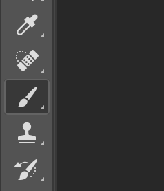
Step 4: Select the Brush Tool

With the Black & White Adjustment Layer selected from the right Layer panel as shown below:

Then select the Brush Tool from the Tools panel which is located on the far left side of the photoshop document as shown below.

You can adjust the size and softness of the brush through the Brush Preset Picker which is located on the top of the Photoshop document.

A larger and softer brush size will give more natural coloration, while a smaller and harder brush size will give more distinct, clean edges and require more precision. You can mess around with these settings to see which look you prefer, or you can switch between a large and small brush size for the edges versus coloring in the inside of the image.


Step 5: Set the Foreground Color to Black

In order to bring color back into the picture, with the layer mask still selected the Foreground color in photoshop must be set to black. The Foreground color tool can be located on the left vertical panel of tools in Photoshop which looks like the image below. To change the color, simply click on the black color swatch and scroll to a black shade in the color selection and select it.


Step 6: Paint the Image Where You Want Color

Making sure that you have the layer mask selected, the foreground color switched to black, and the brush tool selected- go the section of the image that you want to be color and simply start painting where you desire there to be color.


Step 7: Fixing Mistakes

While you can switch the brush size to a smaller size in order to avoid mistakes such as painting outside of the desired image, they can be fixed easily. To erase color to make it black and white again, simply change the Foreground color that you set to black originally, to white.

Then with the brush tool selected and the Foreground color white, simply paint over the area where you messed up and want it to be black and white again.


Step 8: Adjusting Color Properties to Emphasize the Picture

At this point you should have successfully selective colored a portion of your image that you wanted to emphasize. The last and final step you can do it is adjusting the color properties of the black and white layer. With the black and white layer selected, you can go to the properties panel which is located above the layer panel on the right side of the Photoshop document. You can adjust the colors, sliding them back and forth, and they will saturate or desaturate those colors in the black and white layer.  

Step 9: Enjoy the Final Product


I chose to create a tutorial showing how to emphasize select colors while negating other to black and white in order to focus the attention of the audience on one primary thing. As simple as a technique as it may seem originally, I think that it’s simplicity makes it all the more impactful. With so much going on in the world and in our everyday lives, I think that a lot of things are lost in translation. I choose to use the photo with the globe that says “Carpool” on it as the image for the tutorial because I think it relates to self identity. Self identity is a lot more than just physical attributes. It does not have to be just literal, or just one thing. Beliefs and passions are a huge part of self identity and that it what I want to highlight in the tutorial. I am greatly passionate about the environment and finding more eco friendly solutions. Coincidentally, I thought the picture was also perfect because it says ‘carpool’, however it is located in the middle of a very busy, traffic filled city. This irony worked well to make the selective color tutorial that much more impactful.

Conversely, I also believe this technique of selective coloring works well as a method of helping to portray self identity because everyone has insecurities. Everyone has certain things they don’t want to be showcased and other aspects of their lives and their identities that they want to be highlighted- and I believe that selective coloring is a wonderful way to achieve that and help portray self identity in Photoshop. After I completed the tutorial, I used my technique to apply it to my final project, which is pictured below. While I identify as a runner, it wasn’t until I ran my first marathon that I actually admitted it and truly believed that about myself. No matter how many miles and hours I put into training, it wasn’t until I received that medal at the end of the 26.2 miles that I finally started calling myself a runner, so I decided to make that the image that I wanted highlighted and colored. While the background is a collage of all the hardworking that went into forming me into the runner that I am today, it never meant anything to me until that breakthrough moment for me. The selective color technique helped me achieve this and shine a light on my identity and what I want to highlight about myself and it achieves this through the employment of different elements of arts and designs of principals that we discussed, such as emphasis and color and/or the lack there of. 

Face Swap

I chose to Face Swap with Oprah Winfrey. She is someone who possesses many characteristics that I admire a great deal, and I have looked up to even as a child. At first, I think a lot of people, myself included, only know and admire Oprah for her financial success. However, her success is all a product of her hard work. She was brought up in a poor and abusive household, but worked tirelessly to get to where she is today – even when others didn’t believe in her. She seeks to use her own success to help others better themselves. She is an activist and uses her following to make a positive impact. I believe that this image communicates these qualities for several reasons. Oprah embodies a lot of characteristics that relate to self identity, and what I want to encompass in my own life specifically. Her hands thrown up in the air in excitement portrays a victory and is a very powerful stance. By face swapping my own face onto her body, I can picture myself in her shoes and achieving her success, and visualizations are an extremely powerful technique.

In order to create this image, I followed the Adobe tutorial for face swapping on photoshop (linked below). I think tutorials are a great starting point because they give users a general guide and then they can proceed to tweak the picture to accommodate whatever else it may need. I found tutorials with lots of screenshots of the steps, or video tutorials to be the most helpful in assuring that I was following them correctly. My face swap focused on a couple of different elements and principles, namely: color, balance, and unity- in order to assure that the two pictures merged together as naturally as possible. Some of the photoshop tools I used to achieve this were: the selection tool, hue/saturation(to tweak the colors), the eraser tool (to blend the edges more naturally with a big brush size), and the adjustments color match tool. I believe that I would be able to explain this process to another individual by going through it step-by-step and breaking it into smaller pieces. I think a good starting ground would be having them try it on easy, generic example with provided images first, and then allowing them to try it on pictures they choose themselves. Every picture will vary, so it is important to teach the broad and basic techniques of photoshop and face swapping and then individual customizations will work to make the image more realistic.

https://helpx.adobe.com/photoshop/using/matching-replacing-mixing-colors.html

Identity Self Portrait


Some of the elements of art and principles of design I used to channel and portray my identify are color (and the lack there of), texture, shape, contrast, and emphasis.

For my identity project, I wanted to focus on the recreational portion of my identity wheel. Running is a very big part of who I am, so I wanted to highlight that. After realizing that I couldn’t simply place an outline of a female runner into photoshop, I tried to think about what running means to me. It is an outlet for every aspect of my life- physically, mentally, and emotionally. So, I thought it would be interesting to do a compare/contrast of myself before and after running. In trying to role with the theme of this project and be abstract- I decided to use the left half of my canvas as my “before” state and found a picture of the screen that used to show up on old tvs on channels that we didn’t have access to (I used to call it the bug channel). I thought this was symbolic for several reasons; the childhood connection, the annoying feeling you get when that channel didn’t air the show you wanted, the white noise. I wanted to emphasize more aspects of my life that stress me out- and procrastination is a big one. So, I placed a clock with the hands ticking quickly on the left(before) side of my canvas as well. Lastly, being from a big family and in large crowds in general overwhelm me, so I placed a picture of a crowd of people on the left side of my canvas. By keeping everything on the left side, colorless, this emphasizes the difference between my two physical states and makes the overall image all that more impactful.

In order to try and create some unity between the two halves of the project, I placed an open doorway connecting the two sides and unifying them to one. On the right, I found an outline of a person meditating and then I filled the body in with an image of a forest. The right side represents me after a run, running is a giant stress reliever for me, and gives me the same peaceful state that mediating achieves, especially when I’m in the woods and away from people, technology, etc. Additionally, I placed a rainbow of various fruits and vegetables acting almost as a halo around my head. This was symbolic because I am a nutrition major, so a lot of my time and brain is used studying nutrition. I emphasized the fruit rainbow to show the large impact that nutrition has on my life, Also, I have been vegetarian for three years, and feel my best when I am consuming a clean, plant-based diet. Furthermore, I added a vertical landscape of one of the most popular and touristy spots in Albania. This is also symbolic because my culture and being Albanian is a large part of who I am today, however I didn’t just want to place an Albanian flag as the background, so I thought foliage from it would give a similar idea. Nature is also a large part of who I am and how I spend a lot of my time, so I thought it was a good visual representation. In contrast to the left/before side of my portrait, the right/after side of it is much more vibrant and colorful which represents how I become when I am doing the things I love.


Letter to Stephanie

Dear Stephanie,

My name is Besa Maliqi and I am a senior here at Ohio State(go bucks!) studying Medical Dietetics. Nutrition is something deeply important to me and I truthfully believe that food is medicine- and I aspire to inform and help change the lives of others with this knowledge.

I took this course for several reasons. Digital art is such an integral part of today’s society- especially with social media- and I believe it will only continue to prevail in years to come, so I wanted to learn more about it myself. Also, this course fulfilled my last required GE, so it was a pretty easy decision to make. My artistic background is extremely limited; the last art class I took was in the eighth grade and I remember feeling very overwhelmed because the perfectionist part of me is my biggest critic. I find myself wanting to create art, however I feel like I can never express that on paper. I took this course to challenge myself because I believe that you grow the most as a person when you step out of your comfort zone. However, that is simultaneously my greatest concern- that my perfectionist habits will inhibit me from enjoying this course.

Art is important to me because it is a form of expressing yourself and everything is art- paintings, poems, books, food, people. I think one of my favorite things about art is that everyone can be looking at the same piece and interpret it in different ways- in ways that relate to them. I think it crucial to incorporate art in our schools because it shapes individuals for the rest of their lives. As technology is rapidly integrating itself in our daily lives, art is taking a different shape. There is a cultural shift happening in art mediums- from pen and paper to digital art in the form of graphic designs, videos, photoshop, etc. As this societal change is happening, I think it’s important to expose individuals to it because knowledge is power.

I’m excited to work with school aged children because they are so impressionable. Everything and everyone that they come in contact with influences them and helps to shape them. Helping implement core values into them, such as empathy is vital because being able to put yourself in the shoes of another is what makes us human. I think this course will prove to be worthwhile and I can’t wait to see what’s in store.