Elements and Principles of Art and Design

Elements of Art

Color

The quality and type of pigmentation

Value

The brightness and darkness of the object

Form

The depth perception of 3D object being captured

Texture

The quality and definition of a surface

Space

The breathing room for the object

Line

Well, its lines. Shows some sense of movement and linearity.

Shape

Definition of length, breadth, and height of an object on a 2D surface.


Principles of Design

Balance

An image with equally distributed objects/ areas on both sides

Contrast

Placing objects side by side to bring out difference

Emphasis

Prioritizing and guiding the eye to the object of importance

Movement

Path of motion of an object in a still image

Pattern

Repetition of elements with a sense of intent

Proportion

Evenness of the relative size of objects

Alignment (repetition)

Arrangement in a straight line

Unity

Arrangement that invokes a sense of peace and completeness in its alignment


Blend Modes

Normal Blend Mode: Dissolve

This family is the default, although the dissolve options offers a slight variation. The effect only shows if the opacity is decreased. Dissolve reveals the pixels below the image, but does not blend per se. The image was placed above and a the filter was applied, and the opacity was reduced.

Darkening Blend Mode: Linear Burn


In this effect, white becomes invisible and colors darker than white will have a darkening effect. Linear burn creates contrast and decreases the brightness of the base color. The color was placed below.

Lightening Blend Mode: Screen

The colors as a result become lighter when this blend mode is applied. As the name implies, it screens to create an overall brighter composition, and can help create highlights. The color layer was placed below.

Contrast Blend Mode: Hard Mix

This family is a mixture between the darken and lighten modes and uses the two families in a complementary manner. Hard mix yields in a loss of detail, and the resulting colors can only be black, white, or one of six primary colors. Value is added to  each RGB channel in blend layer to the corresponding RGB channel in the base layer. The color layer was placed above.

Invert Blend Mode: Subtract

This family looks for variations between the base and the blend layer. This specific mode subtracts values from base layer. The color layer was placed above.

Component Blend Mode: Hue

This family uses combinations of primary editing components. The Hue blend retains saturation and luminosity while altering the hue of the image. The color layer was placed above.

Week 7- Andy Warhol

My chosen item was the very majestic young cat. While I was growing up, my mother and I would take care of stray cats in the neighborhood and feed them. I never had any pets growing up, so I (more quickly than my mother) got attached to them. The female cats would even bring their litter of kittens for us to get to know (and feed the) like “hey human, look at these even smaller cats. I made so many”.

I believe Warhol’s ideas have merit and are incredibly relevant to pop culture as he typically takes something that is very familiar to the masses and puts it in new, fun, and exciting perspective with his manipulation. His artwork was trying to communicate a new outlook for objects people had seen and repeatedly interacted with throughout their life, giving it a bold, bright, and invigorating outlook. My item, the cat, has relationship to pop culture in that people either love them or hate them, and the cat is a very popular domestic friend to have. This is the kind of manipulation you would use to make memes, so I assume it is very relevant to the people using internet.

I think automation is the way forward- before, I would have painstakingly made some parts of this in paint 3D, but Photoshop has allowed me to explore digital manipulation in ways I did not understand before. While I am still a beginner, I find what Photoshop can do a pretty good automation for my level.

Lava Field + Freckles and Tattoos

Screenshot

Posterize

Invert

Vertical Transform


This image was interesting to edit in that when I first started I did not know how to edit out something as obvious as tattoos. However, I started by patching clean areas of her arm and shoulder to tattooesd areas and that started to cover it up. Further I used spot healing brush to clean up the hand. I am a little unsure of how to make her arm look “unhairy” because it just looks like she shaved her hands. Overall, most of the arm looks fine.

Replacing the background was now a breeze. For some reason I did this several times, never nearly well enough, so at the end of the semester this replacement was a an absolute breeze. Obviously, cleaning it up did take some time, but overall, the process gave me foundation skills to continue on in the class. I learnt a lot about cleaning up images and using the select tool, both of which were helpful.

Dream Journal


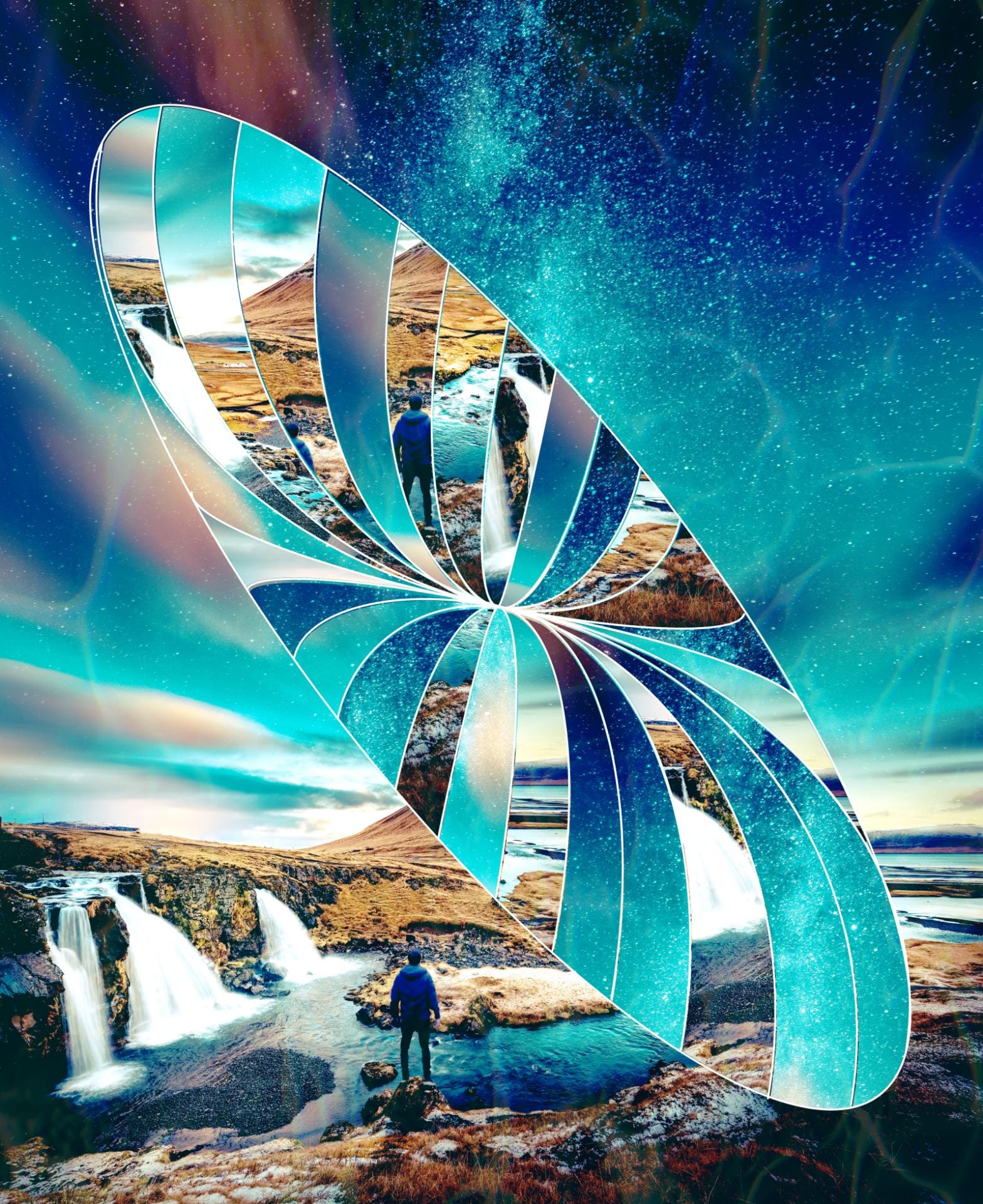
This dream is perhaps one of my favorite and most vivid dreams. I lose all sense of self and simply become a being- one with no name, face, or identity, with a strong wanderlust. I simply become a being with a strong ability to fly and no constraints, and one with a desire to see all corners of the world- going sky high to the lows of the earth, but never in the water with a phobia of the world that lies beneath.

The dream is a culmination of some of the places I am fond of and some of the places I wish to visit. The most important and significant being the northern lights in Norway, the thought of which light up my mood as they light up the sky. In this dream I get a chance to not only see them, but fly through them. And just like a roller coaster, I come down, and get a whiff of the cool water and the grass as I grab a glance of the buildings every time I oscillate between the sky and the earth.


The process

Lets start with the original image- a stock image from Pexels. The skyline of Chicago.

The first thing I did is I added the skyline, and erased the area covering the building. Then I used the spot healing tool to smoothen out the edges where the skyline and the buildings meet.

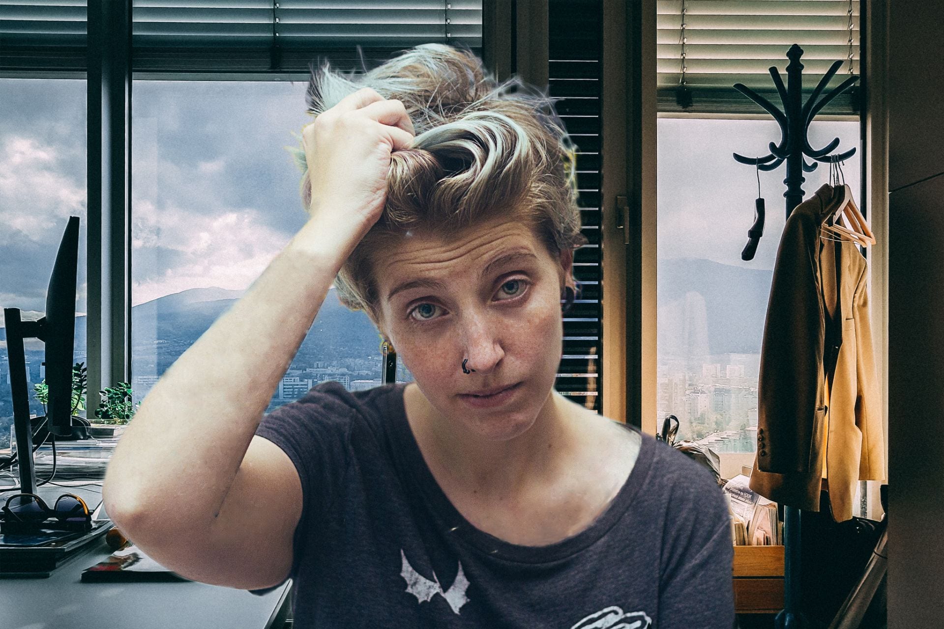
Next, I added the “human” in, and chose the darken option and positioned so it looks like the human is coming up.

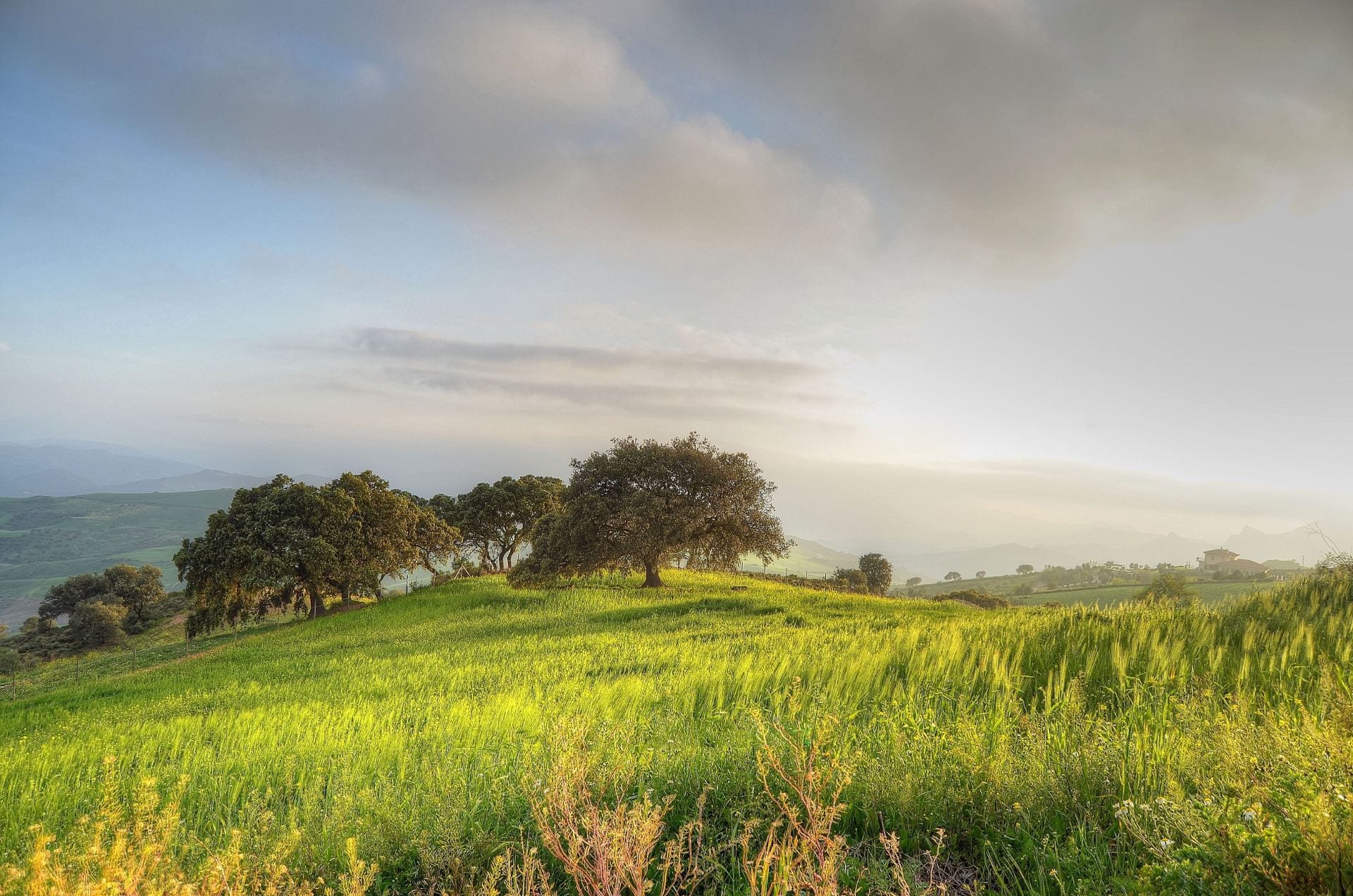
Next, I added the image shows above, erased it, and chose the subtract option to give it the effect observed- one that is of slightly grassy but mysterious water with weeds.

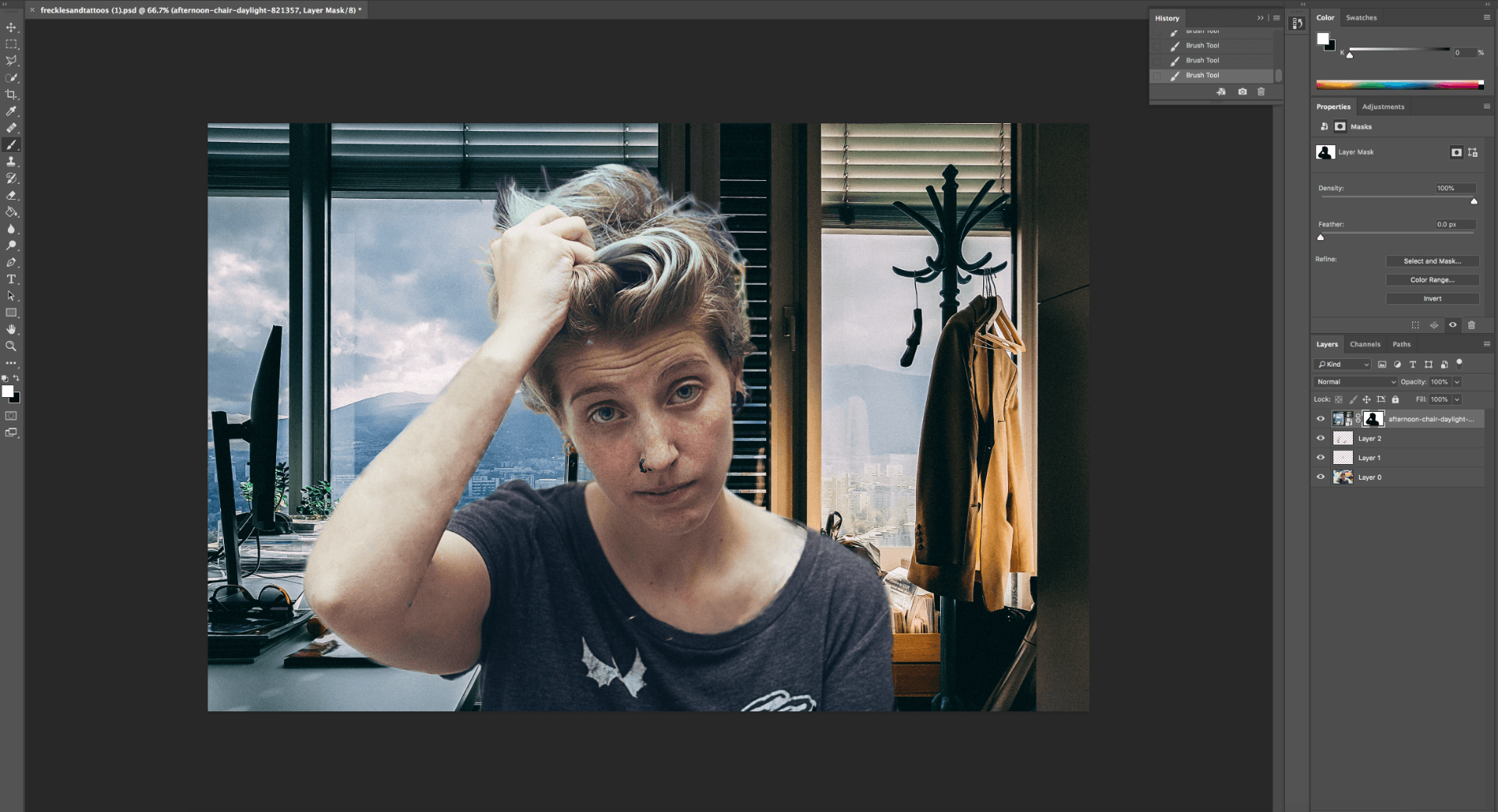
Had to ensure that there were no brand names in my image, so covered that as observed on the right using a lasso tool and layer by copy.

Next, I placed this image above on my dream and erased out all the parts not required, and added the lighten option. However, there are some open patches in the sky…

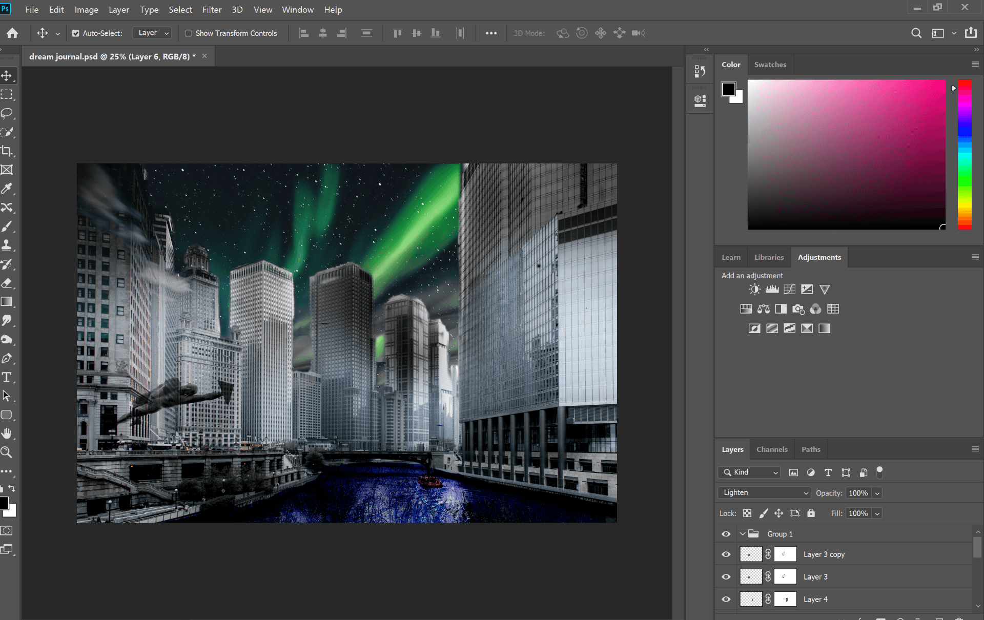
So finally, I chose parts of the northern lights and chose layer by copy, and gave the image some final finishing touches!


Tiny world

The process was straightforward yet fun to make- the tiny world allowed me to use one of my favorite photographs that I took during my visit to Austin TX. I started by resizing my image, inverting, and then polarizing it. I then further added a layer mask of my own image to remove the background, and replaced the card I was holding in my hand with something that held meaning for me.

I believe that location is not just geographical- the mind is powerful enough to evoke the sense of being elsewhere. All it takes is a sense of willingness and a little bit of imagination to be where you’d like.

I believe my space bears a lot of personality and carries several stories of people from walks of life- art is an expression of emotion and life experiences, and there is something truly joyful about being in a presence like so. As a consequence, being in a place evokes feelings- the attachment is never to a place, but the emotional response it invoked.

Playing around with photoshop

Decided to play around with a bright image of oranges- not sure what all I did but tried to play around with as many tools as I could! I primarily wanted to change to color of the oranges and managed to change a couple to B&W and green. I also changed to color of the rind, but with a different technique. The remainder of it was me trying to understand if I could click on tools and use them.