Survival:
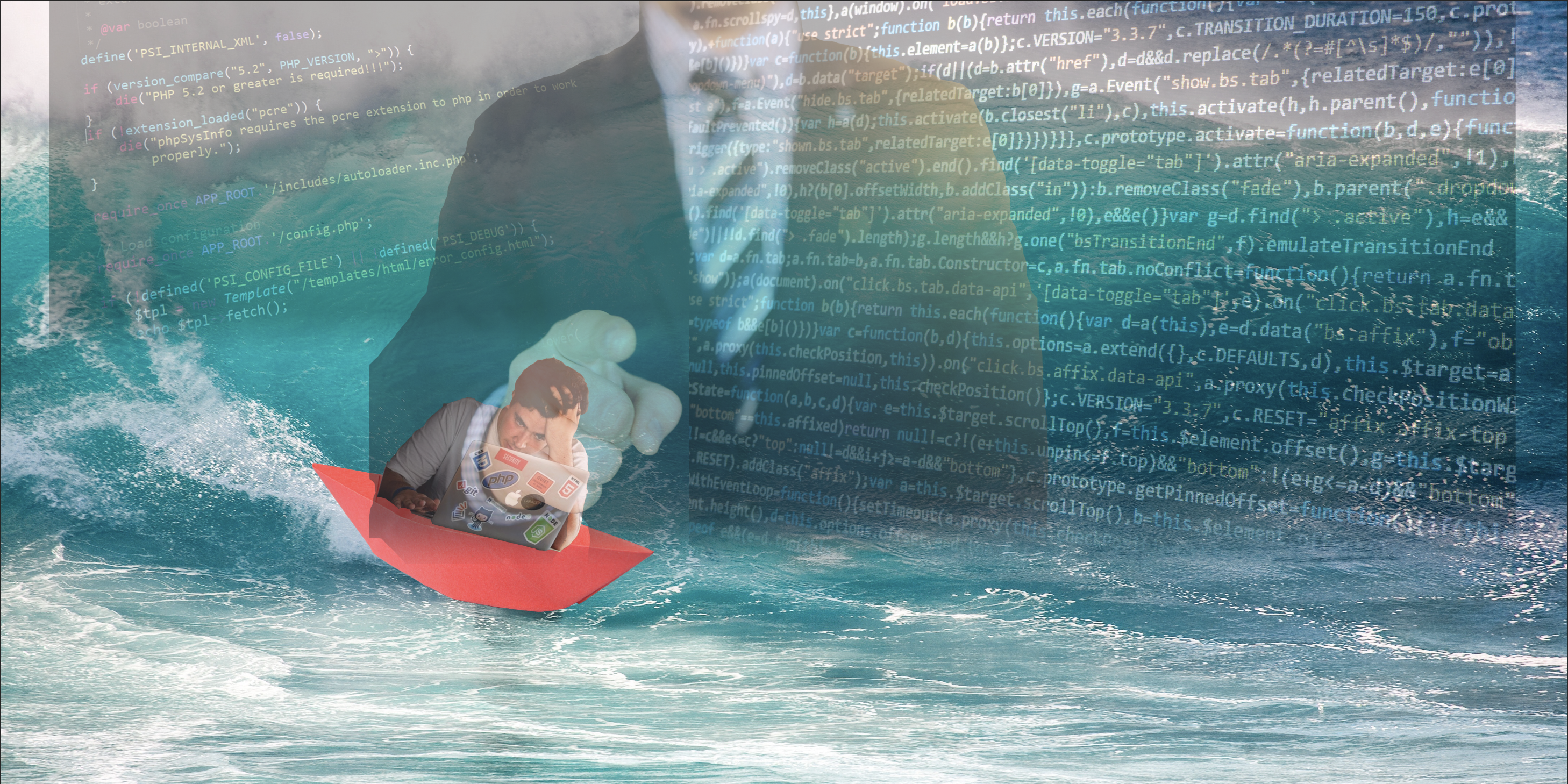
When I first saw this topic, ‘survival’, the thing that entered in my mind first is ‘survive in the work’ since that was a midterm week, and I really had to fight with tons of review work and assignment. I want to use the element ‘sea’ to express that there is a lot of work in my picture. And I also need a people to survive in this sea. I plan to let this person on a paper boat which is very dangerous. ‘Dangerous’ is one of the important element of survival. To avoiding overusing the imagery, I can’t just put a picture of the sea there and let the viewer guess. So that I decided to put some semitransparent layer on the sea like coding or the pressure from boss to clarify the meaning I want to express. I also choose the picture of a man who is working to highlight the idea I want to convey to my reader that: This is a picture about a programmer survive in his endless coding and the pressure from his boss. I want my viewer can feel the pressure and the hardship the programmer in this picture is facing. To make sure the viewer can experience these meaning is very important for me since I hope my artwork can bring people something that they can express on their own words.
When I was working on this work, someone suggests me to use the wooden boat rather than the paper boat to make the whole picture more harmonious. But I don’t think this kind of change is necessary. As I said before, I wish the ‘paper boat’ can give the viewer the more feeling of unsafety to make my work fits the topic ‘survive’ better. There are also some people recommending me to adjust the size and shape of the layers of ‘coding picture’ to makes them fill the whole ocean which is treated as background. I think this is a good idea the whole screen can bring more impression to people than one piece.
The following is about the process I create my work.:
Firstly, I select two pictures about coding to enrich the background, ocean, to represent the meaning that a worker is facing tons of work. Repeat the same process to add a ‘boss’ layer in the work. To do this, decrease the opacity of the layers of these two pictures and put these two layers above all other layers. Then I choose a picture of a people who is struggling with his work. Use the ‘magnetic lasso’ in the tool menu on the right of the windows to choose the counter of that person in the picture, then press ‘crtl+J’ to create a layer that only contains that people. Repeat the same process to cut out a paper boat like what I show in my work. Combine the ‘people layer’ and ‘boat’ layer together.
Reference:
https://www.pexels.com/photo/photography-of-a-person-pointing-on-something-684387/
https://www.pexels.com/photo/man-in-white-shirt-using-macbook-pro-52608/
https://www.pexels.com/photo/action-beach-fun-leisure-416676/
Contrast:

My second topic is about the contrast:
When I talk about the ‘contrast’, the couple of things that come in my mind are water, fire, and wood. But I need more element to enrich my work. I think of the process of water drops into the water, and I decide to reverse this process in my work to express the idea, ’contrast’. I also use a picture of layer as a background to form the double contrast in my work since the desert represents the monotonous which can have a contrast with the first layer of my work consists with three elements. I think the contrast between these pictures are very superficial, and I don’t have to worry my work overuse the imaginary too much. Through this picture I want my viewer to feel two different kinds of feeling the integrity from the range of the pictures of water drops and the incapability from the contrast of the three elements.
Couple days ago, I talked about my work with my roommate when I was still finishing that. He reminded me to use the double contrast to enrich the content of my work which is about the use the desert as background I mentioned in the previous paragraph. This is a good strategy for me when I was struggling to add the new element in my picture at that time. During the final critique, I heard some suggestions from the classmates that I need to change the order of the two ‘water drops’ pictures and make sure I don’t put them together which they thought these two pictures looked so harmonious to fit my topic. I didn’t accept this idea at that time. As I said in the previous paragraph I want to use the reverse of the process of dropping into the water to create the feeling of contrast for viewer. Separate these two pictures only will make my work be random and meaningless.
The following is about the process I create my work.:
First, I choose the two pictures to represent the two different moments of the process that water drops into the water. Use the option ‘Transform’ in the edit menu and choose ‘Flip Horizontal’ to rotate one of picture 180 degrees, reduce their opacity and adjust them in the right position. then add the ‘layer masks (revel all) ‘in ‘layer’ Menu on them and use the ‘Linear gradient’ in the gradient tool to add the gradient effect for the layers to make a transition part between these two pictures. Do the same thing to process ‘fire’ picture and ‘forest’ picture. Secondly, choose a picture of a desert and to adjust its size to make sure it can cover all other four pictures. Reduce the opacity and put it at the position above other four layers. Choose the option ‘merge the layers’ in ‘layer’ menu and use the ‘lasso tool’ to select the joint part of four pictures. Finally, use the ‘Gaussian blur’ in ‘Filter’ Menu to blur these parts to improve the overall sense of this work.
Reference:
https://www.pexels.com/photo/dawn-desert-dry-dune-273935/
https://www.pexels.com/photo/nature-water-drops-of-water-liquid-40784/
https://www.pexels.com/photo/water-reflection-surface-macro-45229/
https://www.pexels.com/photo/bonfire-burning-campfire-fire-270815/
https://www.pexels.com/photo/bright-countryside-dawn-daylight-302804/


