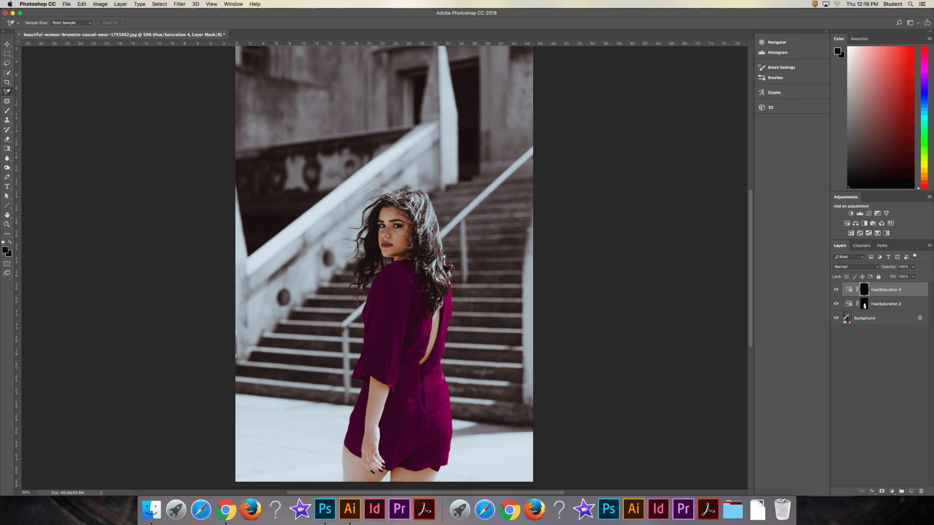
In this blog post, I will explain the six blend modes in Photoshop, accompanied by example images.
Normal Blending Modes
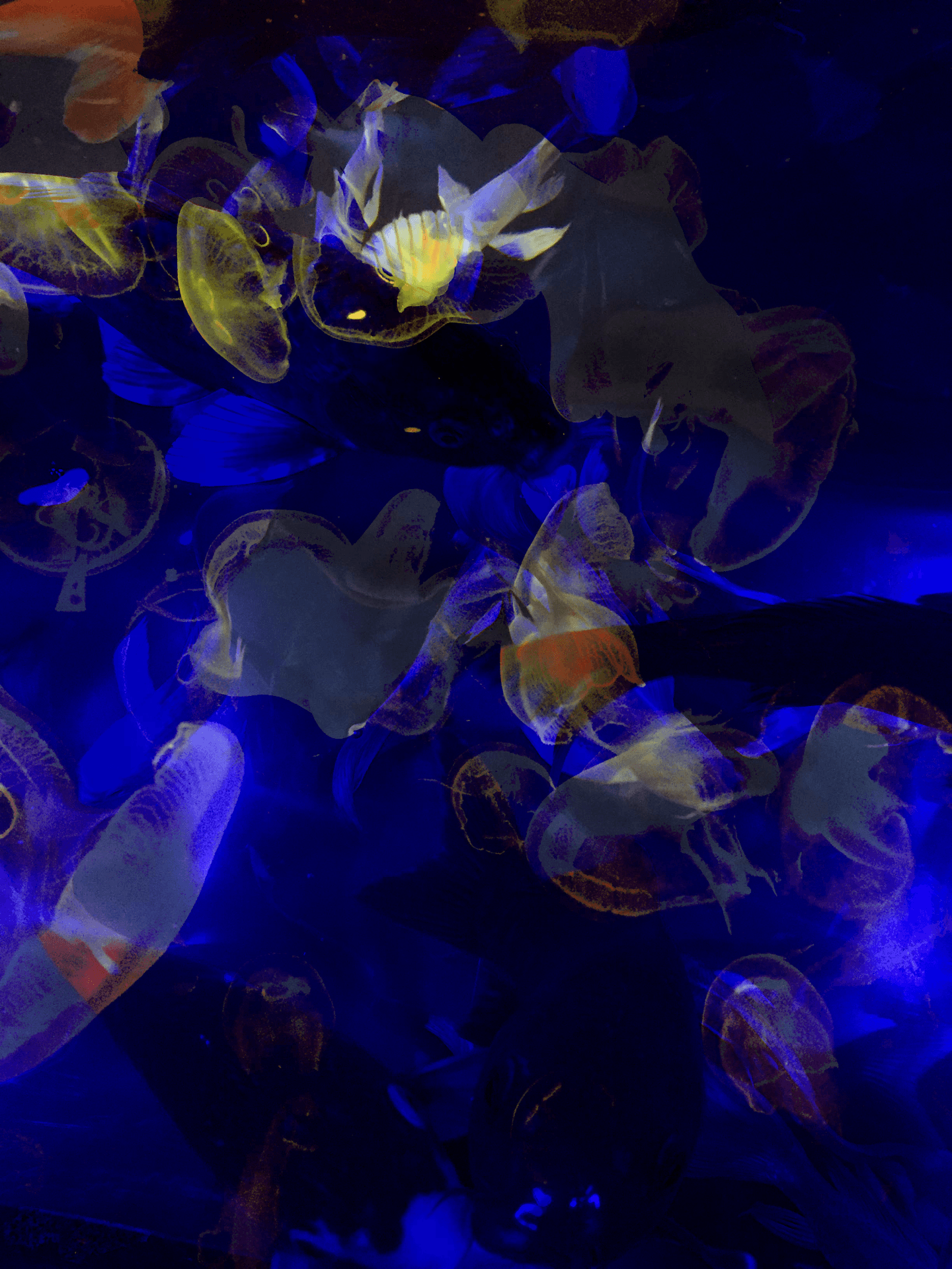
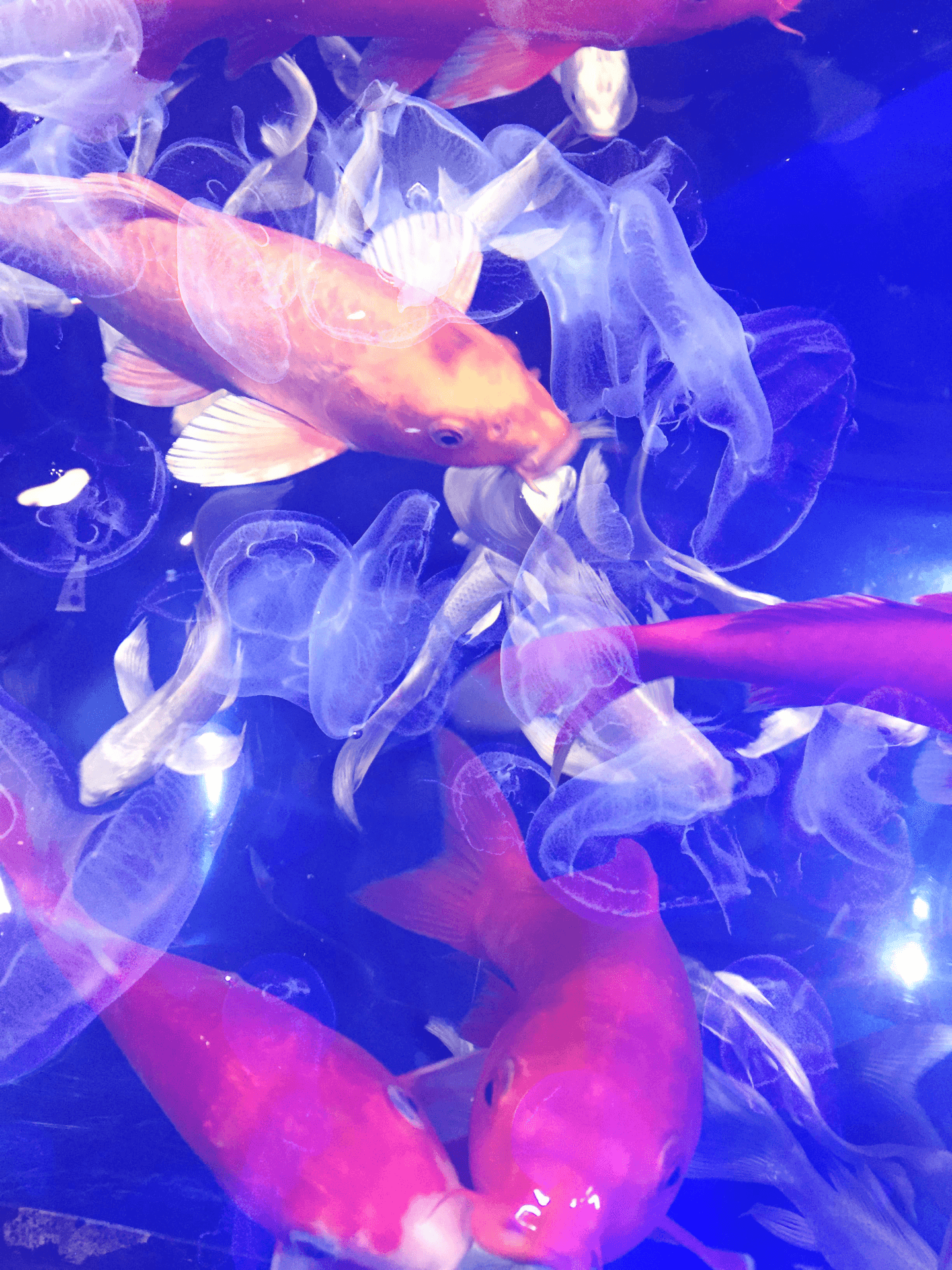
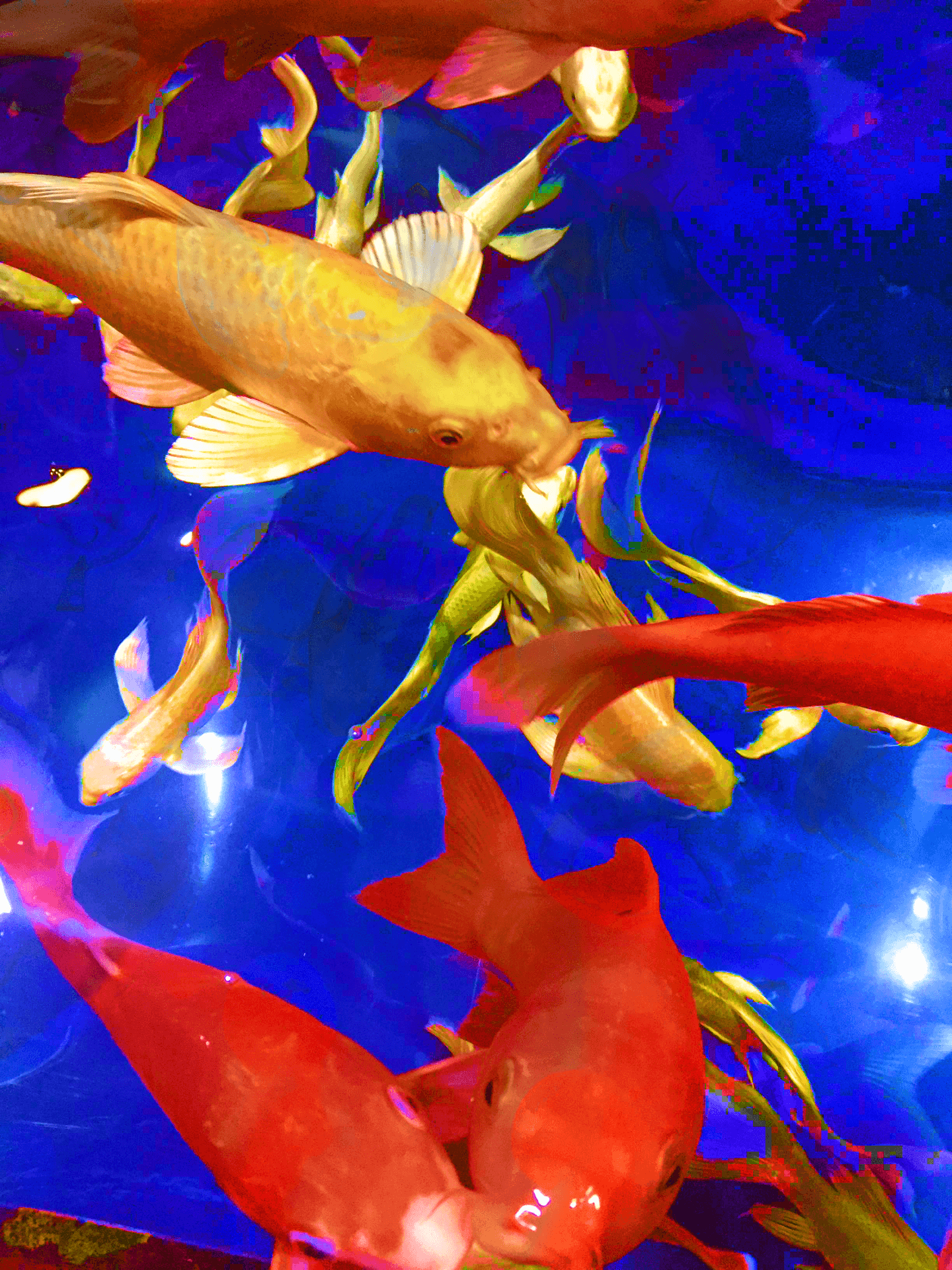
Normal (Original Images)

This is the mode where the overlying layer remains untouched – all pixels are opaque and the top image completely covers the bottom one.
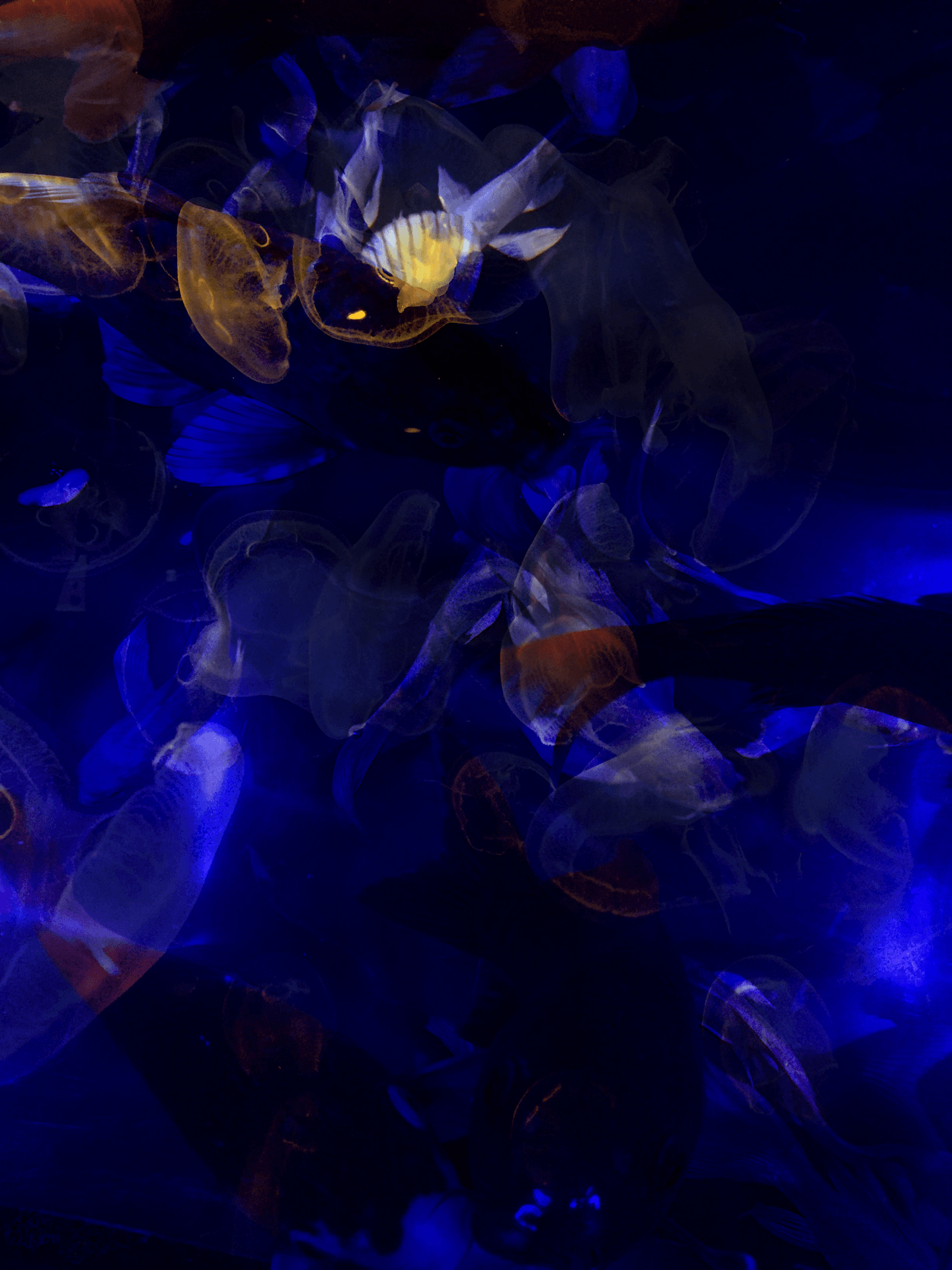
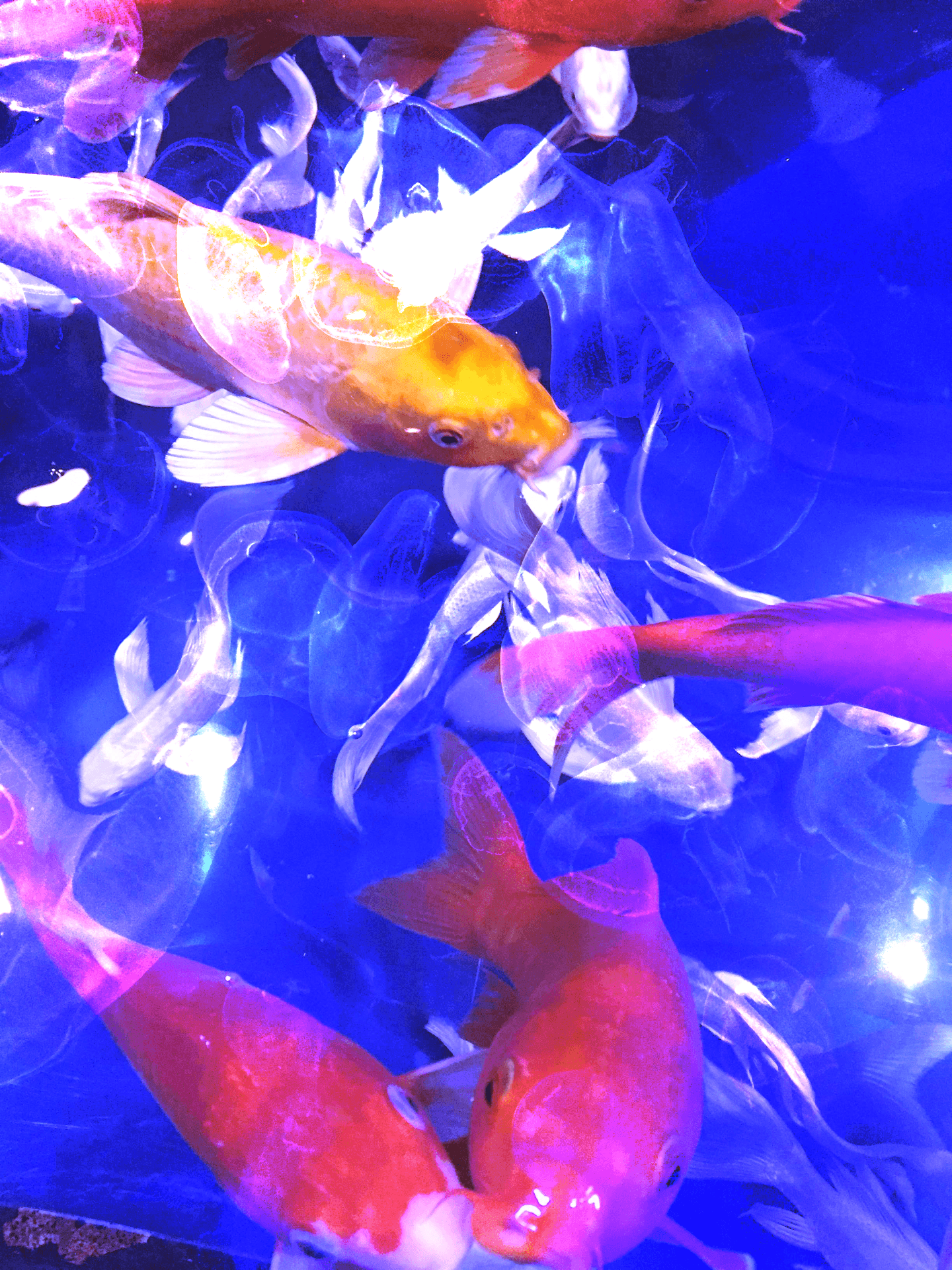
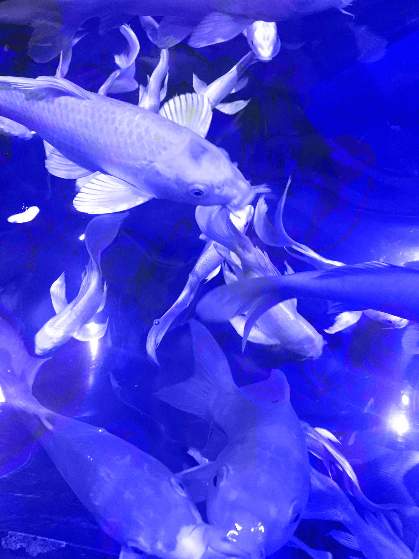
Dissolve (50% Opacity)
Dissolve also doesn’t change the image except for the opacity of the top layer, which reveals some of the bottom layer depending on the chosen opacity.
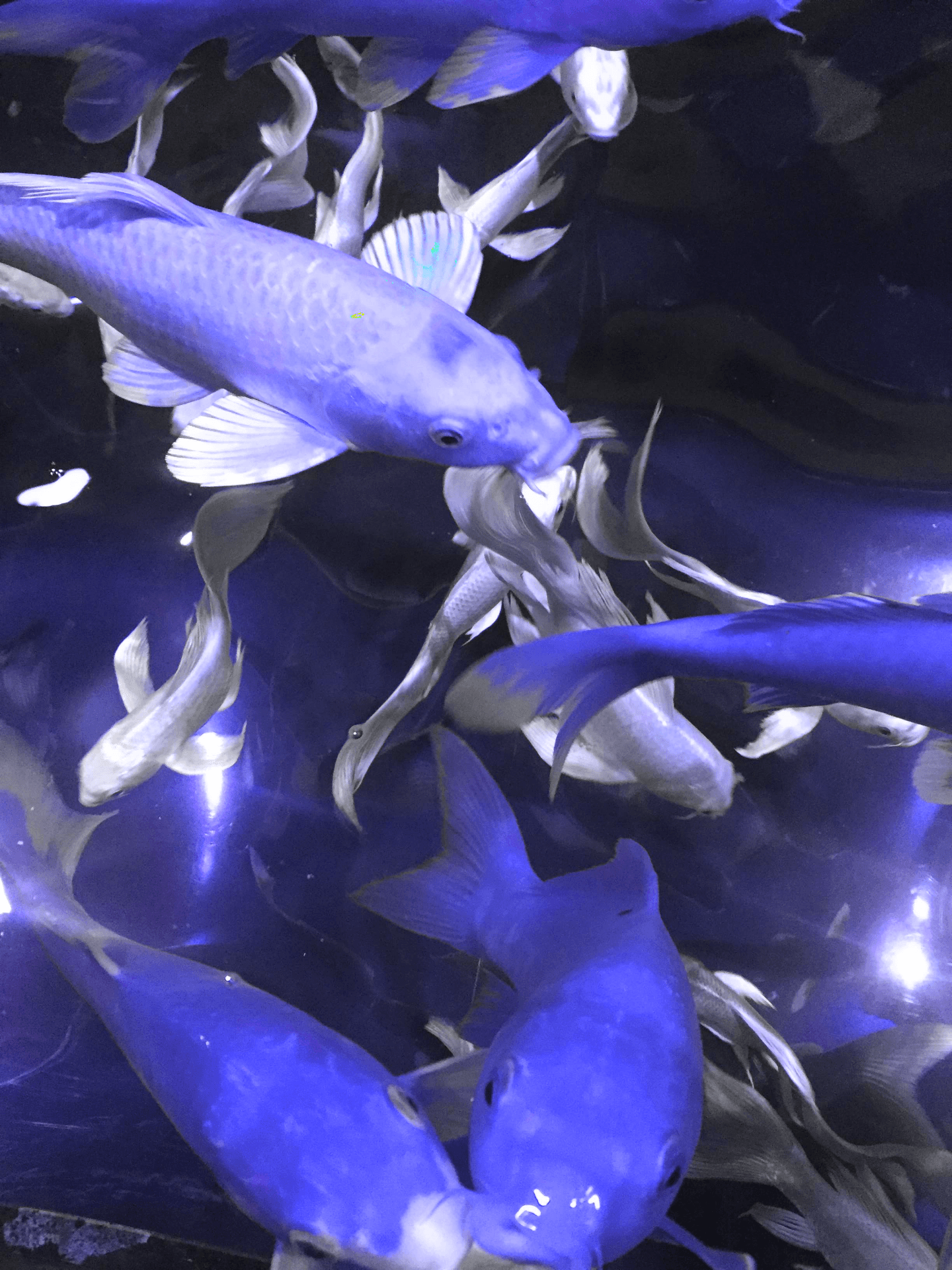
Darken Blending Modes
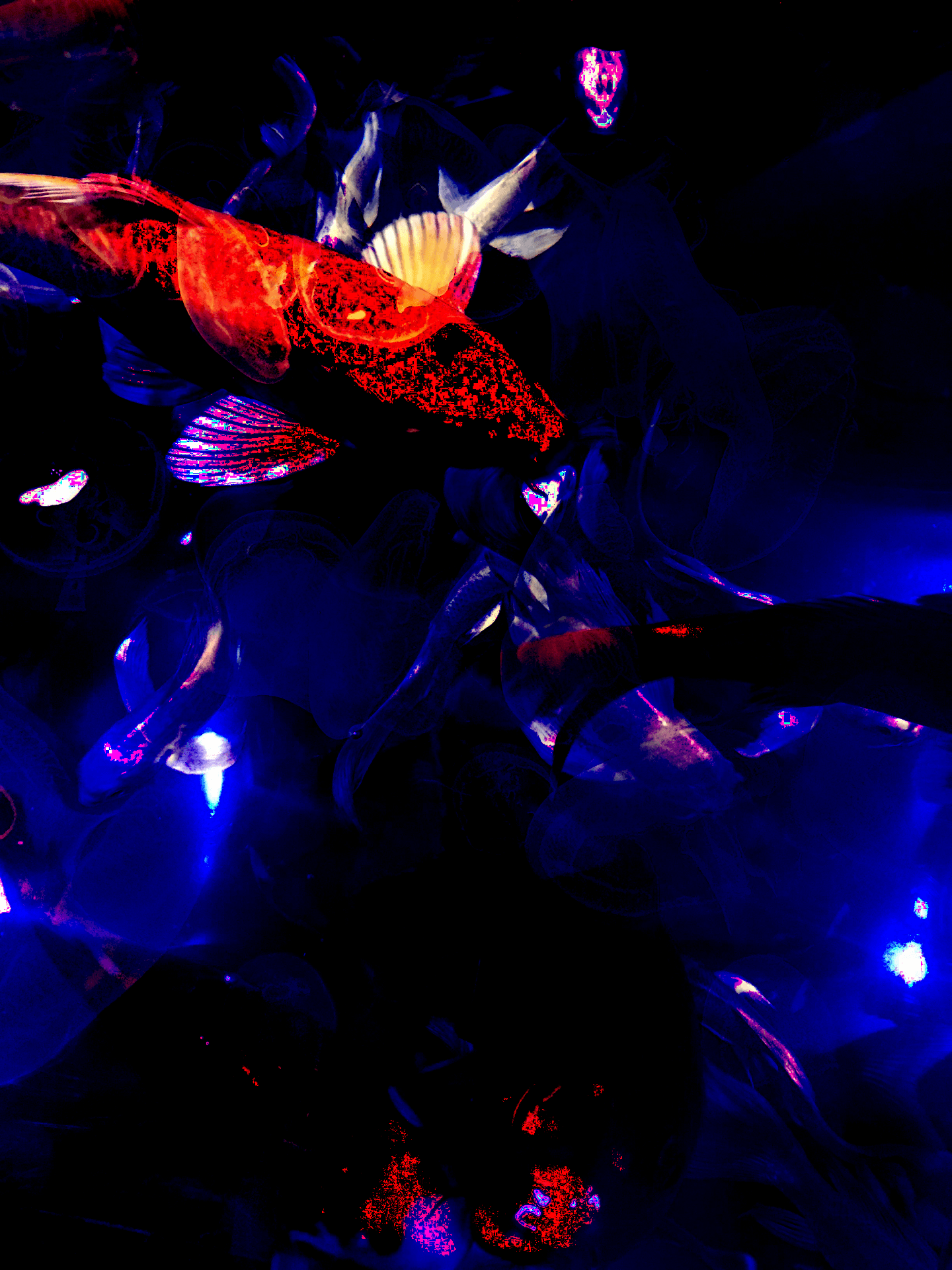
Darken
Darken takes the base or blend color and depending which is the darker one, keeps that color as the result.
Multiply
This multiplies the base color by the blend color, and this always results in a darker color.
Color Burn
This increases the contrast between the base and blend colors which reduced highlights and saturates midtones.
Linear Burn

This decreases the brightness of the base color based on the value of the blend color, and produces the most contrast in darker colors than the other darken blending modes.
Darker Color

This compares the total of all channel values for the blend and base color and displays the lower value color.
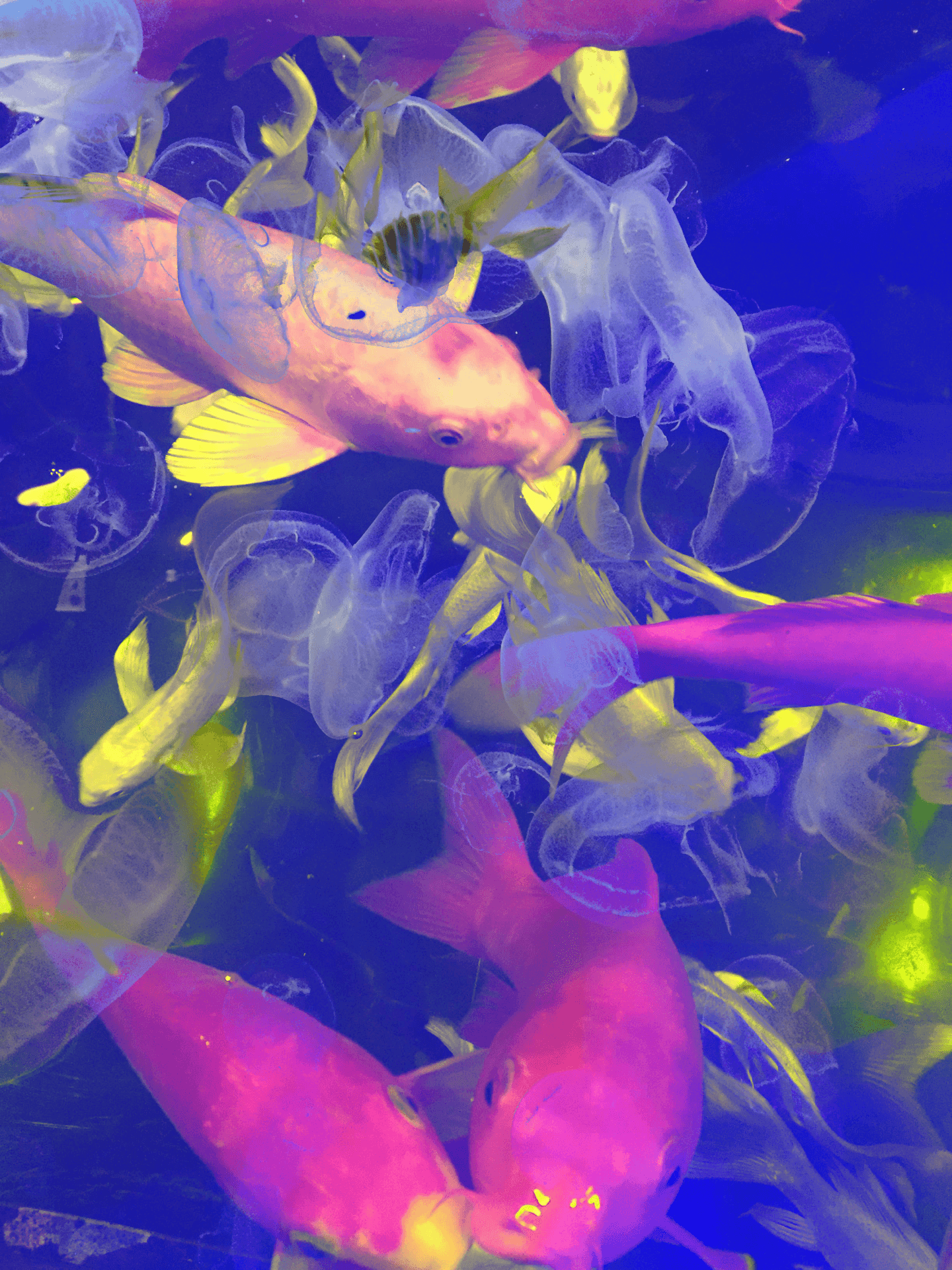
Lighten Blending Modes
Lighten
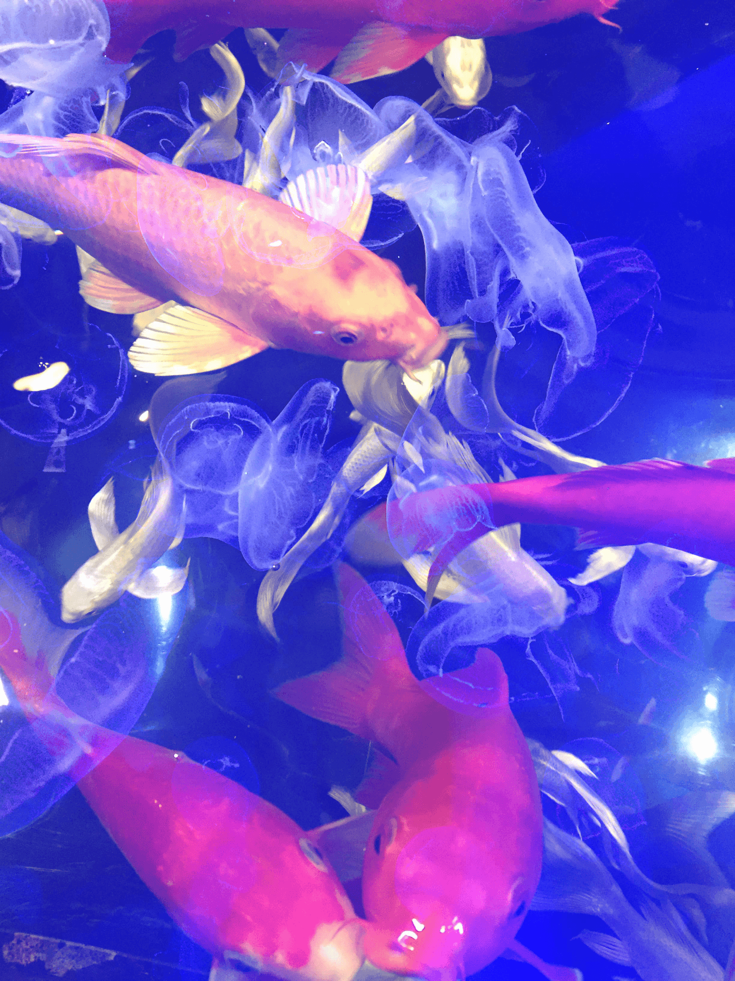
This selects the lighter of the base and blend colors to use in the resulting color.
Screen
This multiplies the inverse of the base and blend colors, always resulting in a lighter color.
Color Dodge
Brightens the base color to reflect the blend color by decreasing contrast between the two.
Linear Dodge (Add)

Brightens the base color to reflect the blend color by increasing the brightness.
Lighter Color

Compares the total of all channel values for the blend and base color and displays the higher value color.
Contrast Blending Modes
Overlay

Multiplies or screens the colors, depending on the base color. Preserves the highlights and shadows of the base color and mixes it with the blend color to reflect the lightness or darkness of the original color.
Soft Light

Darkens or lightens the colors, depending on the blend color. If the blend color is lighter than 50% gray, the image is lightened as if it were dodged. If the blend color is darker than 50% gray, the image is darkened.
Hard Light

Multiplies or screens the colors, depending on the blend color. If the blend color is lighter than 50% gray, the image is lightened, as if it were screened. This is useful for adding highlights to an image. If the blend color is darker than 50% gray, the image is darkened
Vivid Light

Burns or dodges the colors by increasing or decreasing the contrast, depending on the blend color. If the blend color is lighter than 50% gray, the image is lightened by decreasing the contrast. If the blend color is darker than 50% gray, the image is darkened by increasing the contrast.
Linear Light

Burns or dodges the colors by decreasing or increasing the brightness, depending on the blend color. If the blend color is lighter than 50% gray, the image is lightened by increasing the brightness. If the blend color is darker than 50% gray, the image is darkened by decreasing the brightness.
Pin Light

Replaces the colors, depending on the blend color. If the blend color is lighter than 50% gray, pixels darker than the blend color are replaced, and pixels lighter than the blend color do not change. If the blend color is darker than 50% gray, pixels lighter than the blend color are replaced, and pixels darker than the blend color do not change.
Hard Mix

Adds the red, green and blue channel values of the blend color to the RGB values of the base color. If the resulting sum for a channel is 255 or greater, it receives a value of 255 and if less than 255, a value of 0.
Inversion Blending Modes
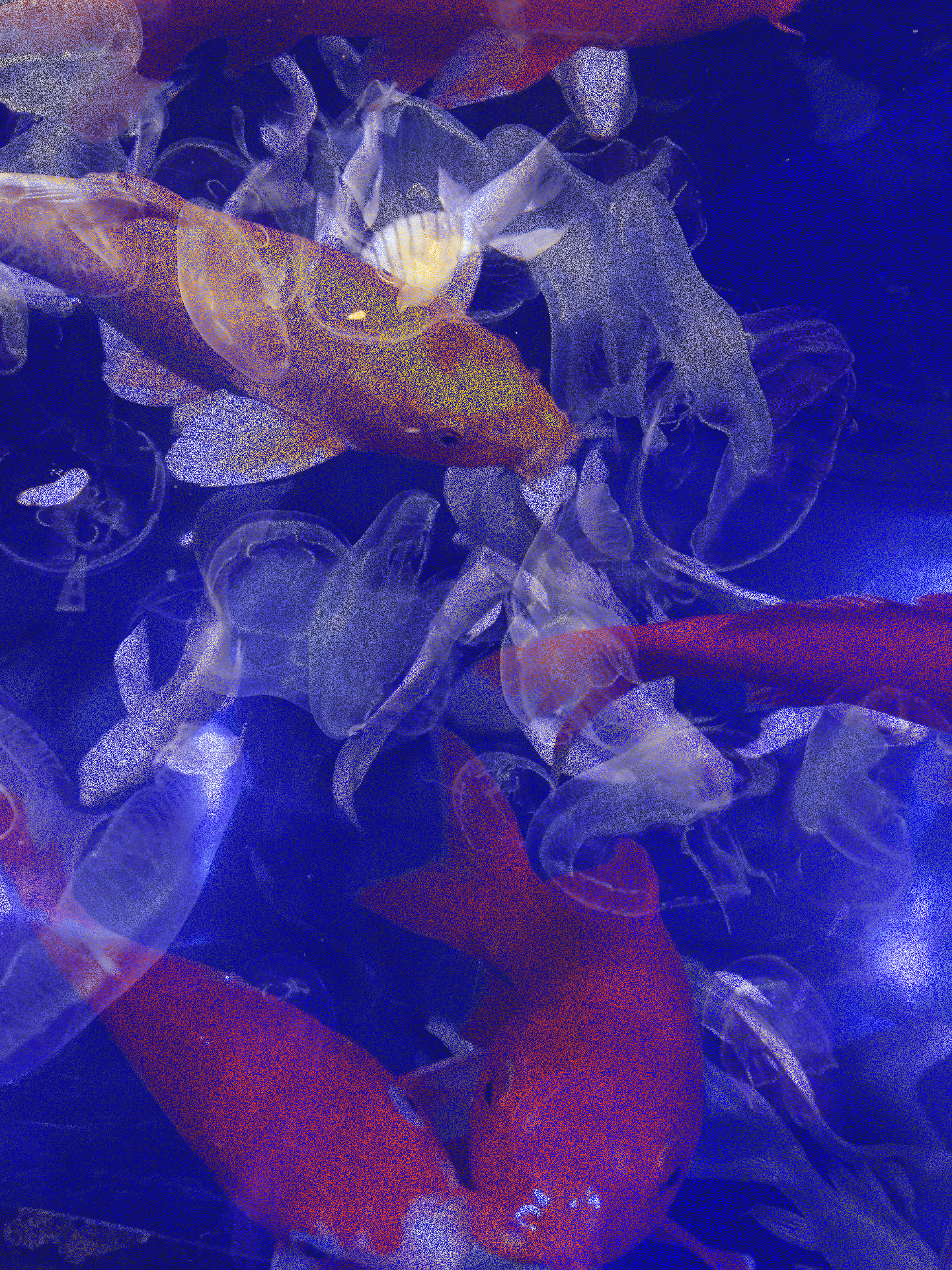
Difference

Looks at the color information in each channel and subtracts either the blend color from the base color or the base color from the blend color, depending on which has the greater brightness value.
Exclusion
Creates an effect similar to but lower in contrast than the Difference mode. Blending with white inverts the base color values. Blending with black produces no change.
Subtract

Looks at the color information in each channel and subtracts the blend color from the base color. In 8- and 16-bit images, any resulting negative values are clipped to zero.
Divide

Looks at the color information in each channel and divides the blend color from the base color.
Component Blending Modes
Hue
Creates a result color with the luminance and saturation of the base color and the hue of the blend color.
Saturation
Creates a result color with the luminance and hue of the base color and the saturation of the blend color.
Color
Creates a result color with the luminance of the base color and the hue and saturation of the blend color. This preserves the gray levels in the image.
Luminosity

This creates a result color with the hue and saturation of the base color and the luminance of the blend color.