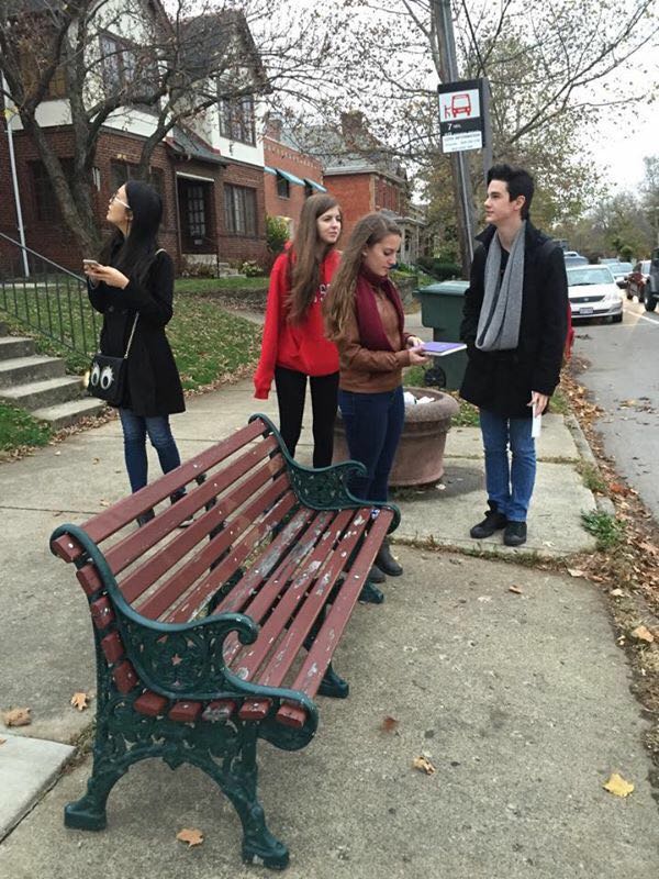
Our plan was to take the #7 bus at 3:34 PM and then transfer to the #5 bus at 3:54 PM. We waited at the bus stop outside of Knowlton Hall to catch the #7. Here, we sat on a bench with a shelter  while we waited. It was a frigid day, so this somewhat helped to keep the cold wind out. The sidewalk was also clean and wide; there was a lot of room for people to stand waiting all while people could pass. The #7 arrived a few minutes late. Once we got on, the driver greeted us kindly. The bus appeared to be in a suitable condition with some signs of use. The overall environment was acceptable. The lights were dimmed, the bus was clean, and the other passengers kept to themselves. The stops were regularly announced over a loudspeaker, and the time, date, and next stop were also announced and shown on an LED screen at the front of the bus.
 Once we got off of the #7, we had to cross residential roads (Neil Avenue) in order to get to our transfer stop. There was no cross walk and the roads were fairly busy. At this bus stop, we had no place to sit. There was only a sign stating that the #5 stopped there. Here, we waited until the bus arrived at 3:54 PM. This bus was slightly cleaner than the #7, but the driver didn’t greet us as nicely as the first; it was also much smaller and busier. The bus was quiet and became less and less busy as we went on. We rode this for awhile until the driver told us that we would have to get off so that she could go into First Community Village to pick up passengers; we weren’t allowed in because this area was not open for the public.
At this stop, there was no sidewalk and no bench. The stop going back the other way was initially hard to spot, and was on the private drive to the retirement village. We all had to stand in the cold for 15 to 20 minutes. The same bus came out of the assisted living home and picked us up again.
By this time, we realized that we had planned to get on the wrong bus. Instead of

The interior of a typical COTA bus.
going to our required destination, we had only gone about four miles. We tossed around the idea of getting off of this bus and finding the right one to get on, but we eventually decided that we wouldn’t make in there and back in time. We chalked this mistake up to the fact that the COTA system was difficult to understand. The website itself warns potential passengers that its information may not be correct, and that they should check Google maps for updated information. The lettering system of the buses also doesn’t make sense unless you know exactly which bus goes where.
 We then stopped again near where we stopped for our transfer to the #5 bus. We had a bench to sit on, but it was very close to the road with no curb. The sidewalk was also narrow. There were two buses that came to this stop; the #7 and the #18. We understood that both went back to campus, so we simply waited for the first one that came, which ended up being the #18. Like the #7, this bus was in acceptable condition with some signs of regular use.
Overall, our trip on the bus wasn’t bad, but required much planning and forethought. You had to look up the timetables online because there are none that we found at bus stops, the Student Union, or any place a university connected to a city bus system would typically have them. In addition, COTA’s website mislead and confused us as we accidentally planned a trip to the incorrect Giant Eagle Market District. However, we did eventually realize that we had taken the wrong route because of the regular announcements of each stop’s location. The other passengers acted similarly throughout the evening, mostly keeping to themselves, and the drivers all greeted us, but to different degrees. Additionally, the equipment throughout our transfers all appeared to be in good condition with acceptable signs of use. These aspects allowed us to feel as though we were in a safe environment, allowing for a pleasant trip that took exactly 1 hour and 16 minutes on the bus overlooking the trouble we had with finding the correct route.


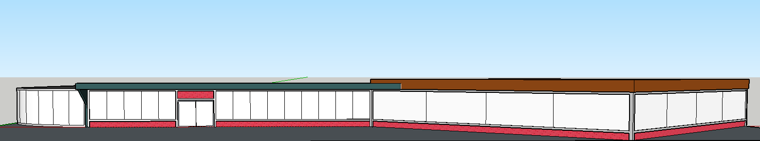

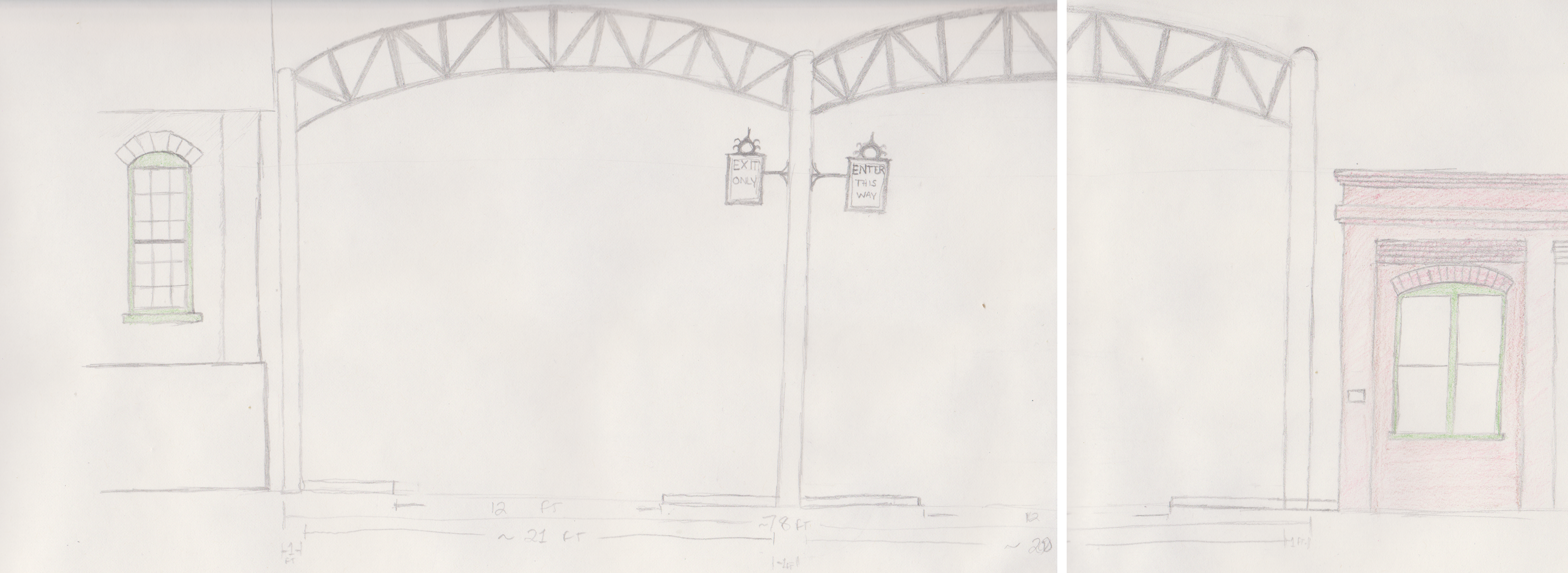


 Design aspects from Columbus preexisting buildings are prevalent in the sketch ups that we were able to do. Specifically, arches in the former “Arch City” are important to making Columbus have its own personal sense of style again. Columbus feels generic and doesn’t need to if it is able to utilize existing features and incorporate them into original design – you won’t need “New York Style” living advertisements, you’ll want “Downtown Columbus Style” living.
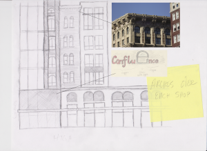
 utilizing copper letters and a giant glass “e,” showing off the arch design in a modern, elegant style. The “e” would be able to light up with LED lighting theoretically and change colors.
 the intersection of Long and High, appears to be built in a more luxury, traditional building style that reflects the buildings over the I-670 cap, according to the sketch. We chose sandstone and dark brick as building materials because of the
  Ohio sandstone quarries, particularly the one in Amherst, and the dark brick which reflects many of the buildings in Columbus that have dark brick, whilst providing a clean, modern contrast. The “x” between the arched retail fronts signifies where the lights, based on the arches from the Short and Old Norths would go. The lettering on this half of the building would be a more sleek, elegant design that reflects and is in tune with the
 southern half of the building, but would provide that formal and luxury living aesthetic. Trees in front of the buildings would be replaced with the native red buckeye tree, an Ohio favorite that blooms beautiful flowers and matches the theme of “red” that people think of when thinking of Ohio. To continue the theme of arches, the red buckeye tree’s leaves naturally curve, making a succession of them appear as arches down the street.